The brief
The brief was to create a commemorative catalogue, in the form of a folded leaflet, to explain the client’s art project: ‘Moving Gallery’, an art gallery inside a double decker bus in Reading. The folded leaflet needed to include images taken during the project, text explaining the project, and the bios of the six artists who’s work featured in the Moving Gallery.
Purpose and function
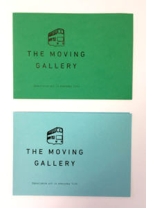
The catalogue was to be given to the twenty donors of the project as a thank you for their contribution, so somewhere on/ in the leaflet there needed to be a thank you note. There was a possibility that the leaflet might be used for other functions in the future to promote the Moving Gallery project, so it was suggested in the first client meeting that the thank you card could be separated from the catalogue.
Requirements
- The client had a limited budget and so was keen for each leaflet to fit on one double sided piece of SRA3 paper.
- 20 copies of the leaflet and 20 thank you cards to go with them
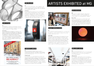
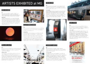
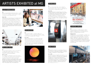
- It was important that all of the necessary information was on the document, including information about the Moving Gallery, the Moving Gallery at its new exhibition space, and the exhibited artists.
- The client already had a running website and there were a few things that she wanted to keep the same to remain consistent in style. The paragraphs had to be set in the typeface Courier New, and the headings in Din Alternate. The headings were also to be inverted in white out of a black rectangle as on the website.
Design process
experimenting with folds
One of the first challenges in this real job, was finding a way to fit all of the content on to two sides of SRA3 paper. Initially there was a lot of content so I asked the client if she could condense the text down to a smaller amount, which she was happy to do. After I got sent a new folder of content I began to work on the layout.
I started by taking a few sheets of A3 paper and folding them in different ways and writing on where the content might sit so find out what might be the best approach.
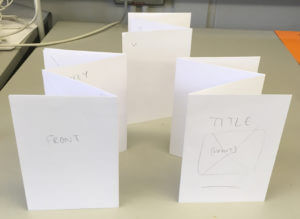
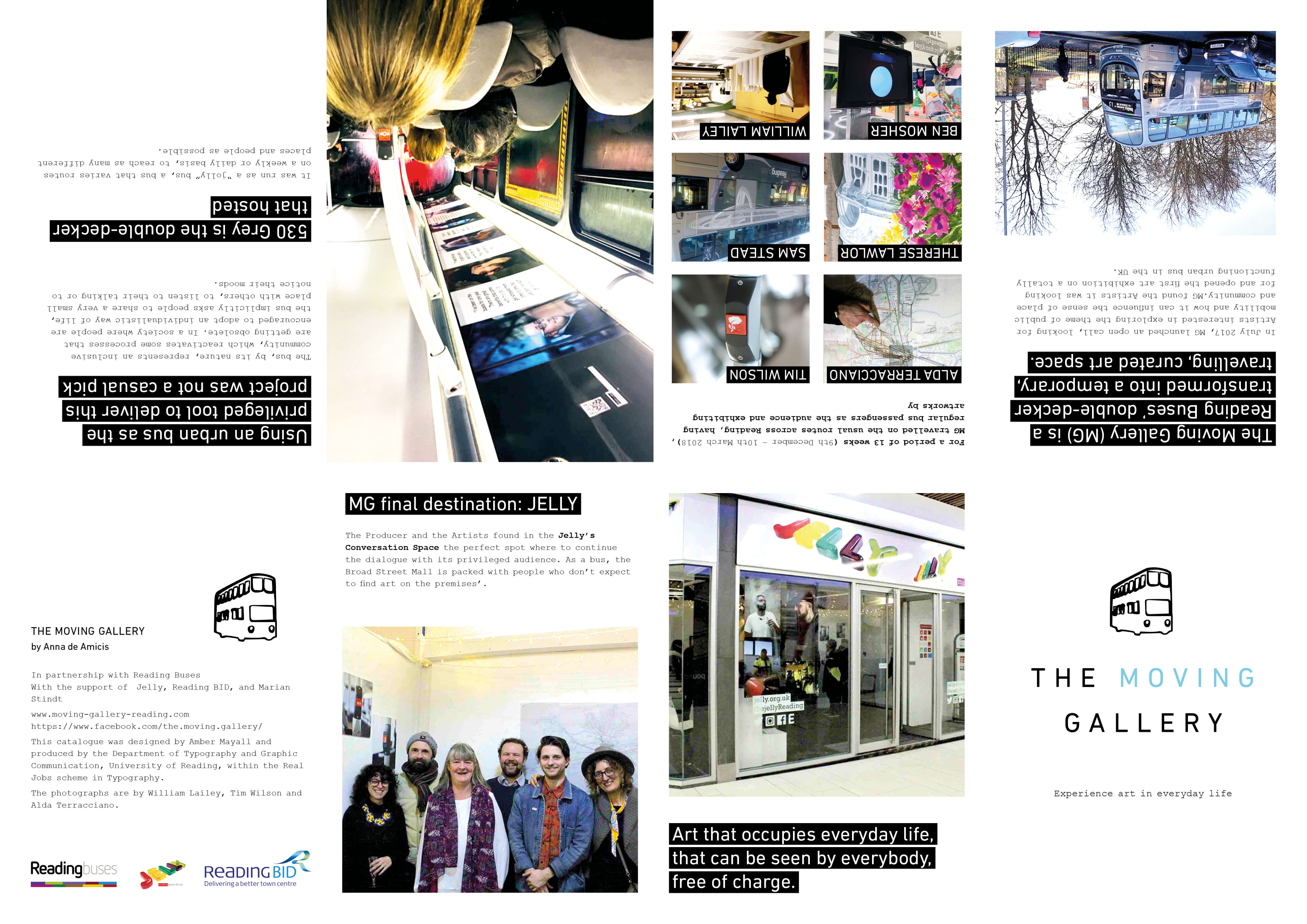
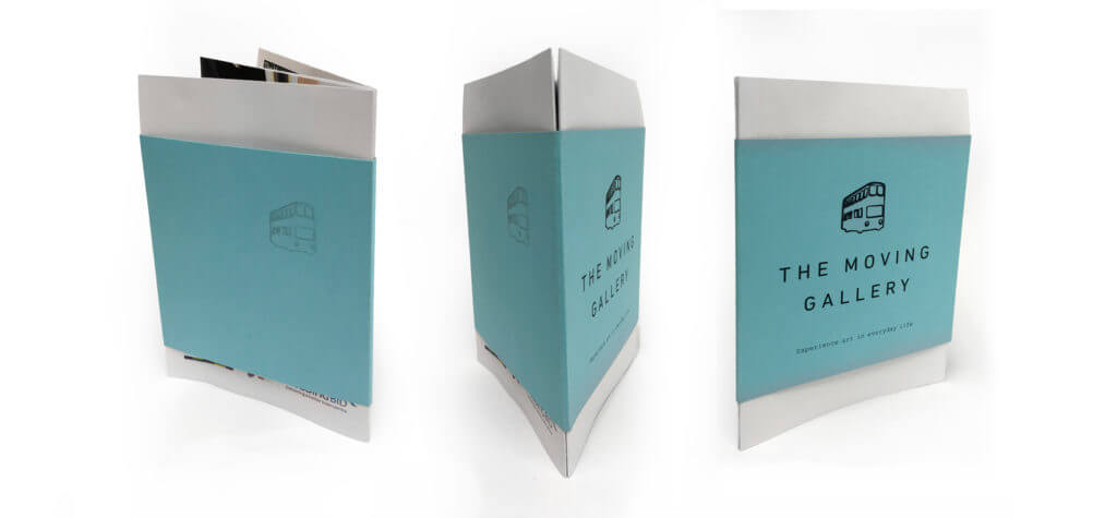
I decided that the best use of space would be to fold it in half longways and then create a concertina. This meant that I could have information on the outside of the leaflet on each flat side and then have a full A3 spread once it is opened.
I decided that the thank you element of the design could be a wrap around card that folds around the main leaflet and tucks in so that it doesn’t fall off.
Layout
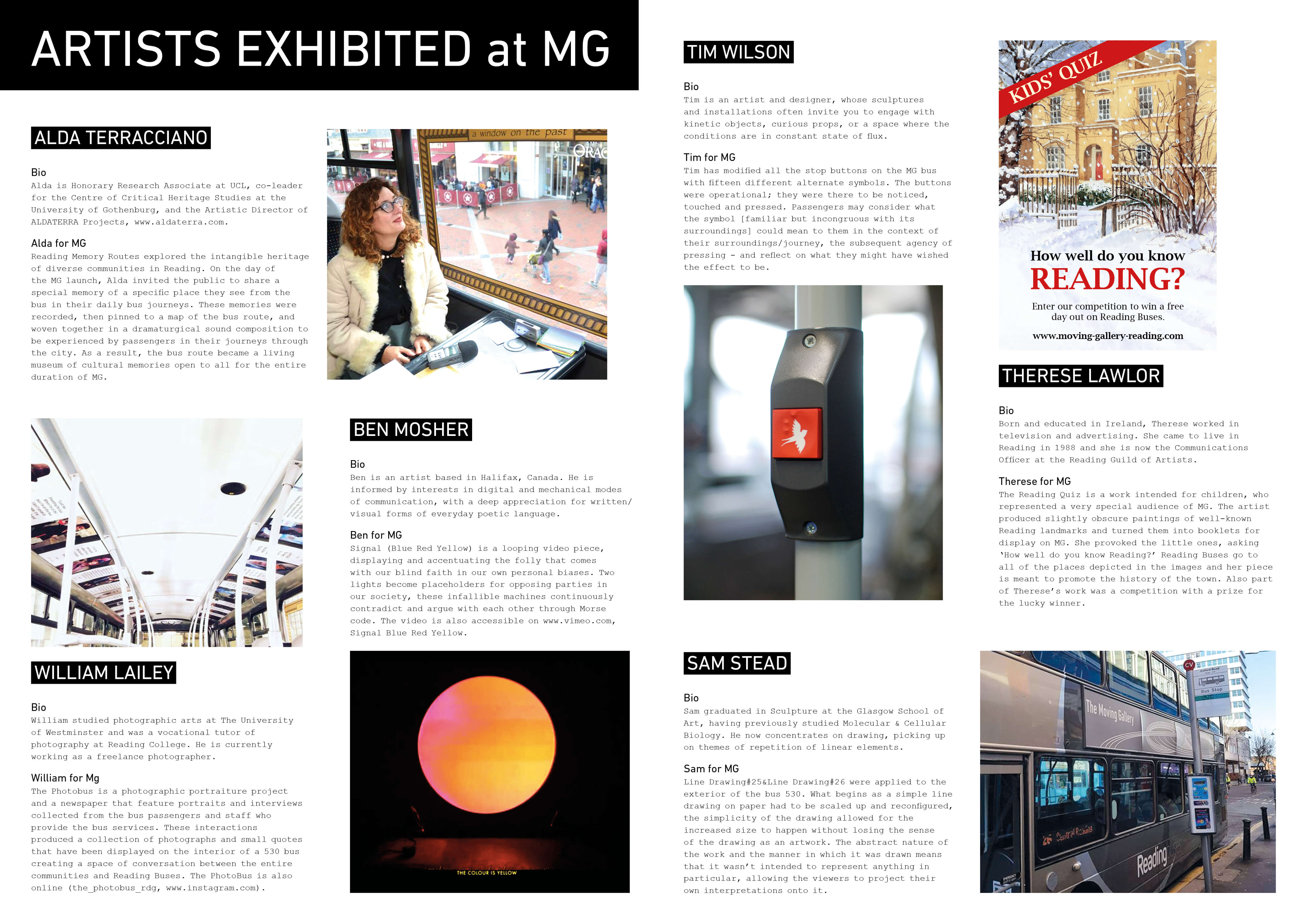
I next needed to decide where best to put the information. I organised the information into three groups according to the text my client sent me: artist information, Moving Gallery on route and Moving Gallery at its next exhibition space, Jelly. As there were six artists and six concertina sides (once you take out one side for the front cover and one for the back), I thought of putting one artist on each, however there was too much information to fit both the name, text and image for each artist on each side without having a tiny type size. I decided to try putting all of the artists on the inside spread, which worked much better as I had more space and flexibility with the layout.
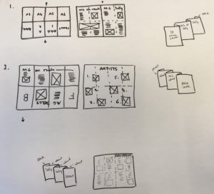
I made a number of changes to the layout throughout the process after several meetings with my supervisor. One thing I had to really work on was my alignment of the artist’s bios. Problems occurred because I had a fairly strict grid but if everything sat centrally on my grid, it was difficult, without reading the text, to see which image relates to which artist’s name.
My first few layouts all had the title on the right hand side of the page, which I later decided was irrational as it made it seem as though it was only a title for the right page rather than both. In this layout I stuck to my grid but this meant that the space between non relating elements wasn’t different enough from the space between relating elements. In this version I also realised that some of my images were far larger than others, particularly on the left hand page where there was no heading.
After moving my title to the left hand page it was greatly improved however I still had to work on the spacing. I tried moving the images around and increasing the space between non-relating elements.
To further improve clarity, I tried using blue bars to link relating elements together. I used this blue as it featured in the logo but nowhere else.
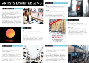
I decided that this was a step too far and looked less elegant and I could just use space to separate elements.
Images
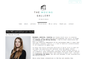
One of the biggest problems that I had with this project was the quality of the images I was provided with. They all seemed to have been taken on a low resolution phone camera for example. I asked the client if there were any better quality images but these were all she had. I did my best to brighten the images in photoshop and sharpen them where I could. During this project, I learned a few photoshop tricks for improving images. I learned how to change the perspective of images to make sure the content was completely upright and also how to brighten the images without making bad lighting appear unnaturally yellow, by playing around with the saturation in specific areas. Although they did not end up being amazing quality, I feel that I did the best I could with the images I had been given.
COlour
Another issue that came up was in the colour of the card I used for the thank you card. When I initially proposed a type of card to the client, she said it was too green. I had chosen the card based on the colour of the logo and this was something I had to work around as it seemed the client had in her head an idea of the colour she would like, but no physical example of this colour. This left me in a situation where I wasn’t exactly what she wanted. After sending back and forth various colour swatches, I ended up resolving this by sending her a link to a card company, who’s card I knew would be fine in the printers, and suggested that she chose a colour of card and purchase it herself then give it to me to print on. As the client only needed twenty copies of the final product, this solution was fine. After this, the process ran smoothly as the client was then accountable for her choice in card rather than me spending money on card she didn’t like.
This problem taught me two things, firstly that I should never buy material without clearing that exact material with the client beforehand, and secondly, to choose colours more carefully and make sure that both I and the client have the same shade in our heads.
The budget
I made one definite mistake on this job and that was not being completely certain of what had been agreed in terms of money. I had been told when I was allocated the job that the client had a certain budget and I didn’t think to check at the time whether this was the case. It turned out later in the process that the client had thought that her budget would cover both the real job scheme and her printing costs, when in fact it would only cover one of those things. Moreover, as the project progressed, I should have discussed with the client that printing a separate thank you card was going to require a bigger budget, as this would mean printing not only the 20 sheets of double sided SRA3, but also at least 10 sheets of double sided A4 card. This mistake has taught me to not agree to printing extra deliverables without clearing the extra costs with the client so that I don’t end up losing money.
Final deliverables
I was pleased with the final design and I think it successfully fulfilled the brief. I had to learn some new skills when it came to making the final leaflets and thank you cards, for example how to score the card so that it would have a small 2mm spine so that it fit neatly around the leaflet when folded. As I am producing all of the final twenty deliverables myself, I have to be very self-disciplined to make sure that each one was folded carefully and to a high standard.
Overall
From start to finish, this was a fairly smooth, quick process. The client was always very happy with what I produced and she was happy to provide any more information I needed at any point. We maintained regular meetings to discuss the design and kept well in contact via email. The project was extended and a new deadline put in place after the client decided that she didn’t need the deliverable until a later date, so after a speedy start, I ended up having longer to refine the design and making process. I met with my supervisor several times over the process and each time got useful feedback that I fed into my work and tried to improve on.
Something I would work on if I were to begin the process again would be to not be so restricted by the clients initial ideas. I think that although the client wanted a certain style and certain typefaces, I could have been more imaginative with their application and maybe suggested some solutions that pushed the boundaries a little just to see if she might prefer another approach. I think I was lucky that my client was so complimentary about my work but I think it made me less worried about coming up with something extremely creative. I think also, because I knew that the project only originally had a few weeks to come to a final design, I was worried about spending time experimenting and so just went with something that was safe. I would like to have pushed myself a little more with the design of the inside pages.