Brief
‘Fairground fonts were designed to be persuasive, to get people to take action but in a fun and eye-catching way. They also have their roots in pop art and popular culture of the era.Taking inspiration from the fonts you see at the fair, how would you re-imagine a different business with a fairground font? It can be as mundane as possible or an everyday item – from selling shoes to selling a service. Or perhaps you can reimagine a modern-day brand with a fairground font.In your chosen medium, whether that’s a sketch by hand or a computer design, show us your idea as a square PNG file, 2000 x2000px, with a few paragraphs of text (supplied separately) to explain the idea if needed.‘
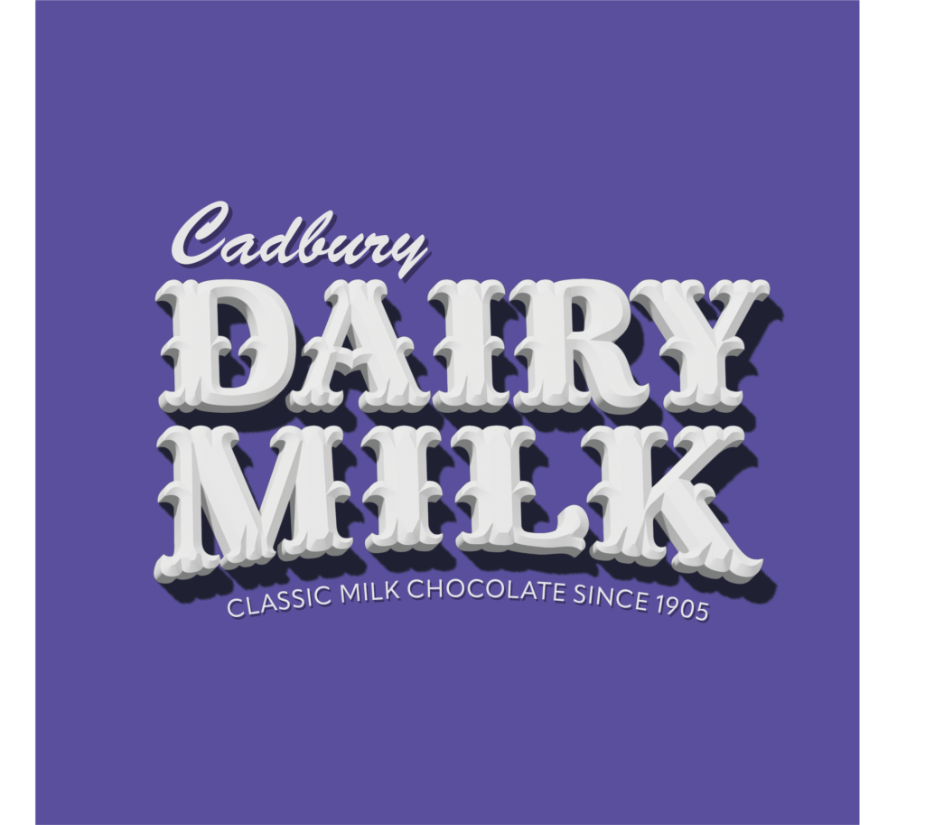
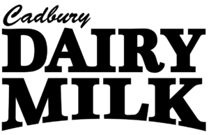
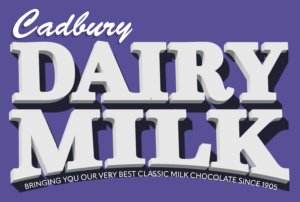
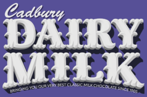
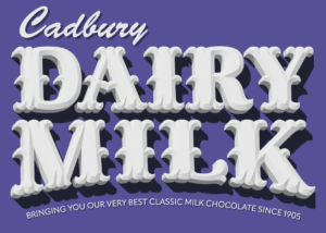
The brand I chose to redesign in a fairground font was Cadbury’s Dairy Milk. My goal was to recreate their Dairy Milk logo utilising a combination of their layout/colour ideas and then the fun designs of fairground fonts.
Research
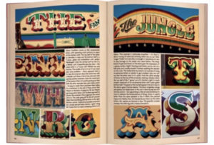
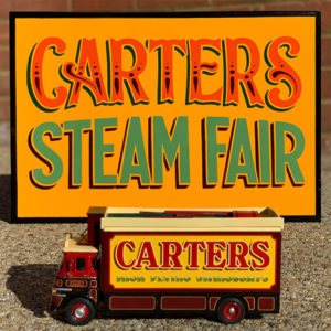
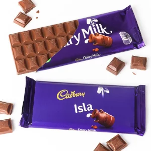
I began this project by researching fairground fonts and displays, mainly by Joby Carter, and also a brief look into Cadbury’s Dairy Milk branding since its release, noting down key design/visual elements within both the fairground displays and the Dairy Milk branding.
Fairground fonts
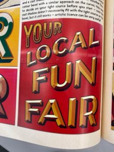
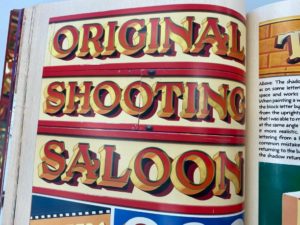
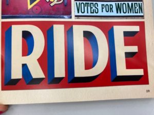
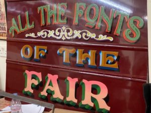
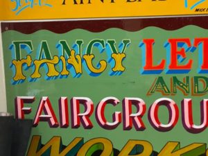
- 3D ‘block’ on letters
- Shadows created
- Bright, unique colour schemes
- Unique accents on serifs
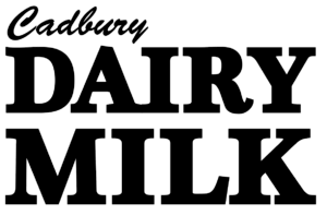
Dairy Milk
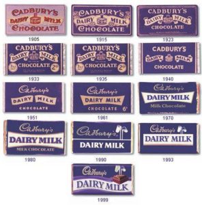
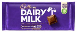
- Brand purple
- Text layout (‘Cadbury’, ‘Dairy Milk’, subtext)
Design
Concept
My initial idea was to follow the general layout proposed by the current Dairy Milk branding and introduce the fairground typeface ideas to it, including the serif paint brush stroke accents.
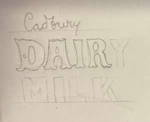
I continued my ‘sketches’ on illustrator. Utilising typefaces to make up the letterform bases so I could visualise how each design might work. I continued developing layout option 01.
Development
Arch
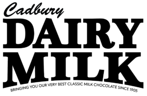
Something I’d noticed in my research is how rarely fairground typefaces sit on a perfectly horizontal baseline, they often sit on some form of curve or arch, setting them apart from standard computerised typefaces. This led to me implementing a curved baseline into my design something to bring a better visual distinction and more interest to my rebrand.
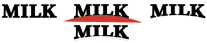
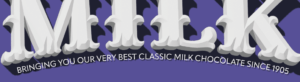
Creating this arch along the bottom gave me space to fit a tagline into my design, something the current Dairy Milk branding features underneath their main text too. I aimed to fill out the width of the arch, if possible, as I worried that too little text would sit awkwardly underneath rather than feeling cohesive with the text above. The goal here also was to bring some of the history of Dairy Milk into the design, this led to ‘since 1905’ being a key part of the tagline.
Drop text and colours
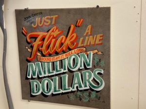
This visual block consisting of ‘Cadbury’, ‘Dairy Milk’ and the tagline formed the basis of my design and layout, so I began developing details and involving colours. A key detail in many of Joby’s fairground fonts is the drop text that sits, often in a different colour, behind the main text and functions purely as a visual highlight/accent.
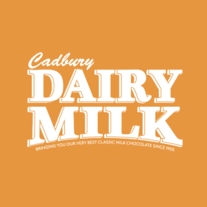
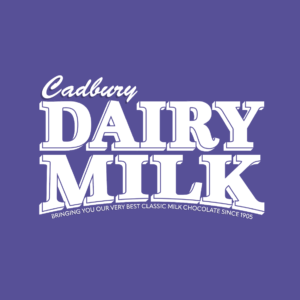
I tried two options for colours initially, one inspired by Joby’s unique colour schemes, utilising more bright and playful colours that wouldn’t commonly be used together, and the other using a similar colour scheme to the Dairy Milk/Cadbury brand colours.
The drop text I attempted to present in a similar way to some of Joby’s work, I used an outline on the main text to separate it from the drop text, allowing the drop text to function as its own feature.
3D block
Another thing many of Joby’s fairground fonts feature is a 3D block that makes up the text, allowing Joby to play with lighting and shadows and how that would interact with the 3D block.
I tried a 3D block with my own design and found that the visual texture this gave the design seemed to work quite well and fit the theme.
In a feedback session a few things were suggested, one of them being to revisit the light source/focal point and how that interacts with the 3D block. It was also suggested that I attempt to bring in the ‘theme of chocolate’ into my design, because of this I looked back at actual, physical Dairy Milk chocolate bars.
In an attempt to implement the theme of chocolate into my design, I was inspired by the nature of the individual chocolate chunks on a Dairy Milk and added a bevel to the 3D block, this added a lot more texture and visual detail to the design and I think helped quite a bit with the overall visual.
Brush serifs
After it being brought up in a feedback session and having already thought about trialing it I began adding brush strokes to the serifs of the main text in my design, this is something that is very common amongst Joby’s work and quite a staple of painted sign text around fairgrounds.
In the previous versions of the design I’d connected the block serifs on the ‘A’ and ‘I’, I carried this over into the new brush serifs however after some peers and I looked at this further I couldn’t get it, visually, to a point where I was happy with it and decided that it would be better to drop the connection and have each letter separate.
The brush stroke serifs created a lot of visual density on the top and bottom of the letters which was fine, except it made the middle of the letters feel quite bare in comparison. To counteract this I went back to my research and looked at options for things other fairground fonts used to add features to the centre of letters, I added brush flicks to the centre of the letters as accents because of this which seemed to balance the letters and make the visual density more consistent.
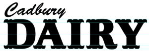

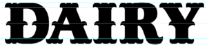
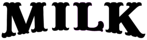
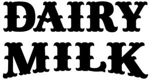
After getting the brush stroke serif concept visual working on ‘Dairy’ I then looked to adding the same style to ‘Milk’ underneath, though this word being on a curve meant that some of the serifs may end up slightly more difficult to get right initially. I noticed, also, that in many of Joby’s fonts he makes a feature of the ‘L’ kick, so I attempted to implement a similar element in design.
spacing
In a later feedback session it was noted that some of the spacing in my design is a little tight. Specifically the spacing of the text above and below the main display text and the spacing between characters within ‘DAIRY’.


I attempted to allow enough space between each character so that none of the serifs would overlap another serif’s 3D block, doing this seemed to give each character enough space and allow everything to not look too cramped, I then rescaled ‘MILK’ underneath so that the text still lined up on either side despite the character difference.
I then revisited the spacing above and below the main text, something that was suggested was to move the bottom text off of the shadow made by the 3D block and to move the ‘Cadbury’ upwards so that the dip of the ‘y’ still fit into the gap between the ‘A’ and ‘I’ but allowing the name to still have it’s own space and not be clashing with the text below it.
Final changes
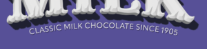
A couple final changes I made were to fix the shadows on the right hand side of the main text as they were getting cut off for some reason and also in feedback it was mentioned that I should reduce the amount of text in the tagline underneath and scale it up so that it fit the space better.
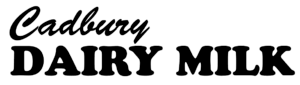
Finished visual