
Background
Oyster outcomes LTD is a consultancy business which offers several different services. These include multi-disciplinary management, governance and assurance, coaching, mentoring and coach supervision, mental health and wellbeing consulting. The idea behind the brochure, was to advertise digitally and through print, the services that Oyster outcomes can provide. Embedded in the brochure are recommendations from previous clients and key characteristics of the business that promotes engagement from clients. The brochure will be both a digital and printed, advertising on the website, through emails and as handouts to future clients.
Restated brief
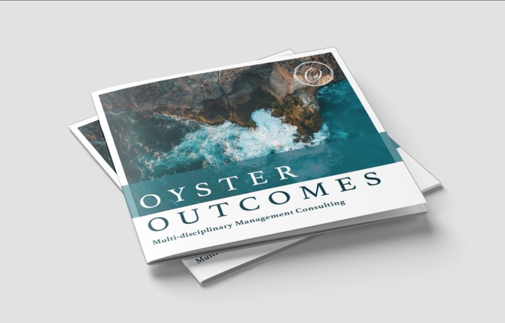
Oyster outcome is a relatively new business and will be reaching its third year in the beginning of April. Oyster is looking for a way to format and promote their specialities in the form of a brochure/ leaflet, to cater to their possible future clients to promote what Oyster outcomes has to offer with their services. The broad aims of the project were to communicate what the business has to offer. Further, to promote Oyster outcomes in a way that targets their audience in the public sector, commercial and charities, and any prospective clients. As for production, the objectives include producing a square size brochure, ideally with a high-quality thick paper. Alongside this, will be a digital format of the brochure, to be exported and used for the website and website distribution. Initial research involved looking at the website provided, understanding their previous design approach to their website and branding for insight to a possible similar approach to leaflet. It was later decided, through the development on this project, that a printed version of this brochure would not be printed through the university, but rather externally after submission. Included in the submission, would be a PDF of the full brochure for email and website, and a PDF ready to print for both the covers and interior pages for the brochures to be printed after artwork handover was sent over.
Research and ideation
Audience
As I began the project, I used several sources as a way of inspiration to begin our design process. I use several previous existing brochures to do this, looking at brochures that are similar to the topic of consultancy. Through research many businesses, similar to Oyster outcomes, don’t over complicate the design, and prioritises the information over images. This allows for a professional approach that was necessary to the audience I was catering towards. Though observing the way of the production of print was necessary, these decisions weren’t necessarily in my control as later in the production it was later decided that my submission was strictly digital. Alot of my ideation was determined by what appearances the business used in their advertising thus far. Alot of my inspiration for the brochure was from the Oyster Outcomes website.
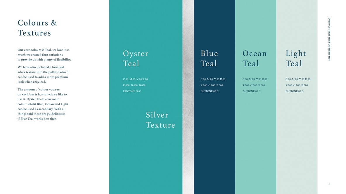
Colours and type
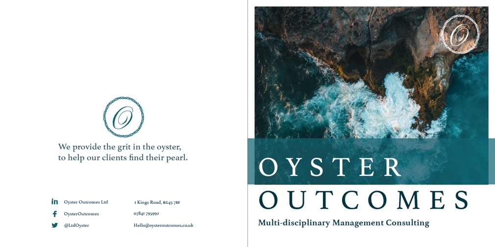
During our first meeting, we were introduced to the branding guideline. This included the colours, fonts including type settings, images to and any logo variations. This set my approach to the project early on. This was helpful in order to satisfy the client and ensure that the brochure is consistent with their website as well. The colours were different shades of blue and a serif typeface throughout the branding guidelines.
Content transformation
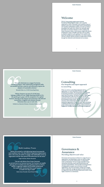
Through analysis, its noticeable that many of the brochures used very limited text, however the provided text copy from clients was extensive. Later agreed with the client, many texts were minimised to enable an easy read and allow the brochure to appear less intimidating. It was easy to discuss with the clients to change this part of the brochure, explaining that in order for the brochure to become more appealing, change in text was necessary. Mutual understanding was essential in order for the design process to be easier to manage with this change, and for it to be beneficial for their brochure. This was changed through trial and error, overall vastly improved the look and feel of the brochure.
Design development
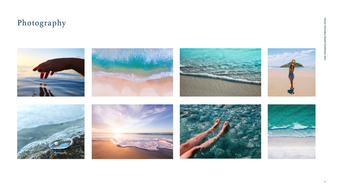
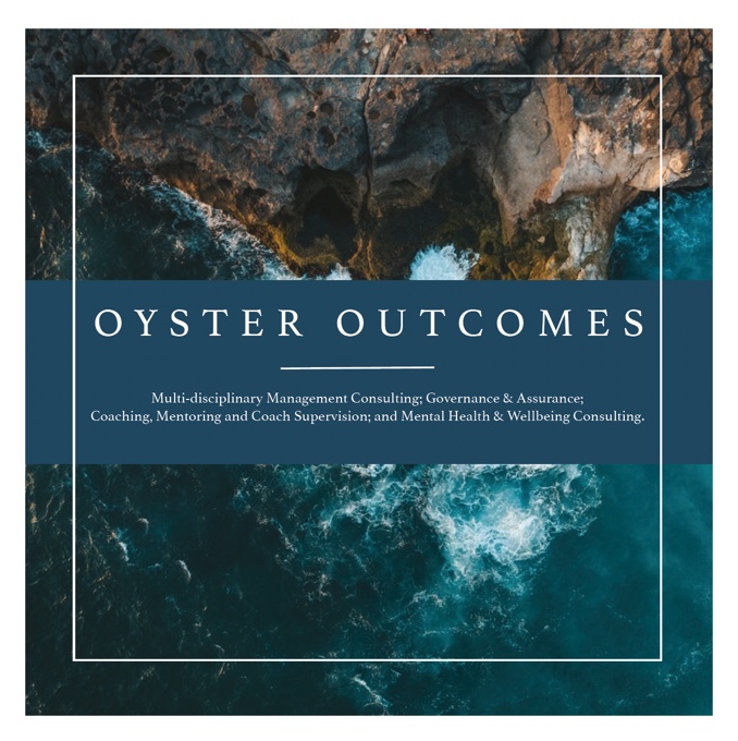
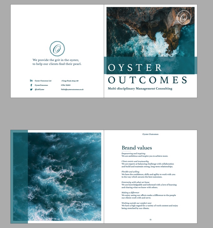
Oyster Outcomes has a heavy ocean theme throughout their website. They wanted this to be included in the design of the brochure as well. This was slight issue in the design process, though they have used this theme in the website, once the design process began, my supervisor highlighted the problem of it complicating the topic of consultancy, and would be confusing to future readers as the images they were interested in using gave connotations of a holiday feel to the brochure, instead of the topic of consultancy. In my mind, I wanted to approach the design in a more mature, sophisticated, and timeless approach. Though elements of the ocean theme could be incorporated, it was necessary to find the right balance of both themes in order to not confuse readers and clients.
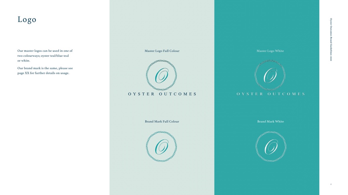
A lot of the design process was somewhat restricted with the branding guidelines that they had requested. This included colour choices, branding logos, picture inspiration, fonts, and brochure sizing. This very much helped guide me in the right direction in order for my clients to be satisfied with the final product and match the website visuals. However, this limited my experimental abilities in the design process.
This was one of the final completed versions of the brochures. At this stage, it was sent to the clients and they were very satisfied with the design. However, many changes were made to the design after my partner in the project could no longer continue working with me for the project. There were many flaws in the design, the design did included in the design were a little too overbearing for the text and was lacking consistency. The next developments would need to be able to highlight the text correctly and promote the good recommendations from previous clients well.
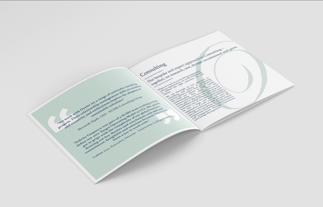
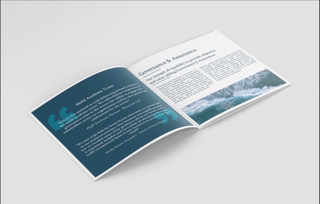
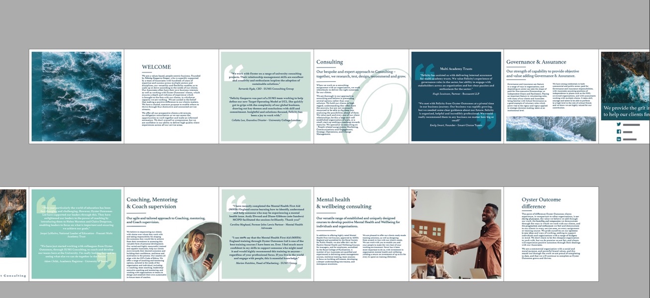
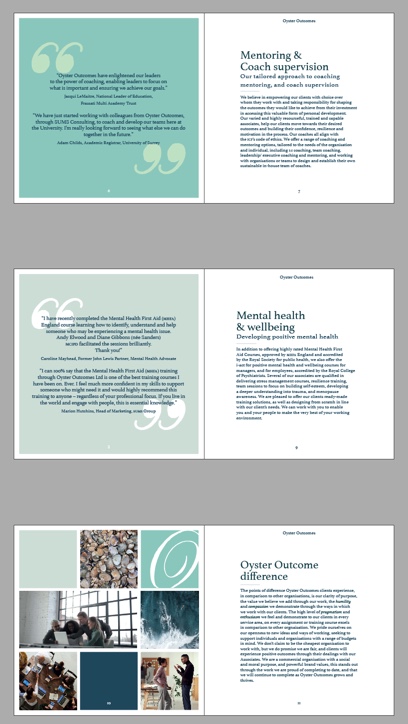
In the next stages of the design most of the elements were changed. I focused on categorising the text and colour better to highlight the separate sectors of the business. The type size and grid was changed in order to promote legibility. I limited the use of the ocean aesthetic photos to help promote the correct topic of consultancy. In replacement of this, and with the consent of the clients, I implemented the use of different imagery including work spaces and welcoming employees to help encourage a welcoming feel to the consultancy business.
Final stages
During the development stages, there were issues regarding communication between me and the clients. This set me back in terms of meeting for the final stages of the design which slowed down the process over. Included in this was the deadline of this real jobs was to be extended due to the work load I had to take on independently after my partner could no longer participate in this real jobs.
During my final stages, small changes were made to my design from my supervisor to ensure everything was correct in my brochure. This included small tweaks to leading, alterations of navigational devices, and finally, ensuring all my documents were print ready for the client to continue with. I had help during the final stages of my process, when it came to preparing the print ready documents including bleed marks for the correct documents etc.
As we will not be printing this off through the University, the brochure is still intended to be printed independently, therefore I printed the brochure off to ensure the sizings are correct and legible and the colours print correctly too.
Reflection
As this was my first real job, there were many first-time experiences in this process. Unfortunately, there were problems with communication via email. Though I did continue the work as far as I could during these responses I received, it was still a reoccurring issue. I feel as though a lesson on my first real job, is that often you are on a different schedule as your client, they may be far more relaxed when it comes to estimates deadlines than you are yourself especially as a student with very limited free time. When continuing in the future, to avoid this from reoccurring, a simple follow up email and/or calling the client may be a better approach in some circumstances in order to find a better way to communicate with them.
Another reflection I would say, that was a particular problem in this project would be to ensure all participants in this project keep an up-to-date shared folder of all content to ensure both parties have all the same contents. This was a particular problem after my partner left the project and attempting to gain required documents wasn’t possible at times. Regarding future real jobs, it’s extremely important for all participants to have a shared folder to include any progress in the work. In this case, unfortunately some of the documents I could not acquire, and many documents were recreated.
A final reflection for my project would be the importance of balance between designer and client. Many for their ideas they may be firm on, however at times their ideas may not be what’s best for the success of the project. As a designer there is a better understanding on what makes a successful design, and to have a mutual agreement and level of understanding in order to continue the design for both designer and client.
In summary I am pleased with the final look of my brochure. Though there were some issues during the process, I am happy with how it turned out, and I am sure it will reflect well on the business. The clients are happy with the brochure turnout aswell and are happy to recommend me in the future as well as potential work opportunities after university.