
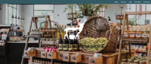
What is Little Orchard Farm?
Little Orchard Farm is an arable farm based in Kent. Our client, Izzy Wedgewood, was beginning a new business venture for the farm where she worked on creating a shop and café for the farm. With our client looking to expand Little Orchard Farm, a series of exciting deliverables were required which brought Izzy to the Real Jobs scheme.
Brief
At the beginning of the project, the client asked for a logo for the farm, a website, a menu for the cafe, and a form of advertising. Although there was a selection of deliverables for this Real Job that adjusted slightly throughout the timeline, consistent contact with the team and our client made this process exciting. In the initial briefing meeting for the project, the client listed farms and their brands which were inspirational to her when founding the business. All of the logos for the farms were similar to the kind of brand identity that Izzy wanted Little Orchard Farm to have. She expressed to us that she wanted to create a brand that feels homely and trustworthy, thus the team decided that it would be worthwhile researching her inspirations and making some observations. The project was initially aimed to have a 2 month turnaround, so a restated brief was quickly established and the research and design process commenced very swiftly after the initial briefing.
Restating the brief
Following our first meeting with the client where we covered important points about the designing process such as her perception and expectations of the deliverables, appropriate communication style and more, we moved on to writing the restated brief. Something that we found challenging at this stage was coming up with the schedule, however after meeting and talking it through with the client, we were able to overcome any confusion that we had and come up with a realistic timescale. By restating the brief, we were able to iron out our concerns by making sure everyone knew what roles they were to be carrying out. We are now all excited and looking forward to carrying out this RJ together!
Communication and project structure
As we are a design team of three, we maintained weekly contact via online messaging, as well as regular meetings online. We maintained contact with our clients via email as well as Team meetings to present design iterations and receive feedback. As we are all final year students with an increasingly heavy workload, the progress of the project became hindered slightly. This, alongside evolving design suggestions lengthened the turnaround time for this project. Our client was a former student which ultimately made communication for this project clear and consistent, so extending the deadline was an easy thing to do. It really helped that the client was in no rush to have this project completed.
Understanding the audience
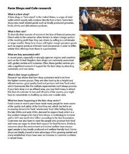
In order to find out more about Little Orchard Farm and it’s audience, we researched the market for farm shops and cafes. This research, alongside the brands Izzy provided us with for inspiration, educated us enough that we felt comfortable in our first client meeting. The team discovered that typical farm shop customers tend to be from the higher income groups, which tells us that they are looking for a brand that represents a helpful and efficient service that is of great quality. In our wider research for the farm shop sector in recent times, we learned that food scares in recent years have made a lot of people far more aware of the quality and safety of the food they eat. This led to an increasing demand for fresh ‘wholesome’ food. From this research, the team were able to deduce that the farm’s brand needs to represent high quality, freshness, and trust.
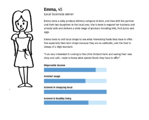
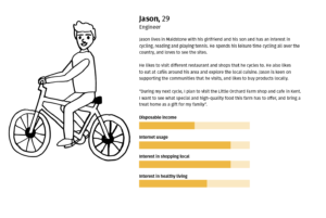
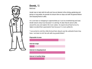
Following on, we created 3 personas that represent various user types that might be consumers of Little Orchard Farm. It was important to identify factors such as their interest in healthy living, their interest in shopping local, and their internet usage because it helped us discover what content people care about. When creating these personas, the team ensured not to stereotype the typical customers that we had found through our research, as Little Orchard Farm wanted to cater for all demographics.
Finding a creative direction
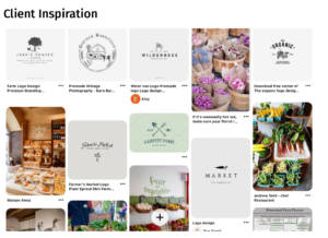
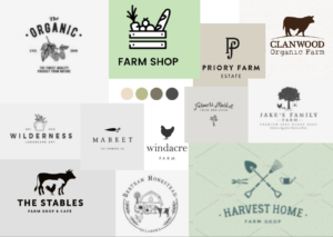
Once we had clarity about the nature and extent of our content, and the fundamental goals of our users, the team began creating a series of moodboards. These were in order for us to see designs for farm shop websites and menus in the current market. This method of gathering inspiration allowed us to grasp an understanding of the direction the client is wanting to go in in terms of visual identity and styling.
Logo moodboard
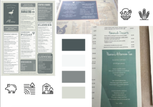
Menu moodboard
Business card moodboard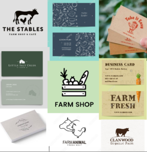
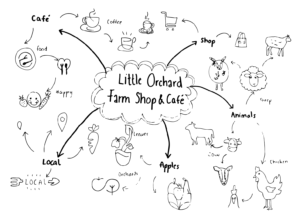
After this, the team began sketching some visual references that were based on information provided by the client. We began mindmapping ideas related to farm shops and cafes, which included aspects such as coffee cups, cutlery, and animals. We remembered that our client, Izzy, had said in our first client meeting that the farm had lots of apple orchards and deers, so these soon became our principal inspirations.
Developing the logo
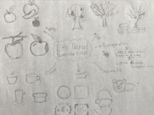
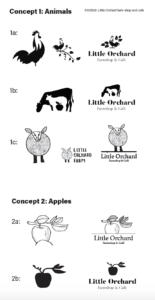
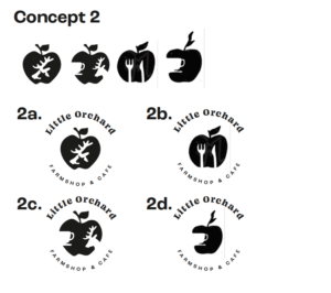
Using the mood boards and list of inspiring farm shops from our client, we were then able to start creating design concepts for the logo. We heavily experimented with the apple and animal concepts as we felt that these best represented the farm as a whole.
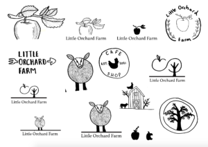
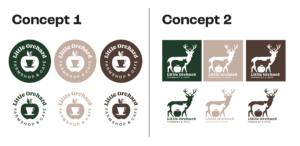
 Before presenting these to our supervisor, the team grouped the logos together in order to distinguish what style the client likes best. We created 2 groups: apples and animals. By establishing these groups, it allowed us to focus on the concepts individually, rather than intertwining the two at this stage. We presented these groups to our supervisor for feedback, which was generally to add some type to see how it pairs with the logo, and to ensure our designs feel organic and fun.
After iterating our designs and adding appropriate typefaces, we presented the concepts to the client. Izzy was really excited by our designs, and felt that we had understood the feel of Little Orchard Farm. She thought that the weight of ‘Little Orchard’ in the designs contrasted well against our illustrations.
“Super pleased with this, guys!” – Izzy Wedgewood
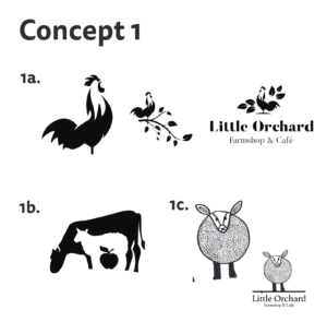
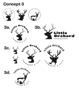
Izzy was particularly intrigued by the design 1b, which features animals and an apple intertwined; combining the two concepts. She informed us that the farm is primarily selling venison in the farm shop, thus asked if it would be possible to change the main animal from a cow to a deer.
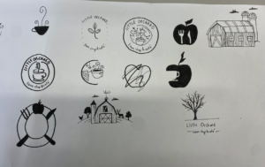
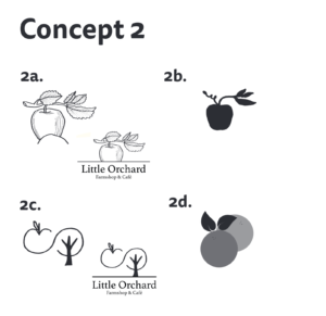
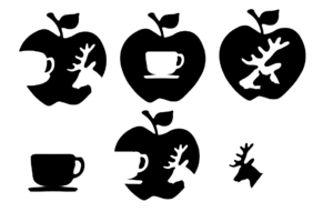
At this stage in developing the logo, something wasn’t quite right. We liked our two concepts, but felt we needed to experiment with many more ideas. The team referred back to our mindmaps and sketches of initial ideas, and thought of some more logo concepts aside from just apples and animals. New ideas we generated included illustrations of the farm itself, coffee cups and sweet treats, and venisons (as this is what Izzy told us she liked). We quickly realised that the most successful designs were those that intertwined two or more elements – whether it be apples and a tea cup, or a venison and a sheep. We digitalised our new designs, and developed them to be at the same stage as the other logos we have previously shown Izzy.
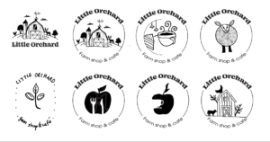
After showing our supervisor and our client, we received feedback on the typography. These were things such as working on the tracking, locking in the type, and experimenting with all caps. At this stage, the team decided to experiment with displaying the type in a circle to act as a border for the illustration. Not only would this help ‘lock’ the designs together, it would also make the illustrations feel complete.
“I like the top one please!! Amazing!” – Izzy Wedgewood
Furthermore, the team received feedback to explore the use of icons in our designs. As our client liked the teacup in the apple concept, the team started thinking of all the different apples and tea cups we could design.
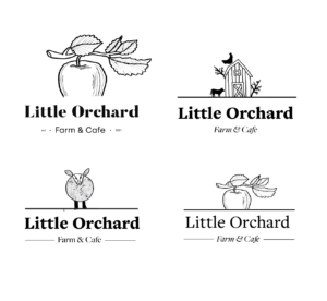
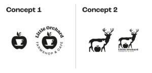
From these, our supervisor chose the most successful design. The team were then able to work on perfecting the typography in this concept. It was clear that the design was well-thought out, and felt locked together. We were then able to show our client our two finalised concepts: the apple, and the animals intertwined together. Izzy chose concept 2, and the next step for us was to create a more sophisticated colour palette. She expressed interest in pale teal, duck egg blue, and grey. Having spoken to our supervisor, she sparked the idea of using colours of foods typically found within a farm shop, such as carrots, cucumber, aubergine etc.
Food inspired colour palette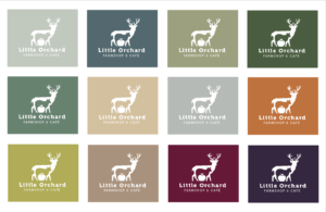
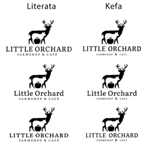
At this stage, we were so close to finishing the logo. However, there was something missing. After going to a real job meeting, we asked our peers what was missing, and the outcome was a better typeface. At the next meeting we went to, we asked the same students which typeface they preferred. It is worth noting that students felt this was what was missing from our logo. They liked the first 2 typefaces because they matched the logo in terms of weight and aesthetic.
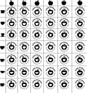
In the following real job meeting a week later, the team showed the designs below. It was vital that we received feedback on our colour palette as this was the deciding factor for Izzy. They liked the dark deer on a pale background as opposed to white on a dark background. They also liked the warm toned ones.
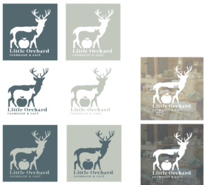
Following more iterations of our logo, we showed a new range of coloured logos to the client. She thought that all the colours worked well, which is great as it meant that the logo was versatile, but really liked the teal background because this implied an organic and fresh feel of Little Orchard Farm. The team were ecstatic that the logo was successful, as this was a lengthy and exploratory process. After showing our supervisor and making the final iterations to typography, the logo was signed off. Having created a successful logo, it set the tone for the rest of the project.
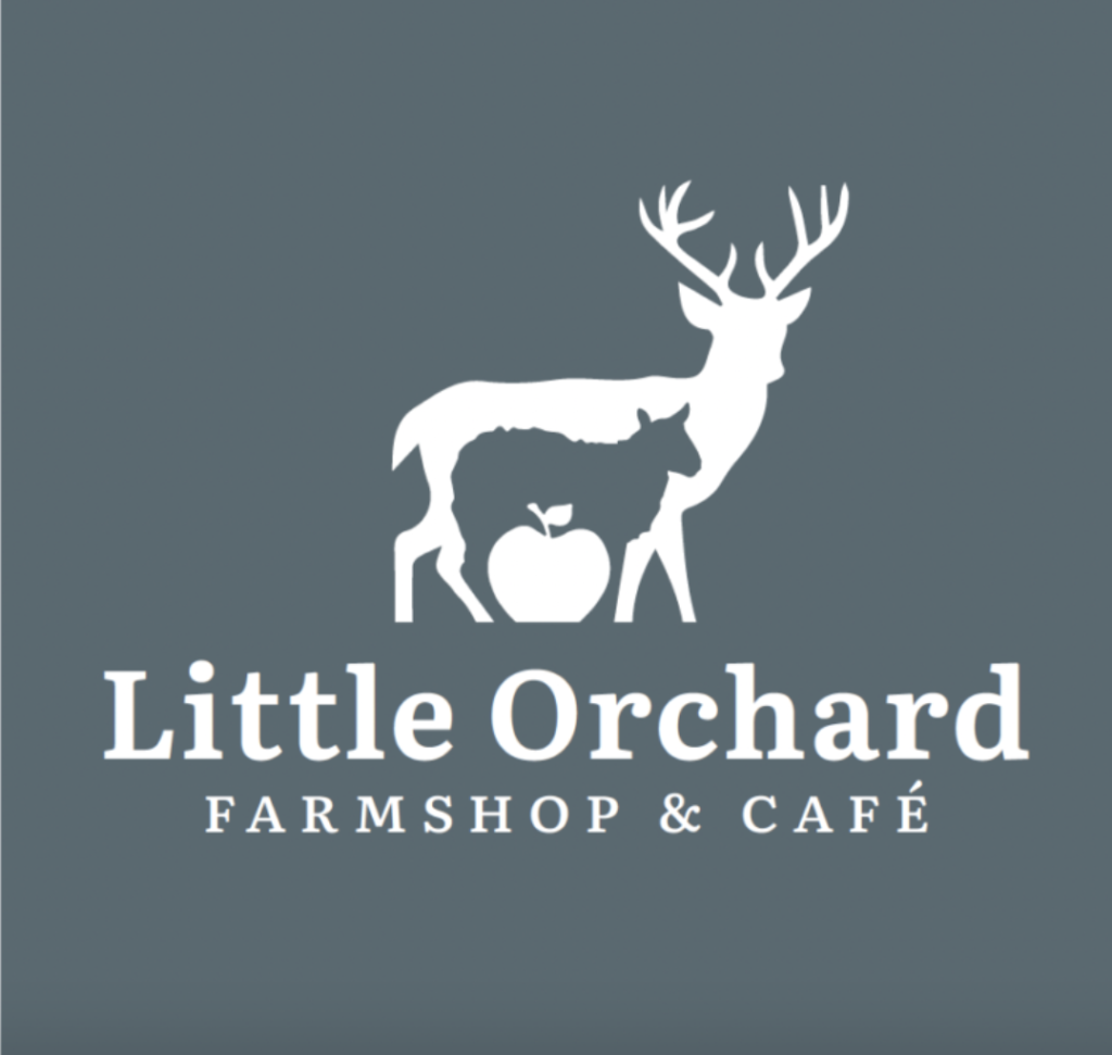
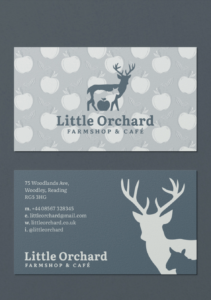
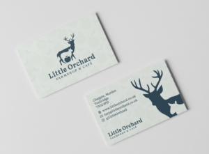
Final logo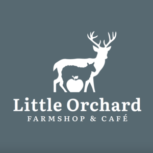
Developing the website
Our initial discussions about the website with Izzy gave us an understanding of what her expectations were and the type of site that she was looking for. We discussed the different platforms for creating and hosting the site, we settled on WordPress as this is something that some members of the team and Izzy also had previous experience using. The customisation that WordPress allows allows us to create a contemporary website that we as a team and the client are happy with.
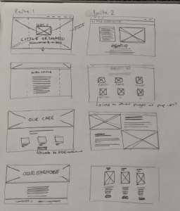
We started the website design by creating a couple wireframe sketches to demonstrate to Izzy the rough structure and look that could be achieved. This was a continuation of the discussion we had had previously with her about the content of the website, we came to a decision that the website was going to be an information base about the business and therefore we needed to take into consideration that users would be reading most of the time whilst visiting the site.
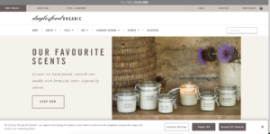
Izzy was very open about the look and feel however did have a couple inspiration sites. Alongside the inspiration site that Izzy provided we compiled a small group of websites that were either a similar theme or had a nice layout and or composition of the site.
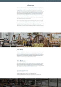
Even though Izzy was very open about how the website looked we felt as though it would be important to showcase the imagery on the site as the actual scenery of the farm shop and CAFÉ is a large factor of what well draw people to the business. However, in saying this Izzy was not able to provide any imagery for the site yet and therefore placement images have been used so far which will be replaced after the site has been handed over, this is something that should have been established earlier in the design process and is something that we will definitely take into consideration when initially discussing deliverables with clients in the future.
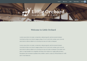
The initial landing page for the website is something that must be impactful and interesting to look at as this is the uses first perception of the site therefore, we decided that the use of large imagery and the logo would be the best decision however other routes were explored however, they were less successful as they packed less of a punch.
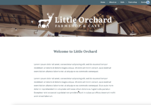
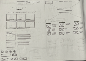
From the creation of the brand, we implemented various elements to keep the website in keeping with the other deliverables. Things such as typeface colour and logo were kept consistent across all deliverables. However, in some cases the colour scheme did not lend itself to better legibility of text. As shown in the images below the colour contrast between the white and the blue and the green and the blue is significantly different. Even though the green is one of our brand colours here it does not work as a background and makes the site appear more traditional and duller. Izzy also stated that she preferred the white as it appeared cleaner and more streamline with the other elements on the page.
“I really like the use of lots of white space” – Izzy Wedgewood.
As the site started coming together, little things such as the images needing to be darker to showcase the text or logo that was sitting on top became clearer. We also started to hit a wall with how far we could progress with the website without actual content. This led to us getting in touch with Izzy and explaining how having the correct copy for the site was integral as we needed to know what we were designing for as opposed to using the Latin text and guessing about which tabs the site would need. This did lead to some delay in the designing of the website as we didn’t really give the client an exact deadline as we should have earlier in the project, similar to the images this is something that we have taken on board and are aware of how important it is to work with actual content rather than placeholder text and images, however in some places like the use of stock images in the current site this could not be avoided.
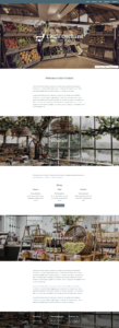
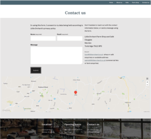
After gaining the real copy for the website we were able to implement the design we had created for the front page and use this across the range of pages within the site. We knew that imagery was going to play a large part of the website however in this iteration they became somewhat overwhelming especially on the farm shop page therefore we took the decision to remove some of them as it stated to become cluttered and overwhelming which is something that the client did not want. As well as this some adjustments to colour and background needed to be done especially on the contact us page as currently this did not fit in with the brand we had created but also with the other pages of the site.
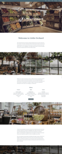
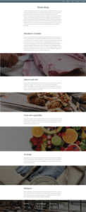
The above images also demonstrate how to much text flowed together on the webpage can seem overwhelming and daunting for the reader that this is something that we had to also take into consideration, and we went back and reduced the amount of text that sat within one block to aid the reading process and make the text more approachable.
By running the creation of the website alongside the other deliverables we have been able to implement the brand in a consistent way across the whole range of the deliverables, even with three people working on the project. Elements of the menu were able to be brought across (the apple pattern) as the website was being created rather than being implemented afterwards, and because of this we were able to resolve any issues that may have arisen such as opacity levels and colour which were interfering with the legibility of the text.


From feedback we gained from our supervisor we were able to sort out issues with alignment and typeface choice to make sure that everything was consistent throughout the brand as well as the website. Our supervisor also pointed out that the images would benefit from having a coloured tint over the top to allow for better legibility of the text.


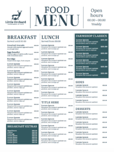
Developing the menus
Arranging a meeting and discussing the client’s expectation for the menu, as well as her providing us with copy, allowed us to come up with an appropriate solution for the menu design. The team approached this deliverable with the idea that a menu is more than just a list of dishes, and that a good design which reflects Little Orchard’s farm shop & cafe concept well would enhance a better dining experience for the customers.
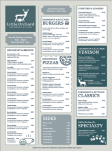
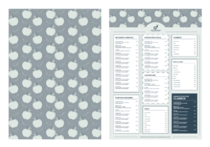
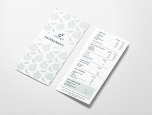
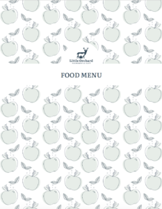
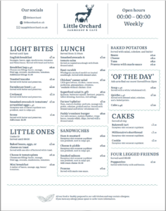
Although we found this deliverable a bit challenging at first as we did not have the list of the foods, after the client provided us with the copy, we were able to design two separate menus – one for the drinks and one with the main dishes. We came up with another design concept that reflects the farm shop well and brings freshness. To improve the legibility and hierarchy of the text, we divided the menu into logical sections. Elements such as the green boxes help to draw the attention to a group of dishes that the customers might be interested in. To complement the design, we designed an apple pattern which was used for the back of the menus.

Obtaining feedback from our supervisor regularly helped us to come up with an appropriate design solution. After it was signed off we were finally able to present the outcome and we made final touches to meet the client’s needs such as moving the title of the menus on the apple pattern on the back. Apart from that, the client was satisfied with the design we presented.
At this stage of the project, we received the copy from the client. We were soon overwhelmed by the amount of items on the menu, so felt lost. After some mindmapping and brainstorming, we decided to create 2 menus instead of 1. This would be a food menu and a drinks menu. By choosing to create 2 menus, it allowed the team to organise the items on the menu clearly and effectively. Our client really liked the idea of having 2 menus also, which encouraged us to find a way to make this work.
What we found challenging during the menu process was keeping typography consistent. We had to figure out ways to divide pieces of information appropriately and clearly for the readers. To overcome this, the team created a series of paragraph styles for all elements to follow. Our client also gave us feedback for the previous menu designs saying she would like to emphasise the price of the items more. To do this, we created a character style for the first number of the price. Overall, designing the menu was quite a lengthy process due to the many iterations we had to make. Nevertheless, it was worth it because it resulted in 2 beautifully designed menus.
“This looks good. We got there : )” – Supervisor
Developing the business cards
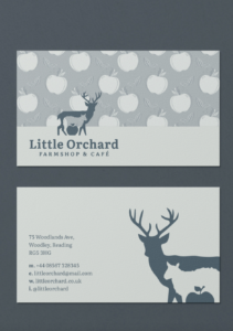
Having spoken to our client, we decided that creating business cards instead of print/ digital advertisements was a more suitable idea because they can be used straight away. Using the colour scheme of greens and blues that we had created for Little Orchard Farm, we created 3 initial business card designs. These designs feature the apple pattern which is seen on the back of the menus in order to ensure the visual identity is cohesive. Seeing the logo at the small scale of a business card really confirms that it is the adaptable and versatile logo that Izzy was looking for. After showing these to our supervisor, she gave us feedback to change the letters on the back (representing email, phone number etc) to icons, as this would make it clearer for the audience.
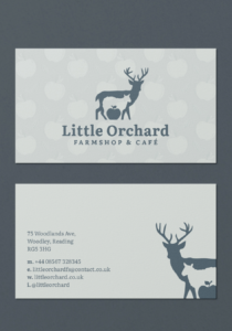
After iterating the designs, the team were able to present our 3 concepts to the client. We had taken into consideration the fact that we were displaying just part of the logo on the back of the card. Initially, it occurred to us that this might be confusing to customers because it was a snippet of the logo, however as the full logo is on the front of the card, it is not an issue.
“Super pleased with this, guys!” – Izzy Wedgewood.
The client was really pleased with the business cards, and said they all worked well. However, she chose the 3rd business card because it brought together the brand the best. The polished apple pattern combined with the teal logo ultimately created the ‘homely’ brand she wanted.
An honest reflection
When reflecting upon the job as a whole, working on a project such as this was a fun and intriguing experience throughout and as a team, none of us had experienced a job quite like this before. Despite being somewhat limited when it came to actually interacting with ‘real people’ as this project was in the business plan phase, the team completed the project successfully. We have been able to have both our supervisor and client involved in the decision making process with our supervisor pointing us in the right direction and helping us achieve the most effective design and the input and collaboration that we have been able to have with the client has aided us in our communication skills and the way we present and articulate the reasoning behind design decisions.
Issy:
“I have really enjoyed working as a team to create a beautiful and unique set of deliverables for this project. By completing this Real Job, I now have more confidence when talking to clients, and feel comfortable and confident enough to ask lots of questions.”
Yana:
“I really enjoyed participating in this real job with Issy and Lachlan as it differs from the other projects I have done at the university. Working in a team to meet the client’s needs and creating the deliverables allowed me to improve my skill set as a graphic designer as well as to enhance my communication abilities within a team and with the client. I especially enjoyed exchanging and combining ideas which I believe helped us to reach a professional outcome for this project which we were really excited to present to Izzy and our supervisor Sara.”
Lachlan:
“This project has allowed me to expand my skills in a variety of different areas, from website design to editorial, even though we may have faced some challenges along the way I am really pleased with the final set of deliverables. I feel more confident in my communication skills as this project has allowed me to take a front seat when discussing my work with the client and because of this, I am more comfortable speaking about my work”