
Background
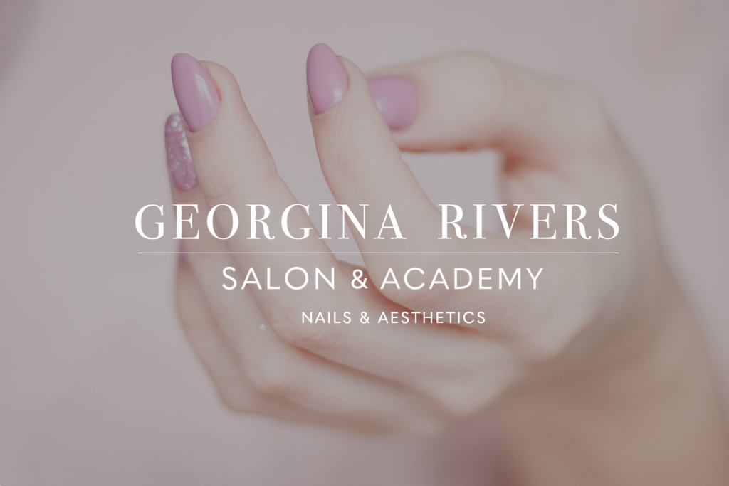
Georgina Rivers started off as a Nail studio in Reading,United Kingdom for the past few years. With the growth of the studio, Georgina was looking to slightly rebrand her business giving it a stronger identity, an Identity to reflect the brand and Georgina Herself. Georgina Rivers Salon, Offers a variety of services including ( Nails, Aesthetics) Georgina is also introducing a new Academy where different courses take place to teach as well as an online shop available to students to buy the products she uses while teaching.
Restated Brief
As a team we aimed to create a professional brand identity, that could portray the personality of Georgina Rivers Salon in an accurate, elegant and modern manner, as Georgina Rivers’ Clientele and Loyal customers accumulate throughout Reading. This visual identity can then be applied to the website being created for the academy where appointment bookings, product purchases and access to academy courses are available. Further the identity being applied to her social media platforms ( Facebook & Instagram ) where she posts regularly to keep engagement with her followers.
As a team we agreed on these deliverables with the client:
Primary:
- Digital visual identity guidelines (including salon & GeorgiaBella logo).
- Responsive website for academy
- Social media strategy & rework (Instagram).
- Social media animation advertisement.
- Mail Chimp email advertisement template
Secondary:
- Fliers template
- Business Cards
- Certificates
Research and Ideation
There are many businesses that offer the same as Georgina Rivers, that are thriving on their social media platforms such as Instagram and Facebook leading me into taking a deep dive into social media to hash out the competition.I decided to start off with similar businesses in Reading that share similarities in the services they provide but not limiting my research to only Reading. Some of Georgina’s Competition Includes;
After looking at endless profiles of salons with similar services and multiple online presences, I have noticed features and aspects that can allow a business to appear professional and well established as well as allowing these businesses/brands to have a significant following and clients. These include:
- A domain name that isn’t too long to search – having a short domain on social media makes it easier for people to find your page.
- A description in the biography section briefly explaining what the business is and what they offer – A good Bio is important! How will people know what you do? What is your location?
- Consistent posting on stories, enough to create story highlights that people can go back and visit – stories are personal they give insight to what is happening in the moment and what is new in designs or what is new to offer.
- Consistent posting on the pages to show their designs, with good feed content – it is more likely people will come back to your profile if you are posting consistently and reminding them of your social media presence.
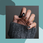
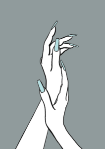
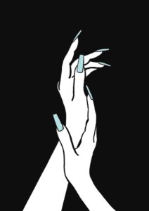
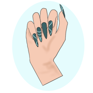
- High quality photography with good lighting- photography is creative and showing off nail designs and techniques in a unique way aesthetic to the eyes, its a form of display for your services.
Leading into creating a Social Media strategy that Georgina Rivers can follow as a guide after the ending of the project, looking further into Georgina Rivers the target audience is wide and her services and academy are inclusive regardless—anyone who want to get their nails done, learn from the academy or even with aesthetics, most of Georgina’s customers are likely to be 16+ as it is usually the age where the interest in self care services start to arise.
Social Media Application
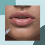
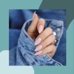
For social media platforms (Instagram & Facebook) following the analysis of the competition, applying the new visual identity to social media and using some of the same techniques mentioned in the research of the competition (Updating Logo, Adding Biographies and Facebook cover photo) to allow the platforms to have a more appealing and consistent Identity to them. Example Instagram posts were designed for Georgina Rivers to allow her feed to have a recurring theme and an aesthetic aspect to them. The photos used are examples of how her photography can be like as well as placement of logo and use of colour.

Deciding that it is best to use different colours from the colour scheme to represent different categories of the business, using an individual colour did not compliment the ongoing theme and direction that we are heading towards, therefore using a colour dominantly compared to the other colours to represent a category was the way to go.
Aesthetics

Nails
Academy
I then decided to create Mockups of Instagram social media posts to show Georgina Rivers how the posts would look like on the page.
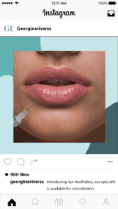
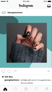
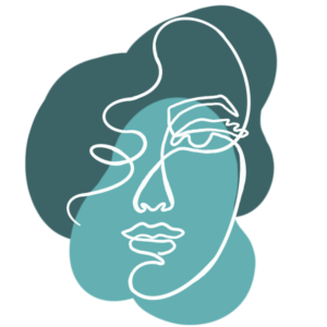
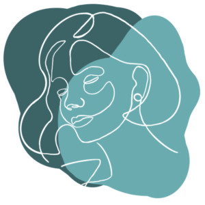
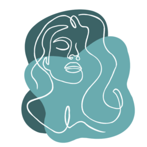
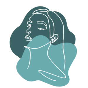
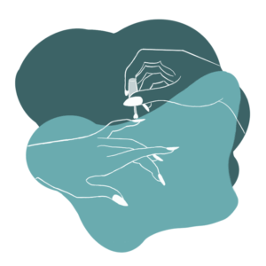
Illustration Style Design Development
“You have to kiss a few frogs before finding your prince” is a simple way of saying that it took a couple tries to find a suitable illustration style for Georgina Rivers. After beginning with mood boards and a couple of sketches and more refined illustrations we started to recognise the direction and illustration style most reflective of what the identity is and the feel we are trying to portray to customers, we wanted it to be personal and elegant- steering clear of anything too cartoon like or childish.
Illustration styles we tried;
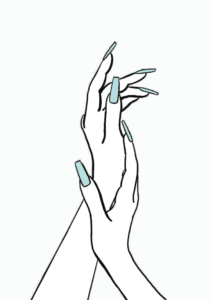
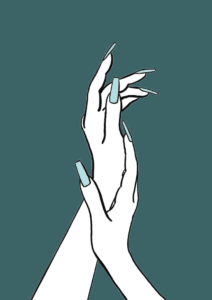
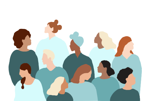
A series of Illustrations were then created to compliment the website as well as Georgina Rivers being able to use them on her social media platforms (for Instagram Highlights Icons), keeping in mind that visual identity is applied. Deciding to go in the direction of line based illustrations and their delicate nature, apart from a few designs that we collectivly agreed would be better in deeper details such as when representing Inclusivity and Diversity (Illustration of collective group of people).

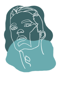
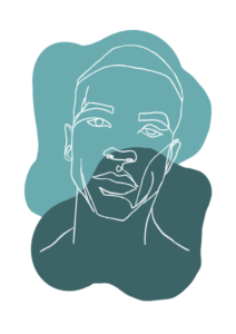


Further more Georgina requested an illustration of herself to be placed on the website instead of an actual image of her. I presented her with three options however it was not what she was looking for. She liked the illustration style of the Snapchat Bitmoji characters and felt that it was what best represented her light and cheerful personality.
Illustrations Presented to Georgina
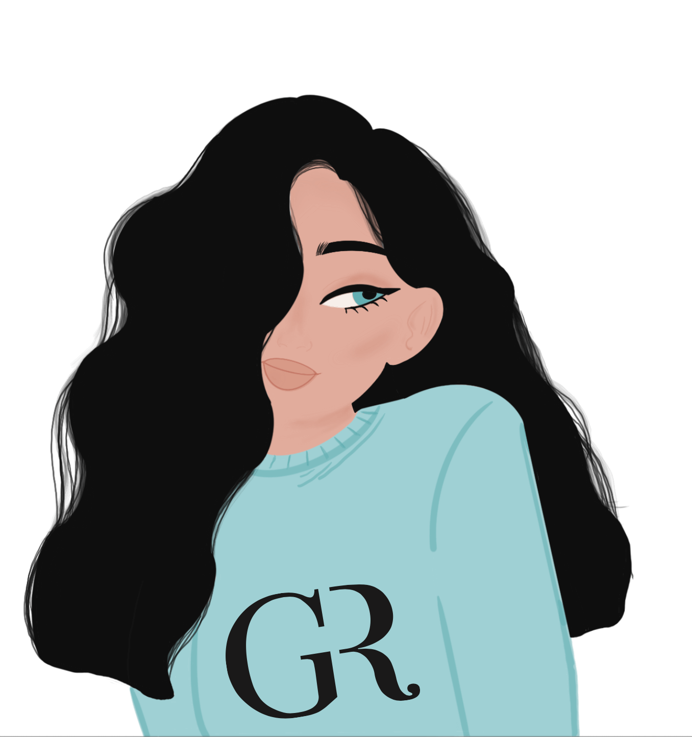


Illustration Chosen by Georgina for website

Reflection
Georgina was happy with the Illustrations presented to reflect her brand identity and has positive feedback on how they turned out collectively as a group of designs that compliment each other and fit well on the website. I believe that once the Illustrations are put into use on her social media platforms Georgina Rivers’ followers will accumulate and her feed will look more organised and Professional.
The Job as a whole took longer than expected to complete, due to our client’s busy schedule. It was slightly difficult for us to communicate with our client as she prefers a different platform than emails to be sent due to her being more active on WhatsApp resulting in the finish date being pushed, however we managed to come to an agreed finish date with her to be able to finalise everything for her to use.
One thing I learnt from this job is that communication is key, setting expectations for communication with the client from the beginning is very important for things not to get lost in translation and to keep on track of the set timeline. I also learned that if someone doesn’t like a certain design not to take it to personally, that it is a preference and opinion for each person and to take it like a champ and keep moving forward and improving to get what they want suiting their needs.
Salma Abdelwahab