

Group collaborations: Generating ideas-Logo, branding, PowerPoint palette, website
Individual jobs:
(Kaylee) Website images, Diagram for ‘intervention’ services, ‘What we do’ and ‘An Evolving market’ illustration.
(Holly) Our services illustration, Website pictograms.
(Kory) Our Reach layout
Introduction – What was the brief?
During the months of June/July 2021 were assigned the brief of creating three deliverables: A logo, matching branding and fonts for a PowerPoint (to help our client explain the meaning and branding of our products to others) and a website for the company: The School Outreach Company. The School Outreach’s aim is to help disadvantaged students, and those labelled under the BANE category, from across the UK develop interview, work and communication skills. The school Outreach helps students, primarily from secondary schools, develop connections with big conglomerates such as virgin media and Google. The company gives students opportunities they would likely not receive after leaving school. Our aim was to connote the themes: social mobility, inclusivity and recruitment through the deliverables.
Research & Design Process
The main themes the client wanted us to connote through the deliverables were: social mobility, inclusivity and recruitment. Our first deliverables we began to work on were the logo and PowerPoint branding. Individually we researched these themes and found visuals we thought best represented each. From these images, we created our own initial sketches for the logo; trying to symbolise all the themes in one sketch as best as we could. For the branding of the PowerPoint layout and logo, we used the same process when deciding on a colour theme.
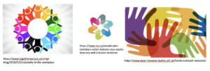
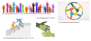
Figure 1: Research pictures
The Logo
When discussing the logo with the client, the client gave us a few example images he wanted us to base our ideas off of. An example image was the ‘BP’ logo. From this we decided to base our sketches off of ‘circular’ and ‘round’ shapes, whilst connoting unity and diversity. In the final iteration of the logo, we connoted ‘diversity’ through the colour scheme. Each semi-circle of the circular shaped logo, is a different colour; this represents the different themes the company represents. ‘Unity’ is displayed through the placement of each shape; the shapes placement and closeness signify how the themes and clients are brought together by the company.
After individually researching and collecting pictures related to the themes: inclusivity, recruitment and outreach, we discussed our ideas as a group. During this group discussion, we discussed: how the essence of the logo should be represented? What different levels of abstraction, and different shapes should be used? We further sketched the logo through the workshop as a collective group. In our original individual sketches, many of our concepts revolved around ‘people’ as when we thought of the themes (inclusivity, recruitment and outreach) a common denominator was the ‘people’ and our audience: students. We drew multiple versions of the sketch with people as the main element, whilst trying to incorporate the circular design into the concepts. However, after further deliberation, we realised this did not conform to the client’s original idea of the logo.
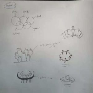
Figure 2: Concepts based on the theme of inclusivity
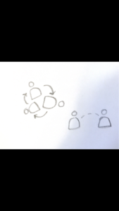
Figure 3: Concepts based on the theme of recruitment
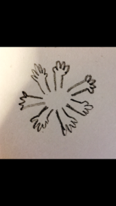

Figure 4: Concepts based on the theme of outreach
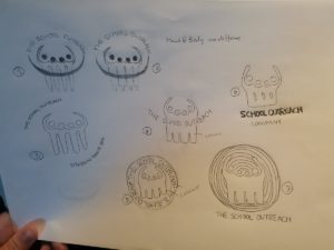
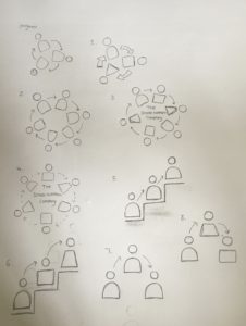
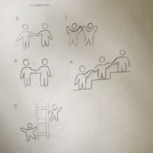
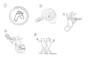
Figure 5: Refined sketches – After meeting with client (By Kaylee, Kory and Holly)
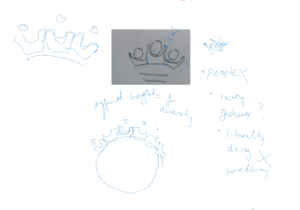
Figure 6: Sketches from group discussion
The Branding & PowerPoint Layouts
The second deliverable we created was the ‘Branding and PowerPoint layouts’ for the client. The client needed PowerPoint layouts so he could create presentations explaining the objectives of the company, the layouts needed to follow the same theme as the logo. We used the logo designed for the company in the PowerPoint templates. Similarly, to the process of creating the logo, we each individually sketched out layout ideas then came together as a group to discuss them and narrow down the most successful concepts. The client provided us with information each slide needed to contain and an idea of what the current presentation layouts he was using looked like. Using this information, we created sketches which connoted how text, titles and images could be laid out. We created a variety of sketches to test where the company logo appeared more appropriate. The top right corner seemed like the best choice as the logo will not block any text or images. From these sketches we created a variety of digital layouts using the colour scheme, type and logo we had already created. From this we created a design which used different colours placed on the side of each page to represent the different themes of the company. Next, as a group we discussed which concepts worked best and which we thought the client would like the most. After the client confirmed he was happy with our decisions, we moved onto the next deliverable: the website.
Figure 7: PowerPoint/Branding slides
Website design
Our website is aimed at 3 groups of people. The first is Hiring organize. The second is Student or parents. The third is School or teachers. Users can choose their identity to enter the corresponding content by clicking on the website. These three pages are composed of 6 parts: About us, Our reach, our service, Client’s and Testimonial, Resources and contact us. People with different identities will show content corresponding to their identities after clicking on them. For example, for schools and teachers, when they click on the ‘our reach’ interface, they will understand that TSoC can bring high-quality companies to students and also bring some activities to students. Bring them confidence and motivation. But if the object is parents or student, there will be no content that brings activity to students. Interviews have also been inserted on some pages to let the customer understand what effect TSoC has brought to customers.
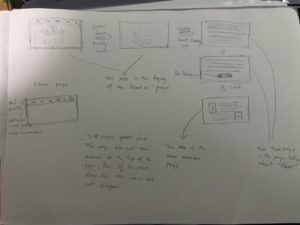
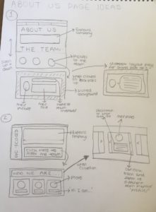
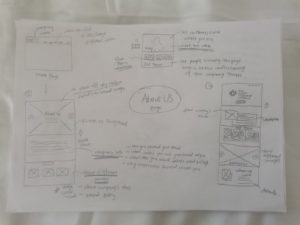
Figure 8: Website Homepage Concept (By Kaylee, Kory and Holly)
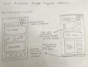
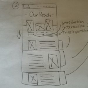
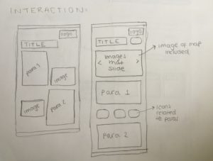
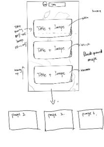
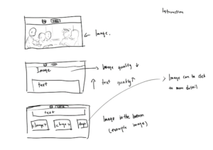
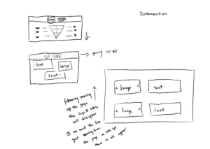
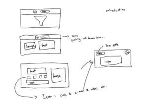
Figure 9: Website Our Reach Concept (By Kaylee, Kory and Holly)
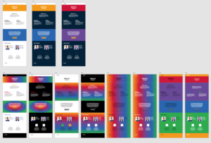
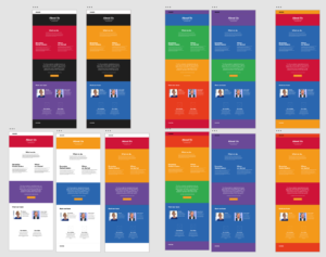
Figure 10: Colour test for website (By Kaylee and Holly)
Website pictograms/Icons & Independent work (Pictograms & Illustrations by Holly)
As some of the group had more experience with website building, they played a more major role when creating the website. However, we still collaborated together and supported each other when designing the deliverable. My main role when creating this deliverable was creating pictograms which represented different sections of the website. The client gave me example images of pictograms he liked, from here I designed a variety of pictograms in the colours which matched the branding: red, purple and yellow. Before showing the client the initial digital sketches, I discussed with the rest of the group which concepts were the most successful. From here we limited the concepts down to a few designs from each group we thought represented each topic the best. I then had a meeting with the client to discuss the pictograms. From here, we eliminated the designs he disliked and further developed the concepts he preferred using his feedback. By the end of the process, I had developed: 17 yellow pictograms, 12 red pictograms and 6 purple pictograms. This part of the project helped me develop and expand my technical skills when using illustrator.
Later in the project, when the website had most of its content and was near completion, I created an illustration for the ‘Our services’ page. I read through the content the client had gave us for the page and tried to link them to a common theme in order to create one main illustration instead of multiple. The theme I felt connected the content ‘our services’ and ‘what we offer’ was unity. After multiple concept drawings and feedback from my group, I settled on a design which conveys two hands shaking with three arrows at the top going in different directions; the arrows are in the brand colour. The arrows represent different services the company offers.
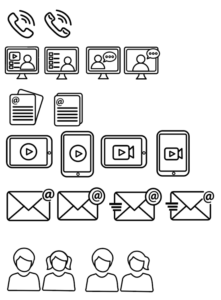
Figure 11: Yellow pictograms in black outline (online concept, version 1)
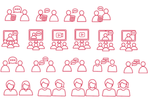
Figure 12: Red icons in red outline (version 1)
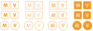
Figure 13: Yellow M & V Icons in outline and full colour (version 1)
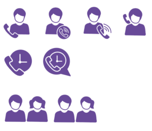
Figure 14: Purple icons (version 1)

Figure 15: Yellow icons (version 5)
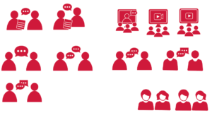
Figure 16: Red icons (version 5)
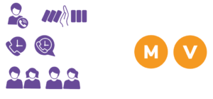
Figure 17: Purple and M & V (version 5)

Figure 18: Yellow icons (Final version)
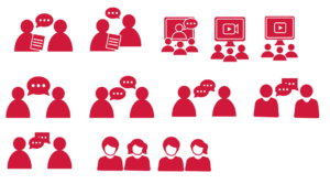
Figure 19: Red icons (Final version)
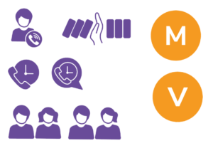
Figure 20: Purple and M & V icons (Final version)
Figure 21: Our service final version
Independent work (Website image by Kaylee)
According to the needs of clients, I try to choose suitable pictures for the website to show the effect. When people browse the website, the pictures in the website can help people understand the content of the page. For websites, pictures are very important because their role is to attract users’ attention. They can transmit complex messages in the blink of an eye. I found some free and paid pictures. We constantly filter and replace photos through communication.
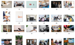
Figure 22: Picture selection stage
Independent work (Diagram for ‘intervention’ services by Kaylee)
I made a diagram of intervention for the website. When making the diagram, I used the colour palette provided in the brand guidelines. Because this diagram will be used in conjunction with the website, I used the same colour as the brand. I use Sequential palette to make this diagram. After some modifications to the diagram, I changed the colour of the pattern uniformly to purple. This is more consistent with the colour of the brand. Through the diagram could explain the concept helping people up to level up. When I drawing the diagram, let everyone at the same level of height. Use different numbers of boxes to represent student needs. Different height with different boxes means different students have different requirements. At the same time to use colour to indicate different levels.
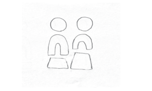
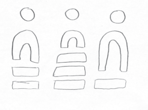
Figure 23: Sketch of intervention diagram
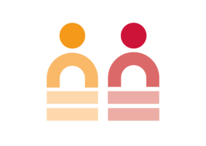
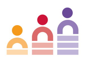
Figure 24: Digital version 1
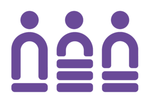
Figure 25: Final version of intervention diagram
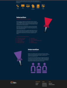
Figure 26: Our services final version
Independent work (‘What we do’ and ‘An Evolving market’ illustration services by Kaylee)
For these two illustrations, the sketches were done by me, Holly and Kory. We have drawn three different plans. The purpose of this illustration is to allow users to better understand the text when browsing the web. When I communicated this illustration with a client, we chose one of the options. The client also gave me the details of the illustration he wanted. I draw the digital version on the computer based on these feedbacks. Finally, I choose the colour according to the colour wheel of the branding guidelines.
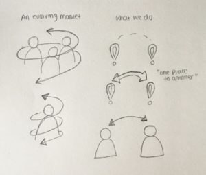
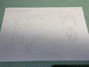
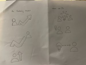
Figure 27: Sketches of ‘What we do’ and ‘An Evolving market’ illustration (By Kaylee, Kory and Holly)
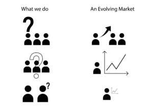
Figure 28: Digital version 1 (Without colour)
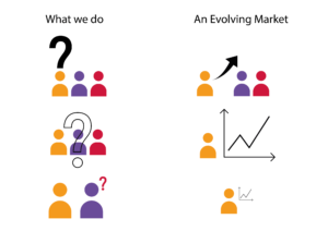
Figure 29: Digital version 2
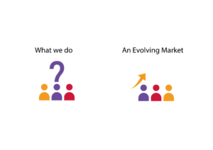
Figure 30: Final version
Independent work (Diagram for ‘intervention’ services by Kory)
The independent work I do is to modify our reach pages that we have done. I need to modify the original light blue part and the text next to the map and determine whether to add a map. After reading the page information provided by the client, I know what the page needs. The content is mainly about what kind of benefits TSoC will give to their customer groups. Like for the school, what they bring is the best choice for students. And to increase their confidence in students. It is almost the same for parents of students and customers. It is very interesting that I found a exactly the same thing in his description called: Gatsby Benchmarks. This word is very unusual in ordinary life. So I think this must be their outstanding part. So I went online to check the meaning of the word and made a design about it.
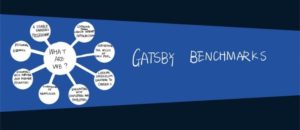
Figure 31: Our Reach with Gatsby Benchmark
I replaced the text in the middle with the definition of Gatsby Benchmarks and showed it in a mind map and problem-centric approach. I believe that most people like me are not very clear about what Gatsby Benchmarks is. It will be very clear and clear to show it through a mind map. Through this picture, the customer can know what TSoC can provide them. The light blue background and the white mind map can highlight the content very well. But after discussing Izzi, I feel that this part is not very important. She still hopes to keep the blue part of the car full of text. And I want me to adjust the text ‘National Network’ next to the map.
Because TSoC is a national company, it is not a global company. So highlighting this part will bring some benefits to the company but also some disadvantages. But in the end, we still decided to highlight this part. I made two versions of the draft design. The first is that the blue part is not changed. The second is to turn the blue part upwards like a card.
In the first type, I put the blue part in the middle of the map and enlarged the map. Because these things are accompanied by the map, I think if you put them on top or below, they will not change much with the map. The second one I do is similar to a card. After dragging down, the text will be overlaid up like a card.
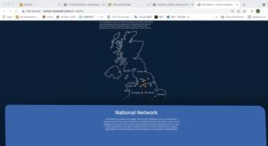
Figure 32: Our Reach with national network card motion
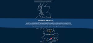
Figure 33: our reach with national network inside map
The final version did not adopt all my changes. The content of the change is to change the original blue part of the content from dot by dot to paragraph. And removed the following content. This makes this page look much cleaner than before.
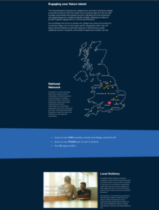
Figure 34: Our reach final version
Reflections:
Reflection on project (Holly)
During this real job, we had lots of time to perfect the design and meet the needs of the client as effectively as we could. As a team we worked well together, some of us had more significant roles in this project than others due to more experience. However, we all individually contributed large parts to the project (such as illustrations) and overall worked well as a team. Personally, this project helped me develop my communication and technical skills. At the beginning of this job I was hesitant to speak up but as soon as the project continued, I felt I contributed to discussions more. The job gave me a better insight on how to work with a client in a professional setting.
Reflection on project (Kaylee)
This time Real Job was a special experience for me. Before this Real Job, I had never done this kind of work for clients. It is also my first contact with design work. Enriched my resume in personal experience. In The School Outreach project, we have been working in small groups. In the group, I am mainly complicated to provide ideas for each step of the design and draw some illustrations. Projects that work in groups usually require excellent communication skills. I think at the beginning of this project, I lacked communication. But after everything is on track, everything is fine. In this project, from Logo to Branding to PowerPoint Palette, and finally to making an entire website. It can be said to be a big project. From this, I learned how to communicate with customers and after making a version, we will meet in a group to discuss which solution is more suitable for use. In terms of design, we often need to conceive an idea in a short period of time, and then draw a draft. Then choose which one has more potential for development. This also allows me to experience that design is not an easy job. We need to consider what customers like, not what we like. Sometimes we find it a version we really like it. Customers don’t like it that much. Group work projects really help me to work on mine communication skills and design skill. Group work projects really help me to work on mine communication skills and design skill.
Reflection on project (Kory)
Through this Real job, I learned a lot of things that I felt I couldn’t learn in university. I learned:
- How to communicate with customers in a professional setting.
- How to work well in a team whilst collaborating on a design.
- And how to meet the client’s needs by combining our own ideas with theirs.
From this experience, I also realised that the client’s ideas cannot always be achieved the way they would like them to be. As designers we must advise them of possible or even more suitable ways a design can be achieved while still meeting their needs.
Trello Link:
https://trello.com/b/7kGuxHtj/rj00514-the-school-outreach-company
The School Outreach Company Website:
submitted on behalf of Kaylee, Holly and Kory