
Background
‘PLACEing Objects Day of Dialogue and Dialectics was conceived as a shared “Crucible” space: an open container where the living archive of embodied knowledge or “ingredients” in the room could be opened up, gathered, sifted, grouped & re-grouped.’
– Julie Brixey, client
Julie Brixey-Williams from the Art department at the University of Reading, studying a Ph.D. in Art, needed to catalogue her PLACEing Objects Exhibition, which took place on 26th February – 8th March 2020, and the Day of Dialogue and Dialectics that took place on the 29th Feb 2020 held at spudWORKS, Sway SO41 6BA. Both are themed on Art and Space.
The pages expand a recent artist-curated display and associated Day of dialogue; it includes a fantastic group of interdisciplinary artists/practitioners who develop relationships with place via objects and materials, poetry, sketches, quotes and photography, along with captions, indicating name, date and information.
A catalogue for this designed publication is available from the British Library and licensed under the Creative Commons. Here is Julie’s website for the exhibition.
Restated brief
The brief was to design a press-ready file containing 48 pages for a book cataloguing the exhibition that Julie Brixey-Williams ran. This included creating the single pages for the publication on InDesign, portraying the PLACEing Objects showcase, a band to hold the book together, and helping source a printing company that can work with this more conceptual kind of publication. The unique critical part the client was interested in was that all pages in the publication must have equal importance. Therefore, we came up with a way to ensure the binding didn’t force a linear format and that the users could rearrange each page.
We agreed on a series of outcomes for PLACEing Objects during our first meeting to restate our brief. These were:
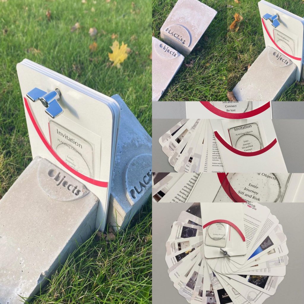
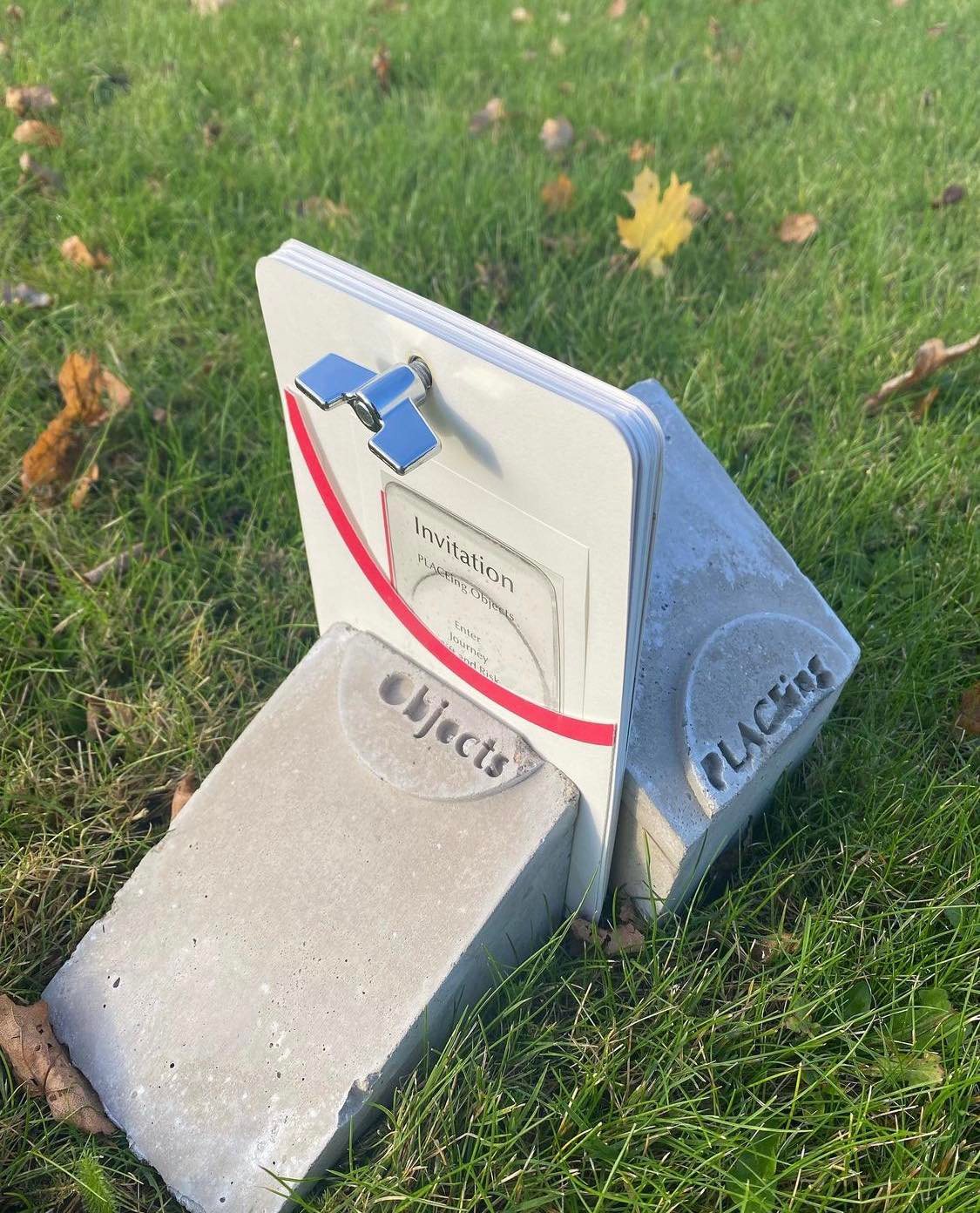
- Design a logo that goes on a concrete tile for Julie’s PLACEing Objects artists publication workshop 2021
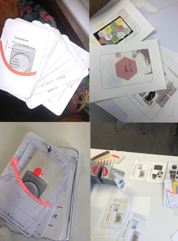
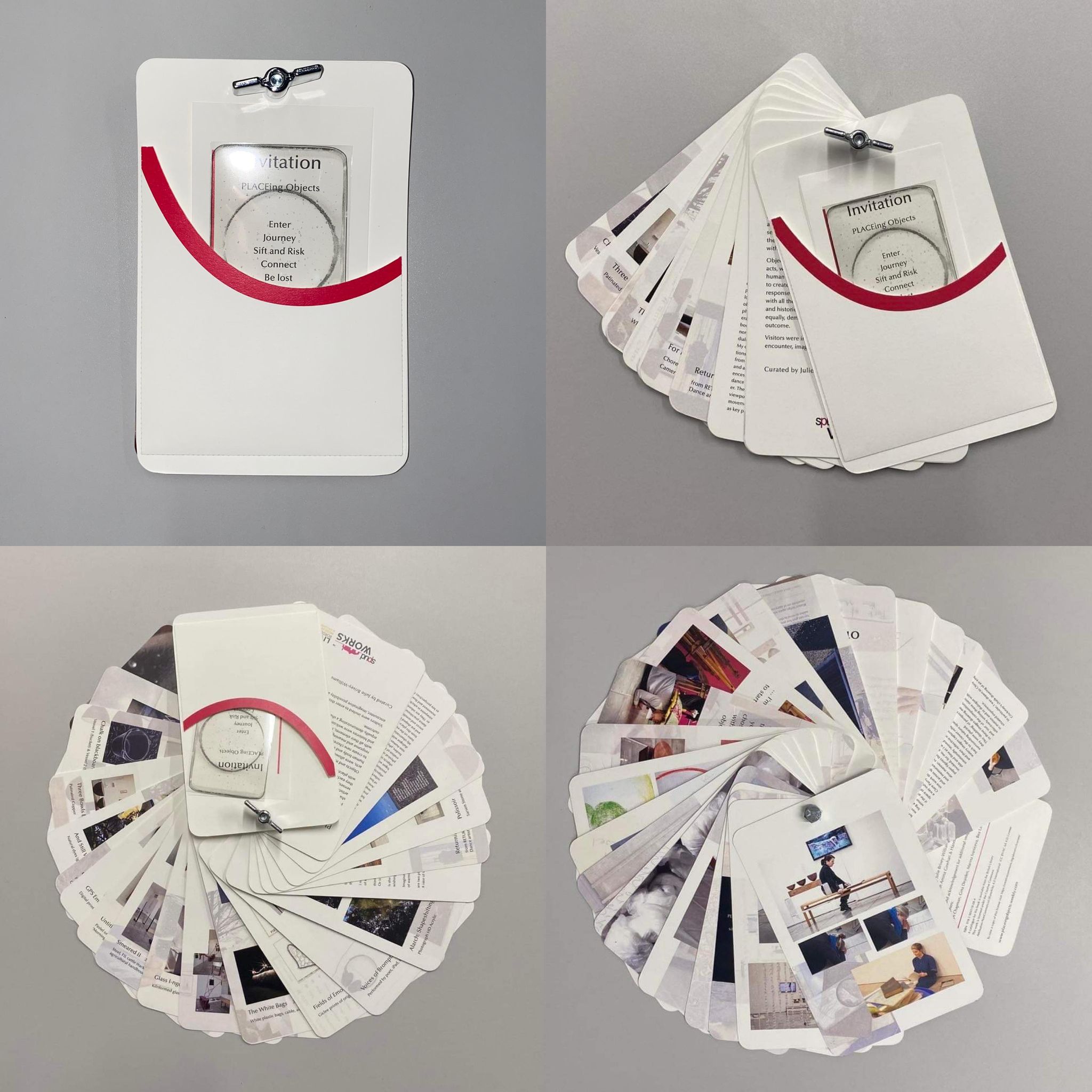
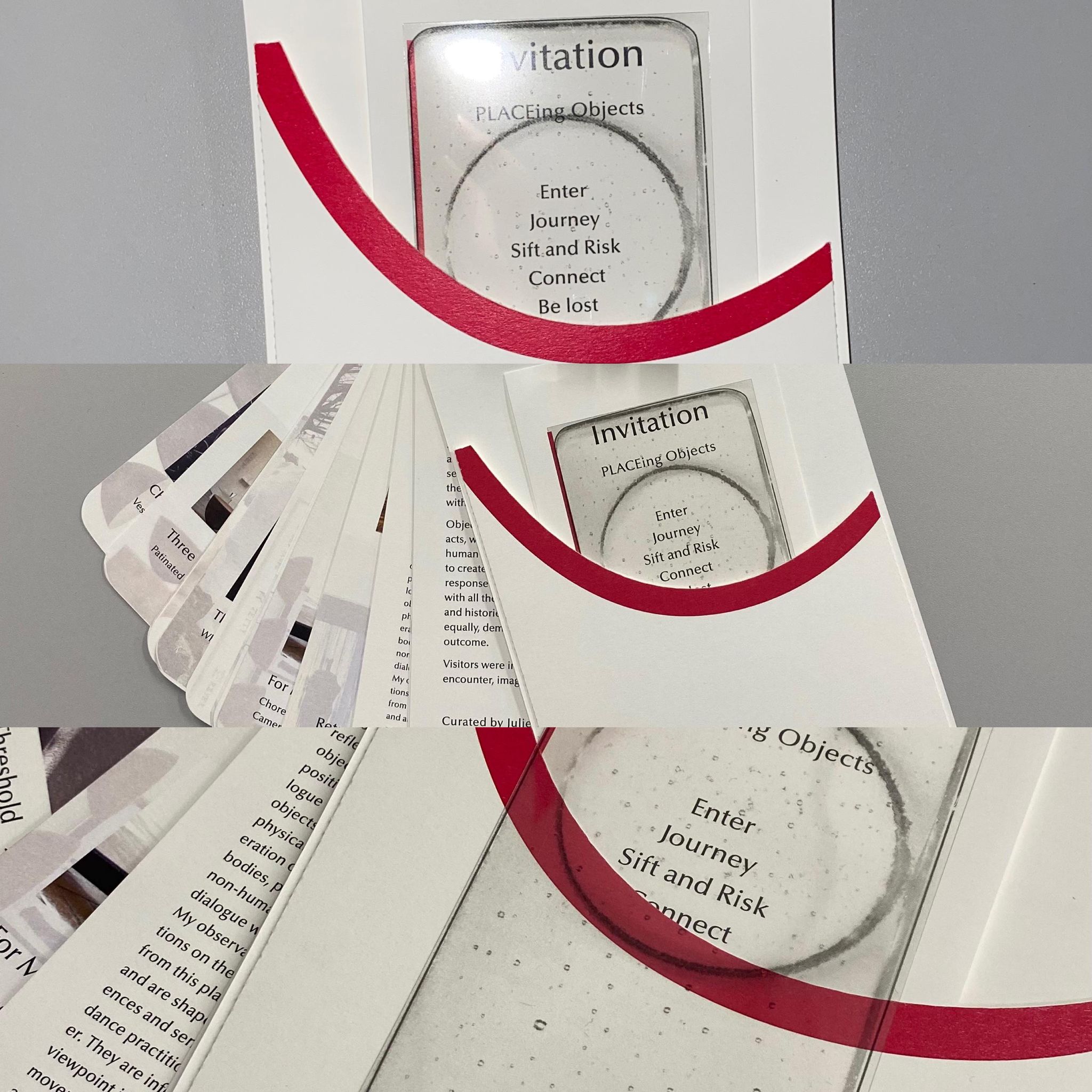
- Create a pocket page that holds the other deliverables we agreed on: a designed invitation card and glass acetate print
- Compose the single pages for the publication, portraying the PLACEing Objects showcase.
- Replacing the band’s idea of holding the publication together to placing a bolt into the designed pages. We have been in contact with Geoff to get his thoughts on this; then, we officially agreed to get on with the math of getting the diameter of the drill correctly.
We also established several preferred features of the printed product on week four, and these features include:
- paper stock 250gsm Olin off white for the publication (agreed after doing the printing experiments
- glass I-ngot iPhone paper to be transparent (decided on the 8th week of the job)
- fluorescent colour of PANTONE 178 C CMYK on the pocket page (decided after a face to face meeting with the pantone colours)
- The publication size was slight as an Ipad mini 5, but we had agreed on 134.8 mm x 203.2 mm with rounded edges.
- The hexagon images and Jo Robert’s pencil drawings had to be scanned to place in the publication document.
- All photos included need to be 360Dpi and Tiff files. Some needed editing on Photoshop for better quality.
Research and ideation
Initial Research & Mood boards
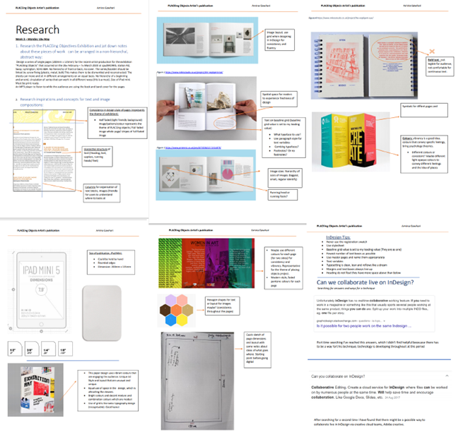
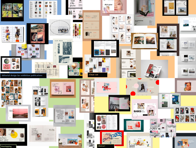
Me and Hannah began this project by looking for inspiration through existing designed publications, creating a pdf placing all the inspirational images with annotations. As PLACEing Objects’ publication format was unique, it was challenging to find similar publications. However, we looked into online exhibition publications such as The Negligent Eye publication and other inspirations on Pinterest; this helped us create 4 mood boards to present for the client. Exploring different approaches to the publication design, including an abstract approach to the publication design, a clean-cut approach and an approach where text or images commonly overlapped.
From doing this, we instantly identified a suitable design that Julie confirmed – a preference for the “Clean” mood board for a format of elegance and clarity in the publication. In addition, developing annotated research had allowed us to interrogate Julie’s style of the book. This stage of the project was the foundation of the overall, as it covered initial information such as dimensions of the text, materiality, colour, layout, and typography.
Personas and interviews
The initial research stage was skimming through Julie’s early content and images of the exhibition shown to us.
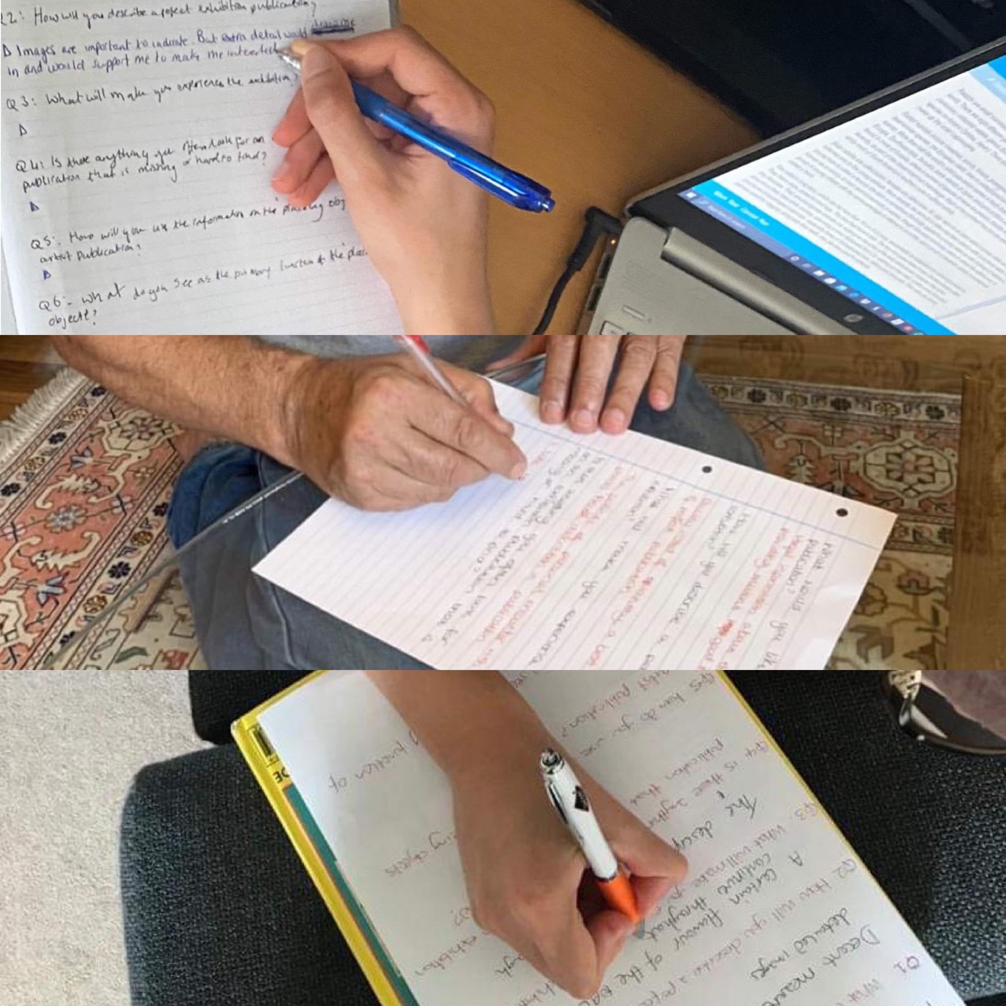
The following step was considering the types of users within the audience consuming the publication. I have created a set of interview questions to get an insight into what potential audiences may expect to see in an exhibition publication. Then, set up 3 key user personas and conduct interviews on people that fit those categories.
Interviewing and testing other people’s thoughts on the exhibition publication was relatively straightforward as I wrote the questions, and they could fill out the interview questions. I have noticed that different generations have different answers and feedback; this helped Hannah and me, as designers, to solve other people’s needs and interests. These interviews played a part in our designing process, as they are linked to the 3 personas. Designers should pay close attention to the interviewee’s responses to build up a result to satisfy the targeted audience
Colours selection
After selecting booklet designs, we started exploring Pantone colours to match the publication’s content. The Pantone yellow 7499C and pink 178C were both vibrant and better-fit colours, and the warm Florence pink is close to the feather duster colour on the poster of Julie’s exhibition – this matched the Julie’s thinking too. Ultimately, after suggesting minor alterations of the suitable colour Pantones, the client was motivated to see a physical booklet of the colours to make a change if necessary. We valued the opportunity to exercise our attention to detail, use Pantone colour books, and gain familiarity with printing techniques!
Design Process
Deciding on formats
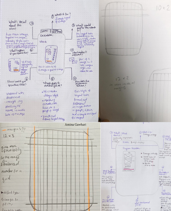
We have started our design process by sketching different concepts of the project. The challenge was to evolve ideas that would reconcile with the client’s intentions. Creating beetle diagrams, annotated sketches to process ideations was helpful in each part of the project. Although we did not decide on a particular design instantly, we earned a better insight into what the client preferred and disliked.
Julie used an iPad mini as part of the exhibition. Therefore, she wanted the publication designed with these dimensions, even the rounded edges.
Also, she needed a way to hold the publication together without being physically bound. While this was initially intended to be a belly band, we ultimately designed a screw drilled into the top. Thankfully this phase of the job had taught me to constantly challenge the brief and find alternative solutions that work for the client and you as a designer!
‘For grid, I would advise something with a gutter between the columns, this means you can easily have a standard spacing gap.’ – Matthew Lickiss, Project supervisor
Designing a grid system and planning on that beforehand was essential, as indeed our design needed to be carefully considered to achieve a suitable working format and layout. Here are some of our analytical sketches for approaching design strategies.
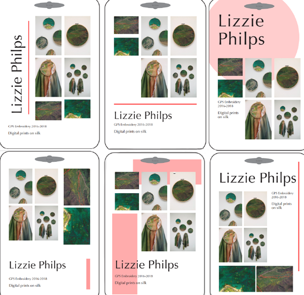
Testing Layout
Designing the pages for the publication was the central part of this project. First, we trialled various layouts and had a meeting with the client (Julie) to discuss the options to choose from. Once we knew what the client needed, we created the grid and paragraph styles on Adobe InDesign for all pages after designing them on paper first. This demanded plenty of testing as the content for each page was broadly different, yet it was essential to keep a precise consistency throughout.
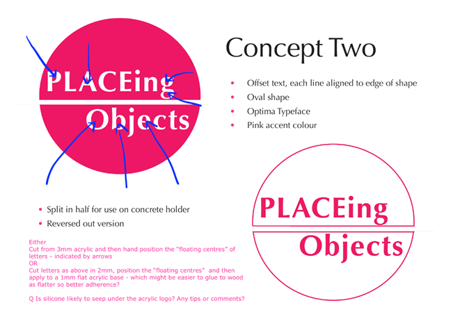
Logo Design
Julie was enlightened with the idea of a sculptural manner to hold the publication, preferably than a band to keep it together; she wanted the publication to sit in between 2 concrete blocks operating as bookends that she would get cast by a professional. The task was finding a solution to anchor the title and branding within the design of the said concrete block.
At this phase of the assignment, a logo was one of the deliverables. The client did not have a specific use for the logo, so we discussed using this on the concrete block to keep the entire project cohesive. The logo used on the block would showcase the exhibition’s name while also adding an element of design to the concrete block. We tested various versions to see how different layouts could work but eventually settled on a logo where the title would be split in 2, ensuring the audience would know the block was one of two.
Concrete block
While we initially thought of involving a vinyl sticker with the logo design, we finally decided that getting the logo cast into the block would be a more subtle method to showcase the logo and develop a sense of it being embedded within the entire publication concept.
This particular proposal demanded some conditions, such as all files having to be sent in. Regardless, after discussing with Jon, the caster, we could get the logo cast into the block precisely how Julie preferred.
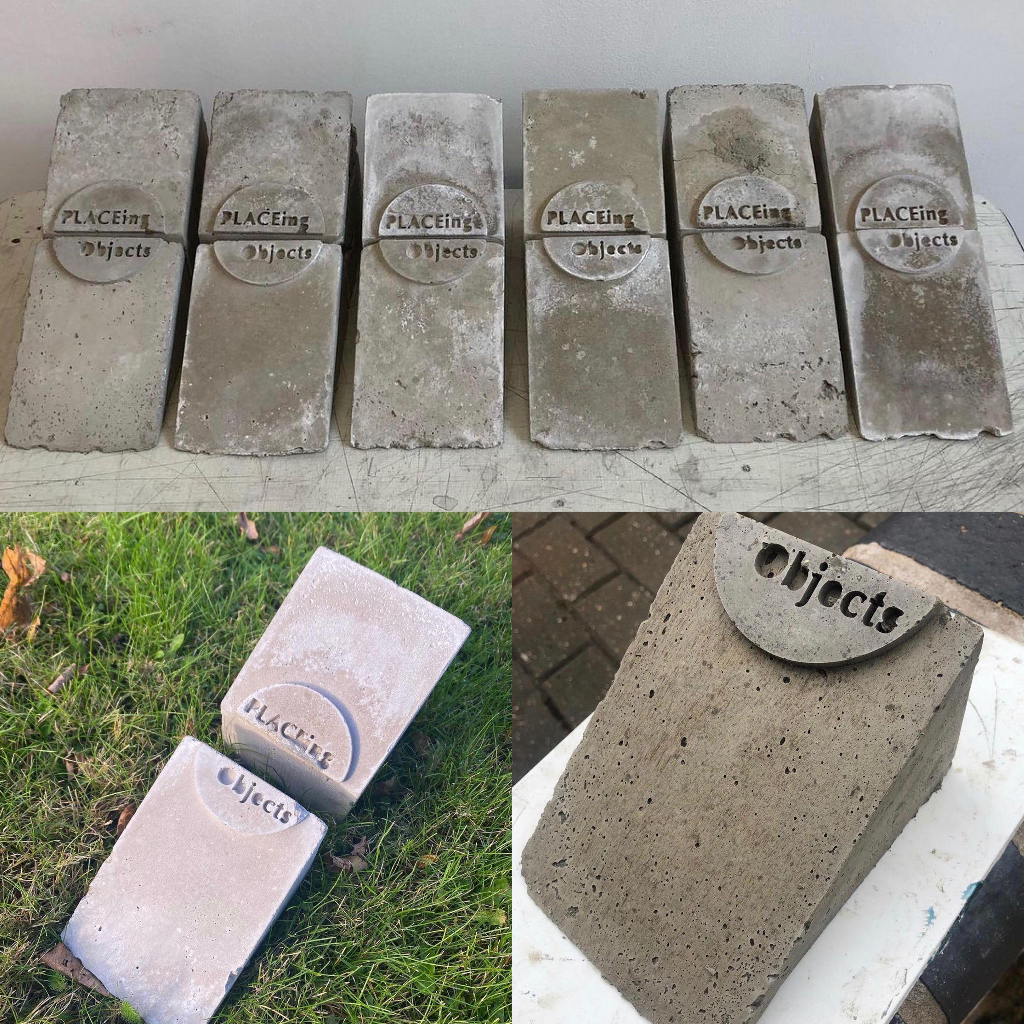
Here is a short video of Jon Lockhart cutting the acrylic logo that we designed to cast into the cement wedge exhibition support for the publication (video credit)
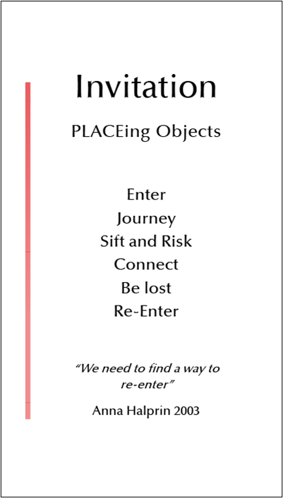
Invitation card design
This was added halfway through the project and was approached by research, covering materiality, formatting ideas, dimensions and fold ups. After presenting the client with a good PDF of study, we have figured out the type of style the client wants. Using the same descended line in the book creates a kind of closure to the rest of the book, and this is good to show a type of consistency. The invitation card was made using InDesign and printed in the stock of 150gsm with the Pantone colour 178C.
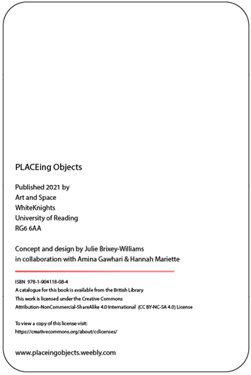
The creative commons were thought to be placed in the invitation card. However, it changed to be placed at the back of the pocket page, and this was noticed as a wrong position for the CC to be indicated. This process had flagged up the idea of realizing to organise the little details correctly. Otherwise, confusion would occur to the audience
Finalising
Iterations
I firmly believe that regularly meeting with the Julie, the client, was the key to the success of this project. We would make sure that we were updating Julie, sending newest iterations of the project to confirm and review decisions for each page. Making many of alternations lead to a robust design that communicated each artist honourably, in the form the client needed.
‘Can’t tell you how lovely it was to see the pages side by side,it feels like a whole thing now… It’s going to look fabulous! You’ve both done such a great job.’ – Julie Brixey-Williams.
Paper decisions
A considerable part of this job was the physical sense of the publication. Having lots of conversations with the client about the colour tones and thickness / quality of the paper was prioty to get it right. We printed out adn sent pages on a different paper stocks to let Julie to choose the one she felt defined her exhibition.
Production
The publication printing and finishing was relatively a brief period; however, due to the type of challenging printing elements, such as the acetate insert and pocket page, we selected the Design Print Studio in the department; it was the most suitable printer. One of the reasons was it made communication concerning all printing flexible as we talked word-for-word to DPS. Also, Geoff was there to instruct about complex aspects of the publication.
Reflection
This job was my first Real Job project. Therefore, there were new experiences and trials for me, from designing for my first client to printing my first job. There were many challenges that I learnt from, which made me look forward to my other real jobs!
It was a massive project with lots of contributors; it carried a lot longer than initially planned; we had to wait for additional content and work to create a highly physical piece of work over multiple lockdowns. Additionally, much of the content can be in different formats, so it took a lot of time to standardise all documents and images to 300dpi on Photoshop, converting them to CMYK colours, scanning then saving them as TIFF files.
Working in pairs added complications, such as that we couldn’t meet in person, so everything had to be done online, which occasionally meant there were communication problems. Additionally, working on the same InDesign file at the same time (online) was impossible, and we would have to ensure the latest files were uploaded to OneDrive at all times. Reflecting, I believe there must have been more appropriate ways to divide up workload efficiently.
However, even though completion held longer than we had both expected, we reached our amended deadline to hand over. We are all pleased with the result; it fits the exhibition’s style, is suitably formatted, and meets our brief’s aims and the client’s expectations. I appreciate the experience this job has given me. I am now better positioned to take on future teamwork, publication design as the practice of layout and printed matter, and more about publication design and printing terminology. I am very proud to have collaborated on this huge project.