
Background
Whilst in Covid-19 lockdown, the client wrote an illustrated children’s book aimed at 6–9-year-old children where all profits will go to Heads Up, a mental health charity, and the WWF. The requirement for the job was to design the layout of the book and make suitable typographic decisions based on the audience and content of the book. The book needed to integrate illustrations with the text in a fun and exciting way to make the book attractive to children.
Restated brief
The aim of this project was to typeset a children’s book which meant a variety of different considerations had to be taken in order to provide a book that would be appropriate for children. The initial brief was to create the text files for a 203x254mm full colour printed book and also an e-book. The client had also asked for some aid with the cover design. Although the book was to be printed, the client knew that they would be researching into this themselves and although they would need some help to ensure the files were appropriate, there were no production arrangements that had to be made as part of this job. However, the client did require different file types for both physical printing and also e-book text files.
Target audience
Children aged 6–9 years old were the target audience for this job and therefore the book had to be formatted to suit the reading ability of this age group and also include typographic detail that would be appropriate but also create some excitement for the audience. Although the book was aimed at younger children, the user personas represented those that may be buying the book for the children as this would often be parents or adults. Therefore, the book needed to be liked and deemed appropriate to aid reading for children by parents and adults that would be buying the book for a child. This is reflected in the user personas created.
New restated brief
The original brief asked for the book to be typeset and files suitable for print and use on e-books to be provided as well as some assistance with the book cover design. However, the client’s ambition for their project changed throughout the job and with this came the need for the book to be marketed in French as well as English. The deliverables for the job therefore required both English and French print ready text files as well as English and French e-book files.
Schedule
The original competition date was due to be in mid-September 2020, but this was more of an aim date as the client was quite flexible. The research and initial designing phase took longer than expected due to the job starting in the summer and therefore prior commitments getting in the way of being able to progress the project quickly. This meant the completion date was pushed back to the end of October. By October all design work had been signed off and both the client and supervisor of this job were happy with the outcomes. However, the original text files that had been handed over from the client turned out to be only a draft copy and needed to be proofread. Therefore, a lot of changes had to be made and the text had to be reformatted each time as large pieces of the copy had been changed and edited. This took a lot of extra time that had not be scheduled in which therefore pushed back the completion date even further. The client was continually sending updated copies of the text files and, learning from past mistakes and in order to save myself time, I requested that they highlight any changes in a different colour. This made it much easier to change the text quickly and meant that the text did not have to be reformatted each time as it was a new file.
Along with changes to the copy and also formatting a French version of the book, the completion date was pushed back to mid-December and finished print-ready files were handed over before this. However, the client required assistance with uploading the text files to Amazon as both a paperback and e-books which took time as it was more difficult than originally expected. This meant that the job was not complete until February 2021 as the client required assistance with making the books available online, despite all design work and files being completely finished by the end of November 2020.
Process
Contact with the client
Due to the covid-19 pandemic, the client was contacted over video call. This method was also used for future meetings with the client which did allow for easy discussion as files could be shared and worked on whilst on the call.
Research
Although I had worked on editorial books before, research into children’s book typography was very important in order to create pages that were attractive and accessible for children. Fortunately, shops were open at the time of research so WHSmith and Waterstone’s were visited to look at competitor books and also get an idea of the features that children’s books include that previous editorial projects would not have used. From this research it was clear that large typefaces with loose leading was very common which allows for easy legibility for children. ‘Fairytale’ style books were also researched as this is what the client wanted their book to be marketed as. These use a larger format and therefore allow for the illustrations to be seen and appreciated more. A lot of the books researched used interesting ornamental flourishes which created more excitement for children and is therefore something that was considered when designing the pages of the book.
Trello board
As this was a one-person job, I did find it difficult to keep up with the trello board. On previous jobs, where work was done as a team, it was easier to keep the trello board updated regularly as it was an easy platform to share files and keep on track of the job with each other. However, working individually meant that it was more convenient to email the supervisor directly with files. All research was completed and shown to the supervisor as well as progress throughout the project but were not uploaded to trello in a very timely manner. It is acknowledged that this is not the most effective way of working but files and progress were shared throughout and kept organised.
Initial designs
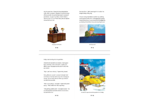
The story of this book has a target audience of 6–9-year-olds and therefore the typography needed to be considered in relation to this. As well as looking at other children’s books for this age range research was also carried out and a ‘Typography for Children’ article by Ilene Strizver was read to gain a better understanding of typography for children (Strizver, www.fonts.com). The inclusion and integration of the illustrations with the text was also something that needed to be carefully considered to ensure a sense of cohesion with the text throughout the book. The client had commissioned an illustrator to bring the story of the book to life and as the job began, some of these had already been completed. As the illustrations were high quality the typography needed to match this to present the text in a fun and intriguing way that also represented the sense of mystery created from the story.
The format for the book was decided to be 203x254mm as this was just smaller than A4 and suited the ‘fairytale’ style that the client required. This format worked well with the illustrations and also allowed an appropriate body of text to sit comfortably at a large size.
Type
Initially, typefaces that had the characteristics explained in the article mentioned above were explored and tested. However, the client requested that ‘Sassoon Primary’ was used for the book. Unfortunately, this typeface had to be paid for and after explaining to the client that this would come at an extra cost, more research was conducted to choose a similar typeface that would still be appropriate. An article from indesignskills.com was read but a lot of the recommended typefaces were more display based and not what the client desired. After discussion with the supervisor, Sue Walker was contacted, and permission was given to use the typeface Fabula that she had created as part of a study into the suitability of children’s typography. This typeface was approved by the client and worked well with the book as it has similar features to Sassoon Primary and is specifically created to aid children’s legibility.

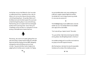
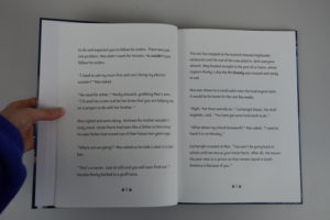
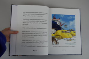
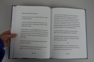
Fabula was used at 15pt on 28pt leading as this is a recommended type size for children’s books for the target age. These sizes were found to be appropriate from the research and also research conducted by the client who was aware that the type needed to be much larger for children. The type also used 28pt spacing between each paragraph instead of indents as this allows for better legibility for children and is therefore accessible for the target audience.

Images and text
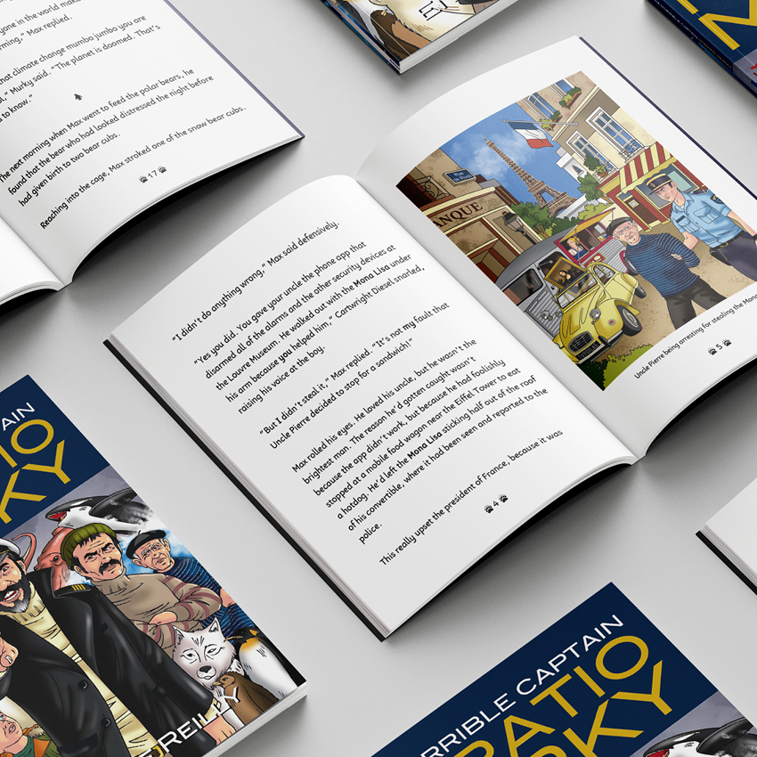
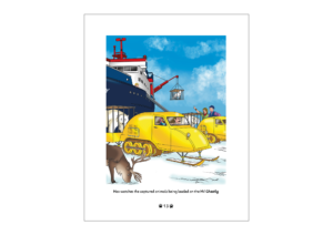
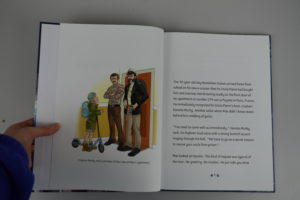
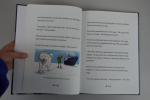
The initial illustrations that I had been given had defined edges that meant that unless they sat on their own on one page, they did not sit well with the text, especially as they were all portraits. Experiments were made to give an idea for vignette edges, similar to some of the illustrations which did not have defined edges and sat more comfortably with the text. Unfortunately, as I was having to communicate with the illustrator through the client, my ideas were not taken forward, but the client was happy for the portrait illustrations with defined edges to be used at full page which allowed them to sit easily alongside the text on a spread.
During the designing stage of the text formatting, the illustrations were still being drawn so although I had designed the spreads to use full page portrait images, I received illustrations that varied in their format. Some did not have full backgrounds so blended into the page more and others were landscape with an attempted vignette blurred edge. These did not fit with the agreed format and could not be changed due to the illustrator’s time restraints. Fortunately, the illustrations with no background sat happily underneath the text taking up half a page and this did not combat the design. However, the landscape illustrations had the blurred edge taken off them as this did not match the rest of the illustrations and although they did not sit as comfortably below the text, this was where they suited the format the most. The client signed off these decisions and was happy with their placement, so although not the most desired format for the illustrations it was how the client had imagined the book format to look.
Whilst proofreading changes were coming in from the client, they also requested that the illustrations used captions. Research conducted earlier in the process suggested that this was not a usual occurrence for children’s books, but the client felt it would aid the reading journey for the audience and ensure that the illustrations linked to the correct element of the story. As all the illustrations sat at the bottom of the pages, the captions were easy to incorporate but only where they were one line long as otherwise the size of the illustration was compromised which was not desirable. Some of the captions were very long and also repeated some of the story which was not necessary and therefore were acting as more than just an image caption. The client agreed that they could be shortened, and this was an easy fix, though did take some back-and-forth correspondence where some captions needed more words taken out than others to ensure they sat comfortably on one line.
Folios and section breaks
When researching children’s books, many of them used interesting elements such as small illustrations or ornamental flourishes to dress the folios. Usually this is uncommon in a normal editorial book or novel so it was definitely something that needed to be explored as adding extra elements would fit in well with this heavily illustrated book. Different types of flourishes and small illustrations were tested to see which would be most appropriate. Ornamental flourishes were used in some children’s books found in the research but for this particular book illustrations that matched the images were deemed to be more appropriate. As the book is about arctic animals and boats, these types of illustration were mocked up around one, two, and three-digit page numbers to see how they would work best. It was deemed that the polar paw print was most appropriate and suited the purpose most effectively as it related to the story and was not too complex to be seen at small sizes. It also wasn’t too dark and did not distract from the rest of the text.
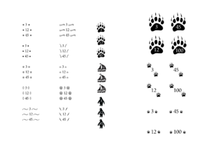
Instead of using chapters, the book used section breaks initially indicated using an asterisk. However, after finding appropriate illustrations to be used alongside the page numbers, it was appropriate to use another related illustration to indicate a new section within the text. The penguin was chosen as again, it related well to the story and created a fun section indication for children to notice and link to the story. At first these were made too large and fought with the text. Downsizing these to a similar size as used for the folios made them more appropriate and sit much more comfortably to be noticed in the text without attracting too much unneeded attention.
Production
The client knew from the beginning of the job that they would be sourcing their own printer and all that needed to be provided were print ready files. However, as they were on a tight budget and any profits from the book were going to support charity, the printers that were chosen only printed a limited number of formats. Unfortunately, the originally agreed 203x254mm format was not able to be used and so the book had to be changed to 203x276mm. This was not ideal, but fortunately easy to change as the margins were made slightly longer in order to fill the extra space. Although an easy fix, this still took some time to get right as the book had to be redesigned in some places which meant that the already pushed back competition date had to be made even later than originally expected.
The original job had requested for aid with the cover design. However, the illustrator took charge of this as it was deemed most appropriate as the illustration style used in the book correlated to the cover. The illustrator sent over the files that I then assembled in InDesign; however, this incurred issues with sizing, especially as the book format had to be changed very close to the deadline. Fortunately, these issues were resolved easily after contacting the illustrator directly to ensure that the size of the files were exactly correct.
French copy
Halfway through the job, the client decided for the book to also be formatted in French, as the hero of the story lives in Paris. All typographic and design decisions had already been made so this was not too much extra work to take on. However, it did involve formatting the text and ensuring that section breaks were in the correct places and also that the text matched up with the illustrations shown on the corresponding pages. This was a challenge as I do not know any French, fortunately, the translator was able to provide some notes in English on the text file to signal where particular images needed to be placed to ensure that they would be on the correct pages. Like the English copy, the French also went through many iterations and small changes which took time as they had to be sent to the client who sent them on to the translator and back again. Although this was a challenge, it was very interesting, and some valuable skills were gained as it is very different formatting French text than the usual English. It also meant that communication had to be kept on top of to ensure the correct changes were being made and any queries were clearly stated so they could be passed on via the client.
E-book
Part of the job was to create print ready files but also files suitable to be uploaded as an e-book. This involved some research using LinkedIn Learning courses and also some testing but was not too complex. There are two formats of e-book which are reflowable layout and fixed layout. The fixed layout worked for this book as there are a blot of illustrations that have to stay in certain places in the book in order to correlate to the correct part of the story. A reflowable layout was tested but this completely reorganised the format and did not work. The e-book files were created and tested on the Amazon Kindle Preview app. It was also ensured that the colour space of all the illustrations was changed from CMYK in the print appropriate files to RGB which is used for screens.
Amazon book
As the e-book files had been created as EPUBs they were easily uploaded to Amazon by the client, but Amazon also provides a service where the book can be bought by the reader and printed from Amazon which is a cheap alternative to using a printer and distributing the books in bookshops. Therefore, as the book profits go to charity, this was a suitable method for the client to sell the book. Due to the nature of this process and similarly to the printers that the client had chosen, they only printed certain book formats. Unfortunately, the new format of 203x276mm was not available but the original format 203x254mm was which meant no changes had to be made as the files were also up to date in this size as well. For consistency, this is not ideal but due to cost limitations it was convenient for the client who approved both sizes being used. Part of the challenge of uploading the print files to amazon included ensuring that the correct ISBN number was on the correct book as different numbers had been used for both the English and French printed texts and also the English and French Amazon texts. This meant thorough checks had to be made before uploading and confirming the files to be printed. The real problem came with uploading the cover files which had specific requirements in relation to bleed and print area. This took a lot of trial and error and also required the illustrator to edit the cover and move elements where the barcode had to be added with no control over its placement. Eventually, using the specific requirements for the file, this was rectified.
The client has limited technical ability, so screen recordings were made to aid them upload the correct files and use the correct settings to ensure that the upload process was easy and uncomplicated for them. At a later date, the client also decided to upload the book to Barnes and Noble. The process was very similar and the files that were made suitable for Amazon were also correct for Barnes and Noble too which meant a seamless uploading process.

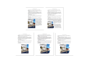
Final designs
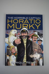
These are some example spreads in the book shown on screen and in print. The cover of the book is not any of my own artwork and the only role I played was assembling the separate front, back, and spine files from the illustrator into one file in InDesign.
Reflection
Although this was my third real job, it was the first one that I had completed on my own. There were positives and negatives to being an individual on a job. I found that it was much easier to develop designs quickly as my supervisor was my main point of consultation. However, where I lacked creativity and struggled to think of new ideas there was no one else who knew the project that I could discuss developments with which is a beneficial factor of working in a team. The use of the trello board for this job also suffered as I did not need to share my ideas with anyone but my supervisor and client which was more convenient to do over email. Although my files were organised, it would have been easier to keep up to date and show progression with regular uploads to the trello board.
Formatting text for books was something I was familiar with, but this was not editorial, but a novel so required different types of typography. The target audience was also children which meant that many different factors had to be considered that do not have to be as crucially correct in a book formatted for adult reading, such as specific type legibility, size and leading. This job allowed for some creativity with the illustrated folios and a lot of new skills were also learnt. Specifically, communicating with those other than the client such as the illustrator and the translator which meant any questions had to be carefully related through the client and emails had to be constantly kept on top of.
This was my first experience of working with printers and also printing platforms and e-books. The e-books presented less of a challenge than I had expected but uploading the book to Amazon and also experiencing constraints with format size was something I had not expected. Fortunately, these issues were resolved without many additional problems, but they did take more time than expected. For this reason, it was fortunate that the client understood that these problems were unavoidable and was able to be flexible with the completion date.