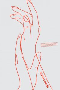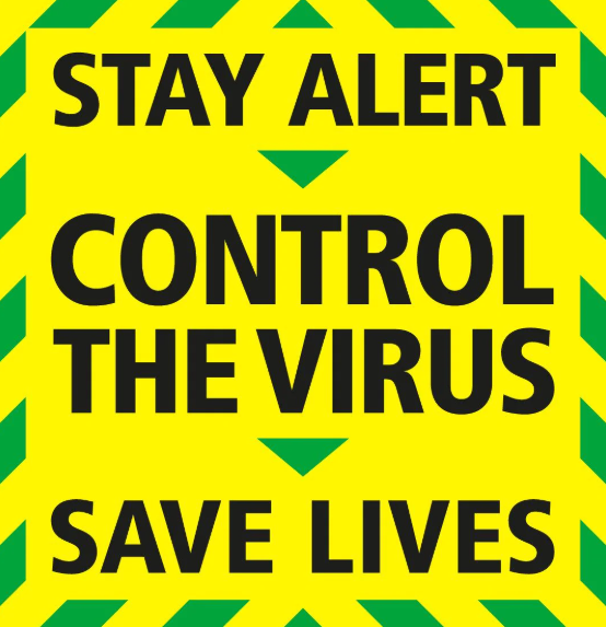

For this task I wanted to look at the differences between graphic design that has been released as a part of a government campaign and graphic design that his been done by individuals not employed by the government. I found some really interesting pieces of design from something called ‘the visual art project’ which is a virtual art gallery that invites graphic designers and artists to submit original poster designs that respond visually to the Covid-19 pandemic. The project was created by Mark Kelner (a DC-based artist), Ben Ostrower (a graphic designer specialising in political campaign branding who founded (wide eye), and Zachary Levine (a historian and curator who runs throughline collaborative).
I thought this would be a good source of comparative work as the designers haven’t had to work with a specific client like the government released Designs. Obviously the two designs have different intentions in terms of sending a message about covid but I think both are effective in their own way. The government design uses a very bold sans serif type in all caps which creates an extremely legible message. The message of ‘control the virus’ is also in a larger type which creates an almost summary of the governments instruction. In comparison to the poster regarding hand washing, the governments design is much more accessible. Not only could this design be read a lot further away (impacting more people) it is just easier to read in general with the centre alligned, large type. The colours used also give this design some sense of urgency for the reader. The border of the design look almost like some kind of hazardous tape which alerts the reader to read the warning.
The hand washing poster uses an extremely small type to elaborate on the message of ’20 seconds’. The use of such a small font here could work in either one of two ways. Some people could be intrigued at the fact that they cannot read the words at first glance or alternatively, someone may simply not be bothered to read it as it requires more effort to look closer. This designer is almost allowed to take this risk as they have not been employed by the key people responsible for controlling the virus. For such an important message perhaps it is best to stick to legible type.
Another large difference between the two designs is that the hand washing poster used illustration to portray a message. A line drawing is used to resemble the washing of hands. Again this could of have varying impact. A line drawing is not something that is bold or even legible at all from a certain distance. This leads to similar implications of the small font choice.. Some may be interested by this, it looks like a piece of art.. however some may hardly notice the subtly of this design which means a failure to pass a crucial message on.
these-excellent-covid-19-posters-are-both-beautiful-and-beneficial

