
Coronavirus signage
The signage used to negotiate social distancing, personal hygiene, and other precautions commonly advertised to prevent the spread of coronavirus, tends to include a similar colour palette, fonts and pictograms.
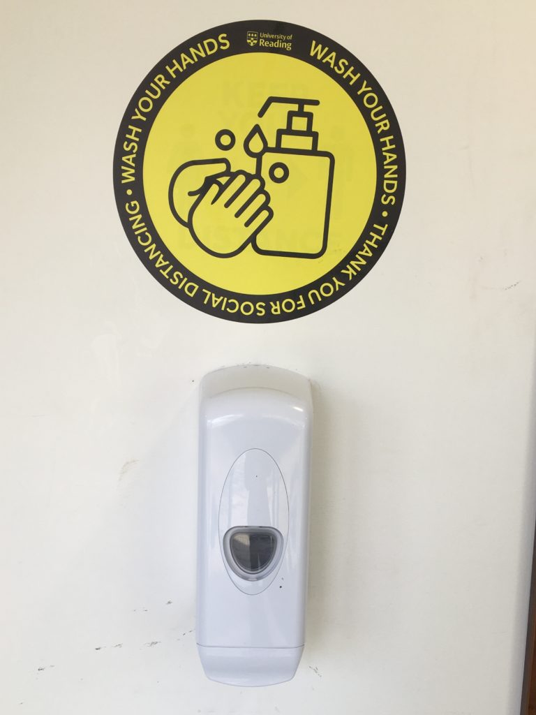
One key commonality between most of the designs was the use of a sans serif font, often in caps or bold, in a dark colour contrasting the background. This makes the message clear and urgent, while retaining the ability to be paired with other design features to make it seem friendly and helpful. The use of a bold, clear sans serif font makes the message readable to the target audience, employing a clinical, professional stance, while also remaining visually appealing.
Another key feature was the use of colour, specifically the use of only one colour or colour family, in combination with either black or white text. Colours that were most frequently used were yellow, blue and green. Yellow alerts danger and is eye-catching but doesn’t suggest immediate danger that might invoke an emotional response like the colour red, for example, would. Blue and green are often associated with healing or medical professionals, and are generally calming colours, so they work well to convey a message that is detrimental to the health and wellbeing of the general public.
I also saw the use of shape being utilised to grab attention, for example many stickers or signs used a circle to have a main message in the centre, with other, important text surrounding it. This works well to grab the attention of the audience, and then maintain their focus to process or follow a message.
Signs were often posted on the ground, in order to explain social distancing protocols, or simply because it provides a good surface area that people will frequently look at. Signs on common signposts or walls also are effective, especially when encouraging people to wash their hands or to direct them safely. The use of stickers on posts or walls also does this effectively.
Overall the use of bright colours associated with clinical practice, bold sans serif fonts, eye catching shapes, and accessible signage are key components in the effective employment of coronavirus signage, whether it is used to serve as a warning, a direction or simply a reminder to stay safe.