This project was a ‘Real Job’ completed by two University of Reading BA Graphic Communication students for a PhD student researching the Human Gut Microbiome on behalf of the All-Party Parliamentary Group on the Human Microbiome.
The Brief
Original Restated Brief
The initial brief was to produce five A4 infographic leaflets for the All-Party Parliamentary Group (APPG) on the Human Microbiome. The infographic leaflets would be given to MPs and policy makers encouraging them to engage with the research being done on the microbiome. A greater understanding of the topic from MPs would help to subsequently inform and impact NHS Policies. The initial leaflets were set to cover: Obesity, Infectious diseases, Autism, Mental health and Cardiovascular disease & healthy ageing. The infographics would need to be concise, yet informative, while being eye catching and engaging to any interested parties. The purpose of the leaflets was to help engage MPs with scientists to create more unity between the two professions and ultimately inform MPs of the research.
This job was initially presented as a project needing a rapid turnaround, with the deadline set to be two weeks after the start date. The reason for this was that the APPG on the Human Microbiome required the leaflets for taking to a parliamentary meeting just two weeks later. However, it was decided by the client that they would in fact not need them until the following visit a month later. This was good news for us as designers as it meant we would be able to provide the client with multiple iterations of each design and get their feedback along the way. On top of this, it would give us a larger window of time to get the leaflets sent to print.
As far as the visual design was concerned, we as the designers were given free rein to create the leaflets however we saw fit. Although representing the APPG on the Human Microbiome, there were no existing design styles to follow or specific branding guidelines to be adhered to – instead we were encouraged to propose possible designs for the client to choose from. The client required the informative leaflets to provide a modern and professional design that was still engaging. The leaflets needed to lend themselves to quick hits of information, made up of a few sections and not too much long prose. This would allow MPs to gain any relevant information needed in the short time they take to glance over them. It was important that the leaflets work individually and as a set as it would not be certain if they would all be handed out at the same time.
Revised Elements of the Brief
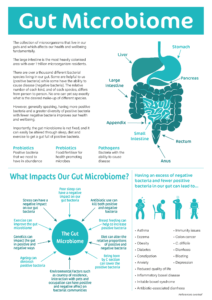
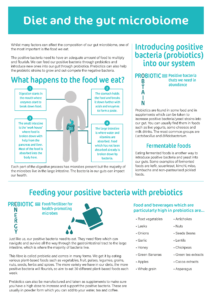
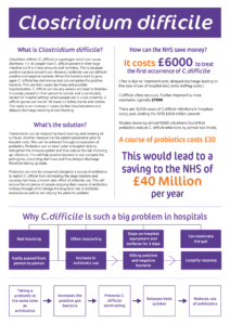
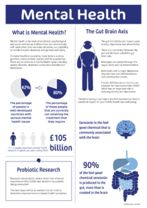
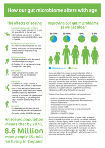
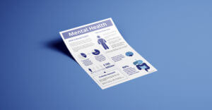
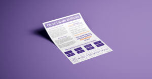
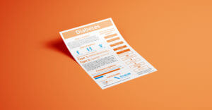
Halfway through the job, we were informed that another member had joined the client side and wanted to add a further three leaflets, bringing the final total of deliverables up to eight. As well as this, the topics for the initial five also changed slightly. The new set of leaflets would cover: Gut Microbiome, Diet and the Gut Microbiome, Clostridium Difficile, Obesity, Autism, Mental Health, Diabetes and Healthy Ageing.
Unfortunately due to the global issue of COVID-19, regular parliamentary proceedings were halted to take care of the more pressing current affair. This meant that the leaflets were no longer on a tight deadline, in fact, they now had an open deadline due to the great uncertainty on when regular preceding would commence again in parliament. This meant that the only deadline which needed to be met was the ‘Real Job’ submission deadline for our degree; this had both its pros and cons. We were pleased to be granted more time to spend on the job as it meant we would be able to provide the client with multiple levels of iteration and really refine the design of the leaflets. However, we were also conscious that we would have to manage our time spent on the job wisely with other deadlines for Dissertation and resubmission fast approaching. The open deadline for the client also meant that they were understandably more inclined to push the leaflets down the order of priorities, slowing progress.
Design Process
Research
Before we could think about designing our own leaflets, we first needed to complete thorough research on a range of elements. It was important to fully understand who we were designing for, what the client was trying to communicate and what the content being presented actually meant. First of all we needed to research the client, to better understand their background and ensure we created designs appropriate for them. We also needed to conduct research into each of the topic headings for the leaflets in order to gain a greater scientific understanding of the material we would be communicating. Many of the leaflets were centred around sensitive topics and thus it was important to fully research and understand each one in order to avoid possibly causing offense.
In terms of thinking about designing the leaflets, the obvious place to begin research was to identify how existing materials with a similar purpose address the topics and present the information. We looked at both science textbooks as well as existing posters and leaflets to get some ideas of how to present the information, particularly as an infographic. From our research, we decided the best approach would be to utilise a modular layout system for constructing each leaflet. The idea was to create chunks of information that would act like ‘building blocks’, and arrange them on the page accordingly to take the reader on the desired narrative journey.
Carrying out this preparatory research allowed us to build a strong plan before entering the design phase, which greatly benefitted the consistency in design and clarity in communication between both designers before interacting with the client.
Copy
Due to the necessity for the copy to be scientifically accurate on topics we were unfamiliar with, the client provided us with all the exact copy they wanted us to use for each of the 8 topics and was delivered to us in the form of just text in a word document. It was our initial job to sift through the copy for any spelling or grammar errors, ensuring any possible mistakes or gaps in content were relayed back to the client. We also went through the copy to ensure that typographic detailing and punctuation was correct (mainly checking for en dashes and hyphens). This was a tedious task but essential and helped to reinforce the good common design practice enforced by the teachings on our course. Throughout the design process this copy went through a number of quite drastic changes with whole paragraphs replacing what was previously a sentence. This made our task of fitting all the copy on the leaflet testing but we were up for the challenge and managed to rearrange elements to fit. The drastic changes encouraged us to create a more dynamic grid system that catered towards creating accessible but interesting textual elements. Although the initial goal for the outcomes was a more infographic heavy style, the client enjoyed the new style of flexible text columns allowing for more text. We learned that while the client and designer may have initial visions for the outcome, there is nothing wrong with allowing the design to go down another path and this experimentation should be embraced.
Imagery
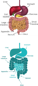
The client did not specify a particular style of imagery they were after, so as the designers, we sourced some example imagery from other scientific leaflets and presented them to the client. This allowed us to present possible styles and better understand the design style the client was after. While the client did not provide direct image content for the leaflets, on occasion they did provide example diagrams that they would like recreated in our style. This was useful from our point of view as it gave us definite visual confirmation of what they were after and avoided any misunderstanding. This helped us develop our illustration skills by taking one style of illustration and reproducing it in our own style.
Knowing we were on a tight deadline, we decided it would be most economical to utilise a style of illustration that was quick and simple to produce. We decided to create flat vector images which would also help all the leaflets to have a consistent visual style.
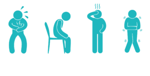

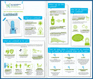
This style of illustration did not mean we had to learn any new skills but was useful for reinforcing the illustration skills and techniques we already had. Through this flat vector style, we aimed to create a consistent ‘Isotype’ style of pictorial figures where the depiction of humans was required on the leaflets. These figures were created to be as generic as possible without implying any specific demographic. While these organic illustrations did not have to be completely accurate, it was vital that the data visualisation aspects of the leaflets were. The need for graphs and charts with mathematical accuracy urged us to brush up on our basic software skills of lesser used programmes such as Microsoft Excel. As our knowledge of Excel improved, so did our graphs. Over time we were able to better understand how best to represent the statistics, creating the right graph to fit the requirements. The inclusion of the refined graphs added another dimension to the leaflets, providing a better outcome for the client’s wish of engaging leaflets.
Use of Colour
It was decided that there would be a limited colour palette specific to each leaflet to help quickly differentiate them individually, but also clearly appear as a set when next to each other. A colour system was devised so that each leaflet would have a different fundamental colour which the colour palette would be based around. The colours were carefully selected for each leaflet by researching colours directly associated with the topics, as well as analysing the connotations and meaning associated with different colours and linking them with the appropriate subject.
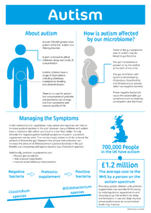
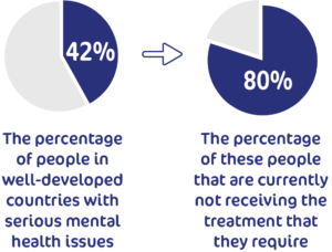
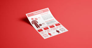
For example, a sky blue colour palette was selected to represent Autism. This was due to research informing us that this is a colour widely used in autism awareness campaigns, as it promotes a sense of calm in a loud and busy world for those on the autistic spectrum. In instances that there was no direct colour relation, theory of colour psychology was used to help assign a colour. An example of this is the Obesity leaflet which utilises a bright red colour palette, connotes danger and fear. It also has visual connections to blood, linking to the elevated blood pressure and raised risk of cardiac problems related to obesity.
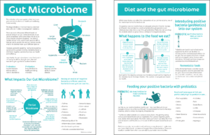
Colour was also used to help categorise and draw parallels between leaflets too. Two of the leaflets (Gut Microbiome & Diet and the Microbiome) were closely related and provided similar content to ‘set the scene’ for the reader. To help identify this close link between the two leaflets and put them in their own category, the same colour was used for them both. As they provide background information, a neutral teal colour was used to limit the impact of colour perception and promote open communication and clarity of thought. Additionally, colour played a further role in connecting the leaflets as a set, with a number of the leaflets’ secondary colour adopting the primary colour of another leaflet. This helped to reinforce the leaflets as a set, whilst also providing clear colour contrast and differentiation on each leaflet. An example of this being the purple and orange used across Diabetes and C. Difficile, as well as the same blue being used across the Autism and Diabetes leaflets.
Completed Deliverables
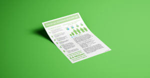
Due to the current circumstances, we were unable to send the final leaflets to print. However, we got the leaflets signed off by all parties and delivered them to the client as press ready files for them to send to print, as and when printers become available again. We also provided PDF files without printer’s marks for home/private small batch printing if desired, or for use online. As well as this, we also delivered all our working files to the client for if the leaflets needed amending or updating down the line; including editable PDFs if they do not have access to the Adobe Suite. Unable to print and photograph the completed set of leaflets, we created a series of mockups to showcase the final deliverables.


Reflection
Teamwork Evaluation
This project was completed as a pair which, from both of our points of view, worked brilliantly. We decided to delegate the leaflets evenly between us and each took responsibility for four of them. This worked well as it meant we could work independently to create the initial drafts, for the purpose of speed and economy, but then confer as a pair about the next steps. It was vital to work closely with each other in order to create a coherent set of leaflets not recognisable as being designed by two people. We worked as a team to create our own design system and rules for standardising the leaflets and then implemented this system individually to our four leaflets each, which worked very well. This form of teamwork has helped to prepare for possible workflows in the real world, where we will work on certain aspects of a design project individually using universal guidelines and then confer with a design team for their critique and input. We supported and encouraged each other along the way and gave our critical design feedback on the other’s work to help us improve. Not only was this beneficial for the one receiving the design critique, but it was also useful for the one giving the advice as it developed critical analysis of work skills.
We were in constant contact with each other sharing opinions, thoughts and designs via email as well as through social media. Trello was an effective project management tool for organising and recording the progress of the project. The use of this management tool helped us to improve our time management as well as ensuring we carried out all the necessary steps that may have been overlooked when trying to meet a short deadline; such as supplying the client with a range of visual references and completing the necessary administration forms.
Client Communication
We knew from the beginning of the project that staying in frequent contact with the client would be of utmost importance for delivering what the client required on time. We first arranged to meet in person for the initial meeting which went well, the client was clear, concise and provided a great brief. We attended the meeting with some preconceived designs following on from our research, the client reacted well to one in particular as it held good potential for a series of leaflets. At the initial meeting it was agreed that, due to the fast turn around time and ease of access, we would stay in frequent contact throughout the week via email and would schedule Skype meetings at the end of each week. This worked well for us, especially when communicating with both the client and her supervisors.
We managed to stay in regular contact with the client, sending over iterations based on their feedback the previous week by email at the end of every week. During the initial stages of the design process, this rota was maintained which allowed for a fast progression of work. However, once the leaflets were entering the final stages, a member of the APPG party started providing input as a third supervisor . This added input saw a lot of changes made to the copy and introduced another level of supervision to sign off feedback on the client end. At this stage our client became a go-between for us and her supervisor, this caused some delays in communication, as on occasion he would take a week longer to reply than the other supervisors because of his understandably busy schedule. This also caused some fragmented feedback on their end with differing opinions on the content and took a few weeks to fix. This experience of having to accommodate changing client needs helped us to develop our client facing skills for the real world, specifically in learning to be adaptable and flexible to help keep the client happy by providing their needs.
Overall Success of the Job
On final reflection of the completed deliverables and the job as a whole, we believe that we managed to create a convincing and coherent set of eight leaflets and managed to deliver the client with what they wanted and needed. We made a good effort to stay in contact with our client during the challenging period and stuck to our deadlines well. Not only did we complete what was initially asked of us by the client, but we also adapted well to changing demands and requests of additional work required. We worked well as a team to not only share the workload evenly, but also in term or providing each other with design and moral support. We enjoyed the many challenges that were thrown our way throughout the completion the job and feel as though we have gained a stronger understanding of what it is like to work on real world briefs, with a real client – or in this case a team of clients by the end – and have to overcome unforeseen hurdles.
This reflective outlook was reciprocated by our client, who when asked about her experience of the project, said:
“I think the Real Jobs scheme is a great idea to allow students to engage in communication campaigns. The students were very professional and worked to tight deadlines. The final leaflets were cohesive, smart and relayed the message effectively. I would definitely recommend Real Jobs to others.”