
Adherence to medication – interactive designs (RJ00394) Report
Background
The client for this project was a PhD student named Othman, who I was not in contact with directly. Instead, I was communicating through the Director of Pharmacy Practice at the Reading School of Pharmacy, Professor Parastou Donyai. Othman was seeking a graphic designers’ input into the formatting of cards, posters, and/or booklets, created to change the way in which health professionals and patients interact when discussing medicines. Initially, the specific focus of Othman’s work was breast cancer hormonal treatment, and its wide range of side-effects. However, in the later stages of this project, the scope was broadened to cover multiple medical issues and procedures.
Restated brief
This project required a booklet which could incorporate icons and words to help patients and doctors communicate efficiently in the short time frame they have together. This particular booklet is designed for a PhD student from Reading University. Both he and his supervisor, Professor Parastou Donyai, were very flexible and open to any form of layout, design, and images used. As such, and given the broad specifications given for this project, there was considerable scope for experimentation.
Aims
- Design a form of visual communication between doctor and patient which would look good in both colour and black and white;
- Design a booklet that works in printed context;
- Design a system of icons to facilitate easier communication for those who are unable or struggle to communicate with their doctor.
Audience
The audience for this ‘Real Job’ project could be a range of different people, as there are many different reasons why a patient may not be able to communicate with their doctor easily. One common example is where a patient’s first language is not English, and therefore struggles to understand or relay information effectively to their doctor. Other people who may find this helpful could be those with learning disabilities, whereby icons may open up a more accessible means of communication with their doctor. Another group of people that may also benefit from a booklet like this are those with memory problems, with the booklet providing a useful place to record previous symptoms and what steps should be taken next. I therefore expect the audience to range in age and ethnic background, which is something I will keep in mind when designing the icons, as I would like them to be inclusive to all. However, the treatments referred to within these booklets are only prescribed to women, and therefore men are not included.
Expected Deliverables
- Medical icons
- Booklet for icons
Personas
Name: Georgia
Age: 19
Needs: Georgia has a learning disability, so loses concentration during doctors’ meetings. She therefore needs something which uses imagery rather than words, so that Georgia can easily recognise and retain the information she has received.
Wants: An image-based communication system so that she can remember the next steps in her treatment and understand clearly what the doctor is describing to her.
========
Name: Grace
Age: 61
Needs: Something either she or a doctor can write notes on when she attends appointments, so she does not forget what has been said and what she is to do next. She also needs clear text or large images as her eyesight is not very good.
Wants: A place she can write any notes prior to and after doctor visits, as these are short meetings and she is worried that she will forget important information that has been relayed to her.
========
Name: Sara
Age: 45
Needs: English is not her first language, so she is often unable to know what was said in her doctor’s meetings, and therefore needs information to be translated for her.
Wants: An easy way to communicate to her doctor what is wrong without the use of words, and for her doctor to easily describe the next steps and possible treatment(s). Either images or a place for her and/or the doctor to write notes to be later translated would be most beneficial for her.
Research
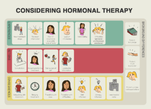
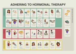

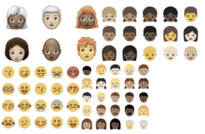
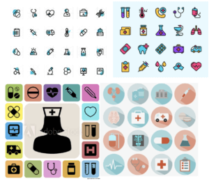
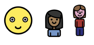
The above images display the original icons and layout that the information was relayed in. To begin my research I used this set of images, created by my client, as a base to work from and to improve on. From here, my research into this project continued by exploring different icons and the shapes used in them. This included the widely used emojis, which are mostly viewed on smartphones and screens. I therefore had to be mindful of the fact that these might not be suitable for the booklet, which needed to utilise larger, more complex, and printable icons. An example is these more unsuitable emojis are seen below:
I then expanded my research to discover other forms of icon design. This led me to explore formats for icons specifically used within a medical context. I kept my research very broad originally to help me explore this area widely, from colours which stood out, to shapes which were appealing; as shown below:
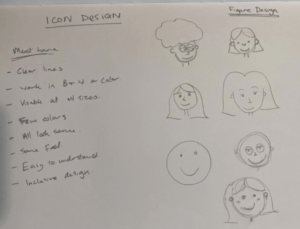
Icons
From this research, I went on to draft a few hand-drawings of how I wanted the icons of people to look. I started with drafting these as I felt they would be the most used and essential to the overall look and feel of the booklet. It was important that these face icons could be easily adapted to be inclusive to all. As such, I tried to keep the detail limited, and incorporate the rounded cartoon features I had discovered from my previous research (as seen below).
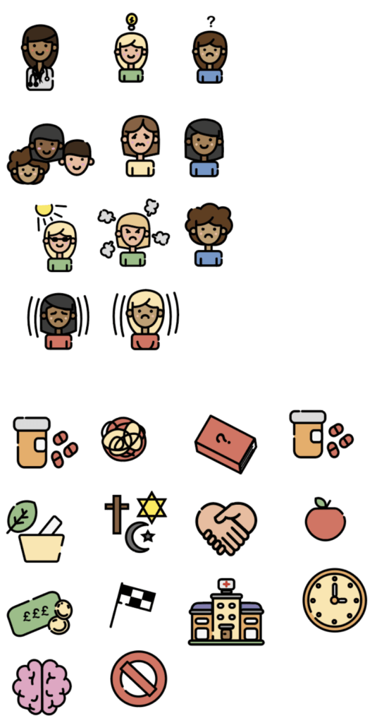
I then went on to transfer a few of my hand-drawn images into digital form, as seen below in the form of Concept 1, 2 and 3. Concept 1 is very limited in its design features, and has taken inspiration from emojis used on phones. This would mean that patients may already be slightly familiar with how these looked, and would therefore find communicating through these easier. However, I concluded that the lack of detail in this concept was too limiting, and may not reflect complex issues well. Concept 2 was designed upon reflection of Concept 1, through increasing detail, then adding some style aspects to be replicated within the rest of the icons. I then went on to create Concept 3, which had more detail and displayed a full body look. I felt this was too complex and may not work so well at smaller sizes. I decided to use Concept 2 as the one to base my other icon designs upon for my booklet. I then developed Concept 2 further to create the final look – as seen in Concept 2 (developed) below as the final icons.
Concept 1 Concept 2 Concept 3
Final Icons
Layout
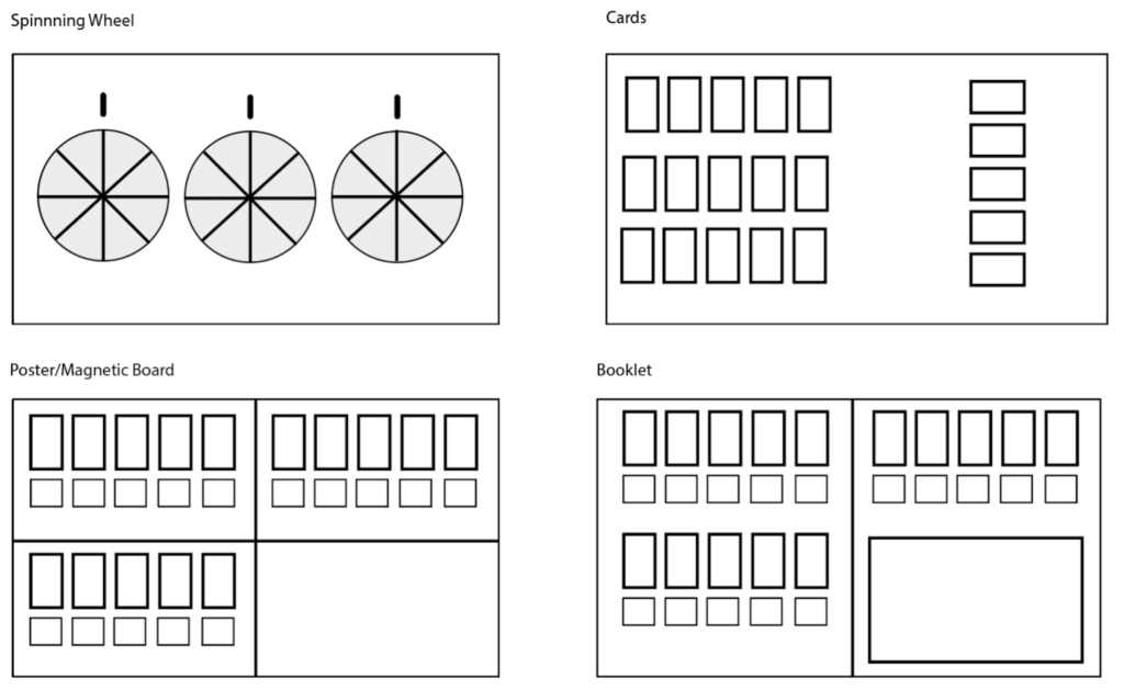
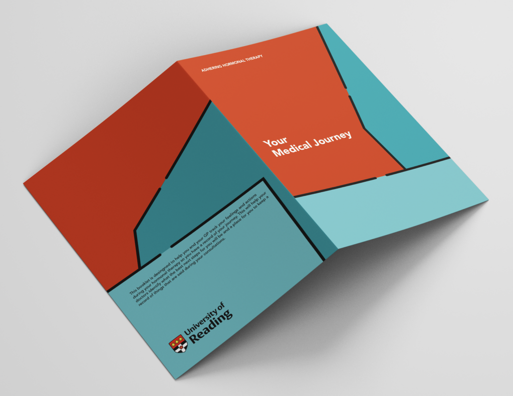
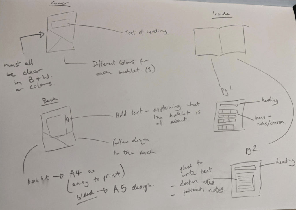
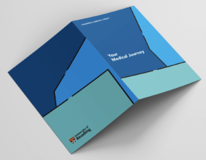
After further developing my Concept 2 to create the final icons, I discussed with my supervisor, Mathew, how best to create a layout and display these most effectively. Originally, my client had portrayed them in the form of a poster, however, they were open to any experimentation (which we discussed extensively) to work out what would suit the patients and doctors best. I designed many different layouts, including a spinning wheel design, a different poster layout, cards, and a booklet (as seen above). My client liked the idea of a set of cards or a spinning wheel best, however, when discussing the practicality of these with nursing students, as well as some research into doctors appointments, I found that these layouts may not be so suitable. The spinning wheel I felt would be too childish and make their symptoms and appointments appear like a game. Similar feelings were felt towards the cards. Another issue with using cards is that they could be easily lost, and when coupled with the expense of printing, it was deemed unfeasible given that they needed to be distributed to both doctors and patients. After this research into the layout, I found the booklet format to be the best for both patients and doctors. I decided to keep this as a format which could be printed on any at-home printing device, hence I decided on an A4 format to be folded into a booklet. The hand-drawn evolved design concept for the booklet can be seen below:
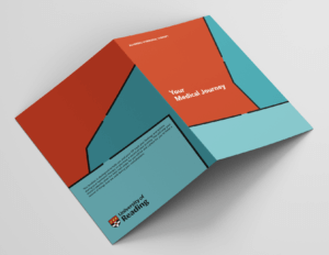
I wanted a design which, when printed, would be clear as to where it should be folded to create the A5 booklet. As such, I went with cover design 2, as this had different shapes on each side which helped display a clear line to fold along for doctors and clients who had printed this file out.
Inside the Booklet
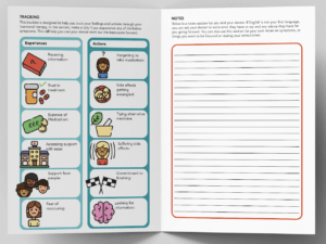
The typeface I decided to use was ‘Avenir’ in Black and Roman. I felt this was easy to read and very clear. From my research, I found that a ‘san-serif’ typeface was best for easy-reading, and as my main users would find reading English challenging, I decided to use this font, which comes in varying forms to create a good hierarchy within the text.
The text I used inside the booklet consisted of:
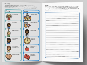
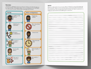
Tracking
This booklet is designed to help you track your feelings and actions through your hormonal therapy. In this section, make a tally if you experience any of the below symptoms. This will help you and your doctor work out the best route forward.
Notes
Below is a notes section for you and your doctor. If English is not your first language, you can ask your doctor to write what they have to say and any advice they have for you going forward. You can also use this section for your own notes on symptoms, or things you want to be focused on during your consultation.
Final Design
The final design of the booklet was then divided into three different designs, depending on the need for them. These different categories were the same as the three original posters supplied by my client, being: ‘Considering Hormonal Therapy’, ‘Adhering to Hormonal Therapy’, and ‘Stopping Hormonal Therapy’. All the booklets also have a main title which is the same for all; being ‘Your Medical Journey’. I felt this name helped best describe what each booklet was for in a broad sense, without sounding trivial.

Reflection and conclusions
I handed this project in on 25th May. However, I feel this project could have taken less time if I had more contact time directly with the client, instead of conveying ideas through his professor. I also had the added difficulty of Professor Donyai going on leave for a period of time, which resulted in slower communication via email. This ultimately meant that whilst all the ideas and concepts had already been discussed face-to-face, finalising the job was very difficult and time consuming. Having said this, I did have a very good relationship with my client’s Professor, Parastou, and when she was not on leave we scheduled regular meetings, and she seemed very pleased with the final work, (although I am yet to hear back from my original client, Ottman). One main obstacle I faced while undertaking this job was the desire by my client to use a layout which, with respect, I felt was inappropriate. I overcame this by compiling further research to present to her, which helped sway the decision as to the final product. From this, I have learnt to not show or discuss all my ideas before I have more thoroughly researched what I am doing. Furthermore, I have also learnt that I should not present ideas that are not practical or fully considered; as it may be better to present fewer, but more developed concepts, in order to prevent the difficulties experienced from happening again.