

Summary
Second Sight is a book publication of Margaret Atwood-inspired works done by Part 3 English Literature students of University of Reading.
I worked alongside Dr. Madeleine Davies – my client – and a student from the Margaret Atwood module, who both edited the students’ entries, while I designed, copyedited, and typeset the entirety of the book. Over 100 copies of the book were printed and published by the University in the first print run. It acted as a souvenir for the students involved, showcased on Open Days, and also sent to staff within the university, staff from other universities, Atwood critics, and Margaret Atwood herself.
A second print run was done due to popular demand, and by request from Margaret Atwood. This was funded by Dr Katja Strohfeldt, the Dean of the school, who was impressed with the whole project.
Restated Brief
After meeting with the client, I was able to gain a better understanding as to what Madeleine’s expectations for this project was. I was also able to ask questions I had concerning the original brief that she provided when I was first assigned to the job. From this initial meeting, I wrote a clearer and more precise brief, detailing what outcomes were expected from this job.
The restated brief for this project was to create a book featuring the collection of works done by the students in the ‘Margaret Atwood’ module in the English Literature course. This project included designing the cover, as well as designing and typesetting the inside spreads. I worked on this book from initial planning stage to print production, allowing me to learn in different areas and stages. We worked with 30 June 2018 as the rough deadline for the printed books to be delivered to the client. This was to ensure they would be ready for the book launch on 5 July 2018.
The main aims and objectives of this project were:
- To design and create a book that showcases students’ literary works
- To make appropriate design decisions in presenting the literary works in a book form
- To make appropriate typographic decisions to fully convey the literature
The roles and responsibilities of my client and I were:
- Client – provide relevant text files, visual files and information to be put in/on the deliverables. Provide feedback on time, so that designers can have sufficient time to amend designs.
- Designer – design the entire book, including the cover, and interior pages. Also to make appropriate layout, and type-setting decisions. Provide print-ready files for client.
The final deliverable of this project were the print-ready PDF files, as well as the printed book.
This project had quite a fast turnaround time considering what the project was. Initially, the book was estimated to be around 70–80 pages. However, it ended up being 170 pages, which meant a much longer time was needed to spend on typesetting each page.
Research
I did some initial research before I started designing and typesetting.
- Research appropriate book cover designs for this type of book
- Research and gain a good understanding of the kinds of texts and literature that will be featured in the book, and be able to make appropriate typographic decisions to convey that
- For the cover, research different typefaces, and typographical characteristics that portray the mood and theme of book contents
The research that I did on these three bullet points all contributed to my design decisions.
Design
Cover
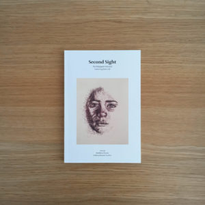
The artwork featured on the cover was decided straight after finalising the title of the book, as the client felt that it was the most appropriate piece to reflect the title. This illustration was done by one of the students in the ‘Margaret Atwood’ English Literature module. I decided to frame the artwork by placing it in the centre of the cover, allowing generous margin space, and space for the title and editors names. I thought that this use of space and layout would keep the cover clean and bring focus to the artwork and title, which was what the client wanted.
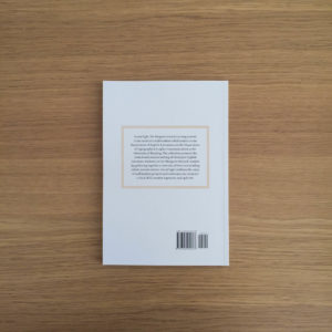
For the back cover, I wanted there to be a link with the front, so I framed the blurb with a border the same colour as the artwork. This helped create a stronger visual tie between both the front and back cover. This detail was well-received, as the client’s students had noticed it and were delighted to spot it.
Inside
It took quite a while to typeset everything due to the varying writing styles and structures of the English students. I found it a challenge to ensure consistency without altering too much that it changes the students’ writing styles. An example was that there were two pieces that were structured like a recipe. However, one piece used numbers and bullet points, whereas the other one did not. Other examples of pieces that had inconsistent stylisation were the pieces that were written as interviews. In the end, it was agreed between my client and I that we did not standardise said styles, and just kept them how it was written. This was because it was considered part of the English student’s writing personality, so it would be wrong to change it. However, I did tidy up the pieces through in-depth copyediting.
The book is split into different sections relating to the Margaret Atwood book that the students’ piece were related to or inspired by. To indicate the start of a new section, I set the Margaret Atwood book title on a page of its own, allowing for a clear break in between pages of text. Above each title, I also created an illustration of an eye. The open eye motif was to symbolise the start of something, and also links to the title, Second Sight.
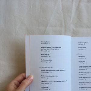
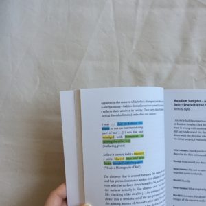
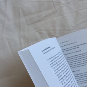
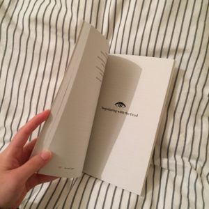
Image treatment
There were six photographs within the inside pages (excluding cover image). These were all printed in colour except one greyscale illustration.
Production
We established the paper stocks and paper weights that were going to be used in the early stages of the project. This allowed me to provide a spec quite quickly for the print job. The final spec was:
Inside pages
140mm x 205mm portrait
Cyclus Offset 90gsm
172pp
1/1 + 7pp in colour
Cover
Cyclus Offset 250gsm
4pp
4/0
Perfect bound
The final files were sent to press on 11 June 2018, with intentions of allowing sufficient time for the books to be printed and bound before delivery by 30 June.
Reflection
Overall, I found this to be an amazing experience, as it helped me develop my typography, copyediting, InDesign skills, print production knowledge, and time management. I learnt a lot from my supervisor, Eric Kindel, who taught me a lot on typographic details and copyediting. Towards the end of the project, we went through every page of the book to flag up any issues, and he was able to provide insightful feedback on them. This project has definitely made me appreciate typesetting and the attention to typographic details a lot more.
One challenge that I faced whilst working on this was working to the ‘deadline’. The 30 June 2018 deadline was not originally set, as it was unclear as to when Madeleine and her student would be able to finish editing the work and prepare the copy for me to start typesetting. This led to a bit of a rush towards the end, as there was a rush to send the final files to press before the client’s funding expired. The reason for the rush was due to the fact that I was not notified in the beginning that the client’s funding had to be used by mid-June. When that was brought up to me, I had to rewrite the time schedule, so that the book was ready to go to press as soon as possible. This caused a reasonable amount of stress and added pressure, but I managed to get all the work done on time.
Asides from that, I thought this project was a success, and an amazing experience. My client was incredibly pleased with the outcome, and gave very positive remarks through email correspondence, as well as during the book launch. I was unfortunately unable to attend the book launch, but Eric and James were able to represent the Department of Typography & Graphic Communication. Below are some quotes taken from Madeleine to express her thoughts towards the book, and the success of the project:
“June, Atwood’s approval of the book is a real triumph. I wanted you to know this, to thank you again for all your amazing work, and also to let your supervisor and James know that the project has had such starry impact.”
“Colleagues in other unis are also asking for the book, and Coral Ann Howells (the star of Atwood studies) has listed the book in her ‘Cambridge Companion to Margaret Atwood’ bibliography.”
The book received a lot of praise and comments from various people. Margaret Atwood herself reached out. Professor Emerita Coral Ann Howells – a predominant critic on Atwood responded to the book as well.
Here are some more responses from people who have received and read the book.
“The volume looks fabulous … I’m really interested in the kind of student project that has produced such a professional looking text, and I suspect I’ll be coming back to you with questions about how it all worked.” – Dr Fiona Tolan, Liverpool John Moores
- shows that it has inspired others to want to do the same
“My CRI groups loved ‘Second Sight’ and several asked whether it is available in the library? Is it? Or could they buy a copy from you?” – Debbie Bark, UoR colleague
“I am so proud that the book is such a success” – Hannah Ralph, student
“There’s even been some sweet Facebook posts saying things such as ‘Margaret Atwood has seen my work!’” – Sophie Harrington, student
- shows the student contributors’ responses to the book
Furthermore, Second Sight was entered for the University Collaborative Awards for Teaching & Learning of 2018/19, and was the winner of the award.
Post-project
Though the deliverable has been handed over, Second Sight continues to open up opportunities of mini projects branching from the book. I was contacted by the client again to create poster-sized covers of Second Sight, which are to be printed and displayed in the corridors of the university buildings for publicity, and showcasing our achievements made through this project.