
Background
Kaffee Haus advertise themselves as ‘proprietors of amazing Artisan Coffees expertly roasted in Nottingham’. The company is owned by Daniel Wright and Alexei Lambley-Steel and as was established as a limited company in 2016. They produce coffee bean blends and are sold in different weights with respect to different brewing methods. The blends are comprised of various coffee beans from around the world including Peru, Columbia and Honduras. Our first meeting established their core audience as millennial-aged (21–35) coffee drinkers.
Restated Brief
Initially, Alexei and Daniel gave us a brief to create a ‘rebrand/new logo for our online Artisan coffee business.’ with the potential for this to extend into a new coffee packaging labelling design. The logo would be the new face of the company featuring in not only the website and packaging but with the potential to move into a coffee shop logo. The client requested that the design was both modern and catchy, this is with the desire to appeal to the generation ‘Y’ customers.
Research and ideation
To gain knowledge of the project at hand, Phoebe and I spent some time researching the brand. After this took place we join a call with Alexei and Daniel who explained to us their expectations of the project and their hopes for what we can deliver. Their subtle Germanic theme was an area that needed further research. We also took into consideration the needs of the audience, which in this case is millennials. Most millennials subconsciously sway towards contemporary designs and the highest looking quality for the lowest price. After this, we compiled our research into a mood board (figure 1), which was then sent to the client to obtain feedback as to whether the style was of their expectations and taste. After understanding the brand, their hopes for the rebrand and the current market we had an understanding of the direction this project would take.
![]()
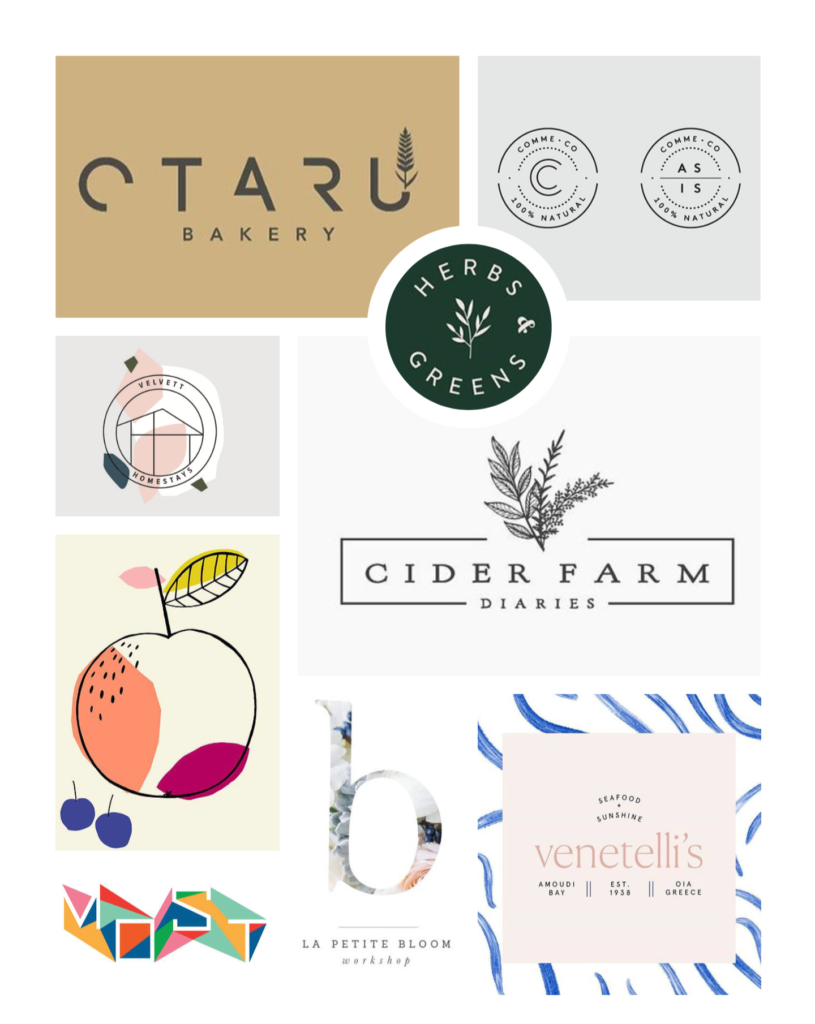
Figure 1 – Mood board of research compiled and sent to the client.
Design Development
Logo
The client’s first request was for the company to see a rebrand, we advised that this was a wise choice, as the decisions made in regards to branding will inform all other deliverables. The direction Alexei and Dan wanted to take the rebrand did see some changes throughout the process. Initially, they hoped to have an ‘edgy’ logo that alluded slightly to their Germanic sounding name (as seen in the sketches in Figure 2 and the mood board set out in Figure 1).
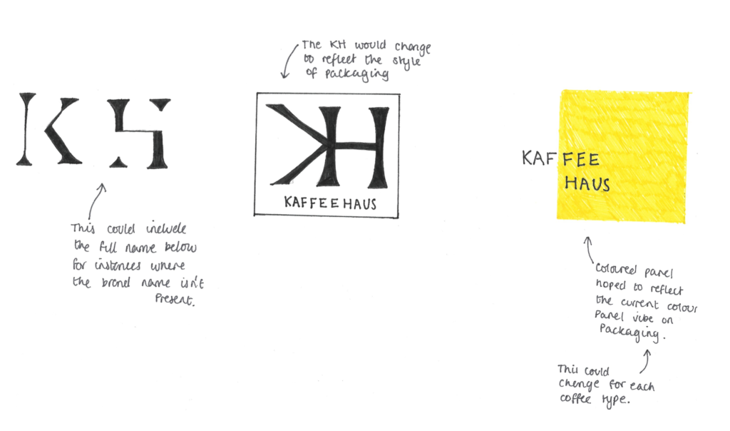
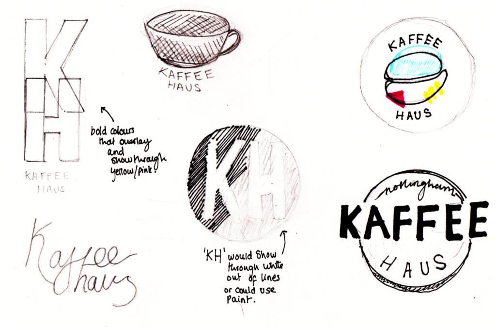
Figure 2 – Initial logo sketches that were drawn and sent to the client.
However, in a move to add a more classy atmosphere to the company, the client asked us to take a new direction with the brief. Their new marketing strategy hoped to have branding that demonstrated a premium brand. After this move, we spent a lot of time sketching and developing the idea (Figure 3).
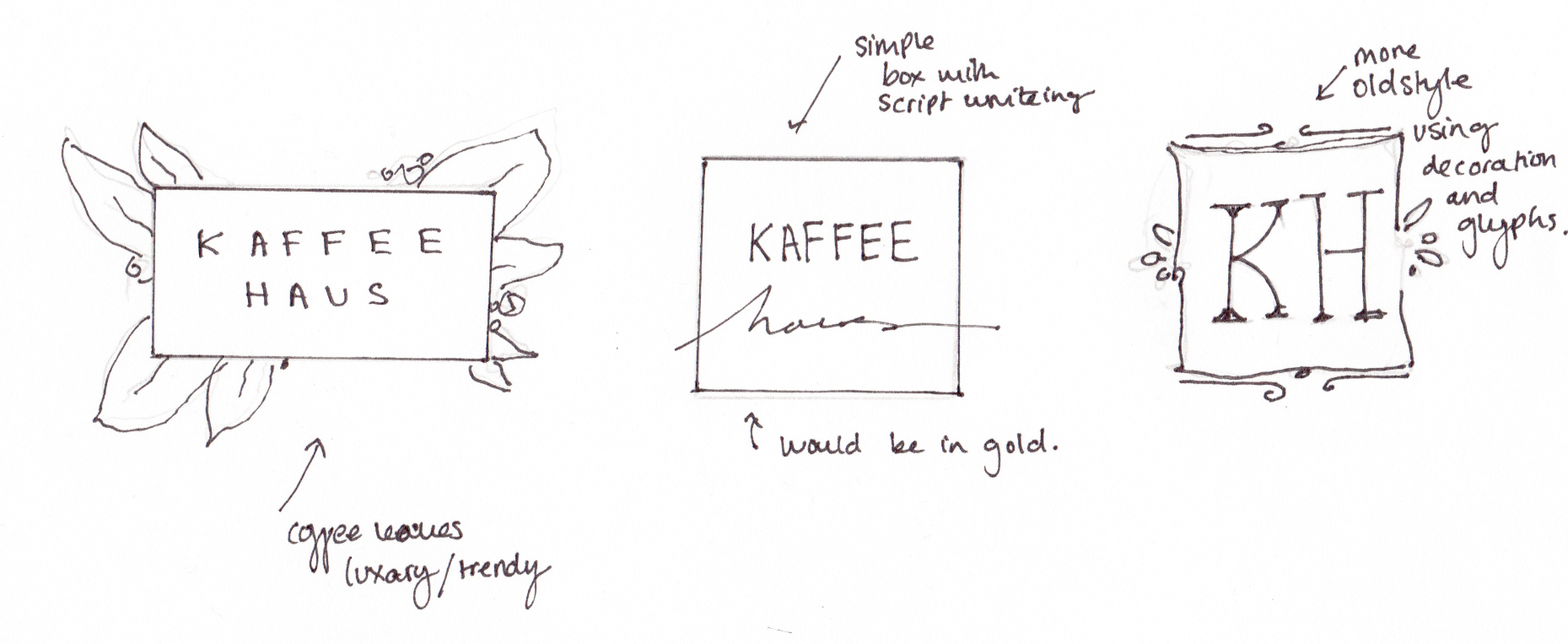
Figure 3 – Initial logo sketches that were drawn and sent to the client.
We are still in discussion with the client to decide on a final logo. The client informed us of their favoured logo (figure 4), yet our supervisor raised some flexibility issues in regards to their chosen logo. Therefore, we presented a simplified logo (figure 5), which removes many complications but does not quite meet the vision of our clients. Ergo, we hope a compromise will resolve these issues.
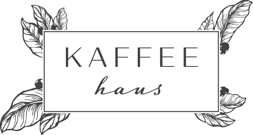
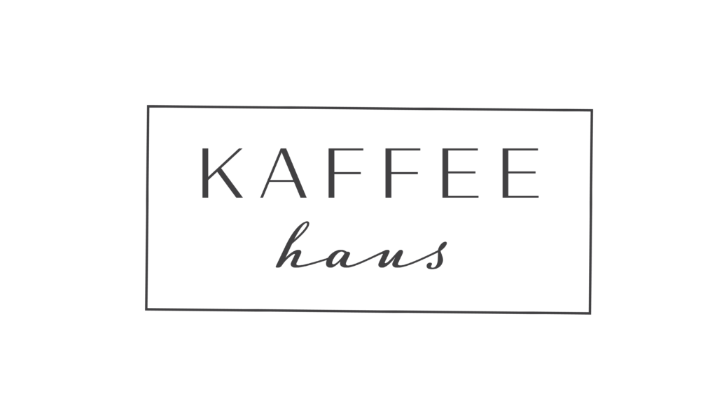
Figure 4 (left) – Clients favoured logo.
Figure 5 (right) – Simplified logo.
Packaging Labelling
After progress was made on the logo design, work began on the packaging label. As the favoured logo concept was produced by Charles, his main focus was on the logo design while Phoebe’s main focus was on the packaging design. Having said this, it is important to know that work was not done mutually exclusively and design decision were regularly made together. The ability to allude to the ‘edgy’ style came into play when designing coffee bean labels (figure 6).
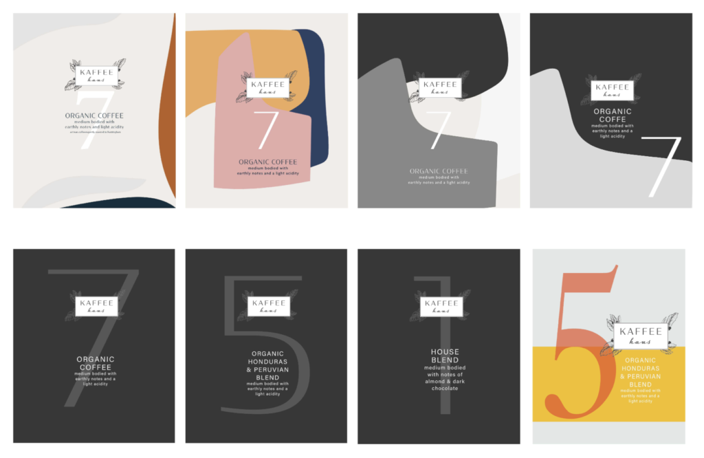
Figure 6 – Initial coffee bean labels.
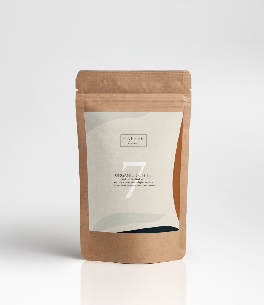
The client favoured the first design, with a few minor alterations. To be certain the label is effective, every alternation made was printed onto a coffee bean bag, this helped to ensure, spacing, size and colours were correct. Hence the small alternations to the spacing of each of the elements. The most recent editions of the label (figure 7) features the minimalised logo and will change when a finalised logo is established. Besides the logo, the label design has been signed off by the client.

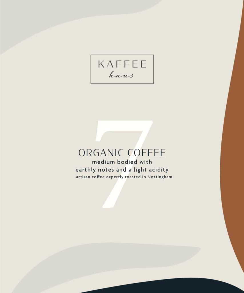
Figure 7 – Favoured coffee bean label.
Reflection
Regular communication with our client allowed us to overcome any challenges we faced and we hope this continues. Due to the busy schedules of both the client and ourselves, our timeline outlined on our restated brief was not closely followed. However, this was not an issue as our client emphasised their requests to have a high-quality logo over a restrictive deadline. One instance that caused a delay in communication with the client was due to Charles being involved in an accident. Although this caused a delay, the client was very understanding. Thankfully, during this time Phoebe was still able to work on the packaging label designs which allowed the progression of the project to continue.
Furthermore, the process has pushed both Phoebe and me to consider the durability and flexibility of each of the designs we create, in order to not only meet the requirements of the client but to allow the design to be versatile and not limited in placement, size and colour.
We are both proud of the work we have produced so far. The opportunity to learn more about the design process has been invaluable. The positive relationship built with the client is a testament to their contentment with the process, communication and outcomes.