
MEETING THE CLIENT
Once this job was allocated to us the first step was to contact the client. This job was part of an initiative of The University of Reading carried out by the University’s Centre for Quality Support & Development. We contacted Nicky McGrr (Open Online Course Project Manager) part of the University’s Study Advice team in order to set up our first meeting in which the client, roughly introduced us to the project and explained what our contribution would be (three videos). After reviewing our notes from that first meeting and getting a general idea of the project and the deliverables we gathered a list of questions or things we needed in order to have a complete and clear brief (see below)
Questions we have/things we need:
- We need a specific deadline date
- We need a list of the main illustrations for each video
- We need a document specifying the content of the three videos not only for the sake of their structure but also for our understanding of each topic
- We would like to have the video examples we talked about in our first meeting for inspiration
- Is there a structure for the video you are especially keen on?
- What is the audio for the videos? Will it be provided?
Following this meeting, we met with Yen Tu (Assistant Digital Learning Producer) who oversees the illustrative aspects of their courses. From this moment on we mainly met and reported our progress in the project to her. In our second meeting where we were able to ask the questions raised after our first meeting. Shortly after discussing the project with Yen Tu and the rest of the team, the client provided us with a written and more complete, focused brief, which also included further background information about the overall project. We then considered carefully the brief and its objectives and agreed on everything except for the deadline, which we thought left us with a very reduced time span to make changes. We then spoke to the client and moved the original deadline they suggested (31st of July) to the 14th of August. See final brief below:
THE BRIEF
Study Smart: Your Essential Guide To University Study
Background Information
The University of Reading created a 3-week online course: ‘Study Smart: your essential guide to University Study’, to be hosted on the digital learning platform FutureLearn. The aim of this course is to support the student’s transition to learning in Higher Education by helping them reflect on their previous learning, introduce them to the different expectations and styles of learning, and being part of an academic community.
The course was scheduled for launch in early September to coincide with the new student intake. The primary audience were first year undergraduates who are about to commence studying at the University, though it could also be used by any student as a reminder/refresher.
Objectives
The objective is to create three animated videos, approximately 2-3 minutes long. The Study Smart team intend to include one animation per week, to represent the following principles:
Week 1 – Constructing citations
Week 2 – Communication at University
Week 3 – Learning at University
Inspiration
The feel of the course is to be informative and exciting for students to watch, the client provided an example of a video for inspiration (https://www.youtube.com/watch?v=_6xlNyWPpB8). However, the client made it clear that this material was to serve as inspiration and that they did not expect the same style as they wanted us to be innovative and creative with our ideas however they were keen on the two dimensional style of the illustrations in this video
Content for videos
The Study Advice team also drafted a sample script for each week, in which key points for each video were pulled out to outline the basis of each video. These sample scripts were edited later on the project when necessary
The client also agreed to provide the full recording of the voiceover of the academic, Michelle Reid, who provided all of the voiceovers to help set the pace and tone of each animation.
Dates
All illustrations to be completed- 17th July
Week 1 animation – 24th July
Week 2 animation – 31st July
Week 3 animation – 7th August
Animations to be completed- 14th August.
THE DESIGN PROCESS
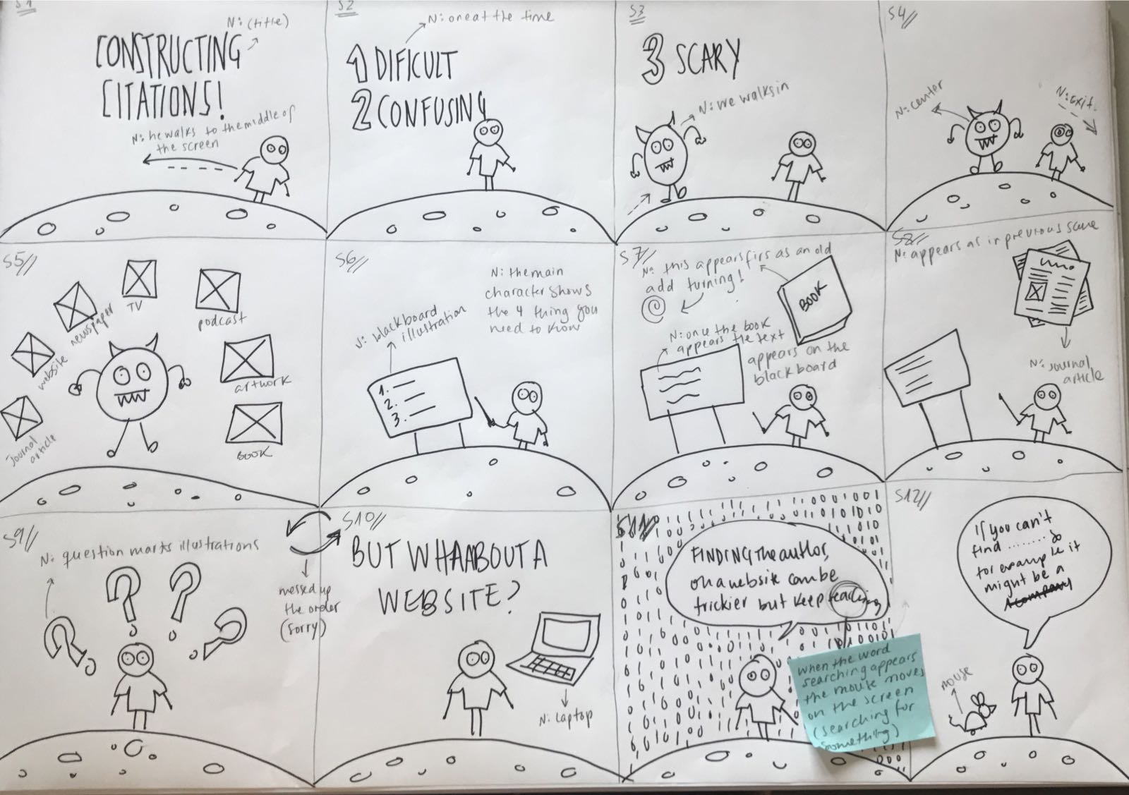
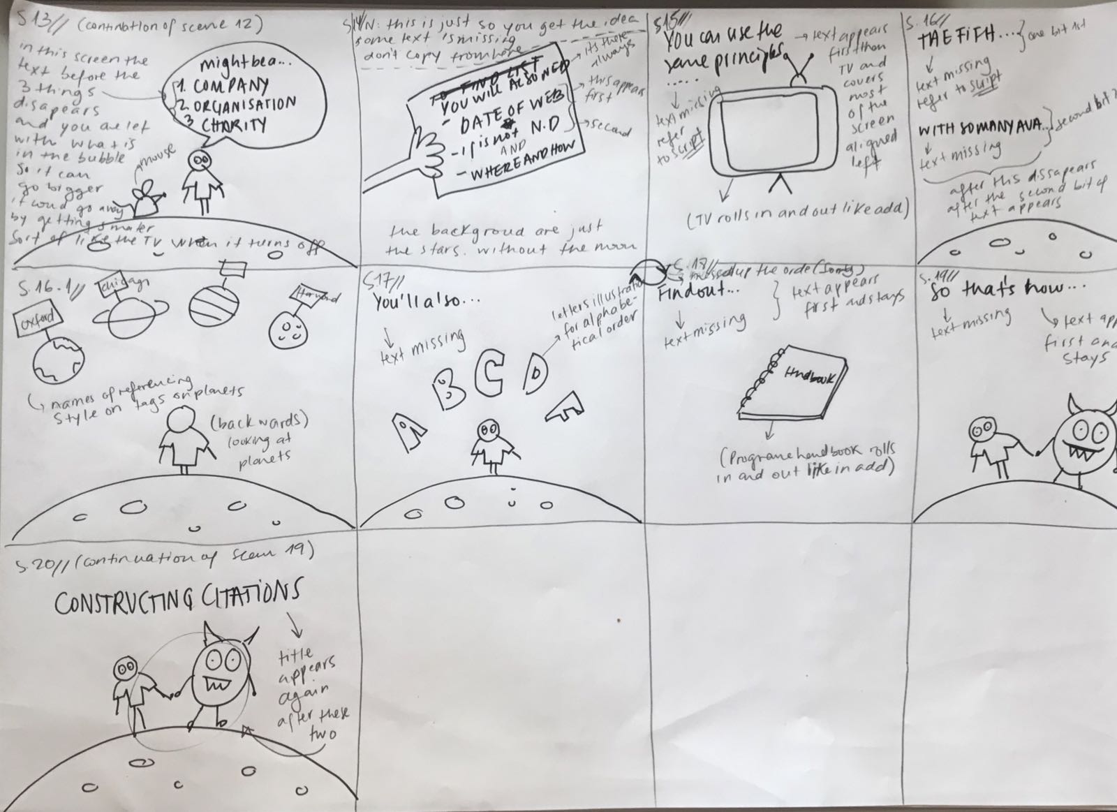
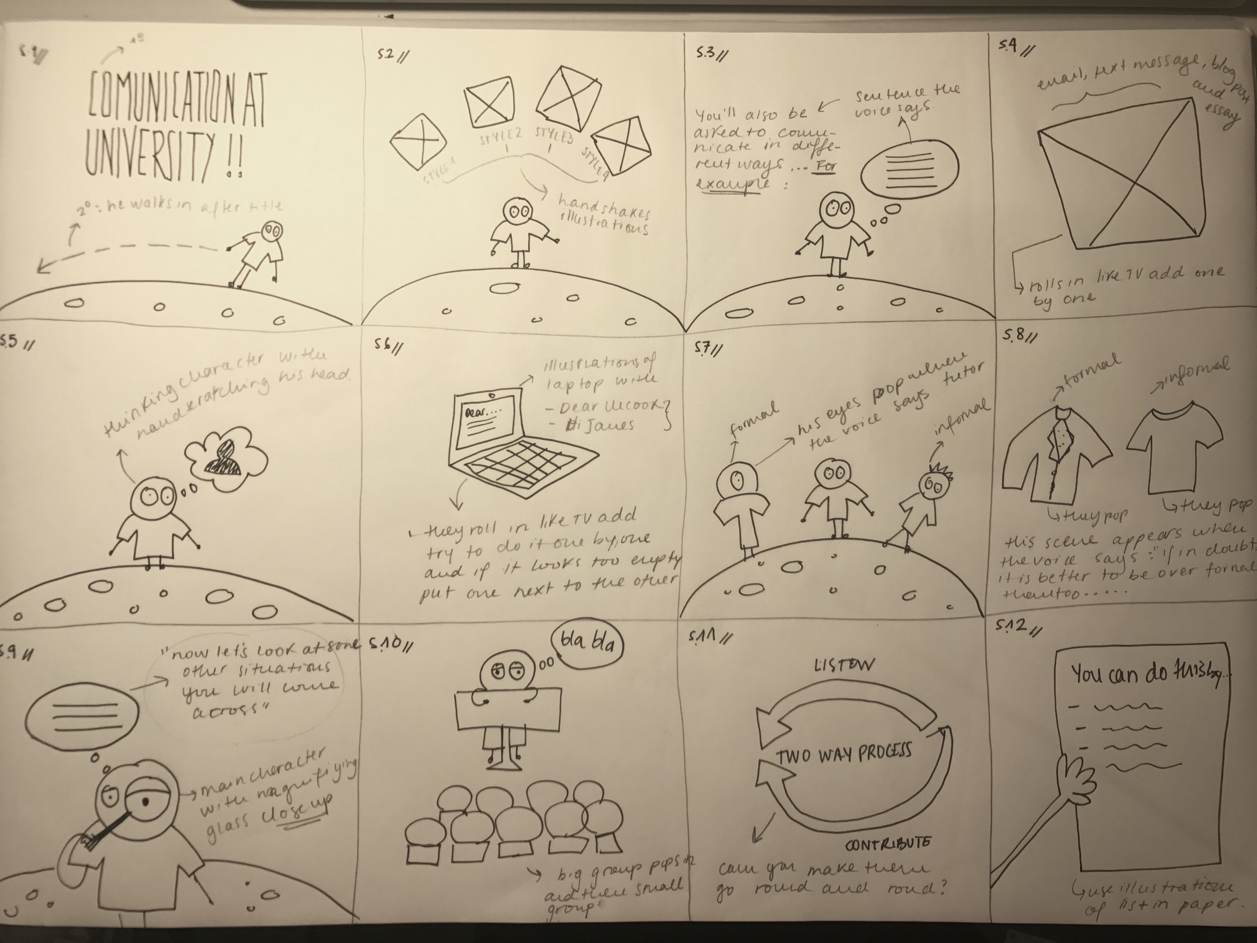
Once the brief was reviewed and agreed on the client sent us 3 tables, one for each video in which they suggested a series of illustrations could potentially go along the voice over of each video. This way of breaking down the videos was very helpful for us as it allowed us to create a list of illustrations for each video as well as creating a detailed story board for each animation. It could be argued that the story boards (see images below) were our way of visualising these tables and making any changes to them if necessary or more convenient for the overall flow of the video.
Video 1
Video 2
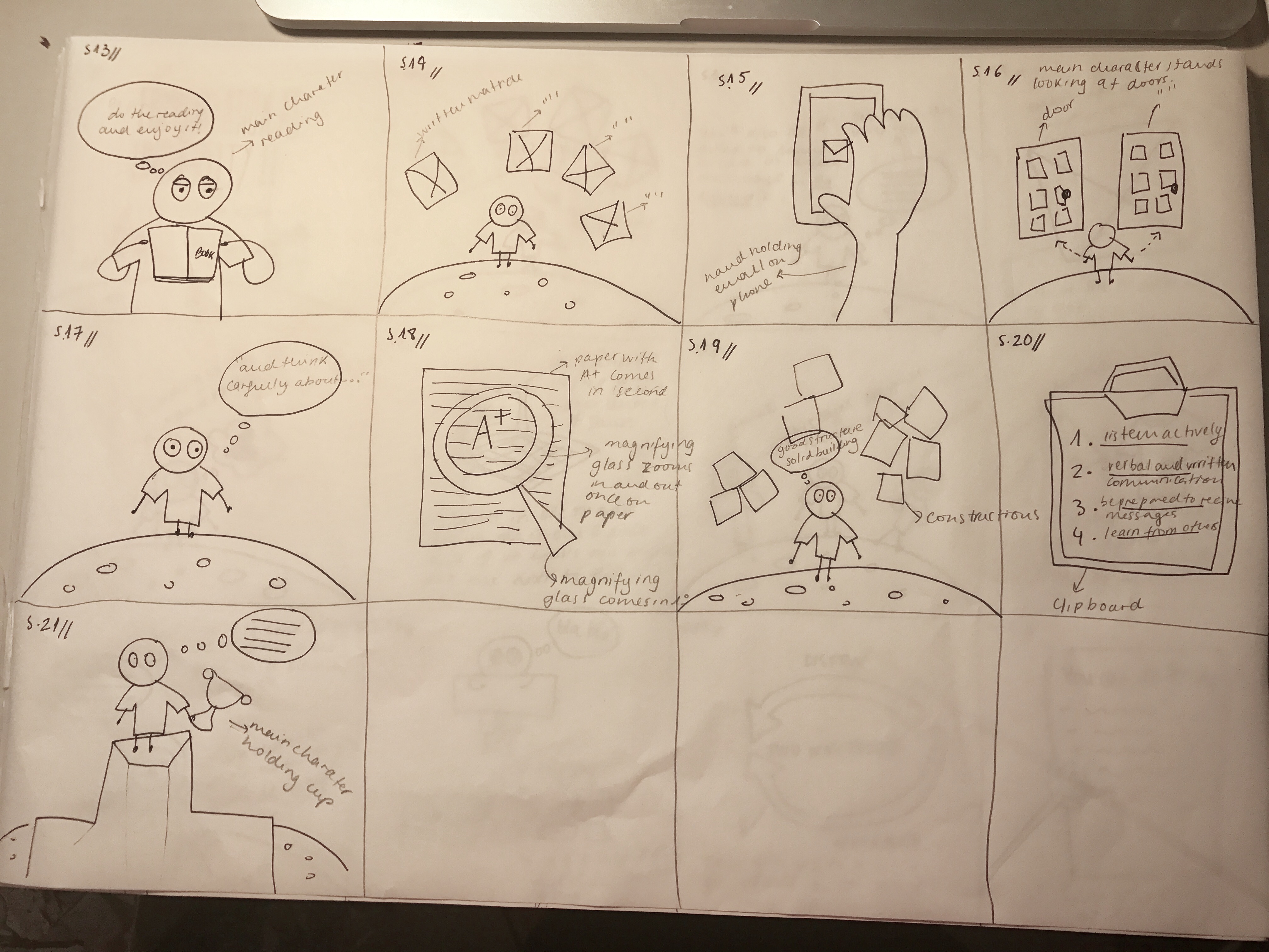
Video 3
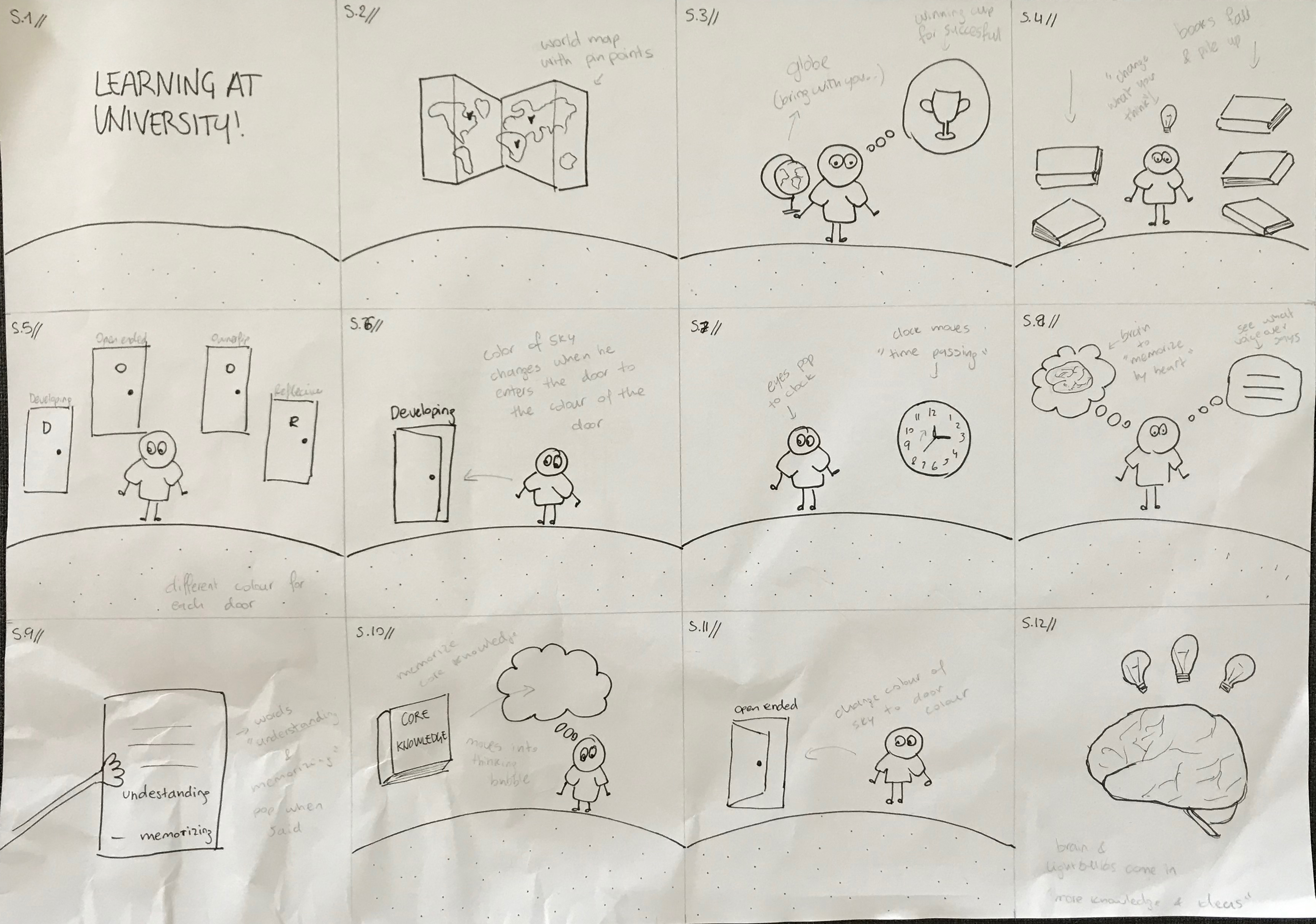

Due to the nature of the three videos, we created three different scenarios in which the main character takes the viewers through all they need to know on each topic through visualising what is being said by the voice over.
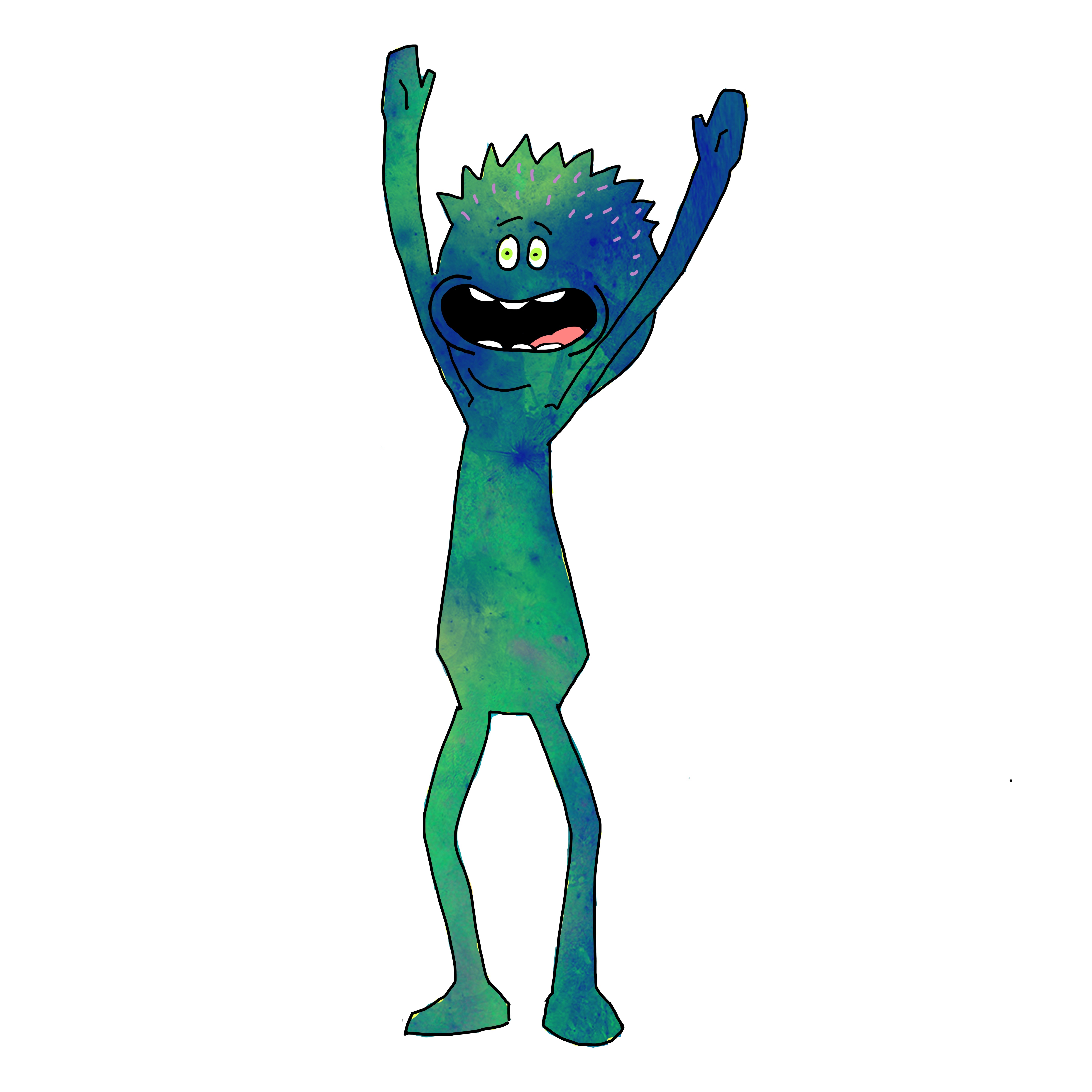
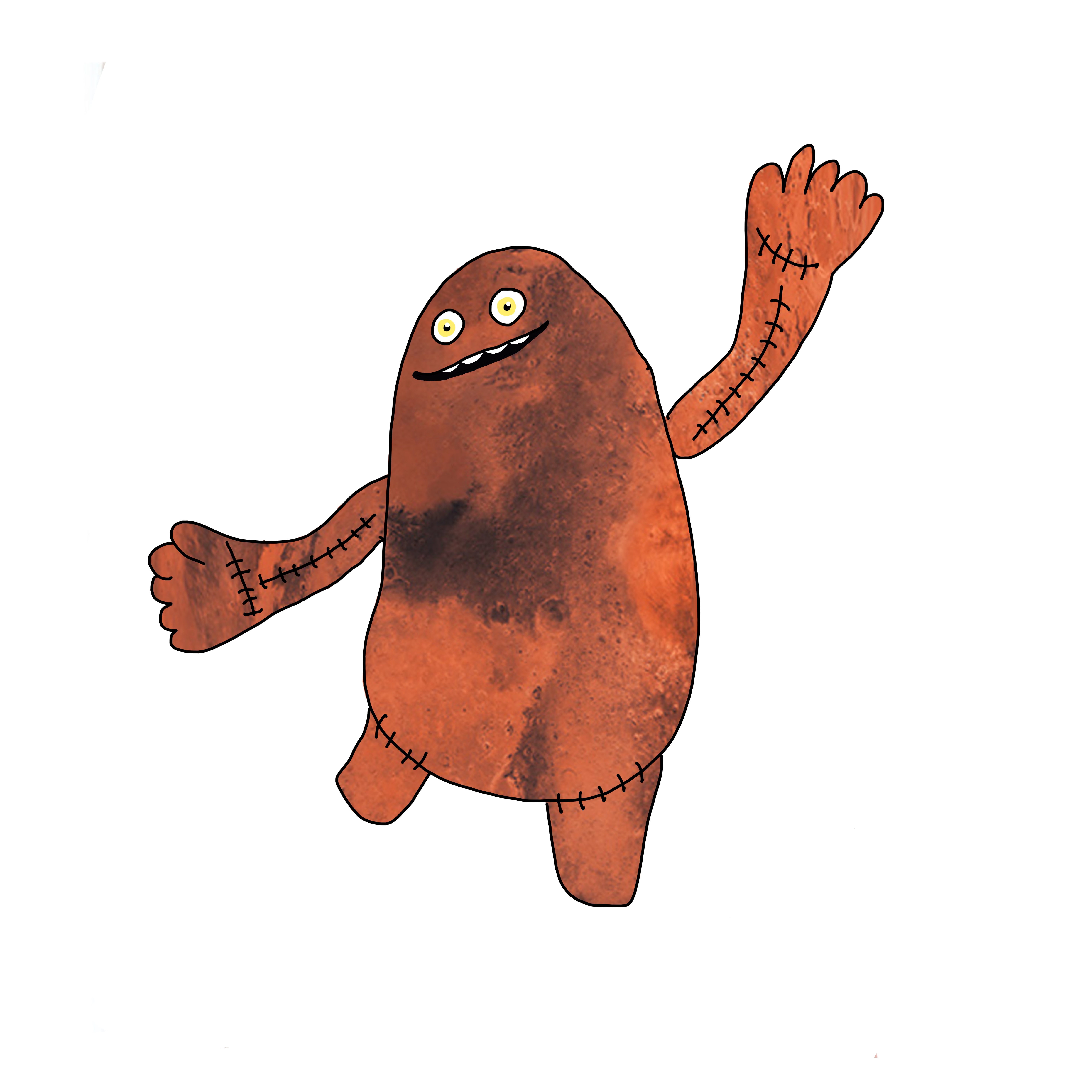
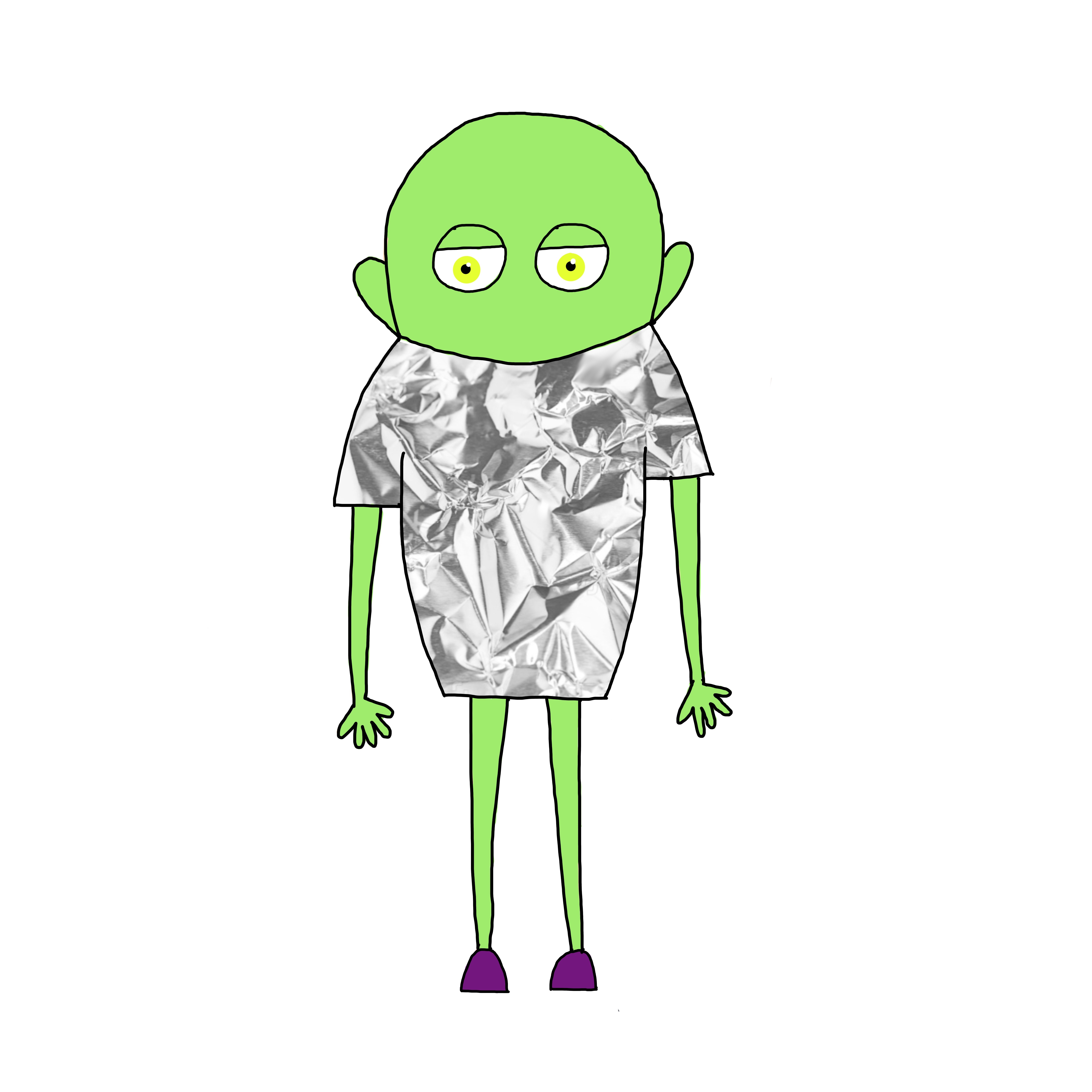
The client suggested they preferred a simple, however, colourful animation style where flat colours would be employed. The first step in the process was to design the main character who would stay the same in all three videos. We suggested using a robot or alien-like character to avoid gender specification. The first main character, however, was not approved by the client and therefore we kept exploring other routes such as other robots, a monster or an astronaut. (see images below).


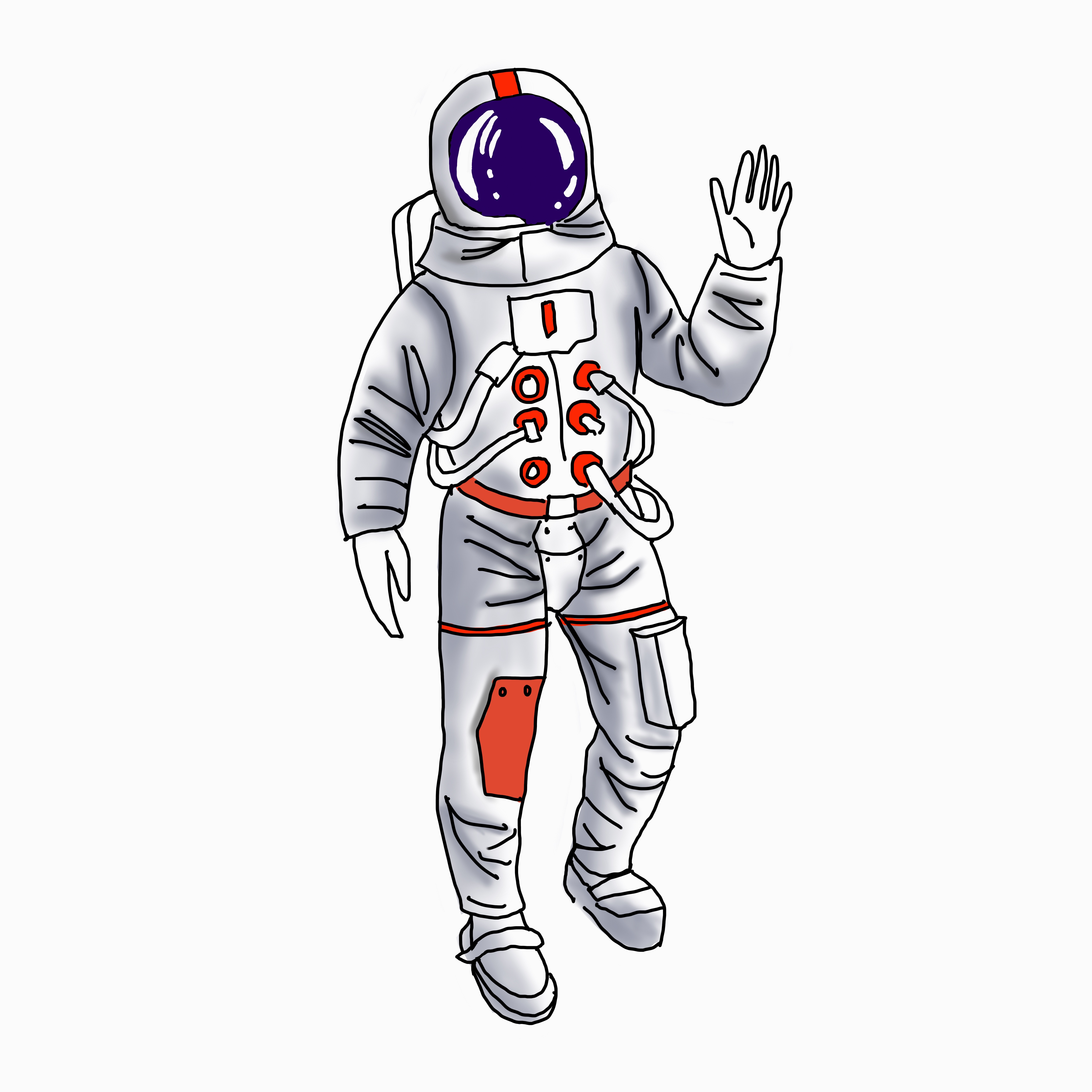
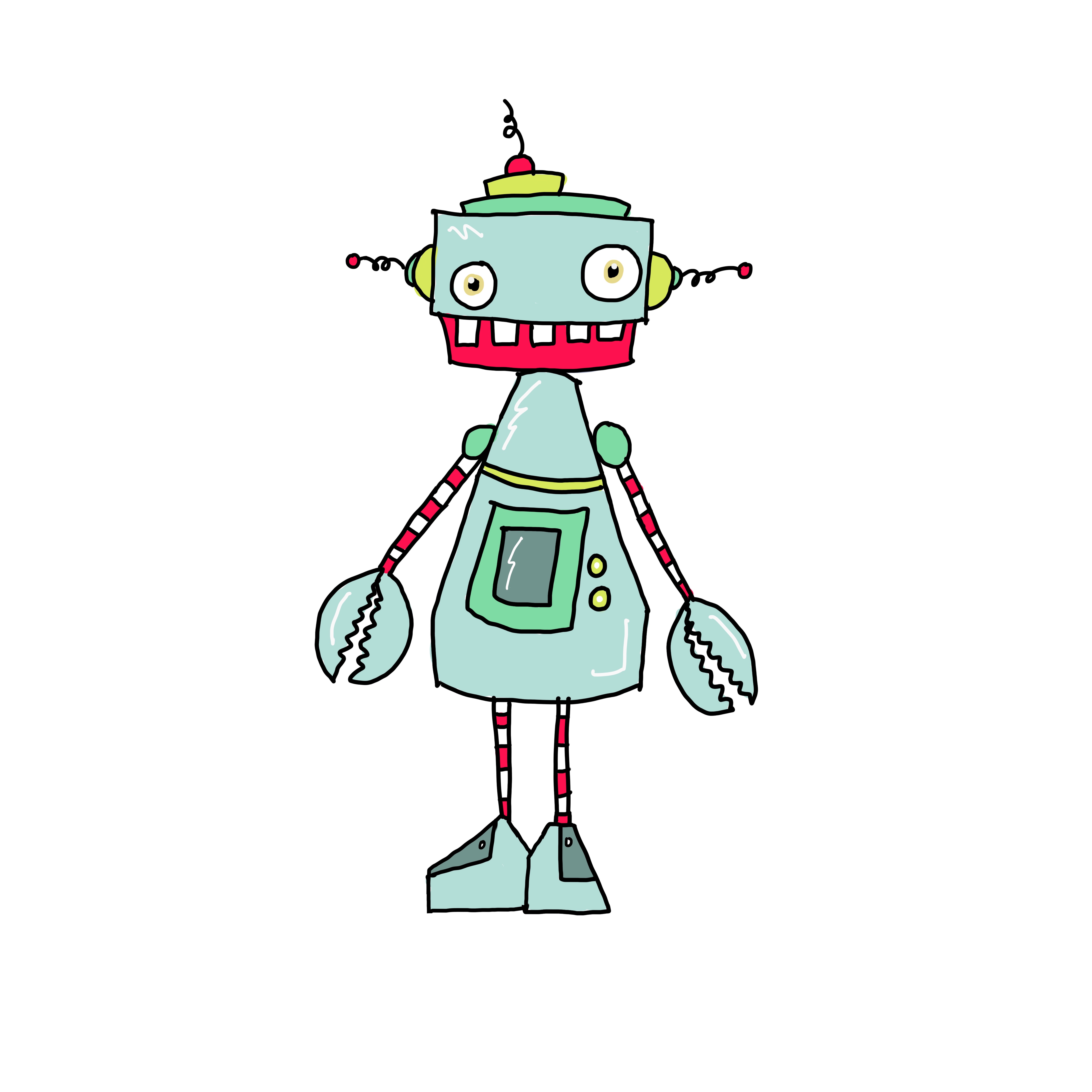
However, after sending these illustrations to the client their feedback was that, despite they were keen on the idea of having imaginary scenarios and characters for the videos, they preferred a more human-like main character which would still remain non-gender specific. Much like the character used in the TedTalk video they provided as inspiration. The client also asked for the main character not to have a real skin tone as well as any features that could make him more relatable to a specific race or gender, such as hair.
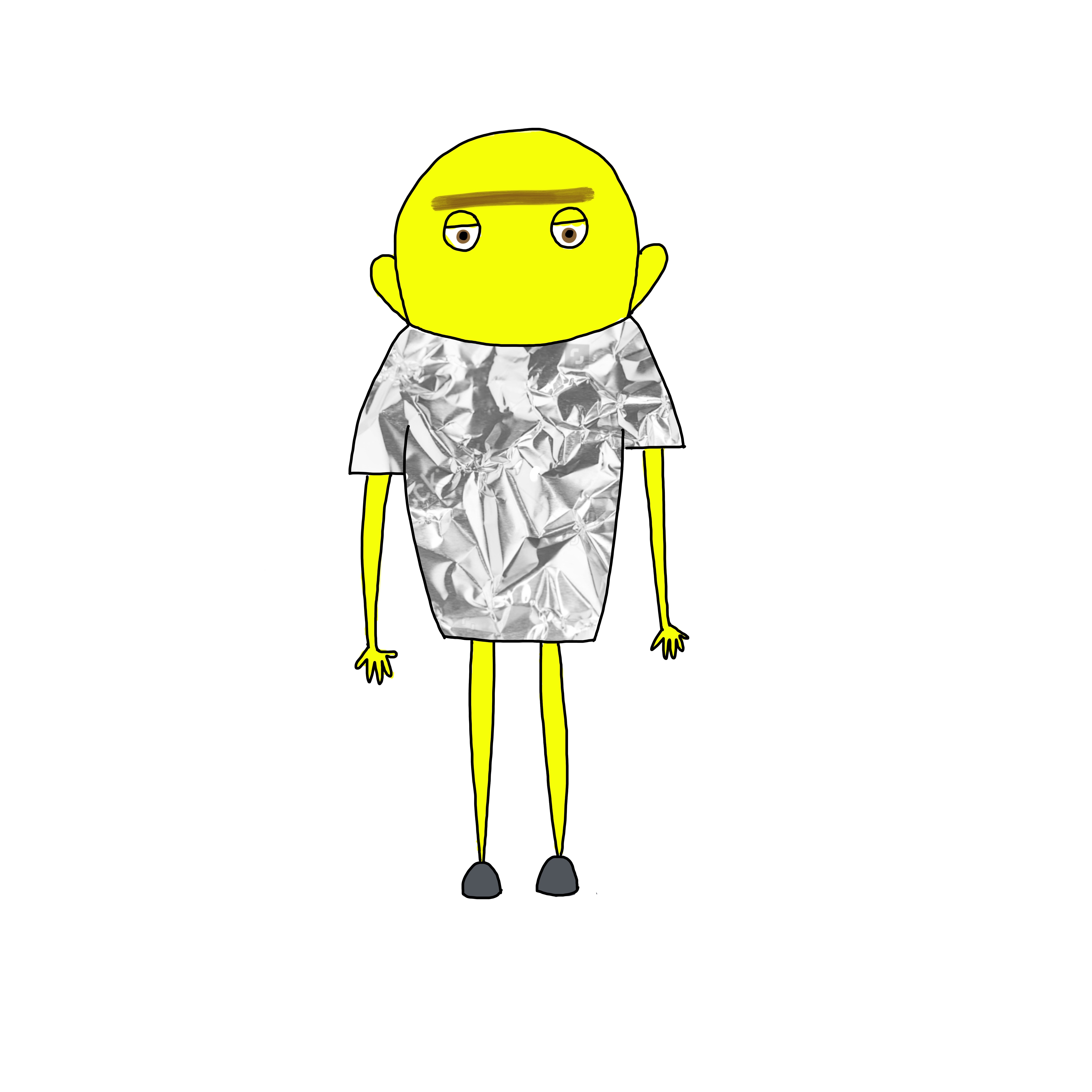
After receiving this feedback other options for the main character were designed (see images below ) and we suggested the inclusion of texture in some of the illustrations in order to contrast that flat solid colour feel of the illustration style.
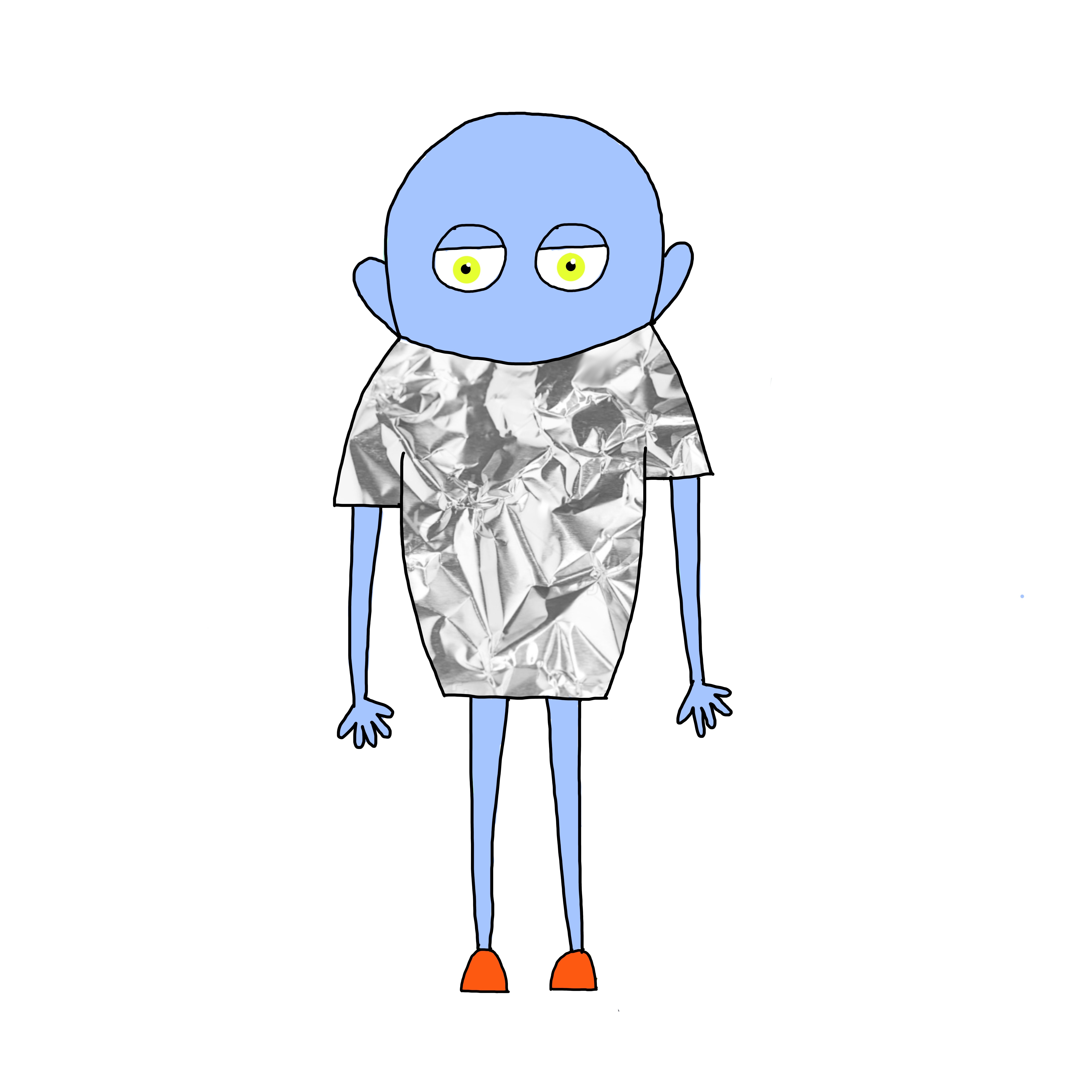
The feedback received from the client after sending these other options was that they were very keen on the use of texture, however, they specified they wanted the main character to be quite simplistic, having a more stick man like appearance. Therefore we took a new approach to designing the main character (see images below ).
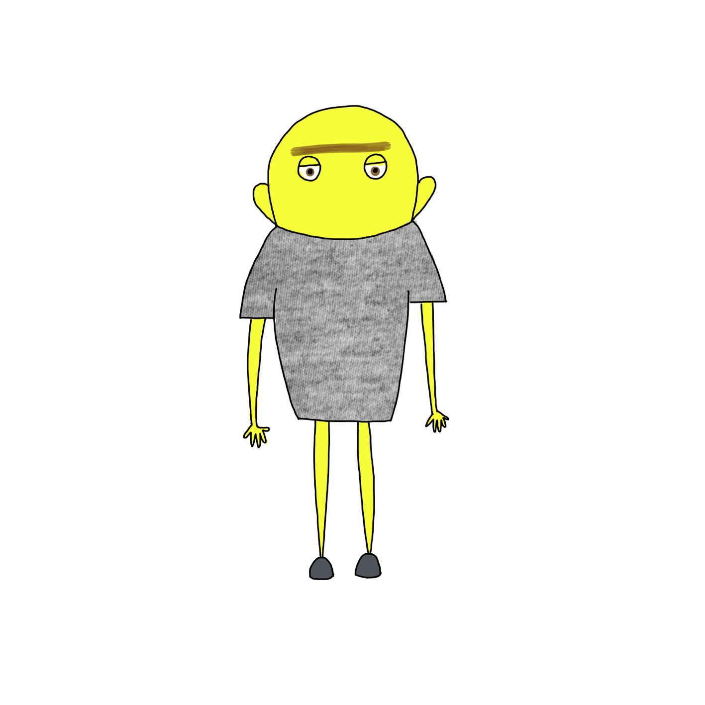
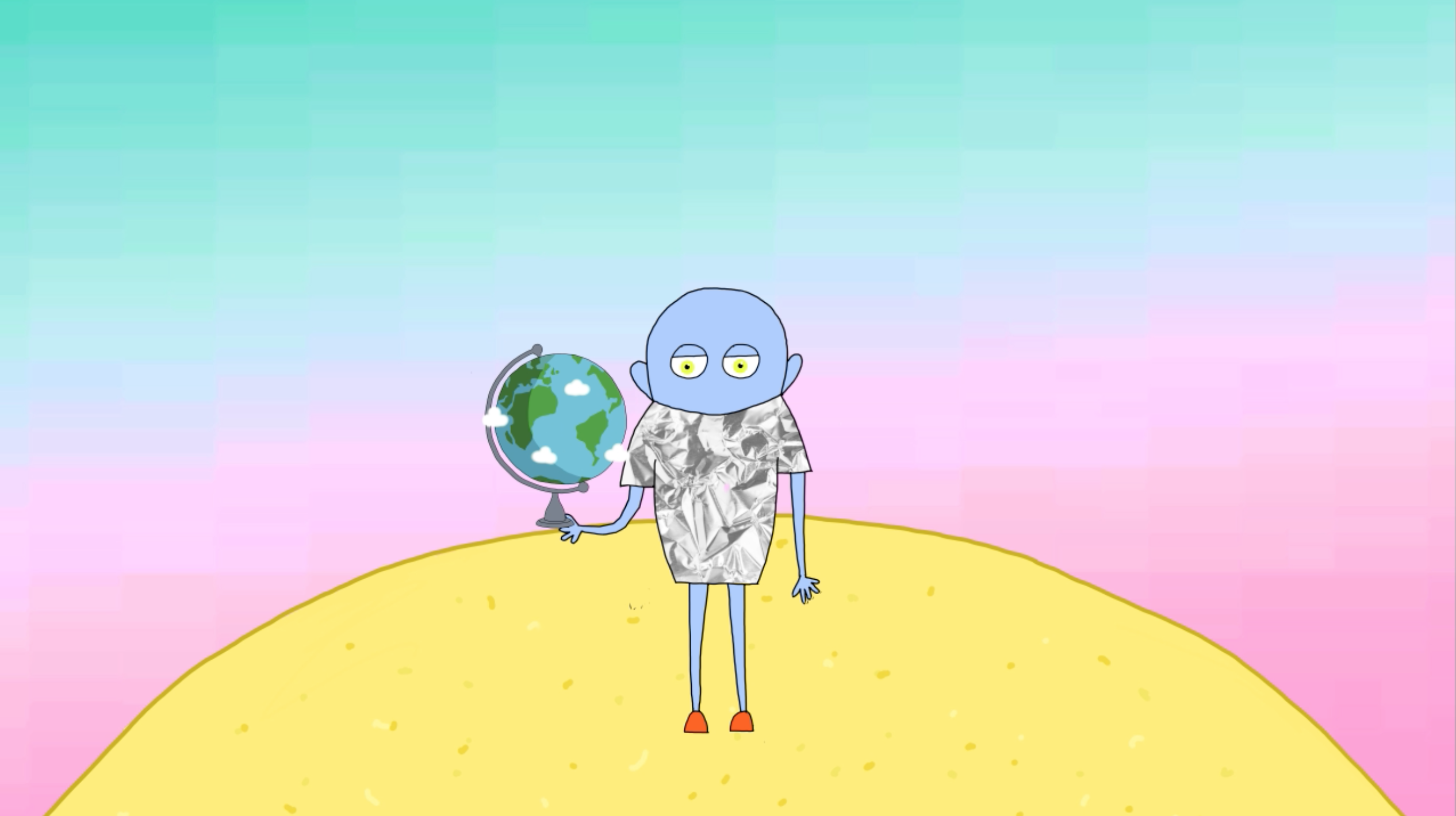
The client was quite pleased with this new more simplistic approach which we developed to reach the final design for the main character. We created two final options (see images below). However, the client preferred the blue skin tone as it was less alien-like.
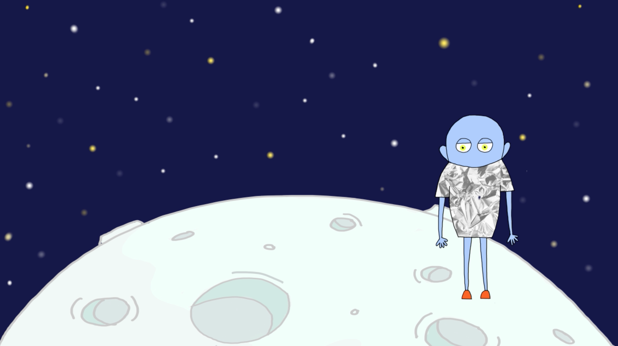
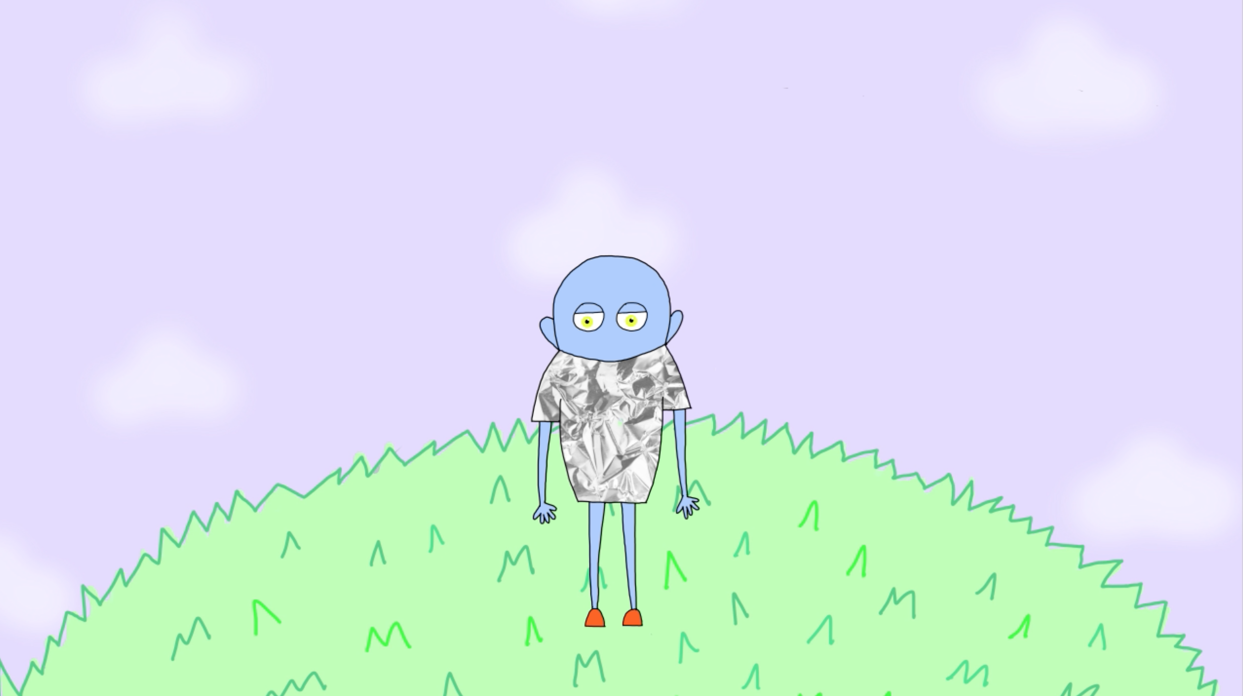
To differentiate the videos between one another, as they have the same main character, we gave each of them a different background, keeping, however, the same style and theme. The background is always a planet with the sky behind it. Both the planets and the skies have different textures and colours. (see images below).
The fact that the client provided us with the three voice overs from the start, made the process simpler as it allowed us to accurately time each action in every scene.
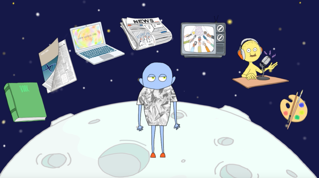
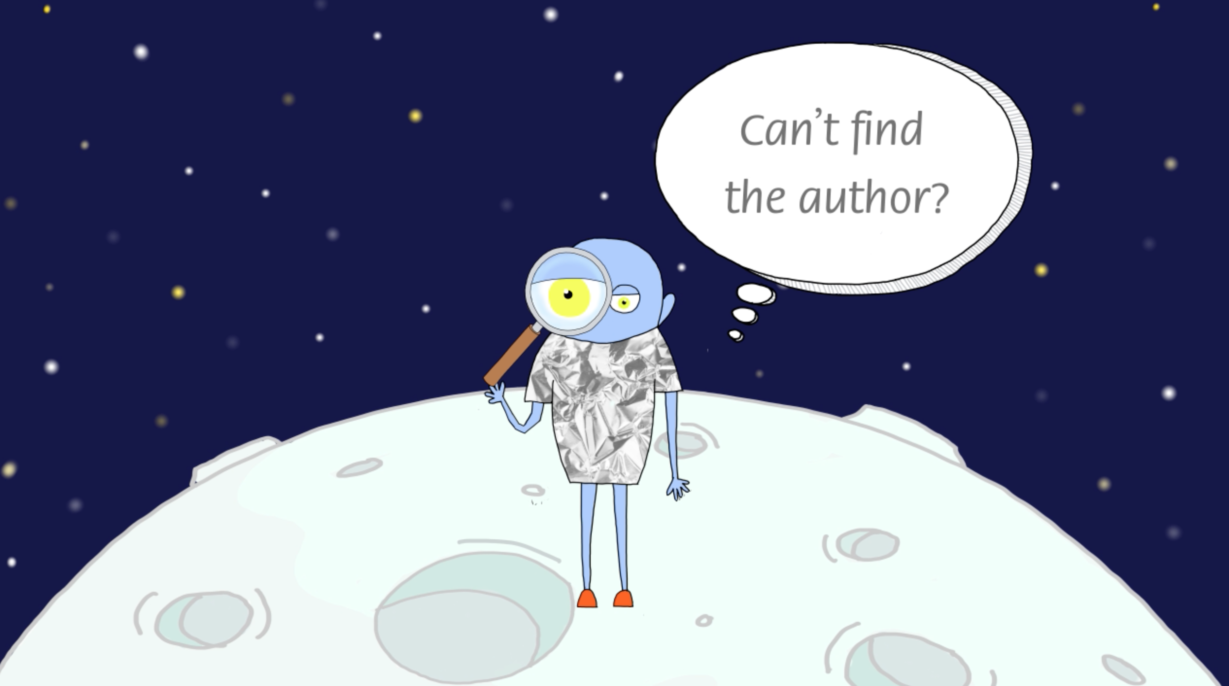
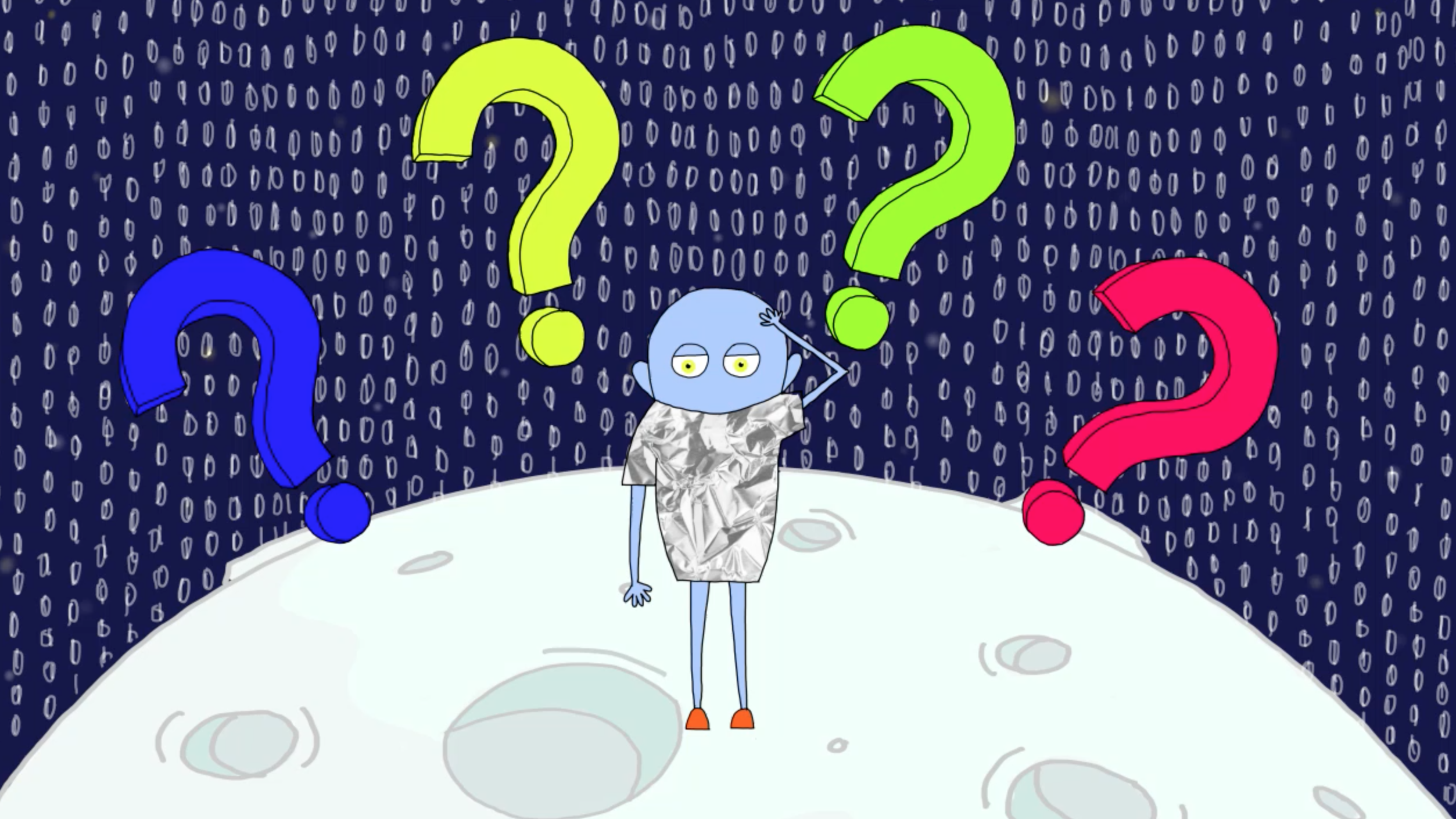
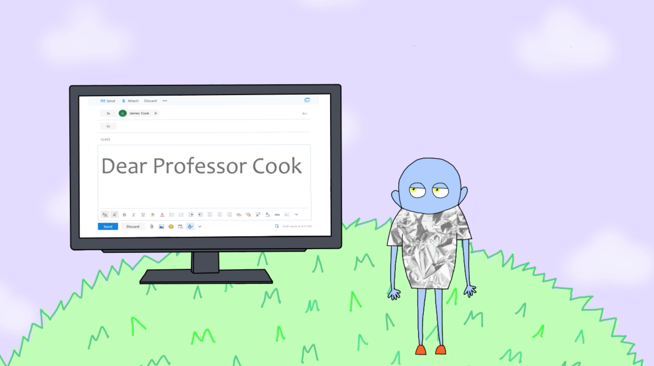
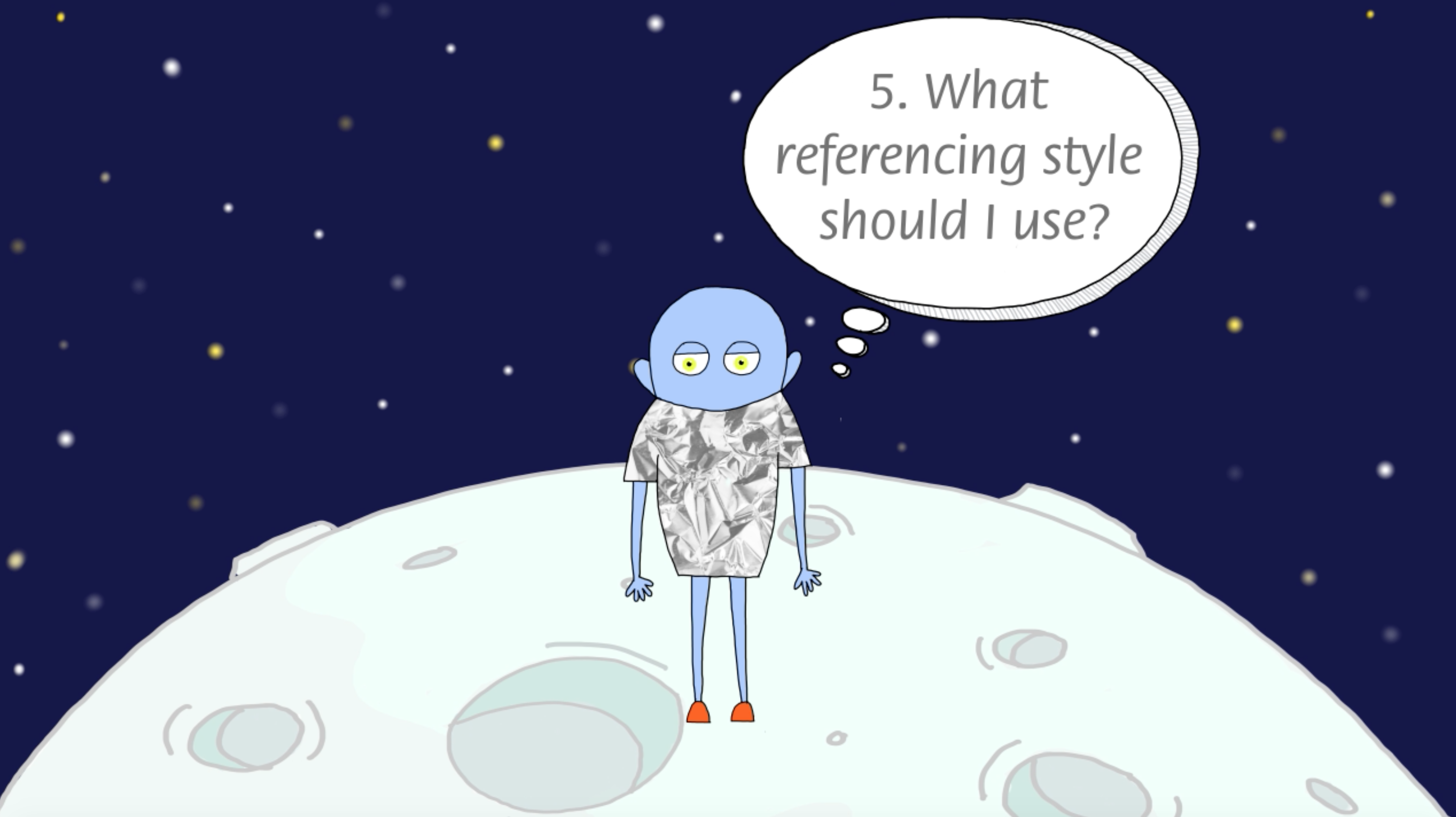
The videos mainly display what the voice over narrates. However, the audio contained pauses in which we added some features/actions to make the whole animation more interactive and quirky. An example of these details can be seen in main character’s eyes which move depending on what happens around him and continuously blink in order to give a sense of movement. We also added features such as question marks popping up when the character is confused, or magnifying lenses when he is exploring something new. These kinds of details were carried throughout all three videos (see images below).
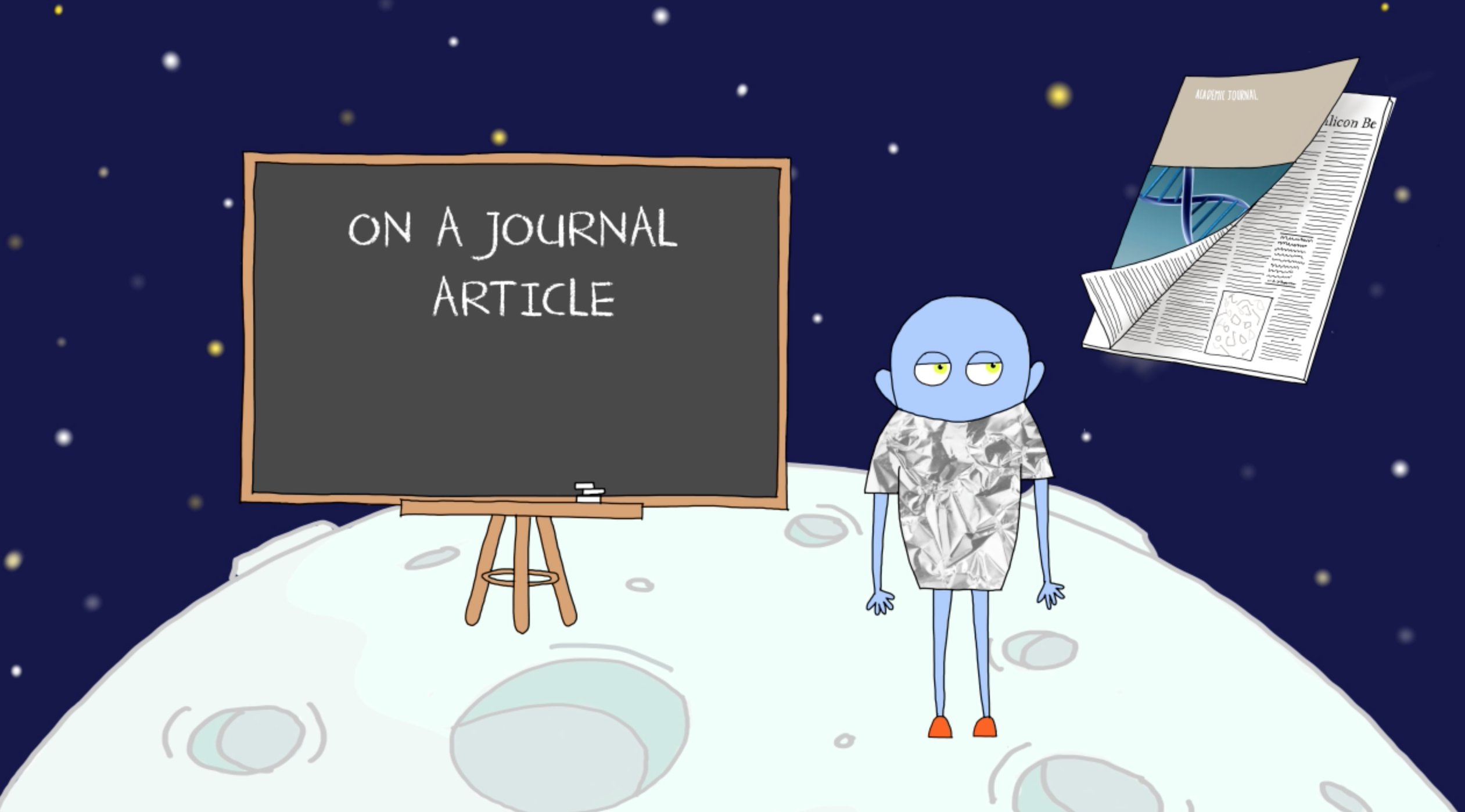
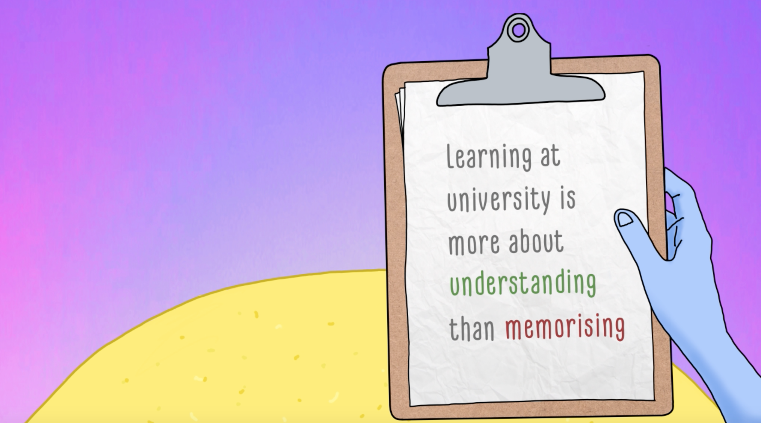
Due to the context of these videos, it was also key to include some of the most important information as text. This helped make the explanations on each video clearer. We created different ways to animate the text, which helped to the overall dynamism of the animations. Some examples of these text animations are speech bubbles, text appearing on a chalkboard or laptop (see images below).
The first video took slightly longer to animate as we had to get approval for the main character and the illustration and animation style.
When we received the feedback on the first video the client often seemed quite confident in what they wanted to change or tweak. They occasionally suggested us to change features for ones they had initially thought of. However, some of these suggestions were later on discarded with mutual agreement following our recommendations to avoid confusion. An example of this was the client’s idea of using a mouse to represent the action of searching, which ended up being better represented by a magnifying glass
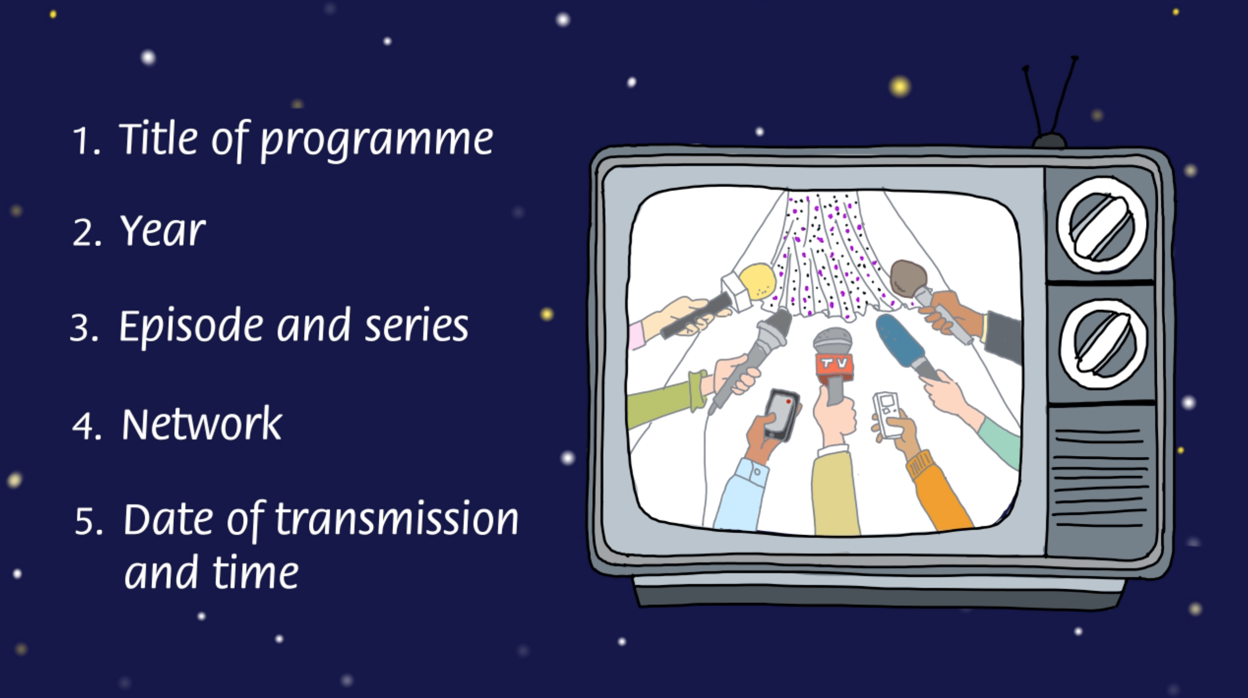
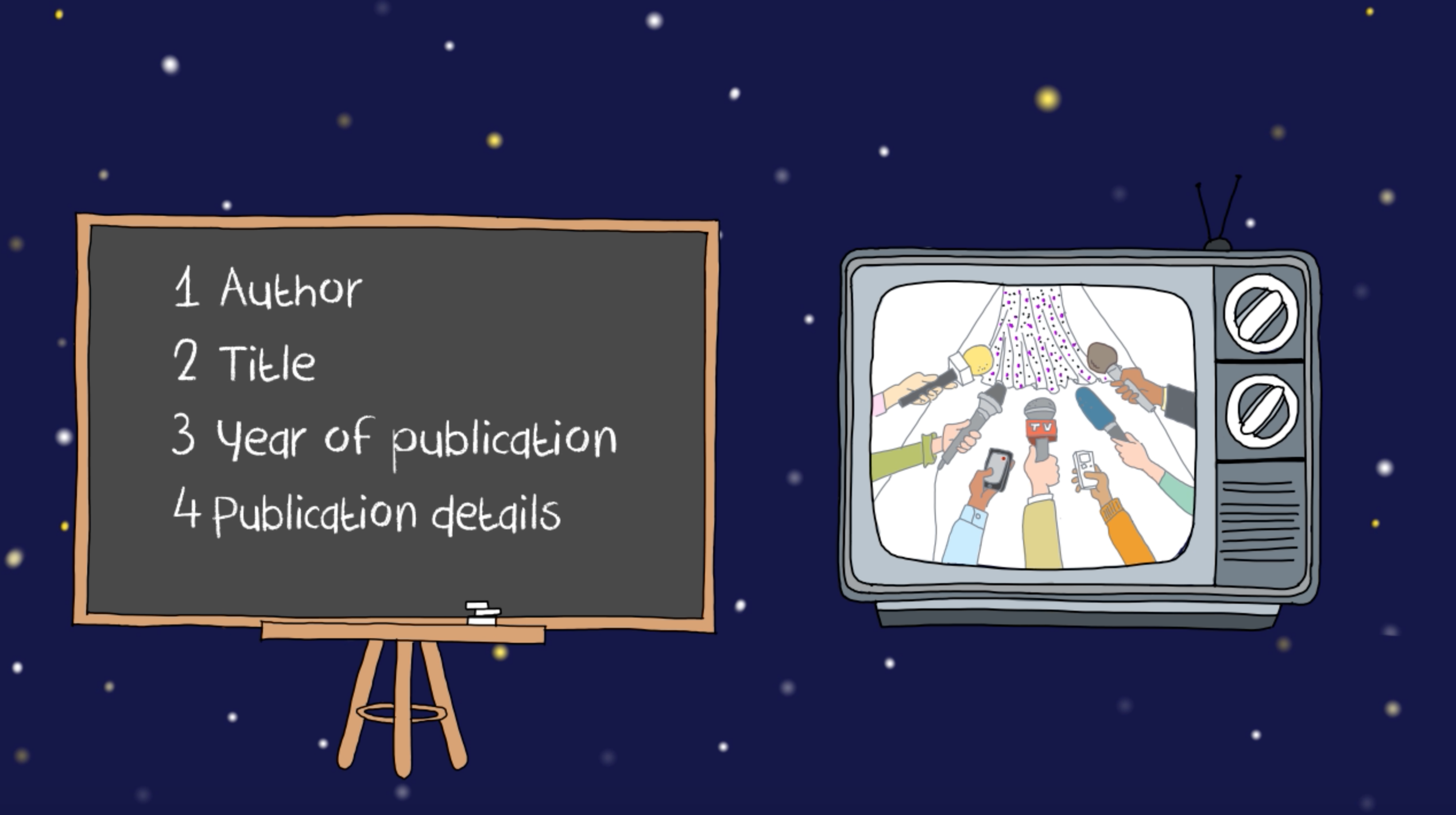
We did not always agree with the changes received in the feedback. However, in some instances, the client insisted on us making these modifications. For example in the first video, when the TV rolls on the screen, we initially had the text floating next to the TV. However, the client made us add a chalkboard with the text, in order for the latter not to float. We personally thought it was more unnatural to have a floating board next to the TV. (see images below).
LEARNING OUTCOMES
As this was our first real job, it helped us learn how relationships with the clients work, and taught us some key points that will help us in future jobs.
The clients often knew what they wanted but were open to opinions and new ideas. We found it was important to voice our opinion as in some cases we can advice the client in order to achieve a better design product. However, we learnt that if the client does not agree with an idea or feature in the work, it is, after all, the client’s product, and therefore we realised the importance of sometimes accepting these disagreements in order to provide a product closer to their needs
It is important to also keep in mind that the client might not be able to give feedback or answer questions right away. In the later stages of this project we also learnt that it might not be worth spending too much time on small details at first as the videos continuously get reviewed by the clients who not always communicate all changes at once. Therefore it is wiser to work on the main features and structures first in order to have more time to review and refine the details when the deadline starts to get closer.
It was also important to meet all our formative deadlines as leaving things last minute would have meant some of the changes the client requested could not have been made. In some cases the client also asked to see work before the deadline to allow more room for potential changes.
Lastly, during this job we also learnt the importance of continuously saving and backing up our files to allow us to go back to a previous version at any time.