
Introduction
With this real job, it was made clear right from the start that it would be an intense project, as our client – Katja – needed it to be invoiced and sent to print within a month of the original brief. Being our first true real job, this really put the pressure on and informed many of our design decisions throughout – making us work with efficiency and speed, as well as quality.
Brief
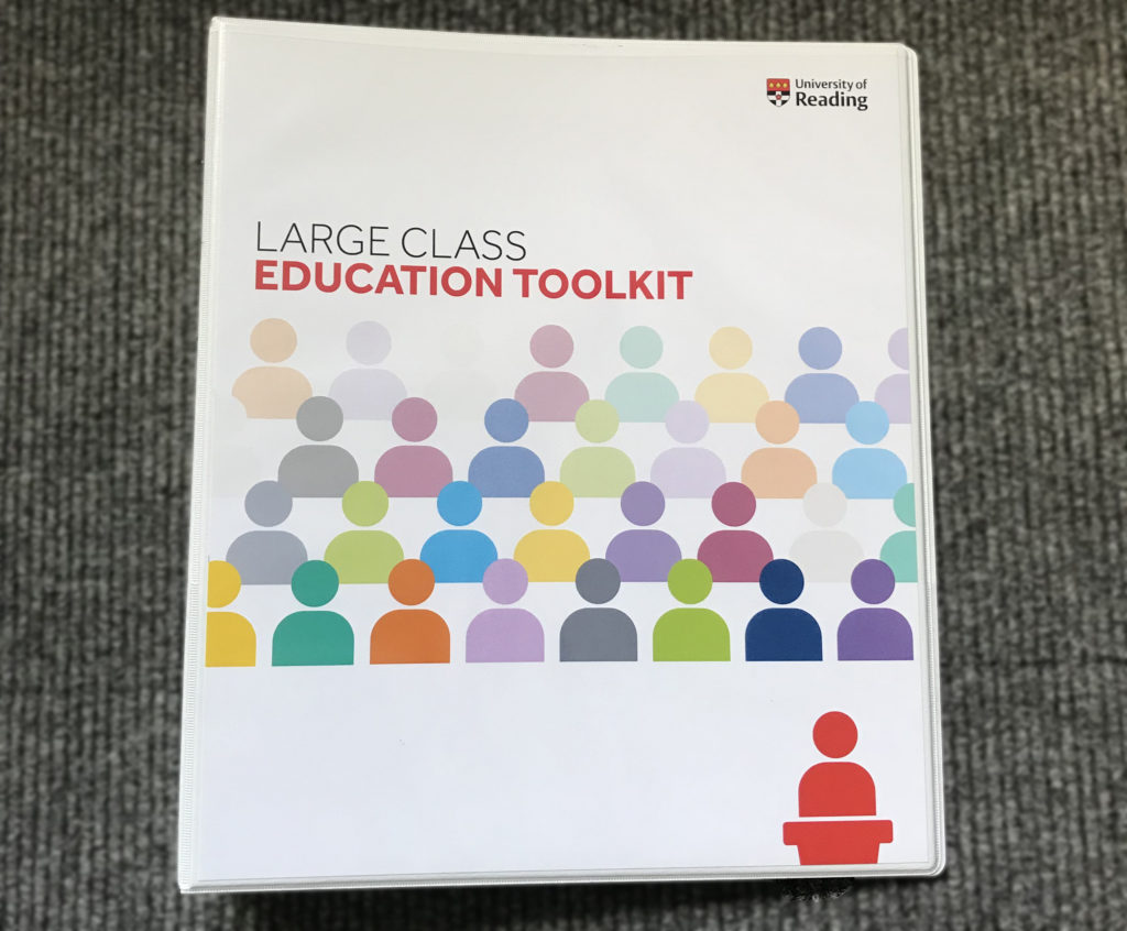
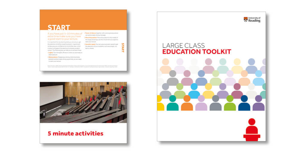
To summarise our brief, our client had requested us to design a folder which contains around 35 sheets of information, varying in size of paper sized A4, A5 and A6 for lecturers to use in aiding lecture planning activities at The University of Reading. Different sizes of paper were to be used to denote different complexities of activity ideas.
The brief also asked for a ‘premium’ and durable feel to said folder which would remain clean and solid after much usage. It was at this point we questioned the budget, to which we were told any expense would be covered. Whilst this opened many opportunities to the way in which we could craft the folder – it was also quite a daunting prospect to potentially be designing something worth a lot of money and that would be costly to produce.
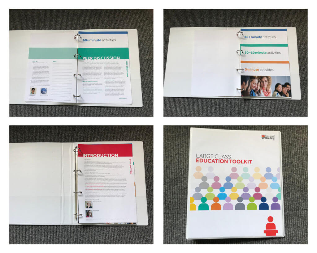
Response to brief
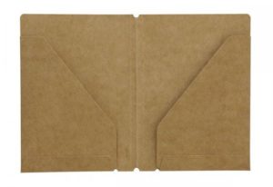
Throughout the briefing session, our client kept referring to the folder as a ‘paper wallet’. We found later after discussing the project with our supervisors and DPS that a paper wallet would no be suitable. This is because the material would be short lived and unable to hold 35 sheets of paper.
To remedy this and create a more durable folder, we proposed the usage of a 4 ring binder to hold the sheets in to our supervisors. Whilst our supervisors agreed with this change, it was still our job to return to our client and convince her as the designers in the room that this was the better option. Our client was very understanding of this, and it felt good to have a client respect our design expertise and decisions.
In this meeting, we also proposed to our client that we used the University templates as a basis for design. This template enabled our designs to be ‘on brand’, creating a consistent design which would be in keeping with other pieces produced by the University.
Our client seemed slightly reluctant to this to begin with, but we explained that it would be a good compromise to make sure that we could hit the tight turnaround deadlines and make sure the overall design was still of the highest quality. From this experience we learnt how to express our thought process and ideas by having a professional and formal discussion. This has helped us understand how to approach this problem in the future.
Our final part of responding to the brief was to get an estimate together for the agreed materials to be produced. We found that this was a much harder process than expected due to the complexity of the different sizes of paper and varying suppliers of the ring binder – but working with Geoff and DPS eventually arrived at a figure. This figure came out to around £3000 for the requested 300 copies of the folder, and although we were told “budget didn’t matter” at the beginning of the real job, we still needed to run it past our client. This figure came as quite a shock to our client and so it was our job to meet with her to explain the current costs as well as how to potentially reduce costs. The solution we arrived at was to print a third of the amount of folders, as well as to use a lighter stock of paper and source the folders from elsewhere – leading to a reduction to a much more comfortable £1500.
Design
After receiving the templates and waiting on the copy for the document, we worked alongside our supervisors to amend the templates whilst using the University’s brand guidelines, but still created a ‘new’ document so to speak. This process taught us both a lot about working within brand guidelines, and paired with the large expense of the project made the project feel very live and ‘real’.

These initial template designs were received well by our client and supervisors, this is because they were partially derived from a template so there weren’t many major problems. The most noticeable changes (shown below) were present in the cover, where a more ‘exciting and colourful’ cover had been requested and within the folder where small changes to the typography and typesetting were required.
Once these changes were finalised, we both worked together by splitting up the necessary tasks to efficiently work as a team, typesetting the supplied copy into our templates. This process was completed in a matter of days and we contacted our client throughout to update them, as well as query about any errors or parts of the document we were unsure about. This style of work massively aided the speed of the design process and we were both impressed that we could typeset such a large amount of content in such a small time.
Before thinking about sending the document to production, we had to check in with our supervisors – who raised a few small amends with the document – the corrected document was sent to the client for sign off. This process went very smoothly as our client had seemed happy with our work throughout and this did not change in the finalisation process. It was then our job to go through the document to make sure it was set up correctly for print, as well as the files being properly set up and ‘clean’. During this process, we liaised with DPS and decided it was best for us to create a mock-up of the document so that we were both in agreement of what was being produced. This practice proved helpful on both sides as DPS could understand exactly what was to be printed, and we were able to check that the document would print properly.
After delivery of the final product, our client got in touch requesting an interactive version of the document to be used online. We did not have much time to do this and so most the interactive document was lifted from the print document, with links and a clickable contents page added to an interactive PDF. Given more time, it would have been interesting to work on a truly interactive version of the document, but we learnt that it was better to work efficiently on this project as opposed to trying everything possible during the design phases.
Reflections
As a first experience of a live – and expensive – design job, this Real Job taught us a lot as a trial by fire. The main learning point being a quick turnaround of a project, where all parties involved are highly responsive and involved. Balancing speed with quality of design was difficult, as it meant having to swallow your pride on some aspects and not being as experimental as usual.
Having professional compromised discussion due to conflicting views with our client was something we had to self-teach. This was a great learning experience as it has prepared us for such conversations in the future.
We also found the estimation and production phase to be a steep learning curve, as we had to come to terms with a complex production, as well as managing cost and our client’s expectations during the production process.