
It has always been one of my main goals, to some day work in the music industry as a designer, and hopefully one day creative director. For the last couple of years at university, I have been chasing any work opportunity I can find around electronic music, and more specifically Drum & Bass. It would make sense that combining design with something I personally enjoy would be the ideal plan for my future as a designer.
After the end of last summer term, the Reading University Drum & Bass Society (RUDNB), asked me to create a brand identity for them, since they were planning to start organising and promoting their own events by the following October. Other than an old low-quality wordmark logo, set in the Blade Runner font, the society had no visual identity before that. I was given two weeks to not only produce the visual identity of the society, but also to create a social media presence for the brand, in order for them to be able to gain more members, and better promote their future events and activities.
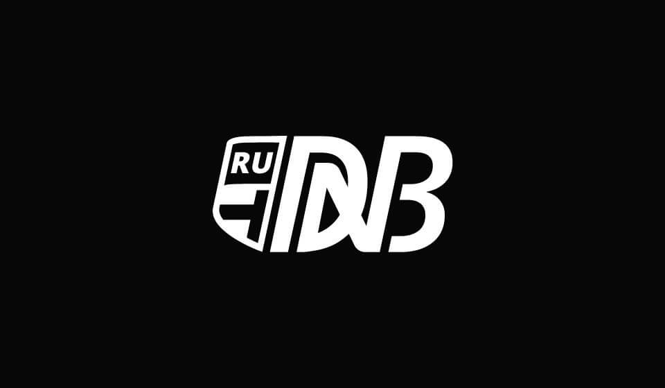
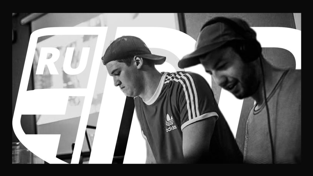
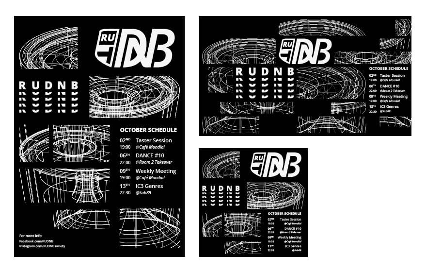
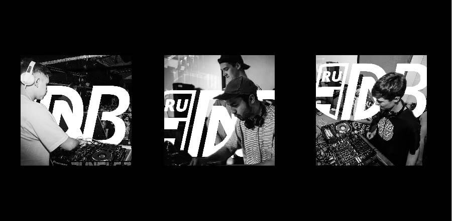
The brand identity that was created had to be dark, minimal and gritty. Bold and aggressive typography was used, along with dark photography and abstract 3D visuals, created from the new logo itself. RUDNB now had a new official Facebook page along with a Facebook group to promote member interaction, a new instagram account to share more casual and friendly photos of the members, and a new Soundcloud account, used by the Society’s DJ’s to promote student music production. All the visuals for the social media accounts were under a clear cohesive visual identity, that aimed to promote a new Drum & Bass society.
I was also tasked with managing all the social media accounts of the society for the first month or so, in order to help them grow and build a membership. There was new content being shared every other day, on all social media account, like Track & Mix of the Week competitions, edited photos of society member to fit the brand identity, promotion of music production, etc. etc. In addition to the social media accounts, a direct marketing campaign was set up through MailChimp, to target all the upcoming Fresher’s that would be joining the society in September.
Within a month of the creation of its social media presence and new brand identity, RUDNB’s Facebook account had went up to 200 likes, and the Facebook group had another 150 new members, with a lot of them taking part in in daily discussion and being active members in the society. Shortly after, the first RUDNB event night followed at great success, with people asking the society to buy T-Shirts with our logo and managed to sell more than 30 in less than a month.

Overall, the new brand identity and activity seemed to work well for the society, and I’m quite happy with how the logo and visuals worked out. I was also happy to be given the chance to handle social media accounts and learn how to promote content on Facebook and Instagram, as I have always been interest in Marketing. Through the work with RUDNB, I managed to meet a lot of local promoters, that were giving me design work like flyers and social media banners for their events, which I was also happy to do, since I wanted to expand music design side of my portfolio.
Regrettably, after the last year of working with local D&B promoters and labels, I’m not sure if there’s much to be gained in terms of learning and becoming a better designer. There are a lot of problems that I did not anticipate when working within a niche, local, underground scene as a designer. Most of the promoters seem to be set in outdated ideas about how they should be promoting within the industry. Every single client I have worked with in the past year, has been micromanaging and requesting a lot of absurd obscure ideas that result in terrible design.
With a quick look to the Ivaderz or Playaz music label website, one can see how most of the D&B industry seems to be stuck in its old ways. Terrible vector art created from tracing photos, or loud obnoxious designs with 10 different fonts and all the colours they can possibly fit in, all within a 150 x 210 mm flyer. This outdated practice in design seems to have been plaguing the industry for many years now, and the local promoters are not about to change that any time soon.
This mentality seems to be linked with the industry fighting back against change of the old-school, a way to keep things the same, and a way for the local promoters to compete with the bigger international names in the scene that are growing bigger and bigger with the rise in popularity of D&B as a genre. They see to be using and embracing outdated practices both in their requested designs, but also in how they promote events.
This is not to say that the whole of the industry is stuck in its ways though. There are several D&B labels that are pushing the boundaries of electronic music design, or at least D&B. Labels like Critical Records have been pushing for a composed high quality visual identity, that doesn’t go overboard with their designs, and seem to be catching up, if not on par, with other genres of electronic music that were always known for boundary-pushing design. When asked about the visual identity of Critical Records in an interview with Fabric, Kasra, the owner of Critical Record’s mentions how since the inception of the label, he’s been fighting against the cliches of the design in the music industry.
“When I started the label I knew that I wanted to combine my love of drum & bass and the culture that surrounds it with some of my punk/American underground guitar music design ethics and my penchant for more minimalistic designs facets. I’ve never really been a fan of the sci fi influenced d&b cliché to be brutally honest, you can be forward thinking without thinking futuristic or using futuristic imagery.”
But then again, he is the owner of one of currently biggest and most well known D&B record label, both in the UK and Internationally. So the problem is not really in the industry itself, but rather the smaller local promoters and music producers being stuck in the old ways of doing things, and being unwilling to catch up with an industry that is moving forward without them. What all this means for a young designer who was hoping to be part of this industry, is that sadly, unless you manage to land a job in one of the bigger names in the scene, there’s little to nothing to gain from a designer’s perspective in experience or learning, which I’m sure holds true for any small and niche industries, and not only D&B.
In the past year, I have enjoyed doing some fun and creative branding work for the RUDNB society, which helped me land several other small jobs throughout the year. But after my experience with the industry, I will more than likely be changing my plans to pursue a career in the music industry as a designer, unless I can land a position as an in-house designer for one of the bigger names. Nevertheless, it has been great producing design work that was out in the public and seen, and to some extent, appreciated, by people that have an interest in the same music as me.
Looking back at the work and interactions I had with those promoters, I have learned a great deal about what I should be willing to accept as a freelance designer when working with such clients. At the start of the year, when I was first being contacted by these promoters to produce design work, I obliged at every request for small changes and revisions that they wanted, resulting in me working extra hours that I did not originally agree to, due to be excited to start working with people of the industry I was looking to join. In the future, when receiving similar freelance work, I will be more careful when first communicating with the client and in setting the ground-rules for how and what work will be produced.
Overall, I am happy to have produced the RUDNB brand identity as I was part of the society myself, but I am also happy to have worked with those promoters while at university. It would have been much worse if I didn’t have this year’s experience and ended up landing a position with a similar music promotion company, resulting in me having a job that I wouldn’t have enjoyed. After graduation, ideally, I will be seeking to earn a position at a branding agency, since it is one aspect of design that I’m most interested in. Maybe that will change as well in a year’s time, after I get to actually experience working there.