Brief
I was approached by James Lloyd, real jobs coordinator, to design the eleventh edition of the University of Reading Creative Arts Anthology; an annual publication that brings together poetry, prose, art and photography by students and staff at the University of Reading and local residents. The Typography and Graphic Communication department have been involved in the design and production for many years, and I was honoured to be chosen to design this year’s edition.
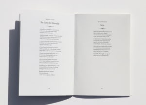
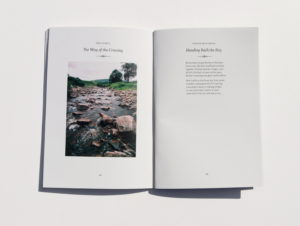
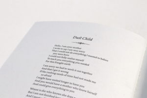
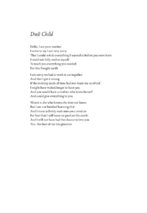
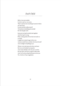
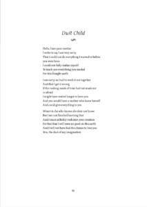
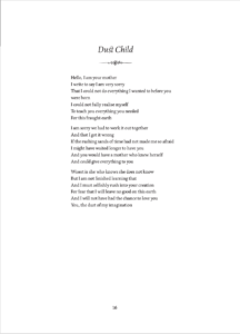
Although this was my first-time text-setting poetry in InDesign, my background knowledge in complex text-setting during this course and my interest in book design, put me in a good position to approach a new type of verbal content. Fortunately, I was provided with several earlier editions of the Creative Arts Anthology that I could refer to, and with Eric Kindel’s supervision I was confident to begin the design process. I promptly contacted both my clients, Jerome Cox-Strong and Peter Robinson, for a meeting. The editors of this year’s anthology were also present during the initial meeting, and I organised to discuss the design further with the editors after the meeting. It was clear that they had little to no vision for the end result, however, they did express a preference for central left-aligned text setting, common in poetry books and in earlier editions of the Creative Arts Anthology. Their explanation for this was: when text is left-aligned to the margins, and the poem has short lines, it can seem as if the poem is falling off the page or into the spine, which is unpleasant. This influenced the final design of the inside pages considerably.
Design Process
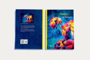
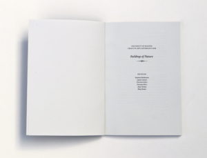
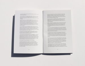
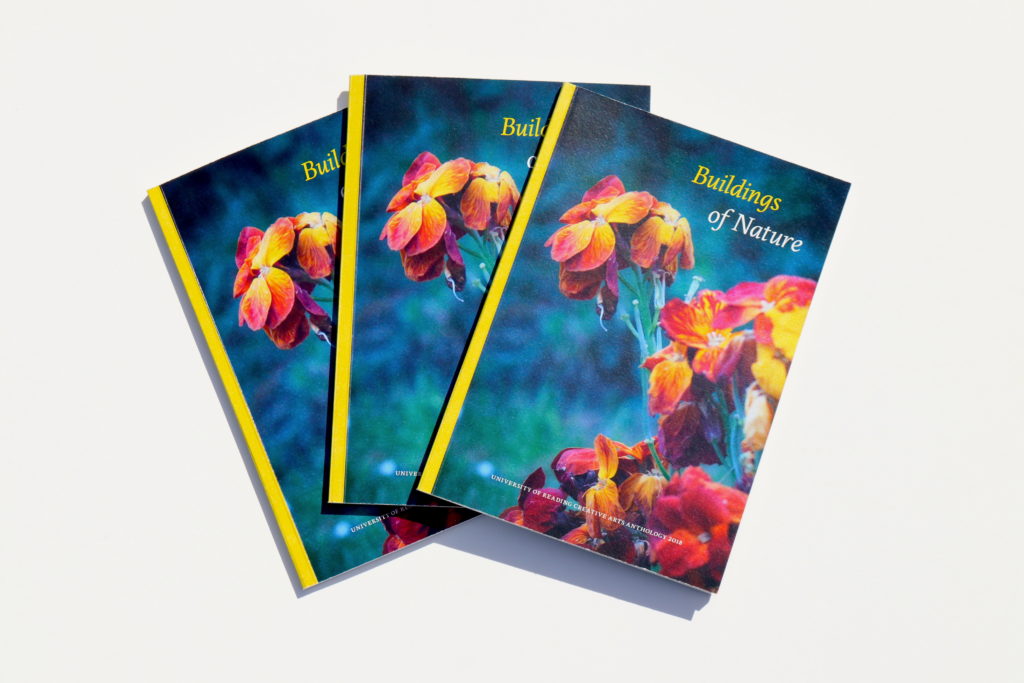
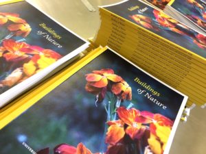
As designing poetry books was unfamiliar territory, I took the opportunity to research past anthologies and poetry collections to explore different approaches to poetry text-setting. The content varied immensely, from poems to prose, and from paintings to photography, providing a particular challenge. The design and the margins had to be flexible enough to accommodate a wide range of verbal content. The editors aided the process of designing considerably, by providing the sequence of poems in a single word document, along with the accompanying images. Not only did I have the verbal and visual content within the book to juxtapose, but I also had to consider the editors preface, contents, and biographies. These were designed after the main book in order to echo the inside verbal content. The editors also specified the image to be on the cover – an untitled photograph of flowers in a garden. This limited to some extent the composition of the text on the cover as I was limited to areas that did not obstruct the focal point.
From the initial meeting with the clients, it was made clear that a left-aligned central design was preferred. I did experiment with both central and fully left-aligned but agreed the central was more fitting for this poetry book. Generating a layout that accommodated several types of verbal content, as well as images, was challenging and time consuming. But, I am pleased with the outcome. The suggestion of centred alignment means text is always visually centred on the page, but the margins offer restrictions for prose and longer line lengths, as well as giving boundaries to images. This was effective, however in reflection, I could have found a simpler solution to the setting of text centrally, for example through a script of some sort.
A major decision during the design process, was the choice of a typeface. Due to the nature of the content, and the theme of this edition, I wanted an elegant typeface that had ‘life’ to it. I thought as this was a University of Reading anthology, what better place to look than at the MA Typeface Design typefaces. After a discussion with Eric about usage rights, it was decided to find one freely available to me from the department or from Adobe Typekit. Many typefaces were tried and some in combination, but it was decided upon to use the typeface Edita, designed by Pilar Cano, a 2006 graduate of MA Typeface Design at the University of Reading. Edita is a contemporary book typeface with a softness and fluidity, designed to be used alongside photographs and other graphic elements. The italic was used predominantly for titles, small caps for author’s names, and book for the body text. To play on the theme of the edition, I also made use of the discretionary ligatures within the italic setting available in the typeface, which added an element of connectivity to the titles reinforcing the theme of ‘life’. I believe my experience from previous editorial projects over this course, made this process much easier.
Rules were originally used below the heading, but these weren’t fitting for the poetry content and theme, therefore with Paul Luna’s suggestion, I replaced it with a decorative element. Paul recommended several typefaces with glyphs and printer’s flowers, which I explored. Eventually deciding upon the glyph, from the typeface Kepler, which is reminiscent of a printer’s flower, to play off the theme of ‘life’ and ‘nature’ that ran throughout this edition.
Feedback from both Paul and Eric was beneficial throughout the process, enabling me to achieve aesthetically pleasing inside pages. In reflection, I would have found the same scrutiny in the feedback for the cover beneficial. Towards the end of the design process, I contacted the Real Job’s team, who showed me how to approach registering for an ISBN and generating a barcode. This provided a useful insight into the editorial process that I didn’t know previously.
Production
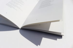
The production process was fairly straight forward, printed by DPS as it is every year. The client liaised with DPS themselves, meaning I had very little involvement. I provided a production specification, which was in line with the client’s specification taken from last year’s anthology. Due to my experience working in a production house, the preparation of files was straight-forward. I prepared the file as instructed by DPS, completing the art working checklist, and communicating with the Real Job’s team throughout.
I caught a glimpse of the books hot off the press and was pleased with the result. I was impressed with the finish quality, especially of the inside pages and the typeface and decorations. The editors were also very pleased with the final design and expressed this during the launch event. Unfortunately, my client informed me that DPS had made a mistake in the production by printing several copies in black and white. But, this has since been resolved.
Reflection
Overall, I am pleased with the finished book and it has proven to be invaluable addition to my portfolio, but also to my knowledge in text-setting unusual texts and handling the production of an editorial project. I believe the project ran smoothly, with clear and effective communication between the editors, clients and I, which resulted in a good working relationship. I am grateful to Paul and Eric who shared their knowledge of editorial design and typography. During this project, I have developed more awareness typographic detail and appreciate good copy-editing, which will no-doubt improve future design projects, university and beyond.