Category: students and graduates

MATD project work in Instapaper

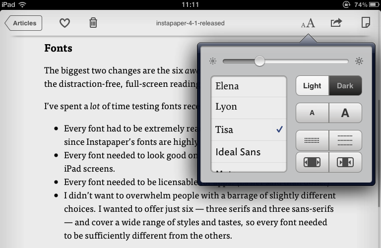
FF Tisa on a first generation iPad

The latest update to Instapaper (AppleStore link) includes six new typefaces, including two that started as MATD student projects: FF Tisa by Mitja Miklavčič (2006) and Elena by Nicole Dotin (2007). Instapaper, a 4+ rated app, allows the user to collect content for reading in a highly user-friendly environment on an iPhone, iPad, or a personal computer.  Extended commentary (and an image of Elena on the iPad) over at Typenotes.

Typography goes to Buckingham Palace

Queen's Anniversary Prize group photo

We weren’t allowed to take photographs inside the Palace, so here are staff and students in the courtyard, still in a daze after the splendid ceremony and being presented to the Duke of Edinburgh (who, it can be revealed, likes his iPad because the type is big enough to read). From left to right: Edward Liu (MA Information Design), Pooja Saxena (MA Typeface Design), Eric Kindel, Paul Luna, Jeanne-Louise Moys (PhD student), Hannah Smith (BA Graphic Communication, Part 3), Sue Walker. Jake Giltsoff (BA Graphic Communication, Part 2) escaped before the picture was taken.

Reading alumni carve poems into the Yorkshire moors

Pip Hall and Wayne Hart carving letters on the Yorkshire moors

A series of seven poems by Simon Armitage are being carved into stones on the moors along the Pennine Watershed in Yorkshire by Reading Typography alumni Pip Hall and Wayne Hart. This short film shows Pip at work.

The Stanza Stones project is a collaboration between Mr Armitage, the Ilkley Literary Festival and imove, Yorkshire’s cultural project for the London 2012 Olympics.

The poems will be designed by lettercarver Pip Hall and carved by her and her apprentice, Wayne Hart, with some of the work taking place on location.

The first verses to be completed, on Pule Hill, were done on location and took a month to complete, with each of the 360 characters taking between seven and 10 minutes to carve.

Pip Hall carving

Pip Hall said: ‘It feels quite a responsibility to try and make something which I feel very happy with and something which is hopefully going to enhance the landscape and people’s enjoyment of those areas.’

Pip is training Wayne Hart with the support of a two-year Apprenticeship Scheme run by the Memorial Arts Charity.

Read more and watch the video at BBC Leeds & West Yorkshire. (Top picture: BBC; lower picture: Ilkley Literature Festival)
Our students do Good for Nothing

Reading University Design does Good for Nothing from Good for Nothing on Vimeo.

Twenty-seven Typography & Graphic Communication students worked on creative briefs for four innovative social and environmental causes. Lots of enthusiasm, brilliant work and new Good for Nothingers recruited!

Thanks to Anouk van den Eijnde at Pipeline Project/Good for Nothing for setting up the clients, being so encouraging and making the film.

See more about the project here, here and here.

Reading font for iPad reading

Athelas, based on a design created by José Scaglione when he was an MA student of the Typeface Design course, is now one of the fonts selected for Apple’s iBook app on the iPad. Athelas was reworked by Scaglione and fellow MATD alumna Veronika Burian for their foundry TypeTogether; it was part of the Tipos Latinos exhibition 2006, and was selected as winner of the Granshan competition 2008 in the text type category.

Wednesday seminar: Rob McKaughan

Rob McKaughan is one of those people who can be trusted to come up with an interesting angle on things. Coming to the MATD from software engineering, he researched pattern languages (a methodology created by Christopher Alexander for architecture, which has spread to software and interaction design, amongst other fields) and their application to typeface design. Here’s a good explanation of pattern languages, from Rob’s introduction to his dissertation:

Each pattern in a pattern language is a rule of thumb abstracted from existing proven designs. More specifically, a pattern is a description of a problem and its solution in a particular context. These patterns are not recipes; they balance concrete physical descriptions while abstracting the pattern’s concepts for use in other designs. The patterns focus on the characteristics of the product, and not the process used by the designer.

Rob outlined the generation of pattern languages, and gave an illustration of how patterns can be used for typeface design (for his dissertation Rob focused on newspaper typefaces, with interesting observations on small size / low resolution text typefaces in general).

The lively discussion (including my immodest observation that some design courses follow a very similar approach to teaching, bar the nomenclature) touched on exciting topics, not least the relationship of pattern languages to innovation in design – much on the forefront of MA students at the beginning of their year…

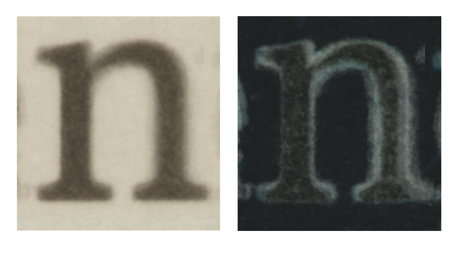
Overlayed letters from newspaper typefaces

A career in design: advice from industry experts

‘What to do with a degree in design studies?’ was the question posed by The Guardian’s Career Blog today. Among the industry panellists answering the question were Will Nice of Goosebumps Brand Consultancy, Simon Manchipp of SomeOne, Robin Levien, and Rob Ball and Greg Quinton of The Partners. On the education side, Paul Luna was joined by Stephen Westland from Leeds, Nicola Francis from Nottingham Trent, Helen McCarron from Lincoln, Andy Edwards from Leeds Metropolitan, and Jamie Dobson from Surrey. Rhiannon James gave the D&AD point of view.

Topics covered included getting the best from an internship, getting a job in a different field from your degree, and the benefits of taking an MA. The panellists also gave advice on networking, portfolio building, presenting yourself to potential employers, how to overcome nerves in stressful situations, and how to cope with the current state of the job market.