
Typography papers 8
A network diagram would map more thriftily than rows of prose the copious intersections between our eleven articles and their authors in this eighth volume of Typography papers. That mesh of work, personal affinity, and politics testifies to a small world with disproportionate impact beyond its edges. Until quite recently, the production of graphic messages – words, pictures, diagrams – lay in the hands of printers, and politics has forever infiltrated print culture.* One of our actors, Desmond Jeffery, made himself part of that tradition of ‘printers as disseminators of ideas, like the schoolteacher-printer James Guillaume, friend and editor of Bakunin and associate of the anarchist watchmakers of the Jura in the 1870s.’
This book is first about design, and we gather several perspectives on its changing form during the transit from scarcity to plenty in post-war Britain, the shift from ‘commercial art’ – picture-making for business – to the work of modern typography and new ‘graphic design’: planning, coordinating, specifying. We trace the idea of design as articulate advocacy, shaping a visual argument or persuasive statement, deploying a wider range of verbal and visual resources than imagined by printers or commercial artists. A leavening of foreigners enlightened this passage, like Stefan Lorant, bringing innovative European photojournalism to Britain: Stuart Hall charts Picture Post’s connections with documentary literature, photography, and film, and the evolution of its distinctive ‘social-democratic eye’. Another émigré was Wolfgang Foges, entrepreneur, deal-maker, and inventor of ‘book-packaging’; had he moved to L A instead of London he would have ended up not in print but in movies as ‘Worth Forbes’, producer if not studio-boss. A real hero of design – though too limiting an award – was Marie Neurath: Matthew Eve finds her in 1946 fighting to keep Isotype independent in an uneasy but essential alliance with Adprint, one of Foges’s three ventures described by David Lambert.
Robin Kinross maps the émigré neighbourhoods of central-European London – ‘a state of mind perhaps’ – in a brisk tour of languages, cultures and print. Some familiar accents echo through these pages – Henrion, Schleger, Schmoller, Tschichold; others should be better known – Elek, Hoch, Teicher, Themerson. On the margins, we see remarkable work by Anthony Froshaug and Edward Wright, and glimpse younger radicals like Peter Burnhill and Maurice Goldring. Robin Fior recalls left politics and designing, learning print in bits, in London of the 1950s and 60s; and he affectionately describes Wright – a mentor who once worked for Foges, was a colleague of Froshaug, and employer of Jeffery – with snaps from a tricky project they shared. We gather a handful of Fior’s political posters, and more from Ken Garland and Ian McLaren, for a brief agitational retrospective. Another red thread through our pages is praxis, a word Desmond Jeffery often used: theory and practice, each bearing on the other, and evident always in the exemplary work of Ernest Hoch, for long inhabiting another margin, beyond artistic and literary circles.
An ever-present character is the city itself: in a metonymic slip reflecting the grossly centralized British state and economy, our title inflates London into the nation: from its bombsites, empty mansions and squats of 1946 to the smarter milieux of the 1960s and the blooming of graphic design – from ragwort to rag trade, one might say. And that is another story.
PS Reading, July 2009
* In a notable recent essay, Régis Debray traced the material forms – books, newspapers, manifestos – in which radical ideas circulated, ‘the passage of printed ideas’: ‘Saint-Simon was a copyist, proof-corrector and bookseller; Proudhon, a typographer. So was Pablo Iglesias, founder of the Spanish Socialist Party. It was a Spanish journalist and typographer, José Mesa, who, exiled in Paris, passed on the heritage of the First International to Jules Guesde, recruiting sergeant of French socialism. Anarchists and socialists were the warring siblings of one family; pamphlets, articles, newspapers, literary supplements, filled their lives. Both followed Luther’s order, to spare neither hardship nor money to set up “good libraries and bookshops” everywhere. The sons of Marx and of Bakunin shared the same gospel: to read and to get others reading.’ (‘Socialism: a life-cycle’, New Left Review 46, July-August 2007.)
Paul Stiff:
Austerity, optimism: modern typography in Britain after the war
This essay is the prelude to a study of modern typography in Britain in the period of the post-war settlement, from the mid 1940s to 1979. Taking the year 1947 as a fulcrum, it surveys the landscape of typography, ‘design for printing’ as it was, during that period of scarcity and social-democratic reconstruction recalled by the word ‘austerity’: from the final days of war in August 1945 to a terminus on London’s South Bank in the Festival of Britain, if not yet the start of ‘affluence’ then at least an end to the years of worst privation. It was the end, also, of an exhausted Labour government, voted out in the general election of 1951. During those six years modern designing took root in Britain, as did modern ways of doing typography.
Stuart Hall:
The social eye of Picture Post
This essay on Picture Post, the photo-journalism magazine, first appeared in 1971. It is republished here in revised form. It attempts to place the achievements and political significance of Picture Post in its wider contexts. These include the development of the documentary movement in literature, photography and film; the graphic innovations in photo-journalism on the continent and in Britain in the inter-war period; the changing structure of popular feeling as World War 2 progressed; and the magazine’s place in what is defined as the evolution of a distinctive ‘social-democratic eye’, or way of looking. It relates Picture Post’s formation, rise and demise, its achievements and limits, to wider political events.
Robin Kinross:
Design in central-European London: interactions between émigrés and natives in the 1940s
This is the text of a talk, almost as delivered, given to a seminar held in April 1997, which accompanied the exhibition ‘Exiles and emigrés: the flight of European artists from Hitler’ at the Los Angeles County Museum of Art. While the exhibition was quite a conventional survey of famous artists, this seminar (organized by Keith Holz) was more idiosyncratic and wider-ranging – in extending the discussion beyond the period and out of Europe, and including consideration of other areas of cultural production, beyond fine art. This contribution tried to locate the émigré designers on the map of London, to look at what they were doing during the war years and immediately after, and to include ‘native British’ people as part of the story.
David Lambert:
Wolfgang Foges and the new illustrated book in Britain: Adprint, Rathbone Books, and Aldus Books
This is an account of three leading British producers of illustrated popular educational books that between them spanned nearly half the twentieth century, and of their innovative Austrian founder and managing director Wolfgang Foges (1910–86). His chief contribution to British publishing was book packaging: planning and producing an illustrated book, sold for an agreed price to a publisher who stocks and markets it. Pioneered in 1939 by his firm Adprint, his production technique typically involved commissioning an author and artists or photographer who worked with an in-house team of editor, designer, and picture researcher. Adprint suffered financial crises and changes of ownership, and Foges never fully owned a publishing house; but he fathered more than a thousand titles and became the first major British maker of illustrated educational books for an international market. A preliminary list of books and series produced by Foges’s companies is provided at the end of this article.
Matthew Eve:
Isotype in trouble, 1946–1948
This article is based on documents and correspondence held in the Otto and Marie Neurath Isotype Collection at the University of Reading. It describes the friction between the Isotype Institute, in the person of Marie Neurath, and Adprint, represented by Wolfgang Foges, in the two years following Otto Neurath’s death. This was a crucial and transitional period for the Isotype Institute, during which were raised questions about the nature of its work and future direction.
Robin Fior:
Recollections of designing and politics in London, 1957–1970
This is the account of an active participant in London’s milieu of politics and graphic design in the 1950s and 60s. The campaign against nuclear weapons attracted the energy of a handful of designers, including Fior. A sample of their work in this effort appears on pp. 141–8, and that of the printer Desmond Jeffery on pp. 199–201.
Call to action: political posters of the 1960s by Robin Fior, Ken Garland, and Ian McLaren
The 25 posters gathered here are almost self-explanatory. Robin Fior supplies background to those which he designed on pp. 135–40, and Ian McLaren on pp. 149–50. Our notes on Ken Garland’s are drawn from conversations with him and from his own published writing.
Ian McLaren:
Designing for CND
After studying at the London School of Printing and Graphic Arts, the author briefly experienced advertising agency life before recoiling and heading for Ulm in 1960. He then worked for Braun in Frankfurt and Ahrend in Amsterdam before returning to London. It was there, in the 1960s, that his engagement with the Campaign for Nuclear Disarmament took place, and which he recounts here.
Paul Stiff and Petra Černe Oven:
Ernest Hoch and reasoning in typography
This is the first published account of the work of Ernest Hoch (1913–85). He remains among the least-known of those émigrés from central Europe who gave Britain new models of designing after the Second World War. In his search for objective evidence to support design, his advocacy for readers, his systematic methods, and his work on clarifying and simplifying complex documents, he can be considered the pioneer information designer. Hoch also campaigned over two decades for reform of the terms and measures which embody basic concepts in typography. Although this failed, his solutions to the continuing problem of dysfunctional designations of type size and interlinear spacing are still both relevant and enlightening. A sample of his work is shown, drawn from the archive.
Robin Fior:
Working with Edward Wright
The author recalls projects with and learning from Edward Wright in London during the 1950s and 60s.
Sally Jeffery:
Desmond Jeffery the printer
This is the first published account of Desmond Jeffery (1926–74), who worked as a jobbing letterpress printer and a teacher of typography. The idea was deep rooted in him that the politics of work and of life are indivisible, and that their proof is in practice. This outline of events in his life, and how he came to be a printer, accompanies examples of his letter-press work which are reproduced on pages 193–208. It includes a personal memoir by Libertad Cabielles, and an extract from a 1968 argument by Desmond against factionalism in polemics.
Typography papers [8] is edited, designed, and prepared for press in the Department of Typography & Graphic Communication, University of Reading (www.reading.ac.uk /typography) and published by Hyphen Press, London (www.hyphenpress.co.uk).
Editor: Paul Stiff
Designer: Eric Kindel
Indexer: Christine Shuttleworth FSI
Typeset and made-up using Adobe InDesign CS3 with typefaces from the OurType Arnhem and Fresco families by Fred Smeijers, Antwerp. Picture origination and editing by Design & Print Studio, University of Reading.
Production at Reading: Michael Johnston, Eric Kindel, Darren Lewis, Geoff Wyeth
Printed and bound by Halstan Printing Group, Amersham, using Book Design Smooth 120 gsm supplied by Vida Paper AB.
ISBN 978–0–907259–39–8
Copyright © 2009 Typography papers, the authors, and the Department of Typography & Graphic Communication.
All rights reserved. No part of this publication may be reproduced, stored in a retrieval system, or transmitted in any form or by any means, without the written permission of the copyright holder.
Much of the work on this volume, including the preparation of illustrations throughout its pages, was supported by ‘The optimism of modernity: recovering modern reasoning in British typography’, a research project conducted at the University of Reading and funded by the Arts & Humanities Research Council. Two of the essays which appear here – ‘Austerity, optimism: modern typography in Britain after the war’ and ‘Ernest Hoch and reasoning in typography’ – arise directly from that project. The editor and publisher gratefully acknowledge the AHRC for its invaluable support in bringing this work to press.
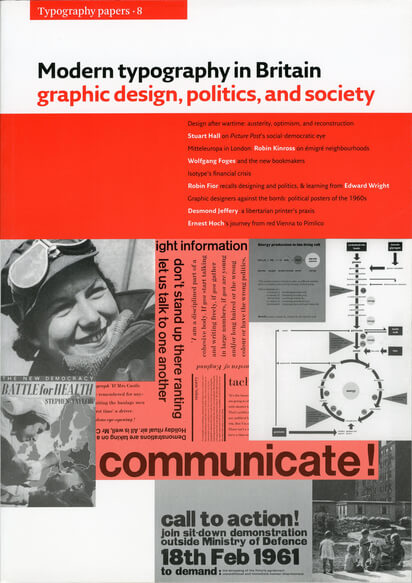
front cover: (clockwise from left) ATS convoy driver (from Michael Young & Theodor Prager, There’s work for all, 1945). From Red paper 2, by Desmond Jeffery, 1968. Diagram of B-complex vitamins (from Health & food, designed c. 1958 by Ernest Hoch). Detail of Eric Auerbach photo of children and prefabs in Bethnal Green (Contact Book 2, 1946). ‘Call to action’: for Committee of 100 by Robin Fior, 1961. Stephen Taylor, Battle for health: a primer of social medicine (Nicholson and Watson, 1944).
back cover: clockwise from left) Marie Neurath in 1945. CND marchers, London 1958. Steelworker (from Something done. British achievement 1945–47, HMSO, 1948). Diagram of National Health Service, by Isotype Institute for the British Council, c. 1950–51. Aluminium prefab house made in factory which made aircraft during the war: ‘It can be erected on the site in under an hour.’ (from Something done. British achievement 1945–47, HMSO, 1948).
Paul Stiff:
Austerity, optimism: modern typography in Britain after the war
Stuart Hall:
The social eye of Picture Post
Robin Kinross:
Design in central-European London: interactions between émigrés and natives in the 1940s
David Lambert:
Wolfgang Foges and the new illustrated book in Britain: Adprint, Rathbone Books, and Aldus Books
Matthew Eve:
Isotype in trouble, 1946–1948
Robin Fior:
Recollections of designing and politics in London, 1957–1970
Call to action: political posters of the 1960s by Robin Fior, Ken Garland, and Ian McLaren
Ian McLaren:
Designing for CND
Paul Stiff and Petra Černe Oven:
Ernest Hoch and reasoning in typography
Robin Fior:
Working with Edward Wright
Sally Jeffery:
Desmond Jeffery the printer
Index