
Typography papers 6
This sixth volume of Typography papers reconstructs the classical letter in Italy. Between 1420 and 1470 artists developed the canonical letterform of the modern era. They reinterpreted the ancient Roman majuscules under the successive patronage of oligarchic bankers and merchants in Florence, of despot rulers of city-states, and later of cardinals in Rome. In the next century, big letters for public display became the work of professional writers rather than of artists, and these professionals also sought backing by princes of the church. The revived capitals, once an enthusiasm of antiquarians, became letters of power, visibly projecting papal authority.
This history waits to be written, for the literature on handwritten letterforms of the renaissance has never been matched by equivalent surveys of painted, sculpted, and architectural letters. Around forty years ago there appeared a handful of essays on these letters; but so few texts – a mere dozen or so – do not encourage generalizations about their causes.*
Much later, in 1987, Nicolete Gray completed her introduction to a remarkable manuscript alphabet of Roman capitals made in the late fifteenth century; but the publishing project of which it was part never materialized. We are pleased to make her text public, in these pages, and thank Edmund Gray for his support. The manuscript itself ended up in the Newberry Library, Chicago, via a route described here by the curator of the Library’s Wing Foundation. A few leaves have appeared in print before, but we publish it in full for the first time. Our thanks to Paul Gehl for his help with this.
Giovanni Mardersteig’s pathfinding essay on Leon Battista Alberti’s part in the revival of the ancient letters appeared in an Italian historical journal. It has probably been the most frequently cited article on renaissance letterforms since 1959. We thank Martino Mardersteig for letting us bring it out in English, through James Mosley’s translation, for the first time.
In a seminal paper of 1964 James Mosley introduced Giovan Francesco Cresci and his pupil Luca Orfei to a wider audience than the small circle of palaeographers to whom their work was known. Forty years on, he resumes the story which he began in ‘Trajan revived’, showing Cresci’s work to be constitutional for the baroque letter which dominated Rome for more than two centuries.
Paul Stiff’s survey of the design of Florentine inscriptional letters in the fifteenth century begins with an inscription which has barely been remarked upon, but which, he suggests, is both significant and exemplary. His many pictures are mainly from a collection assembled over three decades at Reading.
Some readers may wonder that we use ‘typography’ more generously than is suggested by its primary sense in North America and much of Europe: not ‘typesetting’, still less ‘printing’, but ‘designing for reading’. It could be added that, in a time of inflated ‘theory’, pragmatism and empiricism are what our subject most needs. But our curiosity about events on the boundaries between typography and other practices and subjects is unlikely to diminish.
We published the first five volumes ourselves. Typography Papers now appears under the imprint of Hyphen Press, the venture of Robin Kinross who from the start has been our strongest supporter. For us this brings pleasure and some pride.
PS Reading, September 2005
*1954 Dario Covi: ‘Lettering in the inscriptions of fifteenth-century Florentine paintings’, Renaissance News 7, pp. 46–50
1957 Millard Meiss: Andrea Mantagna as illuminator, New York: Columbia University Press (ch. 4 on alphabetical treatises in the renaissance)
1959 Giovanni Mardersteig: ‘L. B. Alberti e la rinascita del carattere lapidario romano nel quattrocento’, Italia medioevale e umanistica, 2, pp. 285–307
1960 (Giovanni Mardersteig, ed.): Felice Feliciano, Alphabetum romanum, Verona: Editiones Officinae Bodoni
1960 Nicolete Gray: ‘Sans serif and other experimental inscribed lettering of the early Renaissance’, Motif, 5, pp. 66–76
1960 Millard Meiss: ‘Toward a more comprehensive Renaissance palaeography’, Art Bulletin 42, pp. 97–112
1961 Charles Mitchell: ‘Felice Feliciano “antiquarius”’, Proceedings of the British Academy, 47, pp. 197–221 & plates xxvi–xli
1963 Dario Covi: ‘Lettering in fifteenth century Florentine painting’, Art Bulletin 45, pp. 1–27
1964 James Mosley: ‘Trajan revived’, Alphabet, pp. 17–48
1964 Emanuele Casamassima: ‘Lettere antiche: note per la storia della riforma grafica humanistica’, Gutenberg-Jahrbuch, pp. 13–25
1966 Emanuele Casamassima: Trattati di scrittura del cinquecento italiano, Milan: Edizioni Il Polifilo
1969 John Sparrow: Visible words: a study of inscriptions in and as books and works of art, Cambridge, Cambridge University Press
1972 Stanley Morison: Politics and script, Oxford, Clarendon Press
Nicolete Gray:
The Newberry alphabet and the revival of the roman capital in fifteenth-century Italy
A facsimile of the Newberry alphabet had been a project of Giovanni Mardersteig’s Officina Bodoni in Verona. He died in 1977 before completing an introductory text; but his son Martino Mardersteig was eager to continue the project, and on the advice of John Dreyfus invited Nicolete Gray to write a fresh introduction. This was duly completed in 1987. It was not possible, however, to find a publisher to distribute the work, and the project lapsed. Following Nicolete Gray’s death in 1997 her son and literary heir, Edmund Gray, explored the possibility of publication elsewhere, encouraged by John Dreyfus. This led to New York and advice from Jonathan Alexander and from Paul Shaw, and finally to Typography papers. The text printed here, with some minor amendments, is that of January 1987; Nicolete Gray would have thanked John Dreyfus for his comments. Typography papers now in turn thanks Edmund Gray, Jonathan Alexander, Paul Shaw, and finally Paul Gehl of the Newberry Library for his support in securing the pictures of Nicolete Gray’s subject – the Newberry alphabet – here shown in full for the first time.
The Newberry alphabet
with a note on provenance by Paul F. Gehl
Giovanni Mardersteig:
Leon Battista Alberti and the revival of the roman inscriptional letter in the fifteenth century
In an essay of 1959 Giovanni Mardersteig proposed that the work of L. B. Alberti and his collaborators at Rimini, around 1450, as central in the revival of the roman capital letter. That essay, ‘L. B. Alberti e la rinascita del carattere lapidario romano nel quattrocento’ (Italia medioevale e umanistica, volume 2, 1959, pp. 285–307) appears here in English for the first time, in James Mosley’s translation. We warmly thank Sgr Martino Mardersteig for permission to publish it in Typography papers.
Paul Stiff:
Brunelleschi’s epitaph and the design of public letters in fifteenth-century Florence
This essay could be sub-titled ‘a designer looks at the classical tradition of letterforms in early renaissance epigraphy’. It is about the design of inscriptions in works of art and architecture in Florence around the middle of the fifteenth century, a time which has been described as a period of experiment in letterforms. I examine the graphic aspects of inscriptions: their configurations and the new style of capital letters which gave material form to texts. Starting with an unregarded inscription which, I argue through illustrated comparisons with contemporary work, epitomizes its type, I survey the design of letters for public texts in Florence during this period.
James Mosley:
Giovan Francesco Cresci and the baroque letter in Rome
Although his contemporary reputation in Italy in the second half of the sixteenth century was high, the name of Giovan Francesco Cresci was not generally well known until the second half of the twentieth century, when he was credited with the responsibility for the major change in the basis of Western calligraphy which took place during the seventeenth century, a development which during the eighteenth century also had its effect on the design of printing types. This essay traces changes in attitudes to Cresci, and summarizes what is known of his life and work, giving a list of his writing manuals and of surviving manuscripts. A letter of 1606 from Cresci to Federigo Borromeo, relating to an inscription made for his Biblioteca Ambrosiana, Milan, is printed and given in translation. A distinctive inscriptional capital letter, based on a classical model, is seen on the new buildings of Rome towards the end of the sixteenth century, beginning during the reign of Pope Sixtus V (1585–1590) and its use can be traced until well into the twentieth century. The role of Cresci’s own inscriptional capitals as a model for this letter is discussed and examined, with examples reproduced from other alphabets for architectural lettering prepared and published in Italy during the century from 1560.
Typography papers [6] is edited and made at the Department of Typography & Graphic Communication, The University of Reading (www.reading.ac.uk/typography) and published by Hyphen Press, London (www.hyphenpress.co.uk).
Editor: Paul Stiff
Editorial group for this volume: Katherine Gillieson, Eric Kindel, Robin Kinross, Paul Luna, James Mosley, Paul Stiff, and Sue Walker
Designer: Eric Kindel
Production manager: Mick Stocks
Typeset and made-up using Adobe InDesign CS with typefaces from the OurType Arnhem family by Fred Smeijers, Antwerp. Thanks to Ben Kiel who made special sorts for the Mardersteig paper.
Production group for this volume: Michael Johnston, Paul Odell, Neale Smith, Geoff Wyeth
Printed on Book Design Smooth 120 gsm in the Department of Typography & Graphic Communication, The University of Reading, and bound by Oxford Print Finishing.
ISBN 0–907259–29–4
ISBN 978–0–907259–29–9
Copyright © 2005 Typography papers, the authors, and the Department of Typography & Graphic Communication.
All rights reserved. No part of this publication may be reproduced, stored in a retrieval system, or transmitted in any form or by any means, without the written permission of the copyright holder.
This volume is for Justin Howes, †2005
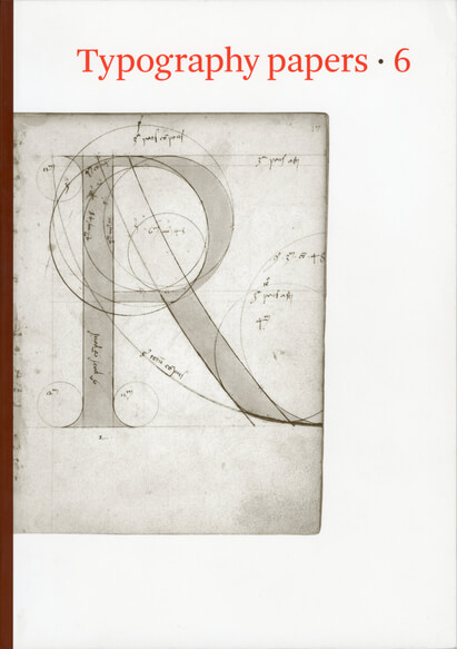
Covers: The Newberry alphabet, fols. 17r (R) and 15v (Q). See this volume, p. 19 ff.
Nicolete Gray:
The Newberry alphabet and the revival of the roman capital in fifteenth-century Italy [PDF]
The Newberry alphabet [PDF]
with a note on provenance by Paul F. Gehl
Giovanni Mardersteig:
Leon Battista Alberti and the revival of the roman inscriptional letter in the fifteenth century [PDF]
Paul Stiff:
Brunelleschi’s epitaph and the design of public letters in fifteenth-century Florence [PDF]
James Mosley:
Giovan Francesco Cresci and the baroque letter in Rome [PDF]