I found this practical task very insightful as I gained a greater understanding in the different aspects and features revolving around typefaces. What I found most useful was understanding why features where designed in a certain way to make it less challenging for audiences to read.
The session was split into two activities, firstly we had half of a font in which we had to draw what we thought the other half would look like and the last activity was drawing missing letters using the features from examples above. I had to really take into consideration curves, Line thicknesses and the lengths for both ascenders and descenders.
Typeface drawing
11 November 2021
Following the Thursday interactive session from Gerry Leonidas, I have come to recognise and acknowledge the details in typography as well as overall design.
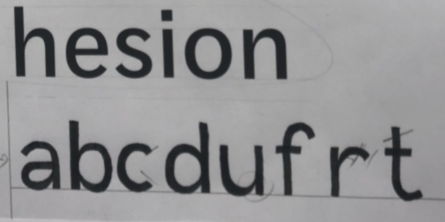
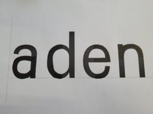
The session had us draw letters of a particular typeface that was only in small parts that were pre-drawn; and from that reference we had to draw the rest of what remained of the text. I believed this exercise was to test our knowledge of not just typefaces, but to see if we could guess the following style through little information.
The picture on the right of the page illustrates an example of my drawn work that shows how I continued with the pre-drawn typeface. Compared to the original, it was fairly accurate, however the “a” and “e” required more curvature, after being given 4 words, the task moved onto doing more without a starting reference on what we had to draw. Very similar to the first example I had drawn, they were mostly accurate other than the curvature of the lines on certain letters. In future projects, I will need to improve my skills of refining and recognising fine details, especially when it is related to text or fonts. These drawing skills will help reintroduce me into sketching for future assignments as well as improving my confidence in refinement.
To conclude, the session helped me understand the foundations of what future analysis of designs/typefaces will require. Additionally, as I have not drawn for a while, it was always helpful to regain my confidence into drawing more again.
Shark Outfit Generator
5 November 2021
I was partnered with Daisy and the 3 things she said about herself were;
She likes sharks
She likes shopping
She likes chocolate
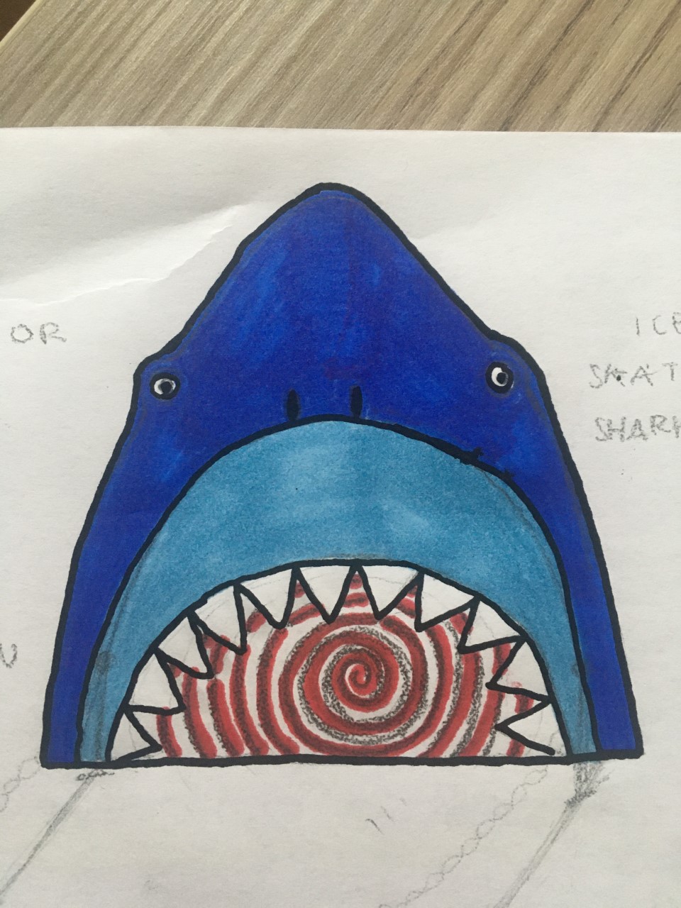
My initial ideas were having a robotic shark for a personal shopper, chocolate on tap in all shops and edible clothing made from chocolate. But for my final idea I created a ‘Shark Outfit Generator’. The idea is the shark eats you, acting as a walk in wardrobe filled with every clothing item and style available, helping to dress and style Daisy.
Labyrinth book narrative
5 November 2021
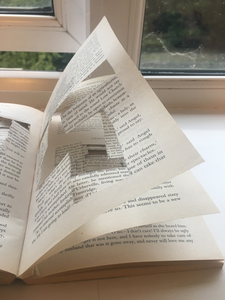
For this brief I chose the word Labyrinth.
I cut out different shapes and sections on the pages, each page representing a different chunk from a labyrinth maze. As the chapters went along, I cut out more and more sections, making it harder to the reader to turn the page, trying to correlate the number of chapter to the number of maze pieces.
Each page had it own individual shape, which made the pages more fragile and easily tearable causing the reader to be more cautious as they turn the page, much like in a labyrinth. I started to block out some of the text but realised this made it easier to see where the next maze sections were. Therefore, I stopped making it more complex too read as the the text lines up with the sentences behind.
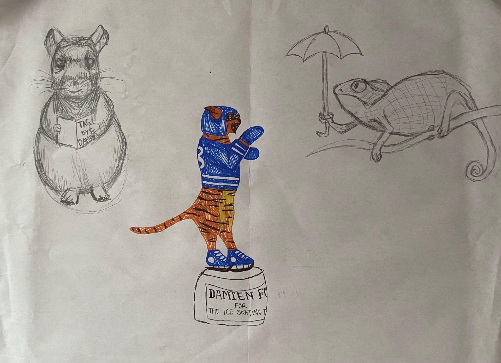
Damien’s Ideal Gift – Tiger Trophy with other statues
5 November 2021
Set of statues and trophies for different aspects and interests of Damien.
I wanted the main gift to be a trophy to celebrate his 5 years of playing ice hockey. The jersey has his team number (13), and one of his favourite animals is a tiger, hence the combination. The sketching began with a simple silhouette of a tiger standing up and then was decorated to fit the colours of Damien’s team.
The other animals are decorations for Damien’s room, as he could use some more. He told me he likes reptiles and small animals, and so I drew a chameleon and a chinchilla. My random words to incorporate were umbrella and magazine, so I gave the chameleon a little umbrella, and the chinchilla is holding Damien’s magazine called Tag, that he worked on a couple of years ago.
Set of statues and trophies for different aspects and interests of Damien.
Letter Shaping and Font Replication
5 November 2021
Task 1 – Fill in the Blanks
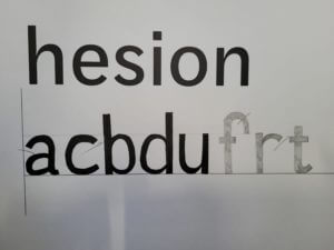
My attempt at the task, filling the missing gaps to complete the letter-forms.
In the first of two tasks, I was given 4 letters in the font ‘Skolar’ with large portions missing, with me needing to fill in these spaces as accurately as possible. While initially sounding easy, I was surprised at the complexity and difficulty of this task.
I began with the ‘n’, which was missing the top curved portion, as I thought this would be the best starting place to ease myself into the task. I used a 6B to begin sketching a skeleton of the shape before switching to a 2B to define the outlines. While I think this was one of the closest letters to the original, the sizing was still off, making it taller than the actual Skolar lowercase ‘n’.
I then moved on to the ‘e’; I struggled on this one more, not knowing if a serif was present or not. From the remaining parts of the other letters, I could see some of the different possible serifs. However, after trying them and deciding they looked misplaced and visually off-putting, I resulted in a slightly tapered but curved edge. While the right choice for this font, my choice to make the letter closed instead of a more open sweeping stroke makes my letter look visibly different from the real font.
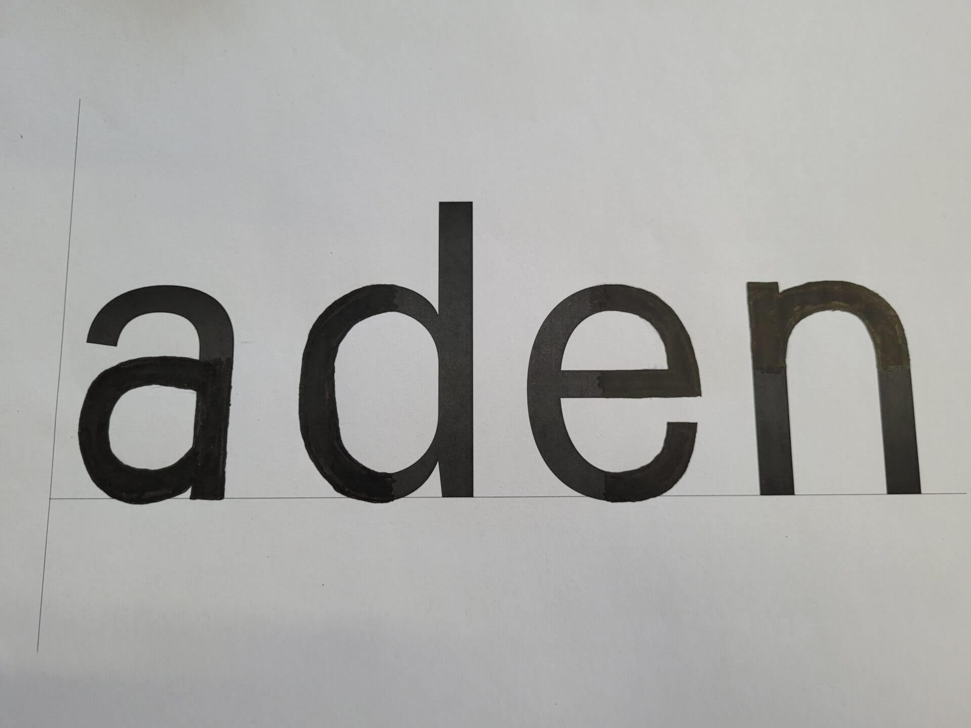
The authentic Skolar font, which I was trying to replicate. I used this image as a comparison following the completion of the task.
Although going in apprehensively, the ‘d’ was not as challenging as expected. By giving the sketching process time, I was able to slowly build onto the base skeleton lines to create a structure that somewhat matched the given portions of the letters. Upon reflection, the real font is more angular than mine, with the bowl joining onto the stem in a sharper manner. Despite this, I think that the curvature and slight descending nature on the bowl are accurate to the original, making this look like a reasonably close recreation.
The ‘a’, in my opinion, is the furthest from Skolar. In my addition to the given portion of the letter, I did not add the angled stress found in the original. The serif is similarly absent from this, making it noticeably different. I failed to capture the angled nature of the bowl, instead of creating a rounded curve with much less stress. However, with the given part of the letters, there was no real way of me inferring the angle or stress of the font. This task showed me the intricacies of type, helping me to spot subtle ques and motifs that run through the letters while allowing me to apply my sketching and drawing skills to a practical task.
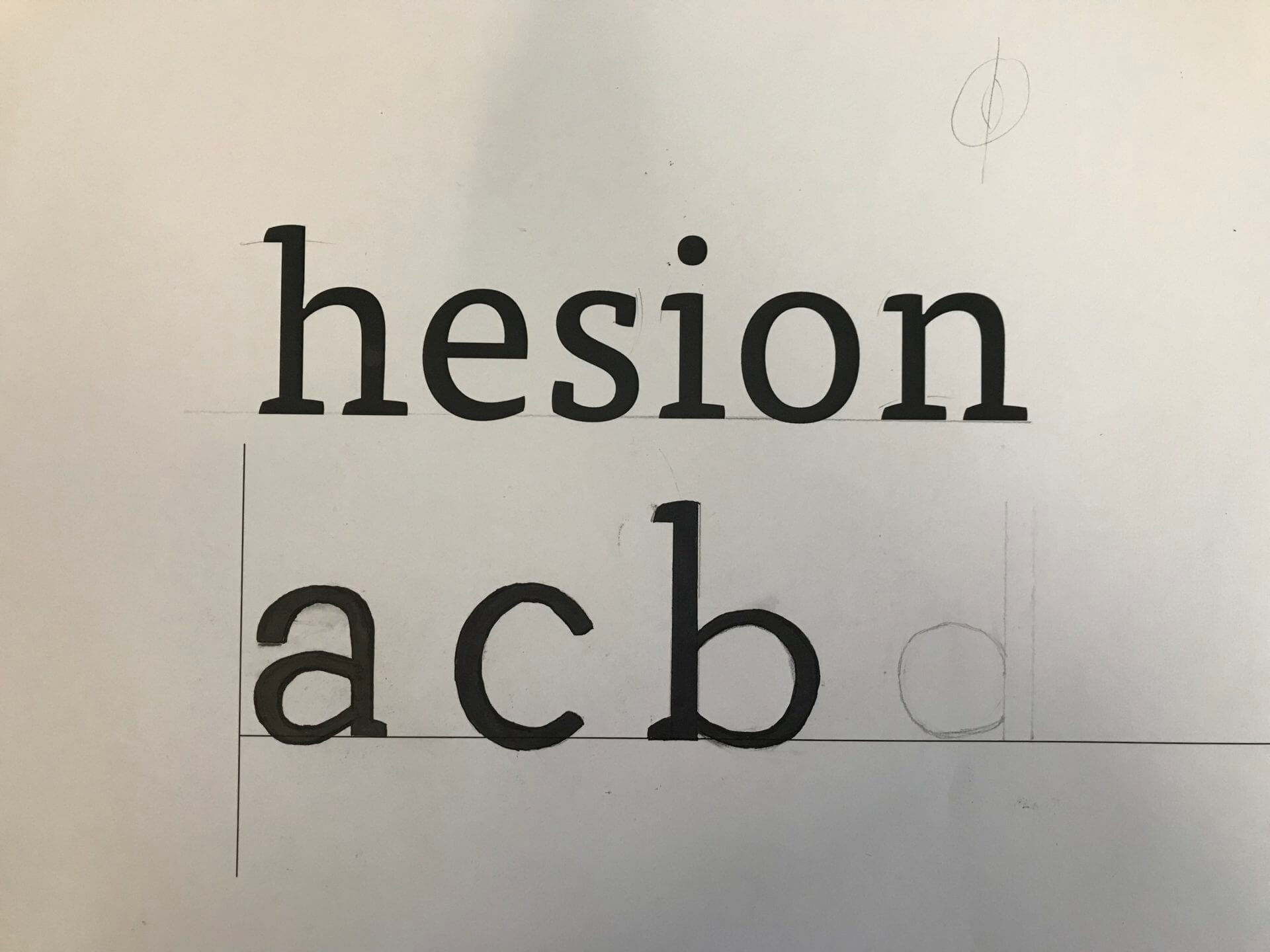
Task 2 – Replicating Entire Letters
A close shot of the task. The 6 given letters are seen above, with my continuation of this alphabet photographed below.
The second task was more challenging still; here, we were given six letters within a particular font and had to continue writing other letters of the alphabet, attempting to replicate the font. Now without the assisting portion of the letters, many more of the choices made were based on the other letters and existing knowledge of typography.
Beginning with the letter ‘a’, I presumed this would be a double story letter from the smooth, open strokes and chunky serifs. Looking back at this now, I think that the bowl of the ‘a’ descends too far below the baseline. While the counter is reasonably proportioned for the vertical stress of the letter, it is also apparent that the aperture of the overhanging stroke is too small, making the letter seem closed off. This does not follow the open nature of the example letters, forcing me to not include a serif and making it appear further from the typeface. However, in comparison to the FF Tisa Standard font I was attempting to replicate, I was not too far away from the real letter.
Following this, I then created a lower case ‘c’. The curvature became a challenge here, requiring a smooth curve and a definite decision on the inclusion of a serif. After looking at other letters, specifically the lower case ‘e’, I decided not to include any serifs, keeping the letter more visually simple. While the real letter does have a serif on the upper end of the stroke, I think that my choice was somewhat informed. With both serifs, the glyph looked out of place alongside the other letters, causing me to remove both serifs. The stress and proportional weighting of the lettering was good, but this task has helped me understand where my weak points are and where to continue independent research into typography and lettering.
Finally, with my remaining time, I drew out a lower case ‘b’. Here, I went the opposite direction, adding an upper and lower serif to the design. Although this is present on the lower case ‘d’, the ‘b’ in FF Tisa Standard only features an upper serif. The angled exit stoke of the curved bowl, stressed proportional weighting and slight descending curve are all accurate to the real font. However, the bowl is more squared off in the authentic typeface, with my recreation being too rounded by comparison.
Although these tasks were not flawless by any means, I think the lessons I have learned from completing them have been incredibly valuable. I looked at letterforms to a very minute depth, allowing me to make judgments and observations on minute aspects of the font. I have also been made aware of areas to improve, which I will pursue and try to actively improve within my studies and free time.