My first quick mock-ups of the cinema listing were all different however we can see that the first for examples very much focused on the title of the the movie (shown with the pink block). This was because my initial thought was that this is what was most important when designing the cinema listings and therefore was at the top of the hierarchy.
As my ideas developed we notice that this becomes the less prominent feature as I wanted to play around with putting the film title in different type fonts and sizes.
I carried this forward when designing my final two listings as I focused on the type of user which would therefor change the hierarchy in the text. I based my designs on the premise that the user would be university students visiting the Reading Film Theatre. Because of this, I believed the date would be the most important aspect following the film title as they would plan going to see a film around their schedule. Furthermore, with there being only 1 film showing a day, I did not want to follow the usual conventions, for example a popular cinema website, whereby they would first list the film title and then the dates and times of the showings and this would not have been practical with only one showing.
My second design shown above, I wanted to play around with the typeface sizing of the dates to make it more eye-catching. At first I just included the large numbers however after receiving feedback from my peers that this was hard to understand, I chose to do this alongside the large months shown above to indicate that these were in fact dates. The use of putting these in the same colour also helped me achieve this idea.
Shown here is my cinema listing I created on Indesign. I chose to use this specific title as it reflects on my learning from this task. The reason it reflects so well is because from creating my two listings (one is showed here) I learnt new things and enhanced my knowledge on some of the techniques.
Before doing this task I struggled with using paragraph styles and characters and now I feel a lot more confident with using them for future tasks/projects. When I did stuggle to create some things or find some things I used the internet and researched how to overcome the issue.
Some issues I did overcome while creating my two listings were having to stop forcing line breaks, instead i used paragraph styles to help me. Overall I feel I have learnt a lot from this, one being to ask for feedback to improve my work and ideas as the feedback I recieved helped me to make my final outcome better.
For this task we had to follow a video tutorial and copy ‘The Great Gatsby’ penguin book cover. I really enjoyed this piece of work as I am fairly new to InDesign. I found that I was really engaged into the task and learned lots of new tools and got to familiarise myself with the navigation of the software.
My client for this real job was an independent publisher based in Reading. The client is writing and publishing a new book that details historic events dating back to the early 19th century. The book tells the story of Danish prisoners of war, residing in Reading during the years of 1807 – 1814; mainly taking from the memoirs of one of the prisoners, who became better known in the town as the Gentlemen Danes (also fittingly the title of the book). The book is the first to detail the ventures of this particular group of war prisoners as the memoirs were recently recovered and have only been translated fully as of 2020. The story of the Gentlemen Danes follows the group mainly throughout Reading and different parts of Berkshire; describing their lived experiences that make for an interesting, historic read.
Restated Brief and deliverables
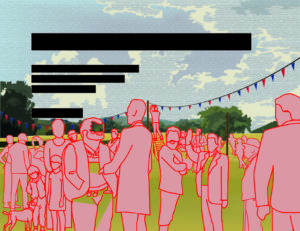
The job originally started off as a commission for an illustrative font cover with a rather quick turn-around; it entailed that I create an illustration that works as an eye catching, historically accurate front cover that did allowed ample bleed and did allowed for the integration of text for the title to exist in the same space also. To begin with there were not many reference images to work from, aside from one sketch that my supervisor had quickly drawn herself. Ultimately the illustration was described to me as a somewhat realistic illustration for The Gentlemen Danes history book that displays one fete (‘Revel’) as described in the text (the text was provided for me also). After emailing my supervisor who was in direct contact with the client, I then found out more about the nature of the illustration and some possible additional deliverables on top of the proposed illustration. It was being discussed if the cover would also serve as a smaller sized thumbnail image on the inside of the book also. I was also told to consider using the colours that were see in the Danish flag and that the exact colour values I use would have to be noted for possible use elsewhere on the book; perhaps for the titles or other text on the cover. This meant that I also had to think carefully about which tones would work on top of the illustration for it to be legible enough.
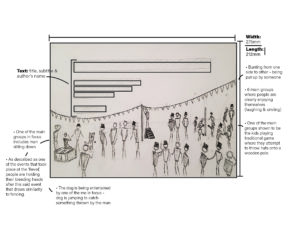
After going back and forth further with my supervisor and client however, we came to an understanding that the colour would be dropped as a deliverable and that the main focus was just the cover as an illustration. During this process the dimensions of the cover (275mm x 212mm) were given to me as well as how much bleed was required (3mm around all sides). From the start the illustration was set as being CMYK as it was definitely going to be printed, and the point was made that care would have to be taken to make sure all necessary detail was big enough to be see on a cover at the size it was. The other considerations that were very important that I think about carefully were the accuracies of not only the scene being depicted, but the clothing, hairstyles etc. of the time as well.
There were only two reasons where the brief had to be changed in a substantial way; one being because of the change of deadline and the second being because the main deliverable changed. During around December time the client decided to change his mind about what he wanted for the cover. I was told that he came across an original painting that displayed the Danish flag on its sales and he thought it to be a very good cover for what he was writing about. This did not mean that I had been designing for nothing however, and he made the compromise to keep a space left in the book for my illustration to be displayed. The brief had to be updated from a cover illustration to a general inside pages illustration; which fortunately meant that I would not have to change much except fill in the space where I left empty for text to be.
Schedule
The job to begin with was a rather quick turn-around of Around 5 weeks, of which I was confident in reaching on time. This did not go as planned however, and the level of accuracy and detail that my client required was more than initially expected. Not reaching the deadline I was given was not however a problem; I had warned my client before time that I may not reach the deadline I was given, which was originally the 15th of October and he explained that he truly wanted the illustration done by January. I assumed then that the original date given wasn’t entirely true to the sentiments of the client. Over the time it took to create the illustration, I believe that I have kept a steady, suitable pace, even when other commitments got in the way. In terms of communication with my supervisor and client this real job felt a little different than the average. My supervisor was a Masters student who was very busy a lot of the time, and it became apparent when her reply times were getting longer and longer. We came to a happy medium however where I would directly email and set up video meetings with the client instead of going to my supervisor first. This was agreed on by all parties and in retrospect made sense for this kind of job; I was making changes as per the clients request so the supervisor just being an extra messenger was not the most efficient. From this point in about early November, I would be meeting frequently with the client, and every so often emailing my supervisor with an update on the illustration process.
Process
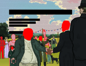
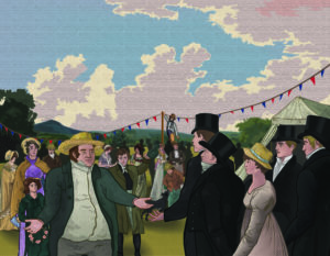
At the beginning the job ran like a normal real job would. I contacted my supervisor for feedback, and when given the green light I would get feedback from the client. Often times my supervisor would be medium between us, but after a while it was established that I was better off getting feedback directly from him as it was his specification I was catering to. It also meant that I wouldn’t have to go through my supervisor just to get to my client. From then we were in agreement that this be the process for communication. In the first couple weeks the interaction between me and the client was mostly to do with general styles of illustration and the composition of the scene. We settled fairly quickly on a style, but the layout of the scene took a while longer to agree on. At this time I was still working with barely any detail and mainly would move rough stickmen figures to signify where a person would be in the illustration; perhaps the lack of detail and didn’t allow for a true representation of what the layout actually looked like at this time. In this part of development we went over a lot of changes in a period of time, building up the composition piece by piece.
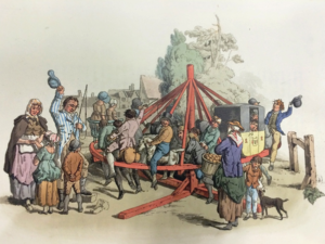
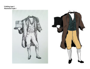
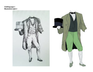
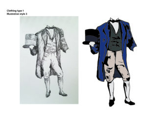
An example of the images sourced from the research visit to the MERL – image is from Pyne’s British Costumes (William H Pyne)
After a while of talking about research for the kind of clothing they would wear at the time, the client requested that I visit the Museum of English Rural life to get a more accurate and confident look and feel for this aspect. The visit was very fruitful, and the notes I took were very helpful to the character development over time. The books where I got the most useful information from were British Working Dress – occupational clothing 1750-1950 (Jayne Shrimpton) – Shire Library, and Pyne’s British Costumes (William H Pyne) It was the first time that I would have to an extended amount of research for an illustration. It was also a learning curve for me in terms of illustrating from descriptions in text.
Design
The first sketches I sent to the client were in pencil and were to get a feel for the number of people in the scene how the scene would be generally set up.
Image of initial sketch used as template for graphic stylesInitial sketch of a possible layout of the scene
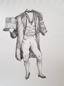
I would also draw in pencil a template for the styles I gave to the client to decide from. I had already been told that the client liked some of the styles shown on my portfolio, and I had also been told that the illustration was to be somewhat realistic. I drew the same human figure and took it to illustrator to create a few different styles of which the client picked the one that incorporated shading made up of hatching. The reason was that it resembled engraving and gave historical connotations in of itself.
One of the proposed illustration styles sent to the clientOne of the proposed illustration styles sent to the client (chosen)
From here we would simultaneously go through different characters and the accuracy their clothing, and the composition of the scene as whole. Up until the last one, every meeting with the client would result in either a major or minor change to the illustration.
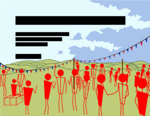
Initial digital sketch – use of stickmen for positioning of charactersDeveloped digital sketch – composition is more balanced and background is built up with detailDeveloped illustration – composition nearly finalised and relevant detailing is coming more and more into the sceneFinal illustration with all details added, sense of depth with blurred background, and etching style finish over the top of it
For a while it was quite intense with the number of changes suggested, but I soon got the hang of it. I also learnt very quickly to work in a way that would allow for things to be moved easily around the illustration without any problems, i.e. ensuring each person was their own entity (by grouping their components) so if they were to be moved to the left or made bigger, it was an easy change. After a while colour was incorporated, many characters were changed around, taken out or added and the whole scene became a reality.
Reflection
The real job ended different to how it started in more ways than one. Firstly I didn’t realise how much detail and research was required for this illustration, and it came as a little bit of a shock to me how much time I would go on to dedicate to it; it stands to reason that the initial brief set false expectations due to it being advertised as a quick turn-around. Another area where there was a big change was the connection between me, the supervisor, and the client, with the supervisor eventually becoming an unnecessary step in getting feedback from the client. The final area was when the job illustration changed from being a for the cover to being for the inside content.
At the start there were a few things that the client wanted to explicitly be in the illustration in some way or another. The list consisted of a black and white dog, some of the Gentlemen Danes in the frame, one of the main Danes being very tall and skinny, a large famer welcoming them into the fete, a line of fete banner across the field they were on and some kids playing one of traditional summer game. With all of these worked into the illustration, the client seemed very happy with what was achieved. A word from the client that further justified this;
“Lewis put his name forward to do an illustration of a country event in Berkshire in the early nineteenth century for a forthcoming book. In order to be as historically accurate as possible Lewis had to do a lot of work in researching the costumes people were wearing at the time. After many online meetings, and a number of adjustments and modifications to the original brief, we finally honed it down to a picture that I was very happy with. Happy not only because it is an authentic reproduction of how the event might have appeared like, but also because it was done in Lewis’ own graphic style. It was a very pleasant experience to work with Lewis and I wish him great success in the future”
Overall I was very happy with how the job turned out, and although the prospect of having my illustration as a book cover was more exciting, I am still very glad and grateful that it even gets to be in a publication of some sorts. The end product felt deserved due to all of the time, research and effort that went into the work. Thank you to Libby Skipp and John Nixon.
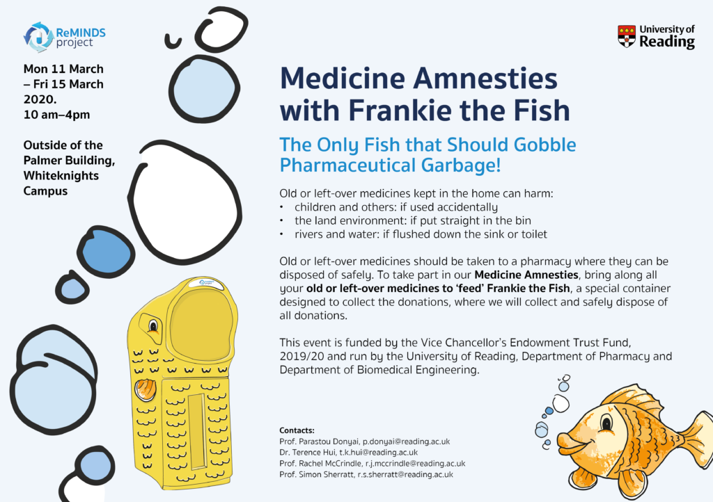
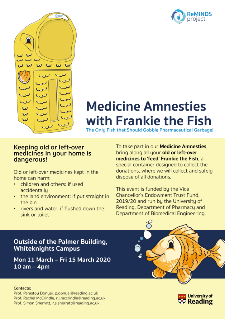
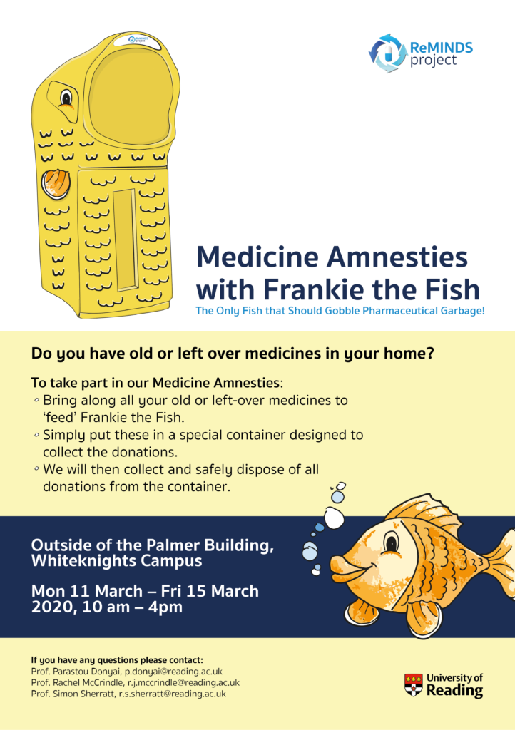
The clients for this project are from the Department of Pharmacy and the Department of Biomedical Engineering at the University of Reading, where they are developing a project to examine medication reuse. The ReMINDS brand is to focus on medicine, the environment, people taking their medicine, pharmacy and drug manufacturing. It is important for people to know that old or left-over medicines in the home can cause harm, and that these should be taken to a pharmacy for safe disposal. This is because otherwise they can harm children if taken accidentally, the land and environment if put straight in the bin, and rivers, water and their inhabitants if flushed down the sink or toilet.
Restated brief
Main points of focus and the deliverables
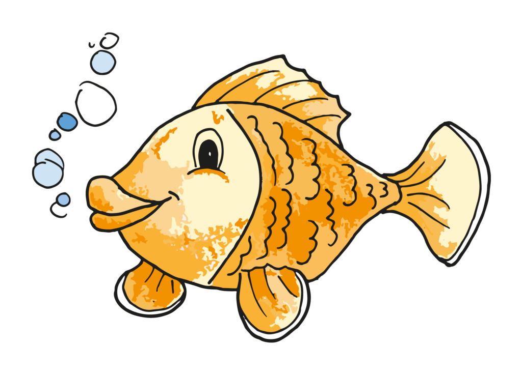
The main aim for this project was to create a set of deliverables all building to run medicine amnesties on the Whiteknights Campus, where people will bring their old and left-over medicines to the ‘Medicine Amnesties with Frankie the Fish’ where they will collect and safely dispose of all donations. ‘Frankie the Fish’ is a special shaped container with vinyl stickers to make it look like a fish character, designed to collect the donations and spread the message that if people flush their left-over medicines it can harm the environment and its inhabitants. This event is (or was to be) funded by the Vice Chancellor’s Endowment Trust Fund, 2019/20 and run by the University of Reading, Department of Pharmacy and Department of Biomedical Engineering.
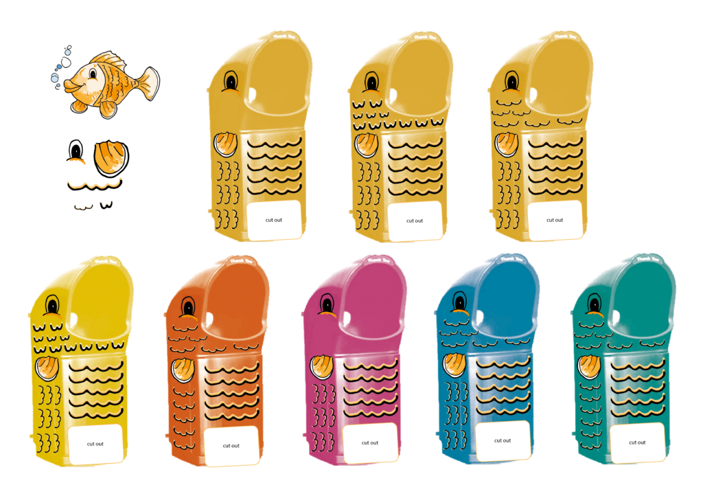
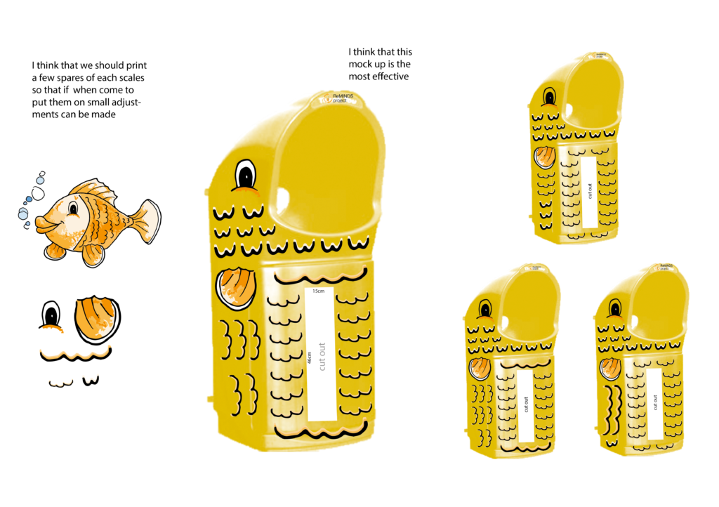
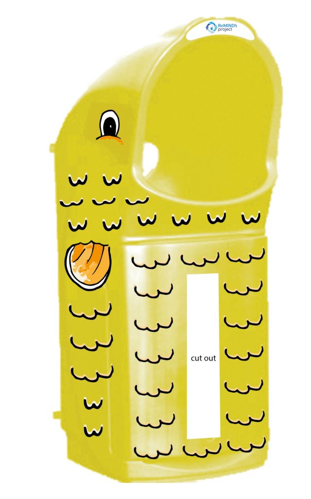
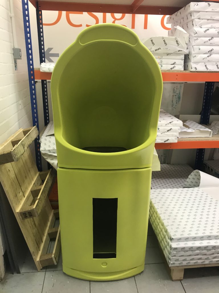
The main deliverable for this project was the large container called Frankie in the shape of a fish that would be wheeled around the campus and elsewhere for medicine amnesties. This provides a safe disposal mechanism and raises awareness of the problem of medicine waste. To make the container look like a fish, it is spray painted bright yellow and was designed to have vinyl sticker fins, scales and eyes. For this, a Print Cut File with these shapes and aspects was to be created to be sent to DPS to be printed. In preparation and to plan how this would look, I created mock-ups using colour and the fin, scale and eye illustrations. Due to the client unfortunately pulling out, as I will explain below, there was not the funding to print the vinyl stickers so there is no physical container to show as there is currently no medical amesite happening because of Covid-19.
The client also wanted a logo for the ReMINDS Project to create a brand around the project and the medicine amnesties that could then also be used on the deliverables that were advertising the event. As part of the advertisement for the event, the client wanted a flag banner to catch people who were walking on campuses’ attention and draw them towards the container to increase involvement. A leaflet was the other deliverable that the client later decided they wanted to have to advertise the event prior, to build up awareness and educate people as to how to get involved and why.
Target audience
The target audience for this project is very wide, being focussed on any student, lecturer or even visitor to the Whiteknights Campus. It is for those who take an interest in increasing the safety in their home and those who are conscious of helping the environment. The wide target audience meant that there was no strong style that needed to be followed.
Schedule
Until Covid-19 took a massive hit into this Real Job, I had stuck to the schedule well on my behalf. I feel that I was very organised and did all I could to keep things running quickly and smoothly. The first restated brief had the goal of completion for the 14th of February, this however was unable to be met due to tasks such as creating the window in the container and, mainly, spray painting the bin with an external company slowing down the process. The client, however, wasn’t worried about the schedule too much, therefore I took it upon myself to set a new deadline of mid-March, which the client approved of. This was to give us a date to work by so to not let the job take a back seat. Until Covid, when students had to head home, we were on track to have the project deliverables ready by mid-late March, with a minimal, quick change to be made to some of the colours after the paint colour came out differently than expected. However, with Covid this meant there were no students on campus, as well as it still not like normal this new academic year, therefore there was no strict deadline to get it done over summer. It was also tricky and inefficient to work on it remotely as I needed to physically see the container to make the important decision on colours. I picked it up again when back at university in September, but unfortunately the client was unsure how to continue in the current climate, therefore I set myself the goal to continue it again over Christmas when my first term deadlines were complete. I think throughout the project I have worked steadily hard and in an organised manner so to hit my schedule where possible and create new deadlines when necessary before Covid. This was my first Real Job on my own and with the deliverables increasing through the project I was pleased with my organisation and prioritisation of tasks to stay on top of things.
Updated restated briefs
Throughout the project I created new restated briefs to make sure the client and I were on the same page, and to give myself an organised, approved list to work from. As the project went on the client introduced new deliverable part way through working on the original ones. In the original restated brief, made towards the end of January, the deliverables were simply a design for Frankie the Fish to go on the container and a logo for the ReMINDS Project. However, after many emails, calls and meetings discussing the project and its progress, by February the client had added a more deliverables to enhance the project. Therefore, it made sense to update the restated brief with the new deliverables to confirm these with the client. The client had been more specific as to how the design for Frankie the Fish was to be stuck onto the container to be the fish character, as opposed to just a 2D design that could be used for other deliverables. As well as this, they wanted a leaflet to let people know about the event and how to get involved, a banner to advertise it further, both with the ReMINDS logo, as previously discussed.
I also amended the restated brief a couple of times after Covid to update the schedule, more for myself by the end as the client was no longer replying to emails, as this helped me to organise my time alongside the expected deliverables.
Process
Initial contact with client
My first contact with the client was through email and closely followed by an online call. In this meeting the client outlined what the ReMINDS brand was. She talked about what she expected from the deliverables and I made note of this. Following this meeting we had consistent email communication where I exchanged initial designs and ideas, having another couple of meetings online a few weeks later to discuss how this was going and extra deliverables she wished for me to do. From then on, aside from frequent emails to the clients, I met with another one of the clients in person. This was mainly to discuss plans for the physical container and to confirm ideas and decisions from over emails about other deliverables.
Overall, I think that this project improved my communication skills and gave me more confidence in talking to clients, both in person and on email, making sure I kept myself organised so that I could answer all their questions and have the work done for when it was needed.
Covid-19 and client dropping out
Unfortunately, after Covid-19 left uncertain circumstances at university and on campus it meant that the client was unsure how we might progress at the moment with this project. This is because the medicine amnesty requires the campus to be busy in order to raise awareness and collect the medicine. I suggested a call to discuss future plans but didn’t receive a reply after a month or so, so was advised to continue without the client. I plan to get in touch again when the work has been signed off, to allow them to see what was made and to give them a chance to use it in the future when circumstances are simpler. I am disappointed to not get the final result of the bin and seeing all the deliverables at work advertising and showcasing the medicine amnesty but because of Covid it is expected.
Research
When I was initial assigned this project, I started by getting a clearer understanding of what medicine reuse was and why this project was so important. I felt this would give me a good base to start this project, and through learning facts around the subject area, like how much of our waterways is contaminated with pharmaceutical runoff, it inspired me to help make the positive change. While I was doing this, I also researched into competitors, or companies/campaigns that do or promote this kind of work already. This was useful in furthering my research, as well as looking at the branding style of this area.
When starting to design deliverables such as the logo, I initially created mood boards from researching medical and pharmaceutical logos online to generate some ideas and to see the different styles that I could play around with. From this research I could see there tended to be a simple, but professional-looking illustration of something related to the health, medicine or pharmaceutical industry, such as DNA, a medical cross, stethoscope, pills, etc. This illustration was often in a bright colour that was integrated with a plain, san-serif typeface for the company name. From my research I chose to use pills to represent the area and as I felt it suited the project best. I then did further research into different styles of arrows I could create for the logo after deciding to represent the idea of medicine reuse with the pill and arrows. I also created a mood board when coming to design the fish character from researching online to get a feel for the different styles I could play with for the client to decide between, as well get an idea of the age groups that different styles might apply to. When it came to creating the leaflet, I found it tricky to arrange everything on the page and to know what style to go for, therefore I found researching medical leaflets useful as examples.
As this is something that is new to the university, there weren’t people to directly ask about past experiences and problems with the medicine amnesties and the branding surrounding it. However, after explaining it to some peers, I got some feedback and tips about what they, students (the people who will interact with it on campus), thought. They commented on how the bin should be linked into the branding deliverables, like with the fish drawing and bin drawing on the leaflet. As well as that, they mentioned that there should be explanation of what the medical amnesties are on the leaflet to raise awareness. As well as this, I created user personas on my Trello page to highlight different possible users and to think about the different people that may interact with the medicine amnesty and the deliverables surrounding it, using this to help in my designs.
Trello board
Through this project I have taken what I learnt from my previous Real Jobs and used the Trello board in an efficient way by keeping it updated as I went. It helped to structure my work and make sure I hit all the necessary aspects for the project. I was successful at uploading the development of my work for different deliverables and explaining reasons why I made these decisions.
Design stage
Fish character
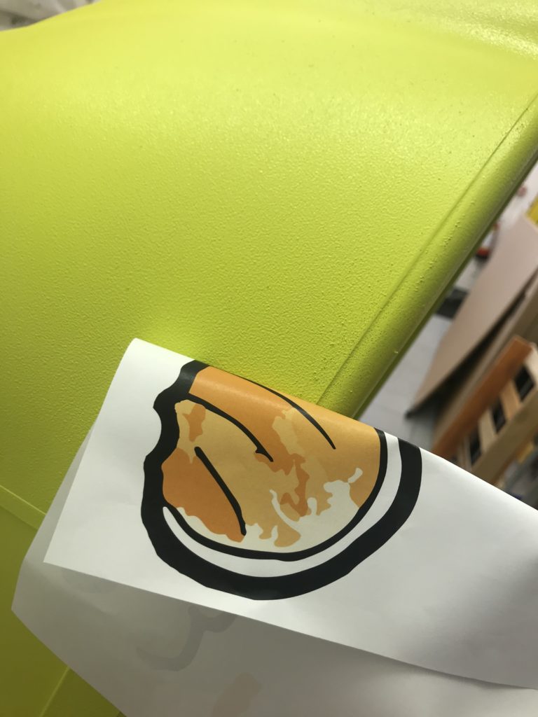
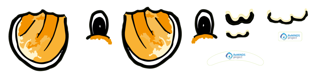
The first task I did after restating the brief was create a fish character. I did this by doing some simple research online at some different types of fish and styles of illustration. Below I show the different fish characters I drew based off of this research online. The client then chose a certain fish character, which I then tried in different colours and sent back to the client for them to pick one, of which they settled on Orange tones. I am happy with the fish character that was chosen as I felt the colours are vibrant and the client liked the idea of it looking similar to a Goldfish. This was to be included on the banner and leaflet to carry the brand and the ideas behind it. Later in the project, when the container was spray painted it looked more of a neon yellowy-green than planned, therefore the colours of the fish were to be slightly amended so the separate features would match the colour the bin turned out better.
Initial fish illustrationsFrankie the Fish drawing
Mock-up
In preparation for printing the vinyl stickers for the physical fish container, my next task was to use the features from this fish character and create a mock-up of the container and plan where the vinyl stickers of the fins, scales and eyes were to go. This allowed the client and me to imagine how it may look in person and to play with different layouts to find the one that looked best. Further into the project, when having to amend the colours after the spray-painted bin came back a different tone than planned, it was useful to use the mock-ups to play with different colours and the arrangement of these. With the yellow being brighter and less orange than planned, a more toned down, lighter orange suited being used more frequently for the fins as the brighter orange clashed otherwise.
The client organised and bought the container previous to me being assigned to the project, therefore after our initial call I was sent over a picture of the shape of the container we were to work with. The first job I did concerning the physical fish container after making the initial mock-ups was to measure-up the bin for the hole to be put in it and to plan for the size and layout of the vinyl stickers. I did this careful and in great detail so it would be as accurate as possible. Once I had measured this, it was organised for the hole to be made in the container, which would later be covered with clear plastic so to see the medicines inside. While the bin was off being cut, I worked out the size each feature would be to use on the print cut file.
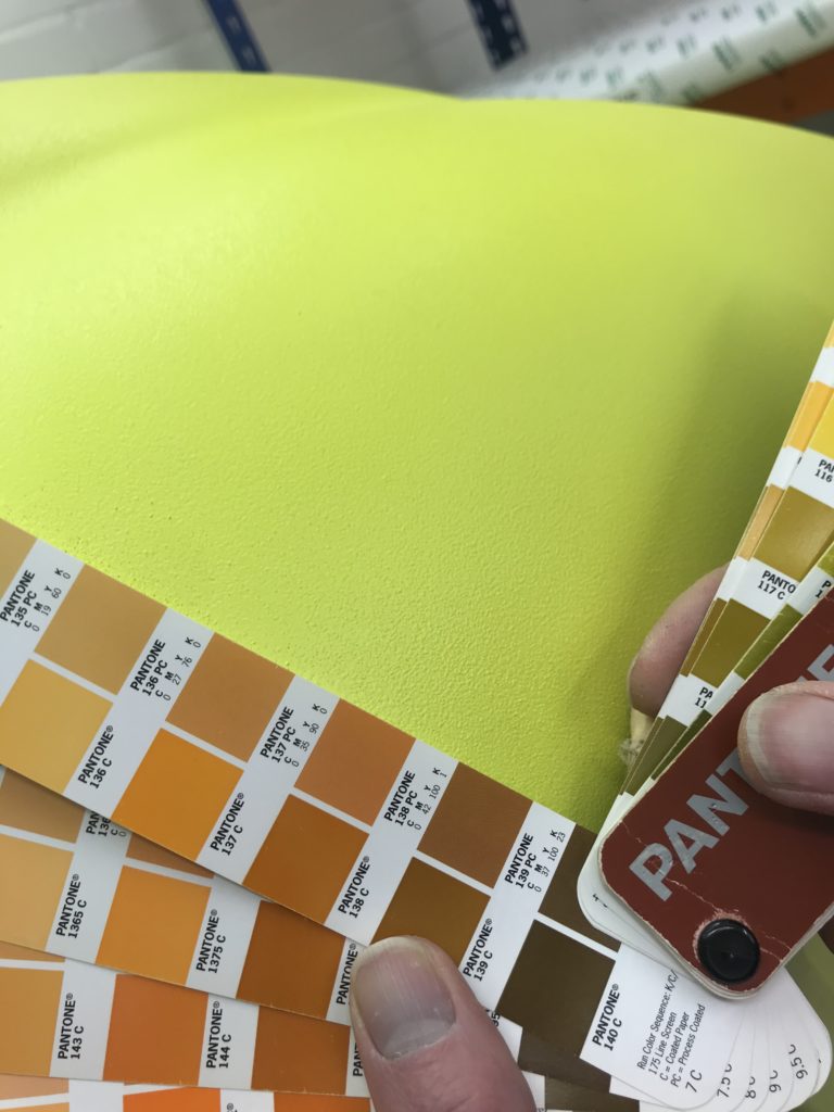
The next task, and the one that took up the most time, was finding the best way to colour the bin. To work this out I spoke with DPS and asked what they best suggested. A wrap was suggested, however deemed more complicated and riskier than printing them separately. Therefore, to give the container colour, spray painting was suggested as the most durable for its outdoor use. When deciding the colour, I sent the client images of the different colours, as well as showing one of the clients the swatches in person for a clearer idea of the colour they’re picking. The colour didn’t come out as the clients expected, being brighter and more of a green-yellow. This was a shame as clients questioned re-doing this, however, as they realised, they had chosen it themselves, they kept it and we decided to simply change the tone and/or arrangement of the oranges for the fins and scales. Now with no client due to uncertainties with Covid, there is no physical fish character container that is finished as there is no funding behind it to have the vinyl stickers printed.
Print Cut File
Once I had measured up the container, I could then decide the size of the fins, scales and eyes of the vinyl stickers. The making of the Print Cut File was something I had never made before. It taught me further tools within Illustrator and the importance of using layers effectively, things that have benefitted me in my other studies.
Logo
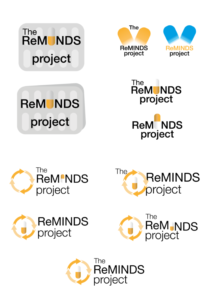
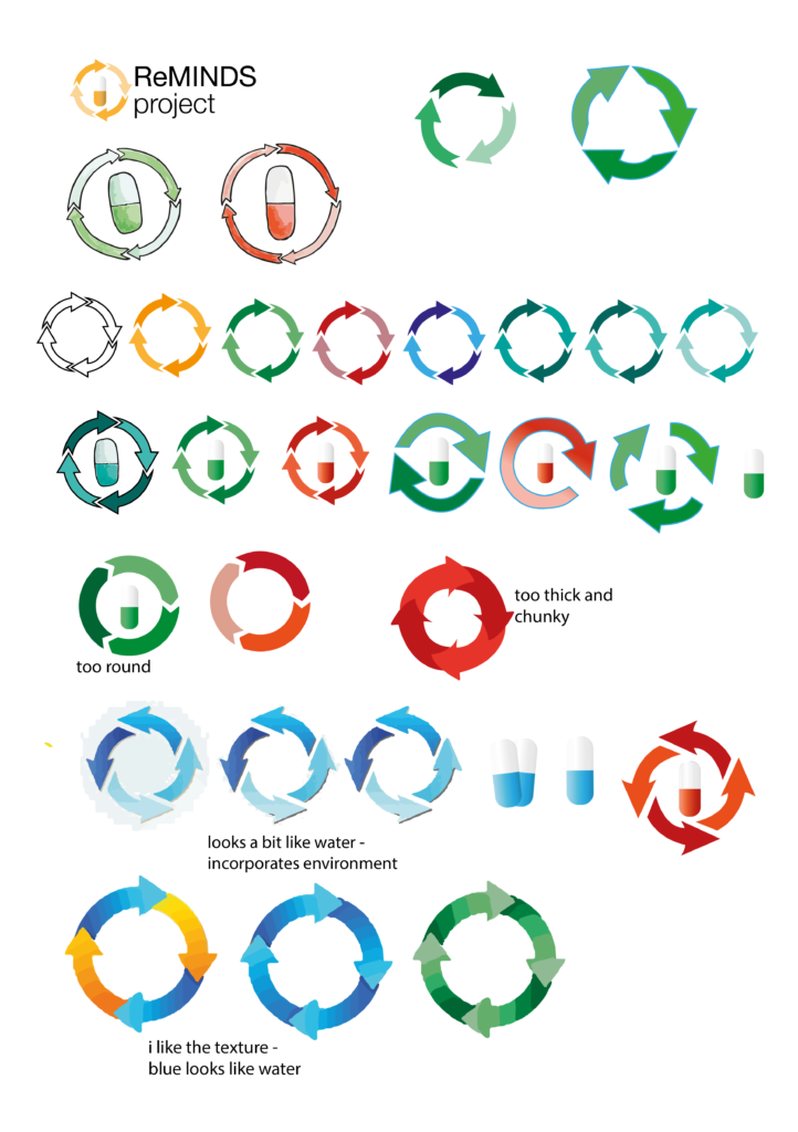
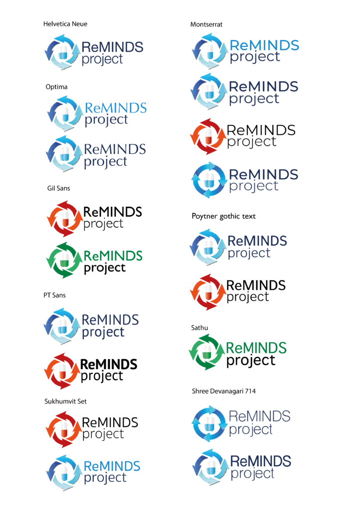
I initially created mood boards from researching medical and pharmaceutical logos online, to generate some ideas and to see the different styles that I could play around with. I liked the idea of incorporating pills as this fit with the project and brand and as well as being understood by all. It also holds a more serious message than the fish cartoon, which is what the client asked for the logo. Once I had decided on this, I experimented with different ways to introduce the pill as a logo, trying to use the pill as the ‘I’ in ‘ReMINDS’, however this wasn’t clear enough and didn’t work as I’d hoped. I liked the idea behind my initial drawing of the pill packet, but when incorporated with the words I felt it didn’t look professional enough. Aside from the pill, to relate the logo back to the idea of medicine reuse and helping the environment, I felt that arrows represented this very well. To add further depth to the logo, I experimented adding water into the design to relate back to Frankie the Fish and the suffering environment in the contaminated water. After experimenting with colour and different arrow styles I decided to incorporate this into the arrows by giving them a water-like colour scheme and texture. I also tried a version of the logo hand drawn and then image traced to create some more interesting textures, but this did not look professional enough compared to ones from my research. I sent the client these logos throughout and built and changes based on their comments, in the end I sent them the final logo in a selection of colours, and they chose blue. The final adjustment suggested by my supervisor was a shadow so the pill would stand out even when on a white background. After creating the illustration part, I focussed on researching typefaces used in medical/pharmaceutical logos, of which I then tried a range of san-serif typefaces and decided upon Sukhumvit Set. To tie the words into the illustration I pulled two different blues from the arrows and used these on the words. As we wanted ‘ReMINDS’ to have more hierarchy over ‘project’ this was put in semi bold weight and the brighter blue, while ‘project’ was in the darker navy and a light weight.
Overall, I think that this logo is effective and hit what the client asked for because it represents the subject of medicine reuse well and in a professional manner, like the logos I found in my research. On reflection, and something I have learnt from this real job is to have more initial ideas and to go into detail for a number of these, not just go into detail with one or two before I send these to the client. Despite the client always being excited about what I showed them, it is more professional to give them a range of options to start with.
Initial logo ideas
Arrow experiments
Typeface experimentsLast series of logo experiments sent to client before they picked
Banner
The design for the flag banner was to be used at medicine amnesties to draw attention to and advertise to people on campus what was happening. The client wanted a simple design that was similar to the leaflet design, in terms of using the same colours, the logo and the fish character. The design I created I think is effective for its purpose because it tells people what the need and catches attention with the bright colour and fish drawing. This was the deliverable that, despite not having designed before I found the simplest to design as there wasn’t much text to fit with the logo and drawing. The background was chosen to be yellow like the physical fish container, so to match the other deliverables and create a cohesive balance between them, as well as it being a bright colour to catch people’s attention. Once the design had been decided, with a few amendments of the layout of text, it was recommended by DPS that the yellow should become opaquer so that the design didn’t show through on the other side. It was also initially going to have different drawings on either side of the banner; however, this was changed to create consistency on both sides.
The biggest query surrounding the banner came right at the end when I was planning to sign off the banner at the end. My supervisor raised the question of whether it was meant to be one-sided with a reverse show through side where the writing would be backwards, or double-sided where the writing would be printed on both sides from left to right. Over the last week I saw an example of a flag banner in the street that showed a one-sided flag banner, this initially made me think I should do the same. However, after exchanging emails with my supervisor for advice, as well as re-reading old emails from DPS, and doing some basic research online that taught me how a double-sided banner is made from two printed graphics that are stitched together with a lining in the middle to allow the message to be clearly displayed, I decided to have it double-sided.
Leaflet
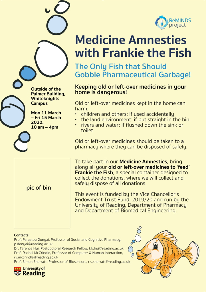
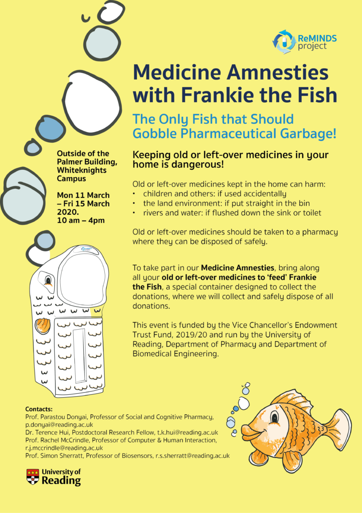
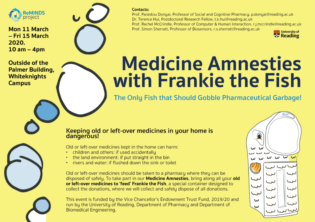
Like the banner, the leaflet was a later addition to the deliverables. The client and I decided that a leaflet would build up knowledge of the project and awareness of the medicine amnesties. The client gave me the information they wanted to be on the A4 leaflet, and after creating some initial designs I felt it was too information heavy, however the client stressed that if possible, all the information should be included. While this was frustrating as I felt it was limiting the design as it looked overly busy and would catch attention less, I did also understand that most of the information was necessary for the reader to understand the ReMINDS project’s goals and details of the medicine amnesties. Therefore, since the client dropped out, I decided I would choose the amount of information myself based on the design, however, of course include the essential information. I played with a couple of designs with more and less information, but landed on the one I did because, although I preferred the design with less, it is important for motivation as it gives the reasons ‘why’ behind the project.
When doing this I did some research into medical leaflets, something on reflection I think I should’ve done sooner in more detail, however doing this gave me an idea of the general layout and design of them. From this I learnt that many of them have quite busy layouts, with a decent amount of information, as medical topics/projects tend to need explaining. These are separated into sections on the page using colour and shapes in the background. In terms of typography, they generally use san-serif typefaces, so to represent the serious nature of the topics.
One issue I had to tackle while designing the leaflet was how to show the fish container. This was because initially we would have had to wait till it was completely finished and taken a photo of it for the leaflet to then be complete and be able to be shared. This was not only inefficient in terms of timings, but also it was pointed out that a photo of a bin or container would never be overly aesthetic, therefore I suggested a drawing instead as this was more visually engaging. I based this drawing off the mock-up I had made previously. This improved the leaflet as it added something more visual and paired with the drawing of the fish well. I also added the waves underneath the blue box as I felt these were appealing colours that matched the theme and balanced the colours over the leaflet.
I decided to use the same typeface that was used in the logo to carry the brand over to the leaflet. It also followed similar tendencies to the medical leaflet examples I found in my research that also use a san-serif typeface.
Final designs
RJ00410 Leaflet
RJ00410 ReMINDS Project Logo
RJ00410 Container Mock-up
RJ00410 Banner Mock-up
RJ00410 Banner Template
RJ00410 Print Cut File
Feedback
Unfortunately, due to the client dropping out and the medicine amnesty not taking place I have not received any proper feedback for the work and deliverables. Before the client was unable to continue the job, they were very happy with the work that I had completed so far and trusted they would be effective in creating a brand and advertising the event.
Reflection
This project has developed into a very interesting and individual project, with the branding deliverables being not only a logo, leaflet and poster, but to design a fish character for a bin that will be used at the medical amnesties.
This was my first real job I took on my own, which at first was slightly daunting as it meant I didn’t have a peer to ask for a second opinion, but with this job I have learnt to ask lecturers and my supervisors more for advice when needed which I think is a valuable skill and one that will benefit me in my studies.
I think I have handled the workload well, especially considering the projects unique deliverables that seemed to have increased throughout the project, and managed to stick to deadlines as well as I could, with factors such as finding and getting the spray painting done being trickier to sort than initially planned. Having to juggle a Real Job on my own alongside modules helped me to cut out my previous habit of procrastinating, as it was important for me to prioritise as the job was time sensitive. This is an improvement that has helped me across many areas of my studies.
Up until Covid sent students home mid-March, I was on track to have things sorted by the new deadline, with only slight changes to make to the colours of the fins, etc on the fish container. I was disappointed when this all had to be put on pause when I was no longer to access the bin to make an accurate colour change, as well as there being no rush to have the deliverables sorted as campus wasn’t busy like normal, so the client couldn’t hold the medical amnesty anyway. I felt that I was very on top of this job while I could be and am pleased with my progress at working as an individual.
This job has allowed me to improve my communication skills through skype calls, email and numerous meetings where a range of different things had to be discussed, and I have learnt to make sure I take detailed notes so I can pass on information correctly. For example, being in contact and talking to DPS directly was confusing at first, however, it has been a great insight to see how these things work and how I should best handle my files.
A more specific skill I have learnt to do on this project is create a Print Cut File for the scale and fin stickers that will go on the bin which taught me about more in-depth tools on Illustrator and further taught me the importance of layers and print specifications.
On reflection, something I have realised from this project is that I need to come up with more initial ideas for things, for example when creating the Reminds Project logo I didn’t come up with enough styles and ideas to show the client, even though they were happy with what they picked for me to develop, next time I would like to give a client more choices.
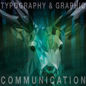
Firstly, how did I come up with the title, “Dear, Typography” you may ask. A letter is a type of typographic piece of work; specifically the most dearest one to me. Another reason why I thought this choice in title was the best fit for this post is because of the play on words – we see a ‘deer’ visually on the final design, right?
…
DESIGN 1
Design 1 (final design)
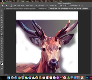
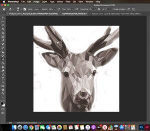
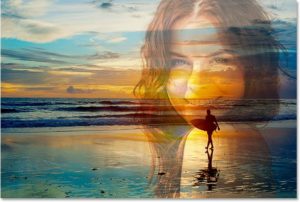
My first design (Design 1), which ended up being my final design, consists of the combination of 2 separate images. my goal was to make it look like as though the image originally had come like that. This required me to research how to blend 2 images together in Photoshop as well as experimenting myself using the different tools available on the software. I used the eraser tool (shown in screenshot 1) to remove the background of the deer in the original image so that I had something feasible to work with in order to blend the crop of the deer in my desired background of the forest. I chose the luminosity filter (shown in screenshot 2) – this made the colours of the background come through into the deer making the 2 images blend together effortlessly. I then played around with the levels of the opacity for the typography and the images making sure both were balanced and legible.
Screenshot 1: removal of background using eraser toolScreenshot 2: applying the luminosity filter
…
DESIGN 2
Design 2
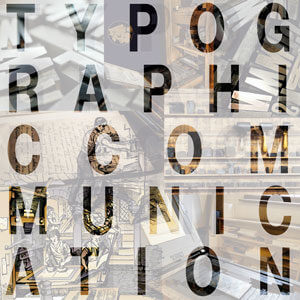
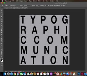
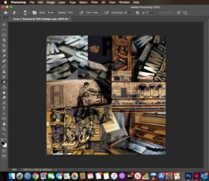
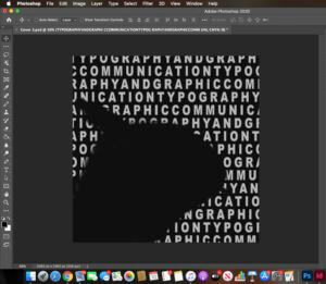
Whilst working on my second podcast cover, I developed a new skill. I had a vision of seeing a collage of images through the outline/fill of ordinary text so I hopped onto Youtube and found some content which helped me achieve what I wanted. I was introduced to a new feature I previously was not aware of before – a layer mask. This enables you to reversibly hide parts of a layer. In this case it was the fill inside the text which made the imagery behind seep through. The fill colour of the layer mask was a sold white, but I wanted to show more of the imagery so I decreased the opacity to show it through the mask (shown in Figure 3) The collage of the images behind (shown in Screenshot 3) relate to the Printing Press and the arrangement of the type on top reflect the topic of the podcast. I experimented with the size, leading and tracking of the text to make sure each letter looked equally spaced out. The knowledge I have gained from the TY1INT module has helped me massively here as I now know how to experiment with the different typographical variants effectively (size, leading and tracking)
Screenshot 3: soft light filter applied on text and inverse/outside area selected with a translucent, white fillScreenshot 4: collage of background images
…
DESIGN 3
Design 3
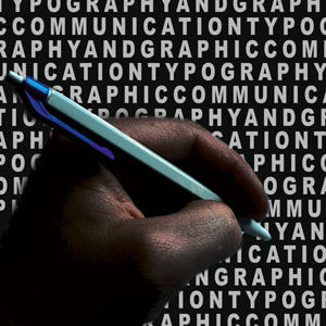
My third idea also taught me a new technique. In my previous experience with Photoshop, I have always used the quick selection tool to remove the background of images, however I discovered through my research that with more simpler images, you can do this easily by just clicking a button. I used the object selection tool along with selecting ‘select subject’ (shown in screenshot 5) Photoshop selected the area which it thought I wanted – the simpler outline. Afterwards, I used the select and mask option to soften any rough edges and to double check that the software had removed and kept what I wanted. I used the vivid light filter on this which gave an abstract look and then placed the hand on a ‘nearly’ black background. I used the image and action of the hand writing as I think it reflects the subject well and to go with it I added repeated text onto the background. I was inspired by this repeated text from my previous design but I wanted to show it in a different place: the background. The repeated words replicate the appearance of a word search, which was my intention. I noticed that due to the filter applied to the hand, it made the text show through on top of it even though the layer was beneath the layer of the hand. To correct this, I used the eraser tool to remove the additional text which was present on the hand. Screenshot 6 shows how the text ended up after I erased the text on top of the hand – you can see that it has made an outline where the hand was. After arranging the layers, I put the hand at the front as I think this is the most vital aspect of the podcast as it displays the theme.
Screenshot 5: removal of the background with the object selection toolScreenshot 6: shows the text after using the eraser tool without the hand layer
Software Tutorials
From previous experience with PhotoShop, I was able to perform the basic techniques such as: adjusting image quality, combining and layering images. However, with each design I made, I learnt a new skill. Not only this, I practiced, reviewed and consolidated the previous skills I already knew. This has developed my understanding in PhotoShop further. In my first design, when I removed the background on the picture of the deer, I learnt how before you convert an image to a layer, when you upload an image into PhotoShop, it comes as a smart object – with this you are unable to edit it. I discovered shortcut keys to make the brush of the eraser tool bigger and smaller which made it extremely easier as the job was done faster. To make the two images blend together, I used a mixture of varying the opacity and made the use of a filter from the effects option. The next thing I want to work on is blending 2 images in a linear manner. For example, combining 2 faces together, using one side from each individual. I want to use this technique in the TY1DP1 module for our film poster production. *Online resource used: https://www.youtube.com/watch?v=US3NZc_pmSI&ab_channel=VerticDesigns
The tutorial I used to help me with my second design enabled me to experiment with text, which I found to be necessary as previously I worked with images. During my A – Levels, I never really understood the concept of a layer mask, however after working on this design, I secured my understanding. The two most important pieces of information I took away from the tutorial I used was choosing the correct blending option (soft light) and selecting the inverse of the text; in other words the outside area of the text. Now, I was able to make the adjustment layer, before choosing the white solid fill and decreasing the opacity, which gave me my desired finish. *Online resource used: https://www.youtube.com/watch?v=bG5r5TM5e2o&ab_channel=PhotoshopTutorials%7CPhotoeffects
My third design was where I sort of combined all the techniques I had learned through this task together. It also taught me a new, and an alternative technique to remove the background of an image. As mentioned previously, the object selection tool is an extremely clever way of PhotoShop helping you to perform the action you want to do. The tutorial taught me how to refine and neaten the edges after the crop was made. This is essential as the last thing you want is to have rough edges surrounding your image. To further develop my skill set in this area, I want to practice using the different background removal tools such as: the eraser tool, quick selection tool and the object selection tool with different images varying in complexity. *Online resource used: https://www.youtube.com/watch?v=DWSa5SYzZu8&ab_channel=VerticDesigns
Resources for Research and Inspiration
Inspiration for Design 1; https://www.pinterest.co.uk/pin/560768591086535921/Inspiration for Design 2; https://www.educba.com/transparent-text-in-photoshop/Inspiration for Design 3; https://www.pinterest.co.uk/pin/267190190374863377/
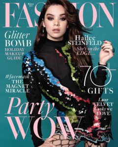
These three images inspired me to make my designs. I came across the first two images when I was searching through PhotoShop edits. The reason why these images stood out to me was how both of them have manipulated the subject of the work. The designer’s have chosen a specific perspective to show the main picture through whether it be through a completely different image or through text. I wanted to learn and understand how to do this in my own work and use it in other areas in this module, as well as the other modules in this course. The third image is part of a big ‘umbrella’ of magazine covers. Many magazines place their mastheads behind their model. They do this because they know that their target audience are aware of about their publication. I was inspired by this idea, therefore incorporated it into my design but in a different style. In the future, I would like to explore this topic; constructing magazine covers and magazines in general. However, I know that a text like a magazine should be ideally made in Indesign.
Reflection
I improved my skills in using the different layers efficiently; photograph editing; using tools such as the eraser and selection tool and experimenting with opacities. I have realised that there are multiple ways to do one thing in Photoshop – some are easier than others. However, each skill/tool results in a different finish.
I feel like I need to improve more on image manipulation and how I can combine images in different ways other than collages and blending. The next thing I want to work on is blending 2 images in a linear manner. For example, combining 2 faces together, using one side from each individual. To further develop my skill set, I want to practice using the different background removal tools such as: the eraser tool, quick selection tool and the object selection tool with different images varying in complexity.
In an A5 format, the Reading film festival flyer had to demonstrate the relevant information in a small space, which I found particularly challenging using this space efficiently to a positive aesthetical outcome. I used a dark blue colour background so that the black text could still be seen and understood. The age censor of the movies I wanted to be the most obvious to the audience and seen before anything else, this way, the audience know which movies they are allowed to watch i.e. If they are children they can watch; U, PG, or in some cases 12 if they are accompanied by an adult. The serif font , minion pro,(a mature font)shows information more orientated towards older people such as the director of the film , actors and where it is showing, the sort of info a child would arguably not be too concerned about past the title which is in serif , Acumin Variable Concept. Overall this flyer does the job it needs to do displaying the information in a format readable. However, I do believe it looks a bit squashed together and would benefit from more space by maybe using a smaller font and general layout the sheet. It also is fairly bland, aside from the 2 colour restriction, including black , I would like to have included more texture to create a more interesting looking design .
In addition to recreating the penguin book design from scratch, we would put our own spin on the classic design with more modern fiction. I did mine on the 2008 movie Kung Fu Panda from DreamWorks. In order to reflect the main characters loving persona, a warm colour that can appeal to kids, the target audience of the movie. I switched out the classic orange for a warm purple colour. Further alterations are that of Po the Panda in the place of the famous Penguin and where the writer of the books name would usually be, the name of the voice actor Jack Black is there. I chose to use him as it is a recognisable name and arguably more recognisable than the writer of the movie. Penguin books also always have a tagline, I used one from a poster for the movie, ‘Prepare for awesomeness. Summertime is Panda time. He’s not a big fat panda… he’s THE big fat panda! ‘a humorous quote to help depicts the comedic tone of the movie. If I were to make any alterations, I would like to make more changed to make the Penguin book design less recognisable, maybe to do so I would have to pull from a more complex source such as a different movie or book.
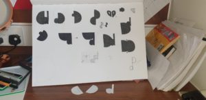
This project involved reducing my initials to basic geometric shapes or silhouettes and merging them in different ways. My initials are the same letter, so I used both capital and lowercase to gain some variation between round and sharp edges. In my final transmogrification, I used watercolour as a medium to emphasise the theme of fluidity.
A useful time-saving technique that I will take from this task was cutting out my initials to trial different combinations of positions and letter casing without needing to draw them out.