Category: Penguin cover (James’s project)

Penguin cover

Bravo Two Zero

This is a remake cover of the action packed true story of ‘Bravo Two Zero’.

I decided to use a black & white colour scheme for this cover to represent the SAS Uniform and its badges. Not to mention that serious forms and documents use only black & white, which emphasises how serious the topic is surrounding this book and the events that took place within it.

I thought to match the same font as ‘The Great Gatsby’ due to the fact that it is a bold sans serif typeface. I feel this was appropriate as the soldiers who endured the events within this book were both bold and brave as individuals and as a unit, but also to link with the font on the face of the SAS Badge which states “who dares wins”.

I did make some slight changes to the cover where the iconic penguin logo was replaced by the SAS badge and changing ‘Fiction’ to ‘Non-fiction’ as this book is based on true events.

The Great Gatsby

Completing the first task for ‘making a penguin’ was straight forward due to video tutorial. I enjoyed setting the typefaces and manipulating the tracking, leading and the horizontal and vertical scales. I will be able to use this new approach on how to set up words on a page to make using InDesign a much easier process. The part that caused the most difficulty was when making the ‘cartouche’. At times, when trying to manipulate the pen tool I would need to go back and re-adjust slightly. After a while I became accustom to this and the whole process was easier. I would then go on to use these same techniques that I had learnt on my next book cover that I designed.


Penguin Book Cover

Trainspotting Penguin Book Cover Design

Having replicated the Great Gatsby book cover, I was then tasked with creating another Penguin book cover for another book, which I quickly decided would be Trainspotting.

Not knowing how much to change the original concept, I decided to create two designs – One following the rigid Penguin formula and another more experimental use of the elements.

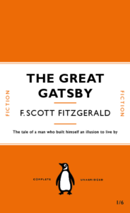
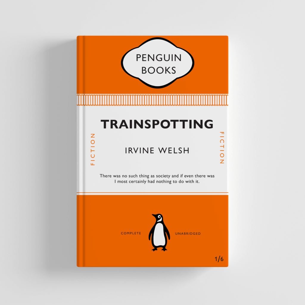
First, I created the more formulaic design. This was comprised of me adding a train track image along the top edge of the coloured block, using the alignment tools to ensure the shapes were correctly arranged. I adjusted the lower quote, made easier by the paragraph styles used on the previous file. When placing this in context with a Photoshop Mock-up, this works well but, as expected, is pretty unoriginal and not recognizably different to the previous design for The Great Gatsby. While the colour was changed to mirror the colour palette of the films marketing, the similar orange shade made this adjustment barely noticeable.

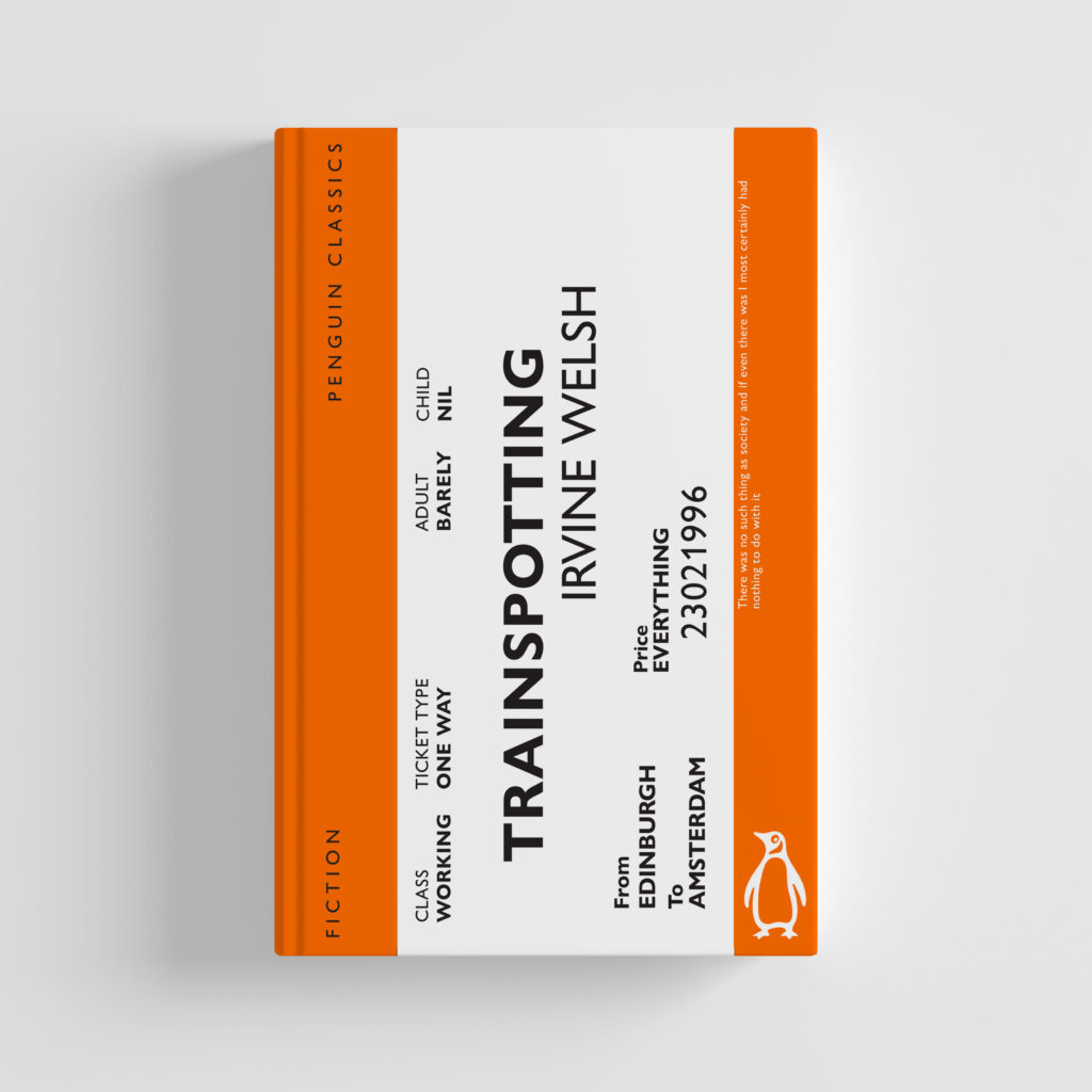
For my more adventurous design, I decided to focus on the imagery of a train, an important symbol as the story ends with the lead protagonist betraying his friends and taking a train to a new life in Amsterdam. Looking at reference images of train tickets, I began to replicate the structure, with the ticket obviously forcing the books cover to be landscape instead of portrait, which would likely allow the book to stand out from other Penguin novels when sold in high street shops. I then added text over the design, mirroring to some degree existing train tickets, while trying to balance the design and create visual hierarchy. The title and author name still needed to be the focus, so I used size and placement in order to direct a viewer’s eye in that direction.

Although this design is more adventurous, it’s deviation from the original means that, for me, I believe this to be the better design. The more creative concept, use of appropriate imagery and subversion of conventions allows this to be more enticing as a viewer of the cover. The design works well as a Photoshop Mock-up, while still featuring the relevant information from the original.

The Shining

For my second design, I decided to base my approach around ‘The Shining’ and because of this I have added many nods to the Stephen King novel. I started by recreating the famous carpet that is seen in the hotel, this process was a lot easier than I initially thought it would be. I made the first initial shape and once that was made it was simply a process of copying the pattern. The font used for the title, author and the brief description is a very similar to the one that was used throughout the posters and book covers for the original. Room 237 has also been included. Although there are many nods to The Shining, I have also kept many of the Penguin book cover conventions. The ‘cartouche’ still remains and the original page layout has also been kept the same. I decided to change the penguin logo, on this cover the logo is white making it slightly more legible to the reader but I still feel like this could be improved upon.


Peter Pan book cover

For my second book cover I used all the similar styles to the original penguin book cover and related to Peter Pan. The first thing I did was change the colour to a green colour that most Peter Pan books are keeping it a solid shade as this is what all penguin book covers are. I then went on to remove the penguin and add a Tinker bell outline to replace it. I was able to do this by inserting a picture from good images then cropping all the back ground out using the snip tool. I then went on to add some more images around the top that frames the penguin book logo. Overall I went for a more simplistic approach as when doing some research all of the penguin book covers where very simplistic and I tried to follow this with an approach of a Peter Pan book.

The Voyage of Argo

As a part of this project, we were also asked to create our own book cover using our template of ‘The Great Gatsby’ book cover and to interpret this into our own concept whether it be a book or movie as our inspiration. For this, I chose ‘The Voyage of Argo’ as my book.

I wanted to include the Greek flag into my book cover so initially I put two white rectangles in the blue boxes so that each stripe was equal in weight however this made the cover look too busy and very white heavy with the text. As well as this, the text at the bottom and top could not be easily read with the strips of white and blue. To improve on this, I made the white stripes thinner to frame the text and images on the top and bottom of the book cover. This was successful because it is more visually appealing.

I made the decision to remove the cartouche at the top as I felt it was did made the cover too white-heavy. However, I now feel as though this was not the best idea as it does not reflect the original poster.

For the text, I used Superclarendon as I felt it was the most similar to the original cover. I then put a boat at the bottom instead of the penguin to relate to the story and I put the penguin at the top with ‘Penguin Books’ beside it.

PDF: The voyage of argo 01

The Secret Garden

After creating the original penguin book cover, I thought of ways to make it different. I have been inspired by various illustrated collections, the Puffin in BloomPenguin Clothbound Classics and the Puffin Classics Deluxe Collection.

To begin with I changed the background to a green to reflect nature, and the garden. To further add to this theme I drew a leafy floral line illustration, over the top of the cover, to show the overgrow garden and that it cannot be contained. 

I lastly changed the penguin to a robin, since is a key piece of symbolism in the book, and helps Mary to locate the secret garden. 

Great Gatsby Rendition David Pearson

We were tasked a recreation of the iconic designs of Penguin book covers to develop our skills in InDesign. This project was not only really fun to create, but also very insightful on how to create stylesheets and format a book cover correctly.

Alongside this recreation, we were asked to make another cover for a different book title. I chose to recreate the cover of The Curious Incident of the Dog in the Night-time by Mark Haddon.