Introduction to the Brief
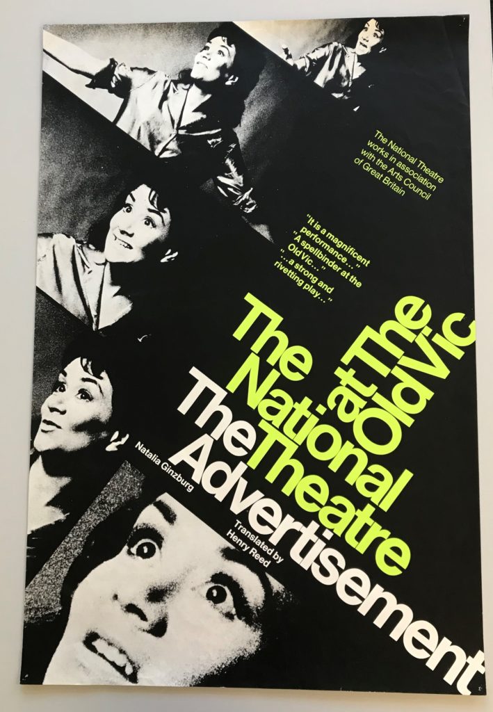
In the lesson with Emma, we looked through a wide sample from the Collections within the department, seeing a vast array of different ephemera. After looking through all of these, I was immediately drawn to the National Theatre poster for ‘The Advertisement’. I found the use of colour and the layout of the text visually interesting, following the modern conventions of a National Theatre poster. Having selected this as my focal item from the collection, I then looked into this piece in more detail, looking for its context and creation specifically.
History and Context
After doing some research into this design, I found that this was a poster for the 1969 London performance of the play ‘The Advertisement’, Henry Reed’s translation of Italian author Natalia Ginzburg’s original piece. The design itself was done by Ken Briggs, a renowned designer and typographer of the 1960s. He became the first of only 5 designers for the National Theatre, coining the unique typographic style and visual identity. However, in the early 1970s, Briggs abandoned this conventional style, placing more emphasis on the individual plays by creating something visually new and fresh for each new design. His modernist, Swiss-style design was often done on short notice, often sometimes in as little as one night. His use of Helvetica, originally through the use of a Letraset, built the foundations for the theatre company’s branding for the years to come.
The photographs used were taken during rehearsals of the play in 1968, featuring images of Joan Plowright as the leading lady, Tessa.
While now highly collectable items, these posters were originally (and ironically) for advertising; These posters would be in varying sizes, placed around London to promote their upcoming shows. The design choices are likely used to reflect this, with the application in places like the London Underground giving a designer very little time to engage and communicate with an audience. Upon researching, I was unable to find much about the creation of this poster. It would have been done by hand, with Briggs being known for his Letraset typefaces, likely meaning a mast copy of this poster was created before being replicated and mass printed. The grainy, textured images would have helped this, meaning that the quality of the images was not lessened by upscaling the poster for different uses.
Colour
 The use of colour within the design appears minimal in an intentionally modernistic manner. The use of a predominantly triadic colour palette allows the design to appear simple and visual hierarchy to be easily created and manipulated to guide a viewers eye. In this design, lime green is used to highlight the words ‘The National Theatre at The Old Vic’. As an already established and credible theatre company, their reputation is something that would likely attract an audience, with the piece being a little known translation of the original Italian play. This allows the poster to achieve its goal more successfully, helping to promote the show with the use of this visual hierarchy. The same green shade is used again on the two blocks of quotation. While also highlighting them to a viewer of the poster, this was more likely used to add visual balance to the overall design, used here to accent and balance the poster.
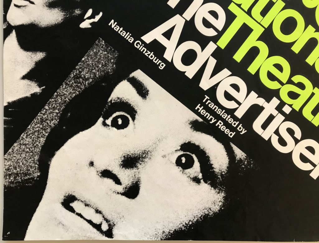
However, the photographs include an array of monochromatic colours, creating depth and texture within the images. This can be seen within the left image, especially on the nose, which appears to have depth through the use of tonal textures and monochromatic colours. While the dimensions of the face are important, the stylistic application of this allows the images to fit well into the simplistic, modernist design style. Practically, as these were shots from rehearsals, this may also have been used to make the images seem more congruous by removing the background and styling them all in the same way.
Layout/Structure
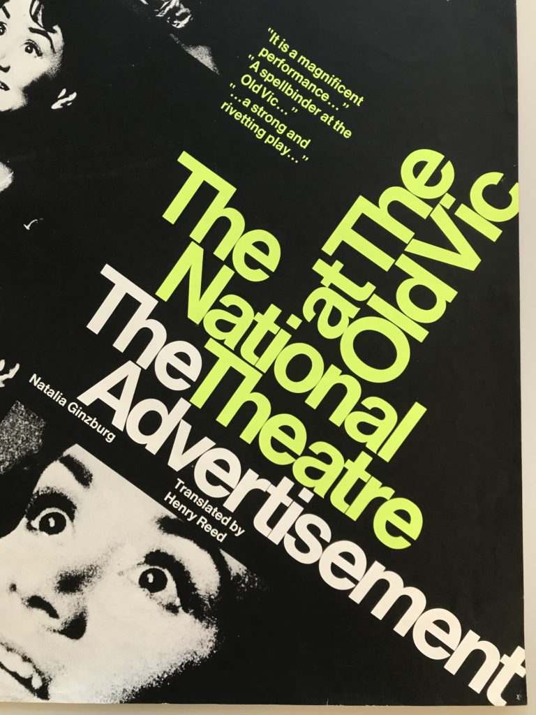 The layout of this poster is visually striking and engaging through the angular text, immediately breaking many conventions of other advertisements and theatre posters. The words ‘The National Theatre’ are positioned centrally on the poster, being the focal aspect and carrying the promotion through their positive reputation.
The incredibly small amount of kerning and leading, a modernistic style choice by Briggs, shows contemporary and unusual nature, again, positive attributes for the experimental and critically acclaimed theatre company. The distance between the text ‘National Theatre’ and ‘The Advertisement’ would usually be visually confusing, but the use of colour helps to distinguish and differentiate these two elements despite their close proximity. The 90 degrees flip for the words ‘at The Old Vic’ created more visual difference and engagement in the design, using the principles of Swiss design in order to captivate and interest a viewer of the poster.
The vast amounts of black negative space around the text allows the images to blend well into the block background colour. In direct contrast to the tightly structured text, this creates a sense of visual balance in the design, helping to not overwhelm a viewer with textual and photographic elements. The space is seen between the two blocks of quotations also helps this idea, giving large amounts of space to these elements, allowing them to accent the main text. The small lettering seen beneath the title of the play, while still relevant, is conveyed as less visually important through the sizing selected, creating visual hierarchy through the size and positioning. While only using two text colours, two sizes and one typeface (likely to create a minimalistic, Swiss-inspired, modernistic appearance), Briggs utilises all three harmoniously in order to create visual balance and hierarchy within the design. The use of layout and negative space only amplifies this, creating a poster that is effective in captivating a viewer, visually stunning through its initial simplicity and modern aesthetic, despite being technically impressive, especially given the hands-on working of Briggs.

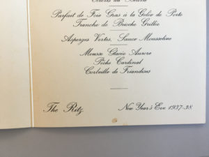
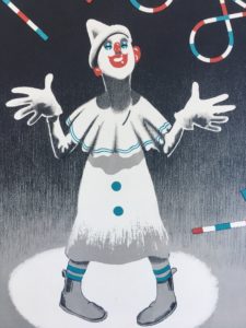 For this mini brief I’ve chosen to write about a menu for New Year’s Eve 1937 at The Ritz. This particular item grabbed my attention with its print design’s minimalist use of colour, and hints of Art Deco style. The gradient in the background shifts the viewer’s focus to the face of the clown and the type by giving the upper half of the design higher contrast between dark and light. The arch in the ‘1938’ frames the clown nicely and draws together the focal points of the image further. The design successfully conveys the theme of celebration which is appropriate for the occasion.
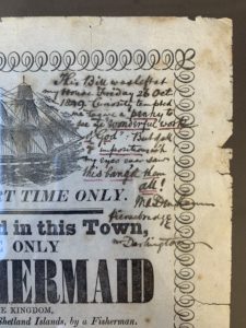 Mr Darlington’s note (in the top right corner) was very hard to decipher. I couldn’t figure out if he was amazed by the exhibition or if he was disappointed. To me, the description of the mermaid sounds a lot like a large fish with hair, I can’t say I was surprised, but I’m sure that this must of been news to spread around town. I think everyone would have their own opinions about whether it was true or not, even today.
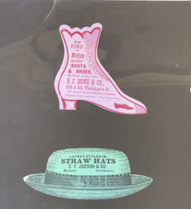 This was a really interesting session for me as we got to look at some things from the collection that we have access to in the department. This was one of my favourite pieces from the collection. I was immediately drawn to it because of the shapes and colours. I loved how each one was shaped into what was sold at each shop, I thought that this was a really creative and thought threw design. When I looked at it initially I wasn’t quite sure what it was, I had a few thoughts. To me it seemed as though it could have been a tags or perhaps some kind of business card?
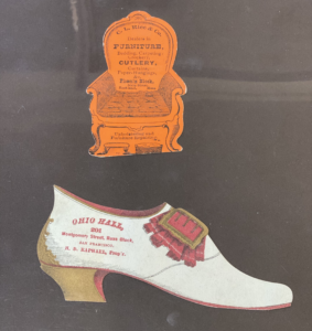 After the sessions I went home and researched to see if I could find out more information about them. I found that most were made in the mid/late 19th century, and that they were in fact trade cards. So these were used by merchants and traders to give to their customers, which were usually made out of paperboard or thick paper as these ones were. They are made small enough so that they fit inside a pocket for easy distribution.
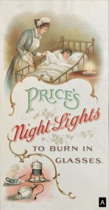 Image A depicts a house maid or nanny looking after a young child, perhaps showing that any wealthy Mother need not to be tucking the child into bed, but leaving that responsibility to one of the house staff. This image suggests that it its not the lady of the house hold to be choosing which candles to purchase but rather than head house keeper.
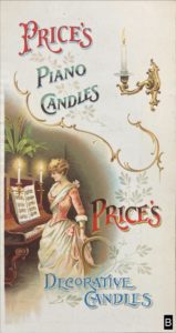 In Image B shows the women or wife in the role of entertainer, but also highlighting her education in the arts and music. Any aspiring women should be able to play the piano. The design is rather clever in the way that on the surface it looks like it is about the different candle types you can buy, but further than that is it informing women, in a rather passive aggressive way, in how the ideal women or wife should be.
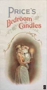 In Image C the Mother, of all people, is shown taking the child to bed rather than the nanny! Perhaps this is a more bit more of a modern image in comparison to Image A since it encourages (wealthy) mothers to take a more active role in the raising of their own child.
 Finally, in Image D the ideal wife in hostess role. I am assuming that the hostess is dressed in red, making a last minute tweak to the cutlery. This suggests that it is the female’s role to make sure the house is well presented, and thus it is her role to chose the candles.