Category: Collections (Emma’s project)

Collections

TWA Travel Poster

New York, Fly TWA Poster

I found that going through some of the collections and having discussions on the work exhibited was a real eye-opener on how work was produced and how we have moved on in terms of design, materials and processes. However, there was an item of work that stood out to me especially once finding out the date in which it was produced.

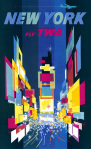
I was drawn to David Clines ‘New York’ travel poster which he produced in 1956. The concept behind this advertisement was so intriguing to me due to it being so ahead of his time. I did further research into travel posters and advertisements around this era and when comparing Cline’s work to other poster, his work was extremely contrasting. This is because other posters consisted of 3 or 4 colours, place names and a directly linked image to the country or city. Where Cline’s work differs is through the use of layers, colours and shapes to depict a country or city, in this case being New York.

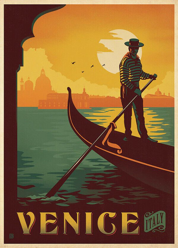
Here are some examples of posters produced during the 1950s:

Venice Vintage Travel Poster | Yorks FramingRio Vintage Travel Poster | TRAVEL POSTER Co.Vintage Travel Posters: Advertising a Dream – The Vintage Woman

I would describe this specific piece of Cline’s work as a “controlled mess”.  Intentional because Times Square in New York is an extremely hectic place, Cline has used multiple different colours in layered shapes to represent the vibrant advertisement boards and shop windows as well as dotted lines to depict bust traffic on top of this.

New York Hotels

When looking at the collections highlighted along by Emma was clear to see that there were some interesting and intriguing items, the ones standing out to me being the New York Hotel logos. Vast arrays of colour, combined with their simplistic image is a common part of all of their designs which builds a logo that is crisp, clear and interesting whilst being simple and informative, a balance within these designs that I found particularly intriguing.

Whilst all the designs shown convey the standard circular shape, an image and the name, they are still all unique in their own ways when looking at the typography, layout and colours.

The Royalton Hotel uses a san serif font for all its typography other than the name of the hotel itself, emphasising the hotels importance of highlighting the hotels name and making it stand out so customers or passers by become familiar with the name. Hotel Manhattan on the other hand is much more simplistic, a stylish ‘M’ as the image along with a san serif font on a coloured background, the anomaly in the 4 examples as there is no inner circle, no secondary colour and no secondary typography.

The other two designs are a little more adventurous with two colours working harmoniously together, a building silhouette as the image and the combination of a san serif font and a secondary more brush script like font. These designs are all successful in their own right but when looking at a hotel sign the second example despite being quite minimal is not necessarily my preferred design but I find the others too crowded with information, the second design has the image in the centre surrounded by text which is much easier to read compared with the other examples.

Circus Poster

My chosen piece from the collections today was this circus poster. I was drawn to this poster because its helpful…but also not. It only gives generic information such as what they have to offer at the circus, but not specifics such as times and location. Therefore, making the poster unhelpful for public planning to attend. However, in the image below it shows a blank space below the title. I think this is where the timings and dates would have been placed but due to a circus constantly being on the move, it’s cheaper and easier to leave the space blank until needed. Another noticeable point in this poster is the size and shape of it. The image above shows the poster is a vertical rectangle. This type of shape would have been used firstly to reduce cost, but also for space on walls or lamppost to advertise. As the bigger the poster, the more likely it was to be cover by something else, therefore creating a poster this size helps to reduce those chances.

Further on to the poster being cheaply made, a lot of the print hasn’t managed to transfer properly. The image below shows an  inconsistency in the blank print around the red letters. For example, on the letter T in tiger, there is a consistent black boarder around the letter. However, with the rest of the word there is a lack of black outline around the letter, compared to the word above, ‘Norna’. I think much of this is due to the poster being cheaply and quickly made. Hundreds of these would have been printed and they were only needed for a short amount of advertising time, so a small inconsistency in the print wouldn’t have meant much.

Due to the poster having no date or location, it makes it difficult to date the poster black to a specific time. The colours used are red and black, which were the favoured colours used in typography during the modernism movement, which helps to date it back to 1930s. Further to this, the image below shows that the circus was mainly made up of animal acts, which are now banned in the UK due to animal welfare. These types of acts were more popular and allowed around the 1930s, helping to date the poster back to the early to mid 20th century.

Memorial cards

During Emma’s session, we went through all the collections available in the typography department. Amongst all the collections, I was specifically interested in the  memorial cards. Memorial cards were used in the Victorian era to demonstrate heartfelt mourning and it was fully expressed through the decorative cards. According to the book, The Encyclopaedia of Ephemera by Maurice Rickards, the memorial cards were ‘commonly 75x115mm’ and ‘relied for much its appeal on the austere extravagence of blind embossing.’ Here, blind embossing refers to the method of creating raised logos or characters without the use of ink and this is evident in this memorial card, as all the text, including the design, is done in blind embossing.

Details of the text

Printing Process

The printing process produced an uncoloured relief image, similar to company seals (The Encyclopaedia of Ephemera, Maurice Rickards). Images of angels, tombs and mourning figures were common elements found amongst these memorial cards to reflect the concept of mourning effectively.

Details and Texture

I was particularly intrigued by this card as its quite simple, with no colour except for in the middle part of the card, where all the text is allocated, yet, at the same time, the piece is a very detailed and sophisticated one. I was also told that this particular card was perhaps made for someone of higher class, thus the intricate details found in it. In terms of texture, I believe the material felt very thin and almost fragile, most probably made out of lace paper, due to the extensive decorations, and being able to create something out of this type of material is very interesting to me.


Lettering Style

In terms of the typeface style, all of the text is in serifs, varying in weight and size, to emphasise on the hierarchy of information to the targeted audience. The text is fully aligned in the centre, making it visually look neat and adjusted, with equal line spacing between each line.

Overall, this was a fun project since we got to see the collections available to us through Emma and have insights into how design has evolved over the years and the different elements that were prevalent during a certain era of design. I personally was able to learn a lot about the hierarchies of information, layouts and the use of colours in design.


Circus Poster

In Emma’s collections session, the circus advertisement really caught my eye, as the shape was odd in comparison to modern posters however the style of writing and colours remain quite similar. It’s interesting to see the development of posters from what they used to be to now and the hierarchy of importance for each aspect, however in this poster, there is quite a large proportion of empty space, which could have included the dates and times as it does not appear to. e there. The images are simple illustrations demonstrating the age of the work, and the lack of technology that was created at the time. The amount of typefaces used however show how they could be new designs so want to show it off. Overall, I like how unique this poster is in comparison to regular shaped ones and how the colours compliment each other well, however it is quite misleading to the eye as everything is of similar size so is difficult to understand which is the most important.

Funeral invitation

I was so intrigued by all the collections, however this funeral invitation caught my eye as it is something I have never seen before.

I was drawn to how thin and delicate it looked and how old it must’ve been for the reaosn that now we hardly see invitations like this and this big. The way it is, I believe it must’ve been for a well known rich special family possibly upper class.

To the left side, the black thing, I analysed it and I believe it is a wax seal as when the plastic was taken off the invitation I looked closely at it and I could see some designs and patterns on the wax seal, which again could represent wealthiness as maybe only rich upper class people could afford wax seals.

Funeral Card

The object I chose to write my blog post from Emma’s collection is a funeral invitation card. I chose this object because of the different typographic elements used.

Printing Process 

The art work has been printed in many different ways.For example, the name ‘Mr Biscoe’ is handwritten but the actual invitation information looks as though it has been typed using a typewriter. The details around the text such as the skulls, coffin and the signs etc all woodcut images that have been engraved into this thick material of card/wood. I think once the engraving was done a stamp or a press was used to spread black ink over the engraving to show all the little details more effectively, and then the writing was added in the empty white space.


Use of Colour 

The only colour used for this funeral card was black. And this could be to signify grief and solemnity. Black was a colour used in the 19th Century for mourning and the loss of an individual and if any women was seen in black when not in a mourning period was seen as dangerously eccentric. The black colour in contrast with the half white background makes the writing really stand out.


Lettering Style 

The letters used in the text is a serif font. The spacing between the lines is quite small. The writing seems together. But the spaces in-between words are quite bigger than a normal space. There is text used for the actual invite message but also in the engraving. The engraving has texts such as ‘remember to die’ and these texts in the graving are all in caps and this could be to ensure the text is bold and stands out.


Audience 

The audience was adults, those invited to the funeral. They had to bring this card with them.


Comparing the designs on Menus


The Menus shown above were made in 1938 for The Ritz Hotel. I was initially drawn to the choice of design on the cover as it doesn’t reflect the brand identity of the upper- classed hotel, but the choice of a clown suggests the entertainment and classical element if the Ritz. The typography presented inside the menu demonstrates the traditional and glamorised element of the hotel, as they’ve used  rather flamboyant serif fonts that almost like its been hand written. The layout for the menu is unusual for the time as it focuses on appearance rather presenting the information clear for customers.

The menu above was created in 1967 for a slightly lower classed hotel. Again the menu uses a painting as their feature cover image as well as a decorative piece of string. But the main difference between the two menus is the layout of the menu and the use of a more simpler serif font. The menu has a more clearer list for customers and include the  price of the food whereas the Ritz menu doesn’t. The ST. Ermin’s Hotel also includes the use of coloured ink reflecting the the evolvement of type design.

Paper wheel charts

During this mini project I was drawn to these paper wheel charts, know as volvelle, that where displayed within the collection. These wheels where created to have answers to lots of different things by the different layers of the wheel that spin around, for example the one on my cover picture tells the user about gardening and the best times to be plating different things in your garden. They are often used to calculate different things in a fun and clear manner as you are able to get the answer you want by spinning the wheel. Reinventing the wheel was a book in the collection which gives lots of examples of different wheels for lots of different things all with very interesting designs some where very old and there where also more modern designs displayed within the book.


B.O.A.C

After initial research into this British Overseas Airway Corporation ticket installment plan brochure which dates back to 1960. The colours used throughout the brochure consist of brown, black and blue. There are san serif and serif fonts used throughout brochure with most of the more important information being bold and in a san serif font, making it more legible and obvious to the reader.

The brochure again hints at when it was dated through the use of predominantly male figures. The wording they use is also very ‘one gender dominant’ the last paragraph where it states ‘every man’. This clearly resembles a time similar to the 60s where women were seen as less than when compared to the man. This can also be seen in the images used where there is predominantly men.


While the colour choice is quite unique, using brown, it does still work effectively. The use of colour does not take away or distract the reader, it does rather the opposite and compliments the brochure. Although the use of colour has been implemented correctly, there are still a few issues that I had when looking through this collection piece. I felt the way that they presented the pricings for the ticket installments could have been presented a lot better than how they were originally. After first looking at the brochure I was hit with instant confusion, the way that the numbers have been presented.