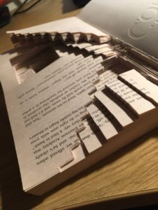
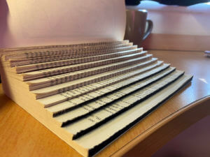
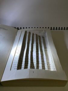
For this brief I decided to pursue the staircase narrative. To represent the idea of the man gradually descending I carved out a variety of staircases which lead you further and further down (or up) the page. Eventually you get to the very bottom which is coloured in black – this creates depth as you cannot tell where the staircase ends. I made the staircases on varying dimensions. This reminded me of M.C. Escher’s illusions.
My initial idea for the broken narratives project was the stairway narrative, in which the protagonist finds themselves in an asylum for a mild illness, the asylum has 7 floors, the floor you’re on depended on the severity of your condition. The protagonist found themselves being moved down the floors until they were at the very bottom which seemed to represent death.
My idea for the design was to turn the book into physical steps, I then coloured the edges of the lowest steps black to fit the representation of death.
This is a mini project called ‘Broken Narratives’ where I experimented with ideas for a conceptual book and it’s materiality. I looked into the theme of a Labyrinth.
‘Labyrinth: a family moves into a house with unexpected spatial characteristics. The rooms keep shifting position every time a door is opened. The family members are trapped inside the house and start a journey to find the front door. While they keep moving from one room to the next, they discover that they are not the only ones lost in the impossibly infinite labyrinth of the house.’
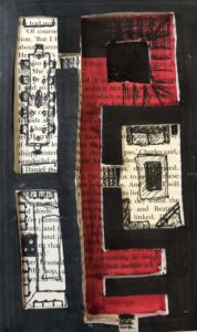
The whole concept of my idea was focused on the rooms of the house and a way in which the family could escape. I created cut outs after glueing pages together to make a 3-dimensional floor plan of a fairly generic home (living room, kitchen, dining room, etc). I then highlighted in red the shape of the landing and hall way, which is in the shape of a key, to emphasise how the family could escape.
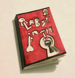
For this project, we were given the brief of designing a book in relation to the story. I chose labyrinth as my theme.
Labyrinth: a family moves into a house with unexpected spatial characteristics. The rooms keep shifting position every time a door is opened. The family members are trapped inside the house and start a journey to find the front door. While they keep moving from one room to the next, they discover that they are not the only ones lost in the impossibly infinite labyrinth of the house.
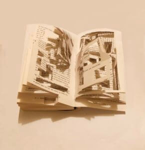
My initial idea was to cut each page into a different maze as a labyrinth is an elaborate, confusing structure designed to make a person lost as the character is in the brief. However, I realised that would be too time-consuming as we only had two hours and would also make the book loose its structure so I then simplified the maze, so that the maze is only on the front page but cut through multiple pages to make some parts of the pages very deep and others quite shallow to add depth and interest to the reader but also to relate to the trapped feeling the character would be feeling.
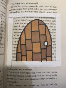
I also decided to cut the book into the shape of an arched door and painted the front cover as a front door as the character struggles to find the front door. The reason for the whole book being in the same arched door shape, is that the character keeps opening door and moving from one room to another so every-time the reader turns the page they will essentially be in a different room.
When I cut the maze, I attempted to cut it so that, the book would still be readable through the maze but would still confuse the reader. I wanted it like this because I wanted the content of the book to be confusing and lost to the reader as the character feels when the go through each room.
Finally, I added distress to the front page of the book with my nails to relate to traumatic experience the character would be going through.
The story of Labyrinth is about a family that trapped inside their new house with unexpected spatial characteristics. They start a journey to find the front door. My initial idea is to create a pop up book with structured pages like a labyrinth.
To represent the story and my idea visually, I designed both for the book cover and inside pages:
The word of ‘Labyrinth’ are cutted out asymmetrically as the book title, which symbolize the shifting rooms.
Symbols of keyhole added to features infinite doors to pass through.
Colour scheme: Red and black are used to represent the mysterious story plot and anger of the family getting lost.
Book pages: Geometric rectangles are cutted out randomly and create a sense of confusion. It also visualises their journey of finding the front door in the house of labyrinth.
Overall, I have experimented with drawing and cutting techniques on the book materials and played with the structure of the book. Although the result is not that well as I expected, I have gained experience of communicating and representing an idea through design but not just emphazise on its aesthetic.
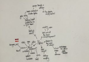
For Berta’s project, we were to chose a theme and based on it, we were asked to experiment on books, by manipulating the structure of the book, be it through disassembling the book part by part or changing the look of the whole book, in short, we were asked to just go crazy with it, as at the end of the day, this was a fun little experiment for us to learn about the different physical and material qualities of books. That being said, I chose the theme ‘noise’ as the brief about this theme really caught my interest and as I was reading the brief, I had already started to form some sort of ideas in my head about what I wanted to do with my book based on the theme. So, I started off by brainstorming my ideas and I made sure to answer the questions in the brief, which were:
What is this story about?
How can it be represented visually?
What concept would represent this story best?
How can it be adapted to the pages of a book?
What part of it will the design concept represent?
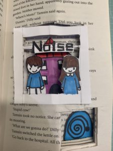
These questions helped me a lot to break down and arrange my ideas. Starting off with the first question, the story was about two siblings who had inherited their parents’ wealth and lived in a quiet house, until one day, they hear a noise and move to a small room. They continue to move into smaller spaces every time they hear a noise, until eventually, they escape through a window, and end up on the streets, empty-handed.
Brainstorming my ideas by linking them to the questionsSome of my first initial ideas regarding how I wanted to layout the book design
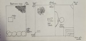
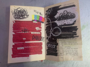
Based on that story, I wanted to design my book in a way that visualised the story in three different parts throughout the book. Therefore, in this first spread, which was at the beginning of the book, I used mainly the colours red and black; red to symbolise danger and black to symbolise the darkness the siblings were probably in as they were inside the rooms. For the left side of the spread, I had highlighted all the text using red marker, while leaving some words out that I thought related to the story, getting inspired by the works of Tom Phillips. I did the same on the other side of the spread, except on that page, I had covered up the whole text using black marker. I have also done some doodles and scribbles to visualise the concept of noise, through drawing the speech bubbles and sound effects, as well as drawing the glitch screen you would see in televisions when the signal went out, highlighting the isolation of the siblings inside the cramped rooms. Being interested in the art of stamping, I had also stamped out the word ‘help’ using letter stamps to show the desperation of the siblings to get rid of the noise. In the right corner of the spread, I had cut out shapes in a descending order, as if to show that as the siblings moved on to another room, the space kept getting smaller and smaller. Some minor details also include me fraying the edges and top of the pages by tearing them off or cutting through them using a craft knife and I have done this throughout the left side of the spread.
My first spread of the book
Close up details of the spread
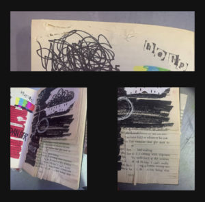
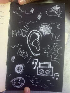
Moving on to my second design, after skipping a few pages of the book, roughly in the middle of the page, I covered one of the pages with black paper and drew an ear in the middle of the page using white pen. Around the ear, I doodled sound effects and symbols to show how the in the darkness, the siblings were on alert for any new noises.
Second page
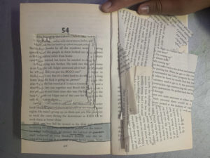
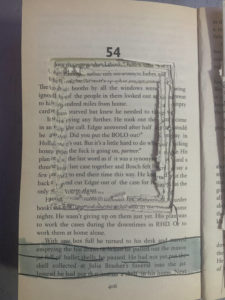
For my last and final spread, on the last pages of the book, I craved out a huge square on the middle of one of the pages, and I continued to do so, however, due to not having enough time, I wasn’t able to dig through to make the square deep enough but overall, I was satisfied with the result. I did this so as to symbolise the window and then underneath it, I drew a road horizontally, to visualise siblings being able to escape. on the opposite side, I glued on the scraps of paper messily to show the after effects of the journey the siblings just had.
Last spread of the bookClose up of the window
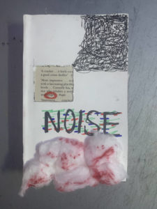
Lastly, for the book cover, I kept it simple by covering the original book cover with white paper. Then, I carved out a square through the page and the book cover, to represent the window, and from the corner of the book, I scribbled in a descending order, stopping when it reached the window. Inside the window, I circled the word ‘danger’ in red to show the danger of the situation. I wrote the title ‘noise’ in capitals, using red, blue and green markers to draw on top of the letters to kind of show that the letters are glitching. Finally, I ripped cotton balls and stuck them on at the bottom, and then coloured parts of them using red sharpie for texture. Overall, I kept the drawings messy and almost childish to represent the siblings, who I assumed, were children themselves.
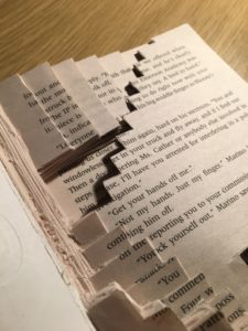
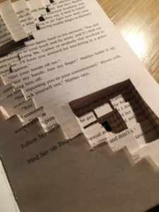
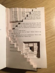
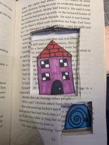
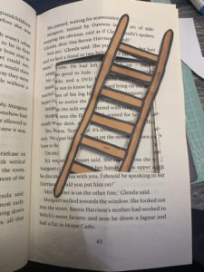
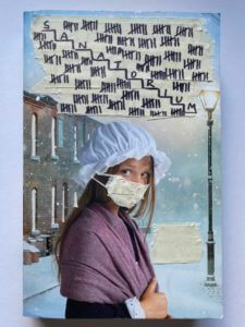
For my book design, I chose the theme ‘Staircase’ and started off with the front cover. The cover already had an image of a girl who looked quite scared with a building which looked like a Sanatorium behind her. Therefore, I instantly used the building and cut out its windows so viewers can have a mini preview into the building before properly entering/opening the book. I put a mask over the girl’s face to represent those with an unknown illness who are about to enter the Sanatorium. I covered the title using masking tape and wrote tally’s of 7 to represent the seven lives each of the patients have before death.
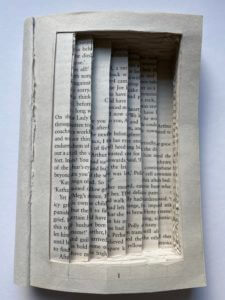
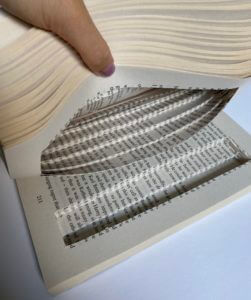
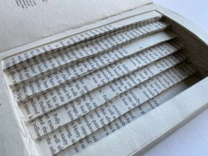
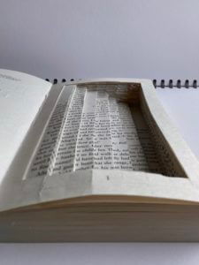
When designing the inside of the book, I created a staircase with seven steps, representing the seven floors in the Sanatorium. I created a border around it so the reader can still see the page numbers, but also so that when you close the book, it looks like a normal book, but in actual fact, the reader gets deceived when opening it, just like the man who was deceived when he was constantly moved down a floor until death.
I played around with light and shadow to create a more ominous atmosphere which I think was successful as you can really see the depth of each stair and how deep it really goes.
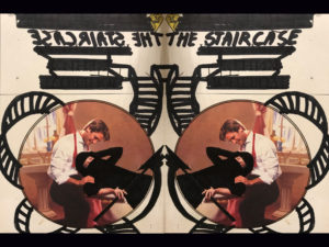
On Monday, we have been assigned to create a book cover that will narrate the story of the book. I have chosen the “Staircase” as my theme for the book cover.It was a story about a man who was barely sick and placed at the 7th floor, however as the time passes by he is moved to the ground level. Even though he wasn’t very ill, he ends up being on the ground floor and therefore, in the grave.
As, the story began at the top floor of the hospital, and I drew a staircase that started from the title of the book (upper floor) and ended with a photo of a man hugging Death (last floor-grave).The idea behind the picture is , man led himself into the death. I drew a black mantle and a scythe over the woman to represent her as a death. I used a black marker to make an illustration of the staircase and Death, as it looked more dramatic.
I had chosen the theme of obsession. In this theme, tells a story of a woman frantically looking for a rat in a room. This leads to her dismantling the bookshelves piece by piece, stripping the wood off the wallks and the carper off the floor.
In my project, I wanted to get across the point that the rat was the torment of the woman in the story, as this was the way i had depicted the story. Therefore, I included the silhouette of a rat behind a disfigured, frantic woman. The idea was that this placement of the rat figure towering over the woman would symbolise the power the rat holds over her. This influence is evidential when the woman ‘dismantles the bookshelved piece by piece’.