Category: research

50% chance of rain

UROP students Silchester
Left to right, Rachel Bartlett, Shyamali Abraham and Matt Standage, questionnaires at the ready
Public at Silchester
Many members of the public took time off from the dig to give us their input

Typography & Graphic Communication student, Matt Standage, has been working together with Meteorology student, Rachel Bartlett and Psychology student, Shyamali Abraham on a joint project between the University’s Meteorology Department, Centre for Information Design Research and Psychology Department on the communication of probabilistic weather forecasts. These are forecasts that show the chance of rain as a percentage – often used in American weather forecasts but less typical in the UK. In this study we are looking at people’s response to percentages presented as numbers, words (likely, unlikely etc.) and through graphic representation.

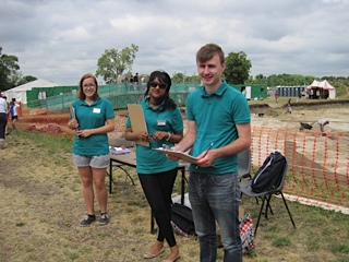
The project is part of the University’s Undergraduate Research Opportunities (UROP) scheme. In the picture (top) you see the UROP team poised to hand out questionnaires to members of the public visiting the Archeology Department’s open day at Silchester last Saturday.

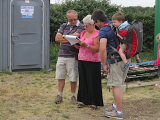
The republic responded generously by taking time to complete our questionnaires, indicating what types of information they typically use to make weather-based decisions and how they prefer to see information about the chance of rain in forecasts. Some 250+ questionnaires later we’re very grateful to the Silchester team for hosting us, to all who kindly allowed themselves to be distracted from their visit to the dig to respond to the questionnaire and also to the many people in Reading town centre who also took part in the research.

Fabula – a typeface for children

abenteuer-schule-ABC

Fabula is gaining popularity for use in resources for children, both on paper and on screen.

The typeface was designed under Sue Walker’s direction by a team of staff and students at Reading, including Vincent Connare, José Scaglione and Gerry Leonidas, as part of an EU-funded project producing bilingual story books for children. Since then it has been available for free, along with advice if required, from the Typographic design for children web site.

Some examples of how Fabula has been used:

Jashanjit Kaur, a designer based in Hyderabad, India used Fabula for Amigo, described as ‘a socialising platform for school children that provides a medium for sharing their ideas and pursuing interests in a safe and secure environment’.

Cecelia Erlich used the letterforms in a Spanish television programme, La cucaracha.

Dietmar Brühmüller used the font for the whole range of four young children’s games, including the one illustrated above.

News from Departmental alumna, Carla Spinillo

Carla Spinillo (pictured above) who carried out her PhD research, on the design of visual instructions, in the Department writes of the success of her work, with colleagues at the Federal University of Parana. Brazil, advising the Department of Health of the State of Parana on the design of patient information leaflets for homeopathic medicines. This has now resulted in legislation to regulate the content and design of the leaflets, which Carla describes as ‘an unprecedented achievement for information designers in Brazil where, for the first time, experts in the field participated in the decision-making process for regulatory documents in healthcare.’


Colloquium upcoming: ‘Printed image and decorative print, 1500–1750’

On Friday March 22, Eric Kindel and James Mosley will contribute papers to the one-day colloquium ‘Printed image and decorative print, 1500–1750’ being convened by Reading’s Early Modern Research Centre. They will both present projects and artefacts associated with the Académie Royale des Sciences in Paris. Eric will discuss the invention of stencil duplicating by Christiaan Huygens, and James will explore a text and an unknown iconography of the making of books that were constituents of the Description des Arts et Métiers.

More information
Booking

‘Isotype revisited’ in Vienna

photo1

Members of the ‘Isotype revisited’ team, Christopher Burke, Eric Kindel, Michael Twyman and Sue Walker, participated in an interdisciplinary symposium and workshop at the invitation of the University of Vienna and the Institut Wiener Kreis.

The two-day symposium, ‘A tribute to Otto Neurath’, took place at Vienna’s Künstlerhaus gallery and coincided with its exhibition Zeit(lose) Zeichen (Time(less) Signs), featuring work made by artists and designers influenced by Isotype and Neurath. Christopher Burke was among the symposium’s speakers; his talk was on ‘The “Weiner Methode der Bildstatistik” (Isotype): between Art and Design’.

photo2

The one-day workshop that followed was hosted by the Institut Wiener Kreis and took place at the University of Vienna. Those from Reading contributed talks about teamwork in making Isotype charts, the children’s books series the ‘Visual History of Mankind’, the making of the public information films directed by Paul Rotha, the outcomes of the ‘Isotype revisited’ project and on-going initiatives at Reading associated with the Isotype Collection.

Railways under London

Railways-under-London-dust-jacket-cov

The London Underground celebrates 150 years today. One of the best representations of the London Underground was a book for children, Railways under London by Marie Neurath, published by Max Parrish in 1948.

This book explained to young readers how the Underground worked, including how escalators and lifts work, how platforms are built for speed and how machines print tickets and give change. Some of the illustrations in the book are straightforward and easy to understand; others are much more complex and require detailed study.

Much of the preparatory material for the book is in the Otto and Marie Neurath Isotype Collection held here in the Typography Department at Reading. Notes and sketches shows the care that was taken in making sure that the explanations were technically correct: the designers and artists often worked from engineering drawings supplied by London Transport, and final drawings were sent to experts for checking before they were produced in the book.


underground

This cross-section diagram conveys depth by showing tunnels at different levels, and shows how people got to and away from the trains by stairs and escalators. The people pictograms take different forms: some represent people standing still; a shortened leg on the standing still pictogram represents people walking up and down stairs, and a side view configuration indicates people walking.


escalator

This diagram explains how escalators work. A full explanation requires the reader to engage with the text, which is written in a very child-friendly way. The pictures of the posters on the wall, albeit comprising Isotype images, and the people on the stair, in particular one holding the handrail and one walking off the escalator, adds contextual information relevant to the London Underground.


See  www.isotyperevisited.org


Using collections in research


Just published in the Journal of Design History, a paper by Sue Walker based on material in the Otto and Marie Neurath Collection, discusses an iconic series of books for children. ‘Explaining history to children: Otto and Marie Neurath’s work on the Visual History of Mankind’ is part of the AHRC-funded ‘Isotype revisited’ project www.isotyperevisited.org

Full Text:
http://jdh.oxfordjournals.org/cgi/content/full/eps031?
ijkey=7xIdEtKckzoulZB&keytype=ref
PDF:
http://jdh.oxfordjournals.org/cgi/reprint/eps031?
ijkey=7xIdEtKckzoulZB&keytype=ref