Loans from the Isotype Collection on display in the new Mathematics gallery at the Science Museum, London. From left: chart from the British Council Study Box on the National Health Service (‘Estimated cost and personnel, 1949–50’); Women and a new society (1946), opened to chart 9, ‘Literacy in England and Wales’; original exhibition chart, ‘Infant death rate and income’ (1933).
The Department has made a long-term loan of Isotype work to the Science Museum, London. The loans are featured in the museum’s new Mathematics gallery, designed by Zaha Hadid Architects, which opened to the public today (8 December). Following a visit to the Isotype Collection, Science Museum curator David Rooney chose examples of Isotype that convey simply and directly the underlying application of mathematics to the production of pictorial statistics. Captions written for the items note Marie Neurath’s early training as a mathematician.
Our experienced supervisors welcome applications in the history, theory and practice of design for reading. Here are some of our recent and current PhD topics
If you have any ideas do get in touch with Sue Walker for an informal chat, and to discuss funding opportunities.
Why not join us as an AHRC-funded Design Star student?
Our Graduate School at Reading is excellent, and provides a stimulating environment.
And the experience we provide in Typography is world leading, not least because much of our PhD work is supported by our outstanding collections and archives, and the research training we provide.
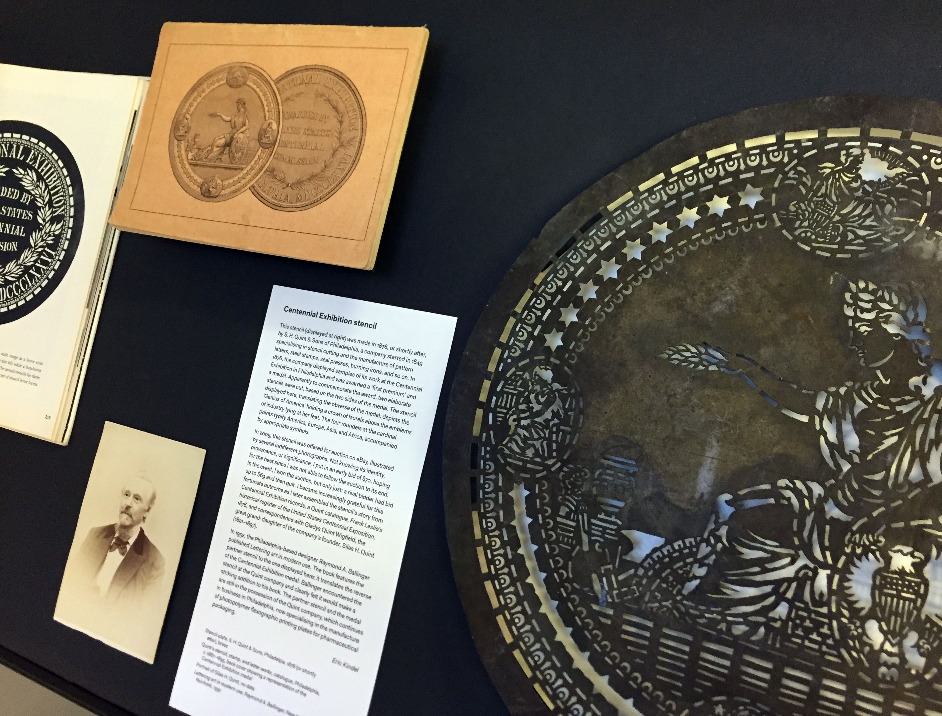
In the last in a series of posts about artefacts in the exhibition ‘Material histories’ (now on in the Department), Eric Kindel tells the story of a stencil cut to commemorate the 1876 Centennial Exhibition in Philadelphia.
Centennial Exhibition stencil (at right), alongside (from left) Lettering art in modern use (1952) by Raymond A. Ballinger; portrait of Silas H. Quint (no date); and back cover of the catalogue Quint’s stencil, stamp, and letter works (c. 1887–1895) showing a representation of the Centennial Exhibition medal.
Centennial Exhibition stencil
This stencil (shown above, at right) was made in 1876, or shortly after, by S. H. Quint & Sons of Philadelphia, a company started in 1849 specialising in stencil cutting and the manufacture of pattern letters, steel stamps, seal presses, burning irons, and so on. In 1876, the company displayed samples of its work at the Centennial Exhibition in Philadelphia and was awarded a ‘first premium’ and a medal. Apparently to commemorate the award, two elaborate stencils were cut, based on the two sides of the medal. The stencil displayed here, translating the obverse of the medal, depicts the ‘Genius of America’ holding a crown of laurels above the emblems of industry lying at her feet. The four roundels at the cardinal points typify America, Europe, Asia, and Africa, accompanied by appropriate symbols.
In 2005, this stencil was offered for auction on eBay, illustrated by several indifferent photographs. Not knowing its identity, provenance, or significance, I put in an early bid of $70, hoping for the best since I was not able to follow the auction to its end. In the event, I won the auction, but only just: a rival bidder had bid up to $69 and then quit. I became increasingly grateful for this fortunate outcome as I later assembled the stencil’s story from Centennial Exhibition records, a Quint catalogue, Frank Leslie’s historical register of the United States Centennial Exposition, 1876, and correspondence with Gladys Quint Wigfield, the great grand-daughter of the company’s founder, Silas H. Quint (1821–1897).
In 1952, the Philadelphia-based designer Raymond A. Ballinger published Lettering art in modern use. The book features the partner stencil to the one displayed here; it translates the reverse of the Centennial Exhibition medal. Ballinger encountered the stencil at the Quint company and clearly felt it would make a striking addition to his book. The partner stencil and the medal are still in the possession of the Quint company, which continues in business in Philadelphia, now specialising in the manufacture of photopolymer flexographic printing plates for pharmaceutical packaging.
On display
Stencil plate, S. H. Quint & Sons, Philadelpia, 1876 (or shortly after), brass Quint’s stencil, stamp, and letter works, catalogue, Philadelphia, c. 1887–1895, back cover showing a representation of the Centennial Exhibition medal
Portrait of Silas H. Quint, no date Lettering art in modern use, Raymond A. Ballinger, New York: Reinhold, 1952
‘Material histories’ presents graphic communication artefacts with a story to tell. The stories – the material histories – describe the artefacts in particular: what they are about, where they came from, their material qualities, their circumstances of production, how they were acquired, and crucially how they link to other artefacts, narratives and representations.
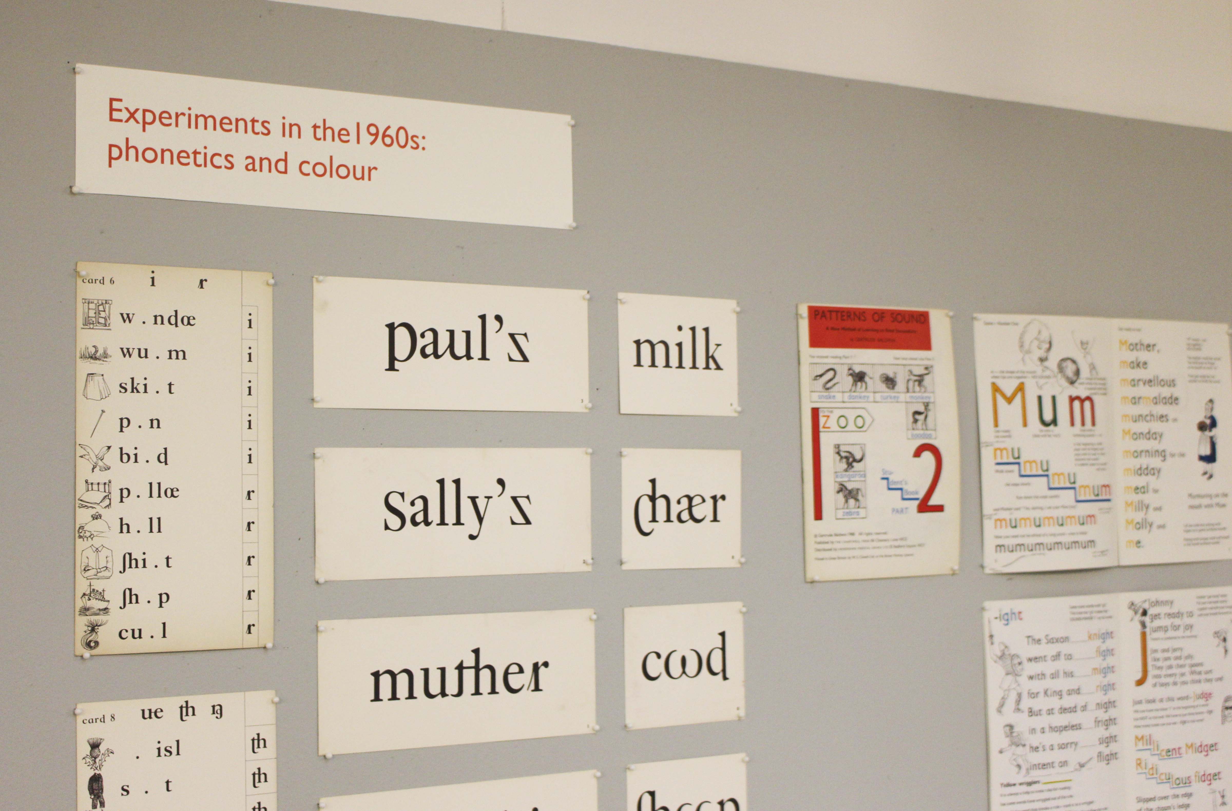
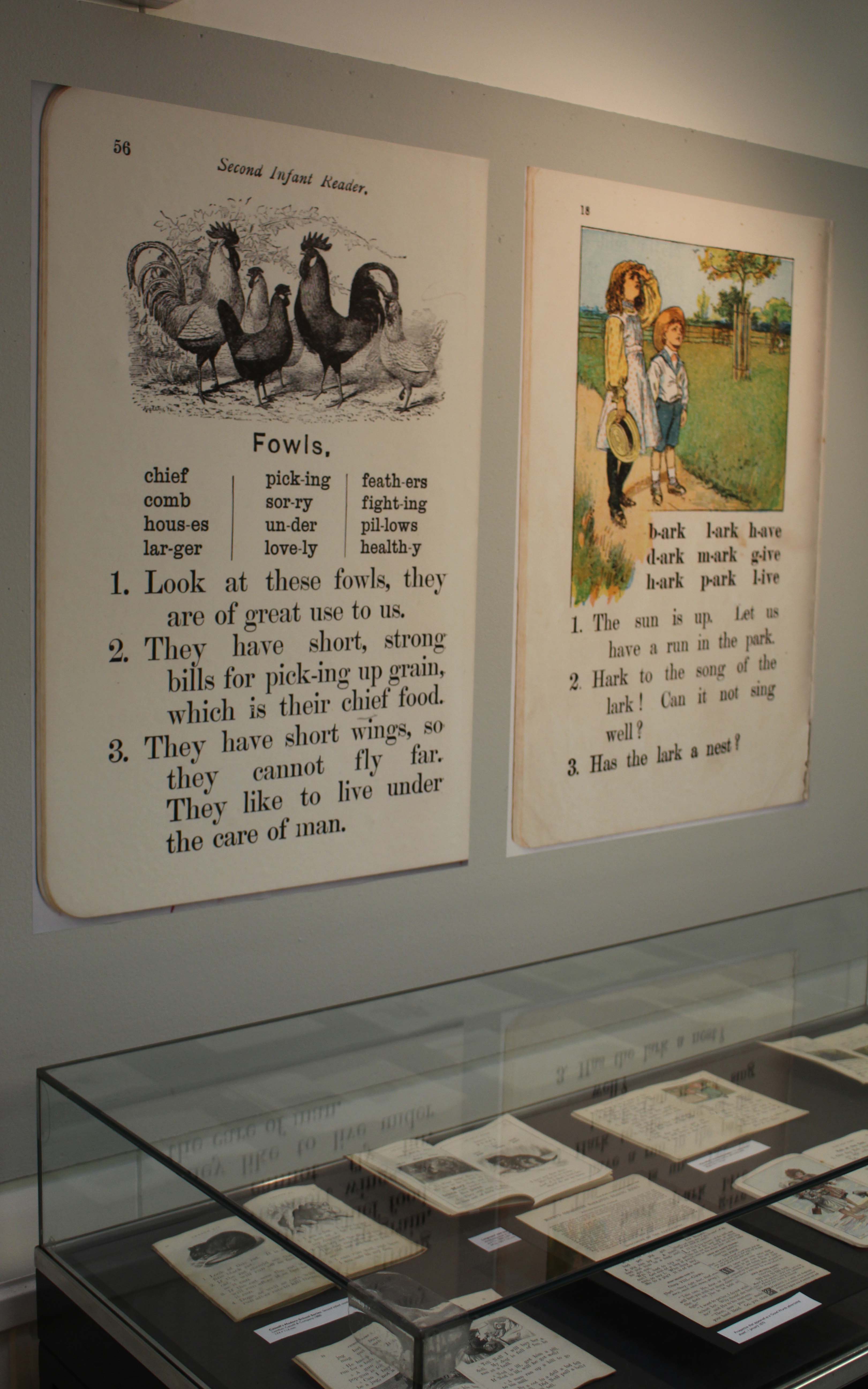
The use of typography and illustration in reading books for children has changed during the last hundred years. There has been a gradual shift from graphic conventions determined by printing and typesetting practice for adult readers to those more appropriate for beginning and emerging readers. Illustrations have become more important and many reading schemes used known artists to create the much-loved characters who featured in the narrative.
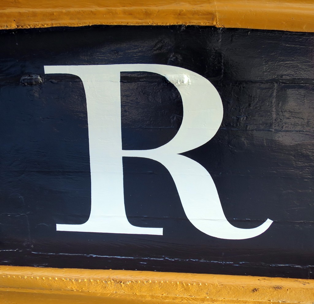
The name of HMS Victory, launched in 1765, the oldest ship of the Royal Navy that is still in commission, has been repainted. The name had been painted when the vessel was refurbished in 2005 for the two-hundredth anniversary of the battle of Trafalgar, but unfortunately the style used was Trajan, the Roman inscriptional letter that was quite unknown in England in 1805. Since the ship was being repainted during 2015 in a colour that is believed to be closer to that used in 1805, the opportunity was taken to repaint the name at the stern, using the ‘English vernacular’, the bold traditional style of lettering that is believed to have been in use at that date. The model for the style was engraved lettering by George Bickham. There was also guidance from contemporary paintings, and from scale models of 18th-century warships at the National Maritime Museum.
The letters were painted by Phil Surey from drawings by Adrien Vasquez of John Morgan Studios. Advice and historical research was by James Mosley.
Typography & Graphic Communication is proud to have achieved the highest GPA score (3.51) in UoA 34 (Art and Design: History, Practice, Theory), and the best REF result at the University of Reading.
Typography’s research covers the history, theory and practice of ‘design for reading’, with particular emphasis on information design, typeface design and book design. Research submitted to the REF included monographs, papers in refereed journals, type design and book design practice, and exhibition design and curation: 46 per cent was given the highest grade, described as ‘world leading’, and a 46 per cent was thought to be ‘internationally excellent’.
Typography’s high-scoring impact result (70 per cent assessed as 4*) reflected Departmental strategy of developing research projects with direct input from research users or with a clear view of the potential public benefit of the research.
Enriching communities of literacy, on the design of typefaces for world scripts traced how Departmental research has been used by organisations including Adobe, Microsoft and Nokia to create access to communication for large language communities, many of which have not, previously, had access to technology using their own scripts.
Designing information for everyday reading demonstrated how wide-ranging Departmental research into the design of functional documents, both historically and in current applied contexts, provided a knowledge base for collaborative projects with government departments (National Offender Management Service, the Cabinet Office and HMRC) which influenced their practices and brought benefit to the public they serve. Public exhibition of some of the Department’s research has changed perceptions of the development and role of communication in civic society.
Congratulations go to Part 3 students, Mel Towriss and Peter Loveland (pictured above) who, over the summer, took part in the University’s Undergraduate Research Opportunity Programme (UROP) and worked with Centre for Information Design Research. Their project examined how on-screen text format affected people’s reading speed and comprehension, as well as people’s views on which text formats were most appropriate for different purposes. The texts used for the study dealt with employers’ responsibilities to run a payroll and were drawn from the GOV.UK web site. Mel and Peter found strong agreement among study participants regarding the text formats; for example, what might be appropriate for beginner or professional readers of the information. Reading times for the different formats did not differ significantly across format but there were differences in comprehension of the information they presented. Mel and Peter were runners up in a research poster competition for all students taking part in the UROP scheme and will be taking their poster to the 2015 British Conference of Undergraduate Research.
Last week saw the launch of the Berkshire Healthcare handbook for carers of people with dementia. The handbook is the product of a joint research project between Centre for Information Design Research and Berkshire Healthcare Foundation Trust to understand the information needs of carers of people with dementia and respond with an appropriately designed resource. Once the handbook itself has been launched our research will continue, to examine how it is used; and the complete process of initial research, design development and user feedback will be made public so that it can be used by other healthcare organisations, in the UK and elsewhere. The project has been commissioned by Berkshire West Confederation of Clinical Commissioning Groups as part of their response to the Prime Minister’s Dementia Challenge which was set up to encourage innovative approaches to dementia care.
Although there has been increased media coverage of dementia over recent years, it is still a poorly understood condition, and most people have no idea of the medical and social support services that are available to help someone with dementia stay independent. The handbook aims to fill gaps in people’s understanding and provide practical tools that will help family members and friends who are looking after someone who has dementia.
The handbook has been developed with the input of scores of carers, who have contributed to interviews about their experience, reviewed drafts of the handbook content and commented on design prototypes. Similarly, professionals from Berkshire Healthcare’s dementia services have also given their input, helping shape the handbook from the beginning of the project. Involving people who will use information resources in their development is standard practice at Centre for Information Design Research and the Cochrane Review has recently cited evidence for the effectiveness of health information that is developed with the input of its potential users.
The collaboration between CIDR and Berkshire Healthcare started with the development of a pain assessment questionnaire for carers to complete, to help doctors understand the pain symptoms of people with dementia who were admitted to hospital and to adjust their pain medication accordingly. This questionnaire has been trialed successfully at the Royal Berkshire Hospital and is now being presented at geriatric medicine conferences as an example of the positive impact of empowering dementia patients’ carers to contribute to the process of care.
Centre for Information Design Research is now carrying out a range of projects relating to health care, including tackling medicines waste, increasing the detection and treatment of acute kidney injury in hospitals and documenting assessments of patients’ capacity to make decisions about their treatment.
The Dementia handbook for carers has been designed as a paper resource, which is what research showed carers needed. The boxes of copies taken to the launch were snapped up, with comments from carers that it was just what they had been looking for. But it can also be accessed on-line at www.berkshirehealthcare.nhs.uk/dementiahandbook.
The Handbook has featured on Meridian TV, BBC Radio Berkshire and Jackfm.
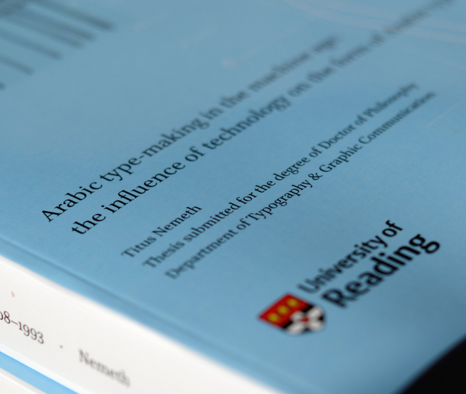
Titus Nemeth submitted his PhD thesis in 2013, on the evolution of Arabic type-making under the influence of changing technologies. The thesis spans the period from 1908, when the first adaptation of Arabic to mechanical typesetting introduced machine-aided composition; and 1993, when the adoption of Unicode marked the end of typeface design’s association with specific platforms. Titus’ research was supported by an AHRC Studentship.
Titus’ PhD represents a number of type-related research projects drawing on archival material, and is a useful reference for all researchers in this area. He has now published on his blog an engaging reflection on his experience doing a PhD at Reading. His article is a source of inspiration and guidance for potential researchers, and contains useful advice for research at this level.
The PhD was not Titus’ first experience in Reading. He had graduated from the MA Typeface Design in 2006, having completed an importantLatin/Arabic typeface and a dissertation on Arabic newspaper typography.
The Department’s Centre for Information Design Research (CIDR) has popped up in a couple of places on the web, recently.
You can see a talk by Alison Black to Oxford Academic Health Science Network on the Centre’s projects on the design of information for dementia care here.
And you can read Alison discussing the communication of uncertainty in meteorological forecasts here as part of CIDR’s NERC-funded collaboration with the University’s Departments of Meteorology and Psychology.