Category: media

Design is not a matter of surface appearance

Typography supports the Design Commission’s launch on 13 March 2013 of Restarting Britain 2: Design and Public Services, and strongly endorses its opening statement: ‘Design is integral to the DNA of each and every public service. Design is not a matter of surface appearance.’

Prof Sue Walker, who contributed written evidence to the Commission, has also been invited to become a member of the Associate Parliamentary Design and Innovation Group (APDIG) to highlight existing work in the design research field that has not yet been exploited by policy makers and those in government, to point to design research as an untapped resource for policy makers. The group will report to a parliamentary seminar in June.

APDIG brings together colleagues from universities recognised for excellent and relevant design research. Information design research has much to offer government and public services through its user-centred and often collaborative methods, as well as through research outcomes that inform the presentation of complex material, in print and online.

An example of research-led information design is the Centre for Information Design Research’s work for the Behavioural Insights Team, a group of economists and psychologists working within the Cabinet Office, to help with a trial they are running to support unemployed people looking for work. Earlier this week the forms were shown in the Independent in a piece describing the impact made during testing.


Supporting design studies in the EBacc

Include design

We are the first institution, with Goldsmiths, to support the campaign to include design in the English Baccalaureate (EBacc), a proposed new qualification. Currently, the EBacc will require pupils to achieve a certificate in five subject areas: maths, English, sciences, languages (ancient and modern) and humanities (defined as only history or geography). This formulation has been widely criticised for its exclusion of creative subjects, and sparked a widely supported campaign to include design in the core subjects of the qualification. The list of organisations and companies backing the campaign reads like a roster of design excellence, across the sector.

The case for design’s contribution to the economy was recently made by the Design Commission’s Restarting Britain: Design Education and Growth report, supported by the Design Council and other organisations. Its text makes a strong case for the contribution of the creative sector to the UK economy in terms of GDP, employment, and innovation. In particular, it highlights design’s role in inter-disciplinary skills that are essential for innovation and enterprise. Design is an enabling sector, without which many seemingly unrelated industries cannot function effectively: for example, advances in science rely on design for their commercial application, and successful differentiation. For Typography’s point of view, this is especially pertinent in a global market where using textual and visual information in meaningful ways is increasingly the product itself, separate from any rendering environments.

You can add your support to the campaign here.


Pencils to Pixels, and more

Gill drawings

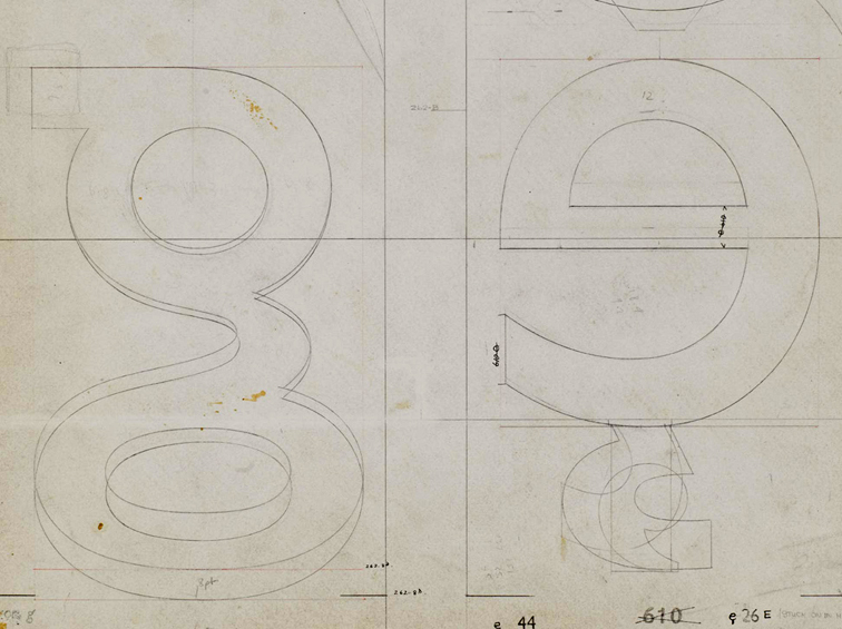
The University is a partner in the Pencil to Pixel exhibition which opened yesterday in the Metropolitan Wharf, in Wapping. After the taster of Gill’s drawings seen in Beauty in the Making last spring, Monotype pulled out all the stops for Pencil to Pixel: the event marks the first public viewing of many materials from the archives in Salfords, from original drawings by Bruce Rogers and Chris Brand, to an unbound folio masterpiece of Modern typography belonging to Adrian Frutiger, to an innovative display taking over the entirety of one of the walls, displaying a never-reccurring combination of typeforms from the company’s library. The exhibition is accompanied by twelve “collections” (booklets showcasing themed selections of typefaces by Abbott Miller, Patrick Burgoyne, and others), and a range of specimens and keepsakes.

The exhibition marks the publication of two major editions: a new issue of the Recorder, celebrating Robin Nicholas’ career in the company (with an opening article by Gerry Leonidas), and a special issue of Eye magazine, dedicated to the contributions of Monotype to type and typography. Both editions include superb photography, and should become instantly collectable – not least because the material in the exhibition is unlikely to be made available in this scale anytime soon.

There are many Reading connections with the exhibition, starting with the main organisers: Dan Rhatigan and James Fooks-Bale are both graduates of the Department. The special Recorder issue  follows on from the Centenary Issue of 1997, published on the occasion of the ATypI conference in Reading; and the Linotype the Film publicity on display sports the exquisite (but unreleased, yet) redesign of Metro by another graduate, Toshi Omagari. Not least, the Recorder includes a picture of Robin teaching a few years back in a room eerily similar to the studio where Book- and Information Design postgraduates spend their days!

More about the exhibition in blog posts by Eye and Gerry.

Simplicity at the London Design Festival

Simple is smart

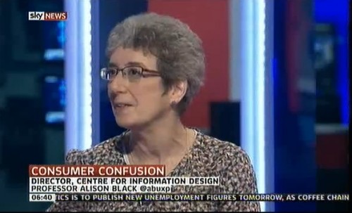
Alison Black, Professor of User-centred Design, shared a platform with leading designers and creative thinkers at the 2012 London Design Festival, explaining the importance of simplicity when developing products and services. Charing the event, which took place at the V&A Museum, was Philip Davies of Siegel+Gale. Other panel members were Merlin Crossingham, creative director of Wallace and Gromit at Aardman Animations; Stephen Fear, British Library entrepreneur-in-residence; and Charlie Allen, bespoke London tailor.

The panel shared their perspectives on the fundamental significance of implementing simplicity to connect to the modern consumer. They also provided their views on a wide range of topics, including how to embrace simplicity while avoiding the simplistic. Another interesting discussion centered around the idea that people have different perceptions and interpretations of simplicity.

“Brands that provide simpler interactions and experiences are winning the battle to stand out in the competitive marketplace,” said Philip Davies. “Simplicity is a powerful tool that helps brands get into consumers’ heads faster, and stay there for longer. As the UK continues to struggle in economic uncertainty, those brands that offer experiences that are clear, direct and easily communicated will generate strong customer loyalty and forge ahead.”

The lively debate played out on Twitter. Highlights from both #SimplicityTalks and the live event will be curated, together with opinions, images and ideas from select influencers who are renowned for simplicity in their fields, to create a book that will showcase the profound impact of simplicity.

Radio marathon for clarity in government forms

Earlier this week Gerry Leonidas joined Bernard Baker, Business Development Director for the Public Sector at SAS UK in a series of radio interviews to discuss the just released ‘Communicating with the Citizen’ report, commissioned by SAS and carried out by YouGov. The marathon session (seventeen radio stations in one day!) picked up on the report’s clear indications that the public wants forms to be more clear, to see a greater use of online channels for communication with the government, and to explore positive incentives in form-based communication.

Interview in the Haaretz

Earlier in the year Reading alumnus Adi Stern, now the Head of the Visual Communication department at Bezalel Academy of Art and Design, invited Gerry Leonidas to give two lectures and work with students of the academy. One lecture was for a wide audience in the academy and visitors (entitled “Where is type now?”) and one for the annual staff meeting of the Academy, on the approach taken at Reading in integrating research and teaching in design. Haaretz reporter Yuval Saar interviewed Gerry during the trip, and the interview is now online (in Hebrew).

MATD project work in Instapaper

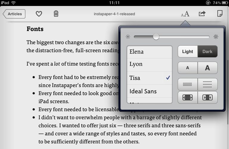
FF Tisa on a first generation iPad

The latest update to Instapaper (AppleStore link) includes six new typefaces, including two that started as MATD student projects: FF Tisa by Mitja Miklavčič (2006) and Elena by Nicole Dotin (2007). Instapaper, a 4+ rated app, allows the user to collect content for reading in a highly user-friendly environment on an iPhone, iPad, or a personal computer.  Extended commentary (and an image of Elena on the iPad) over at Typenotes.