
Labiba and Yaa took the opportunity to design the book Black British Members of Parliament in the House of Commons: 22 Stories of Passion, Achievement and Success for author and client Shirley Anstis.
Brief
We accepted the real job while the book was in the writing process and met with the client to obtain further information. From our meeting, we found the book was a compilation of 22 mini-biographies of Black parliament members. The aims were to inspire and educate readers on potential career paths and role models. The target audience were secondary school students, and the secondary audience was schools and parents. The three deliverables included: a book cover, eBook, and files for a printed book. We established objectives to produce an inspiring, attractive and appropriate book and book cover for the target audience.
Research
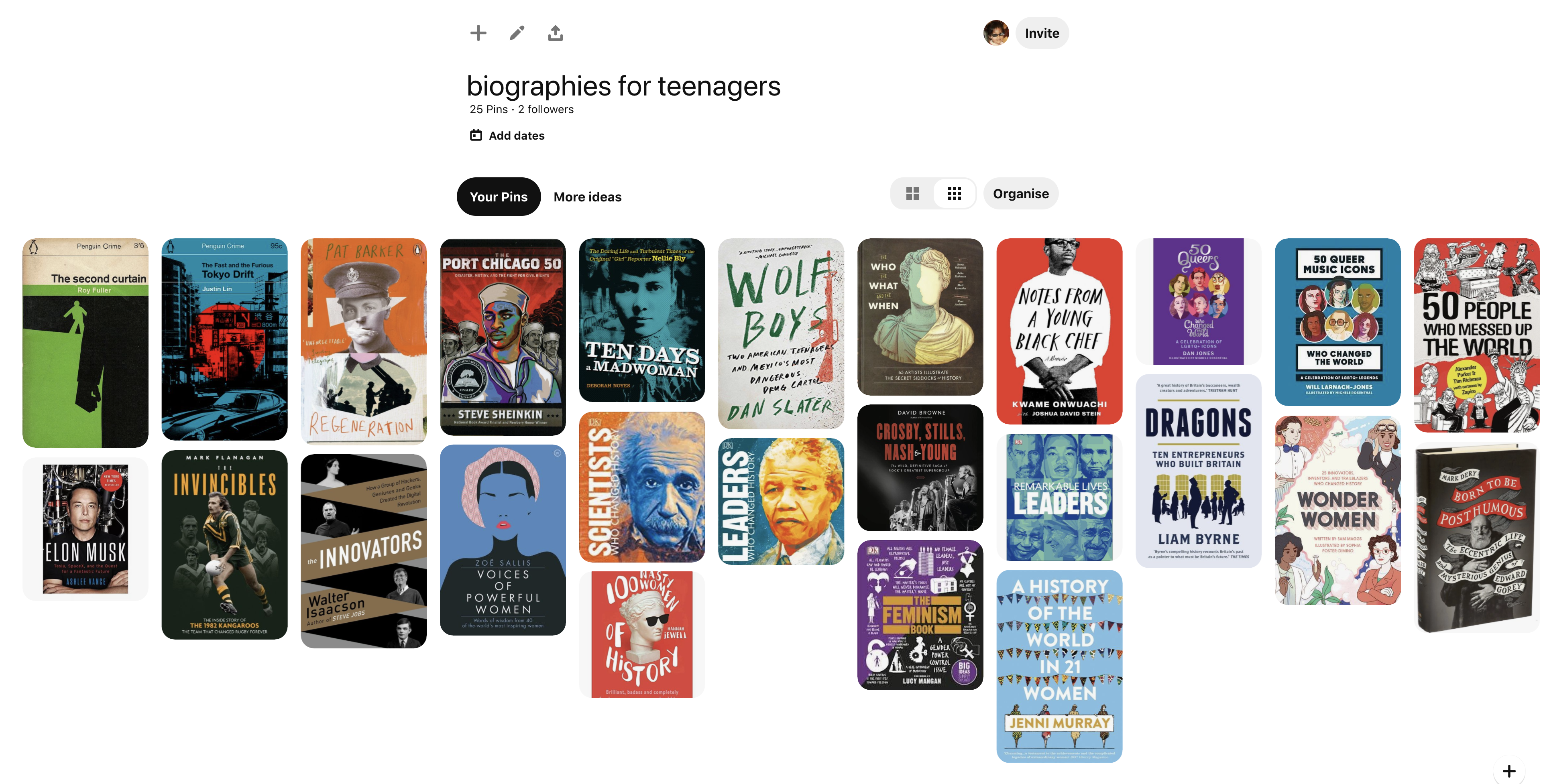
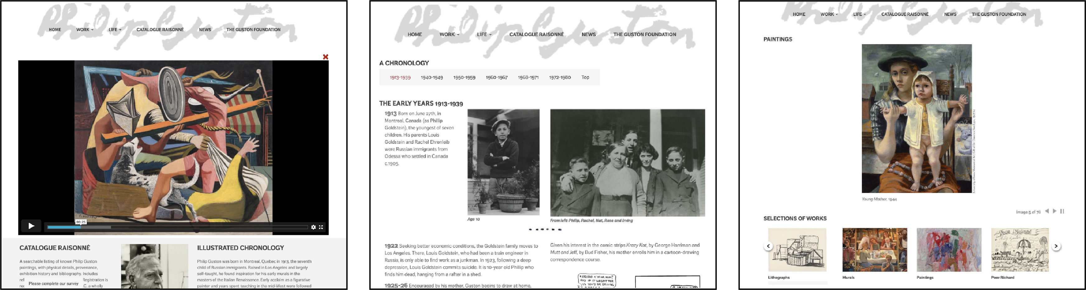
As our target audience were teenagers, we looked at different biographies aimed at our target market; to understand the style and get inspiration. Almost all of the books we looked at had a figure on the front cover, indicating the role model of the biography. Additionally, most of these covers were illustrative, so we concluded illustration would be the most appropriate design to attract the target audience. We further researched different illustration styles and layouts we could adopt to create a more engaging book.
Cover
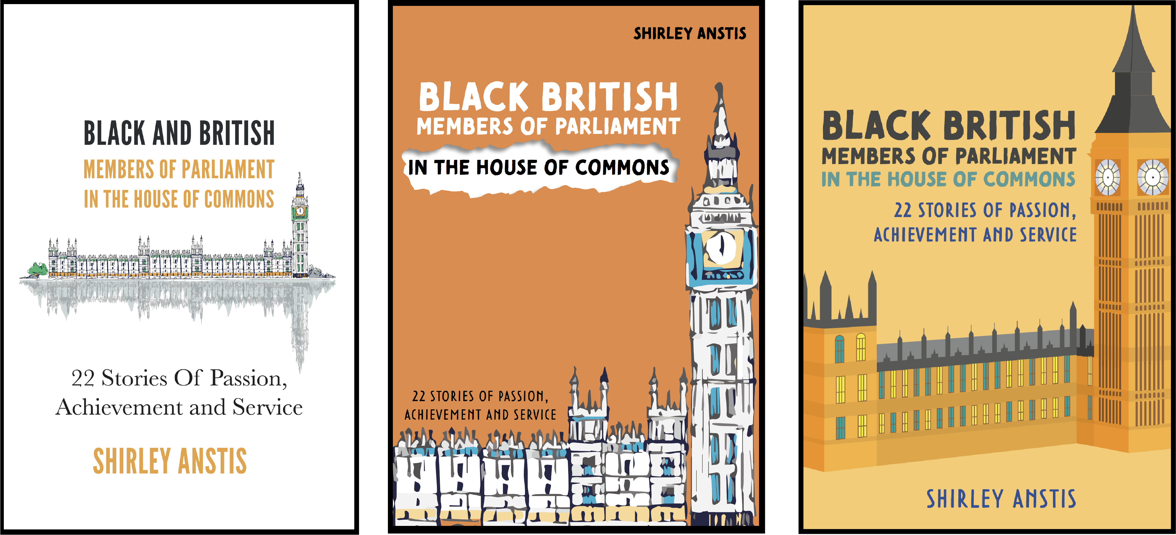
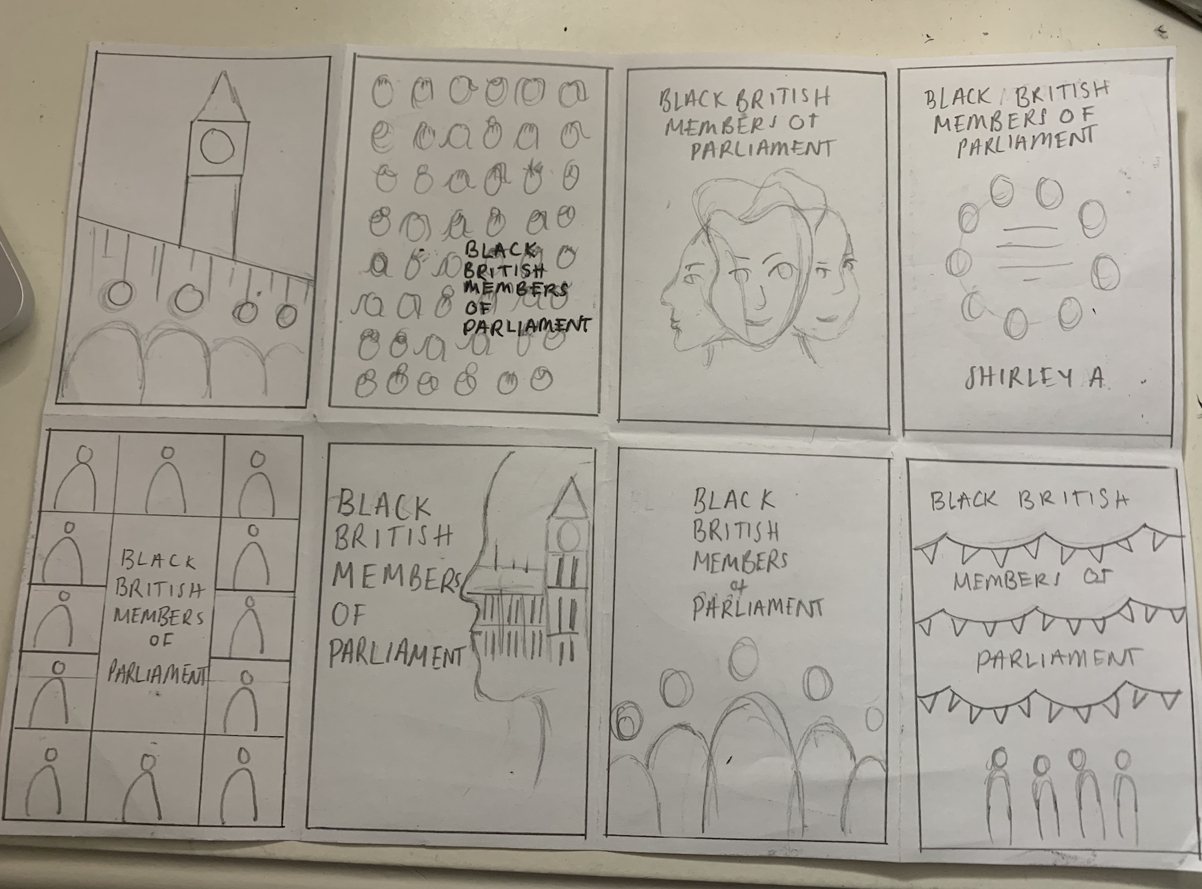
The client presented an initial book cover design. We found it not appropriate for the target audience as it was too mature. Therefore, we tried to adapt the design and work with the illustration provided but noticed it reduced the overall appeal of the cover. After discussing this with the client, she was open to new concepts but adamant about using the Houses of Parliament. We eventually realised that having the Houses of Parliament on the cover would not work despite our illustration attempts because it lacked interest. We had to take a different approach to make it more enticing. After creating some sketches and developing a couple of ideas, we eventually opted for illustrative portraits of the MPs on the cover.
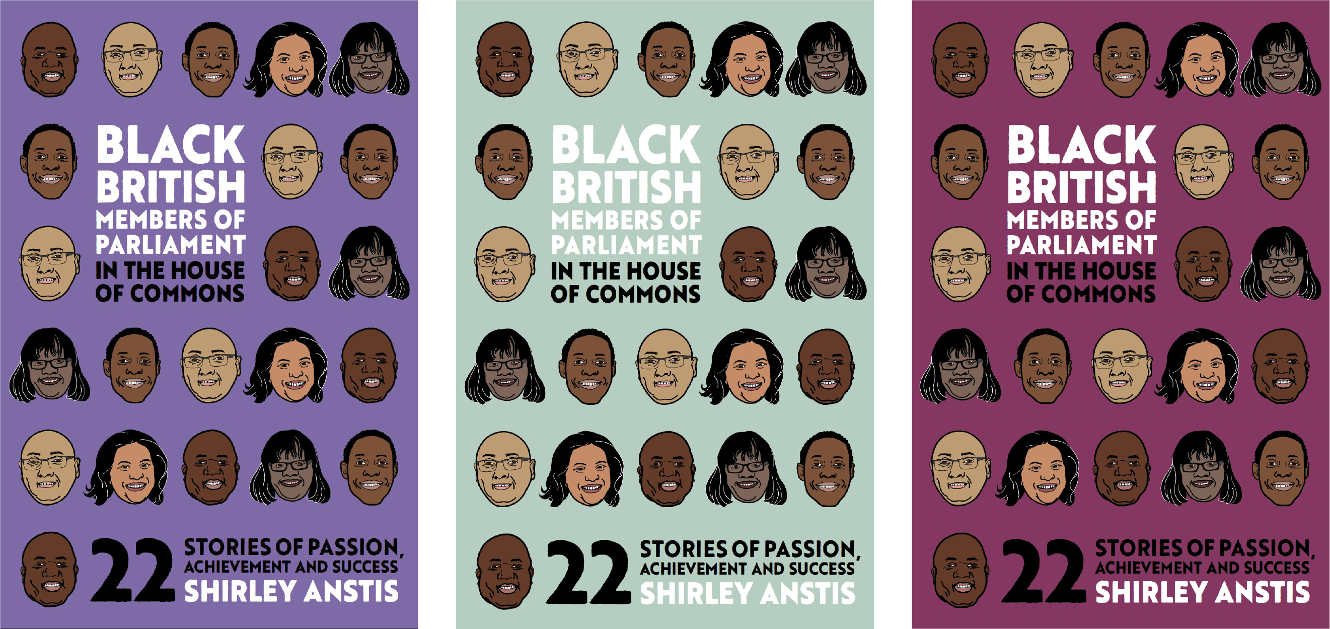
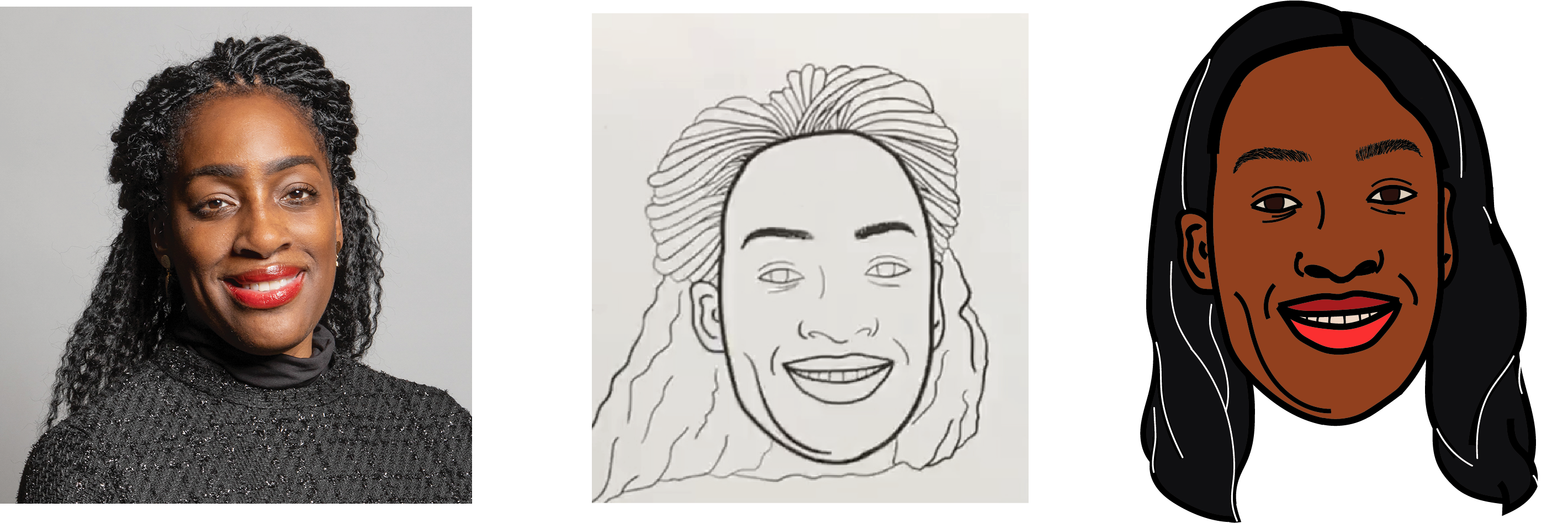
We needed to be cautious about our designs and illustration styles to avoid being racially insensitive. For example, one of the first iterations we created had vibrant colours and a large image. We wanted to add some flair to the cover by adding texture, so we implemented a ripped paper effect. However, class feedback highlighted this effect was messy and unprofessional, thus emphasising racist connotations by reflecting the MPs poorly. We also took into consideration the racist undertones of adopting certain illustration styles. Black people have a long-standing history of experiencing racism due to their facial features. We avoided a caricature style as the exaggerated features within this technique perpetuates racist stereotypes.
We selected the typeface Brother 1816 Printed for the title as the printed texture in combination with the illustration style making the cover appropriate and appealing to the target audience. The solid typeface made the book title bold and complimented the thick lines of the illustration portraits. Initially, we selected different typefaces for the subtitle but received feedback to use the same typeface for the entire cover.

Copy-editing
Once we had received the manuscript, it was essential to clean the copy of hidden characters and correct any mistakes first. Despite our attempts at cleaning the manuscript before designing, we found ourselves making changes throughout the design process. Then we flagged the inconsistent use of names, incorrect labelling of nationality with ethnicity, broken/missing source links, and missing information in the table. Then relayed these to the client for correction.
eBook
As this was the first time either of us had designed an eBook, we educated and guided ourselves through LinkedIn Learning courses. We discovered there were different types of eBooks. As our client intended to upload to the Kindle bookstore, a reflowable EPUB format was most appropriate because it would adjust to fit the readers’ device.
Generally, eBook design is crude, designing for functionality rather than aesthetics. It was essential to assign the correct paragraph, character and object styles to all the content. These controlled and affected the function and outcomes of the eBook preview. Initially, we noticed that exporting the design from InDesign to EPUB produced entirely different appearances in size, spacing, positioning and images. Hence we needed to install a Kindle previewer to check and test each iteration of the EPUB.
We considered typography in terms of on screen readable type, headings and lists. However, the line-length, hyphenation, widows and orphans and headers and footers were irrelevant as these changed by the device and the user’s personal settings. Images appeared in black and white for some devices but in colour for others. They also had to be manually anchored to prevent shifting to incorrect locations.
As EPUB removes multiple-spacing, all spacing occurs within the styles. When designing the contents page, we struggled with creating adequate space between the page number and the section title as the EPUB minimised the space. After a few iterations and feedback back-and-forth with our supervisor, we realised that the page numbers were redundant as they change for different devices. We resolved it by removing the page numbers and ensuring the hyperlinks in the interactive contents linked to the correct section.
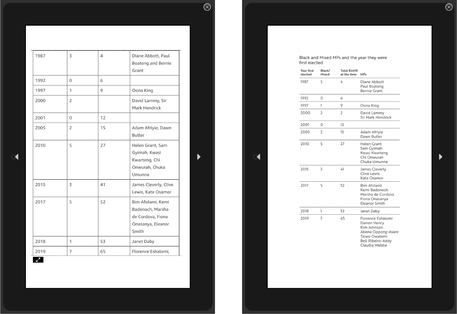
The reflowable format created an issue with implementing the table. It would cut the table across pages rather than presenting it as a unit. Our supervisor requested we indicate that the table continues from the previous page. However, as the table broke by rows, it would be impossible to ensure it appears in the correct place for different devices. Instead, we converted the table into an image so it would always appear as one unit.
After spending hours trying to rectify a simple error, causing all the images to misalign, we learnt that saving new versions of the file for each iteration was crucial. It was hard to identify the cause of new issues being unable to see the previous EPUB iteration for reference. A lot of trial and error was needed to reach the final deliverable.
Book
The design process for the hardcopy was more straightforward. We developed three sample layouts demonstrating a long and short mini-biography, and the chosen layout was the client’s preference. Flowing the text and images into the document was simple. Most effort and time went into refining the typography, ensuring consistency and removing errors throughout the copy.
Unlike the eBook, printing needed considering. Initially, the hardcopy was supposed to be in colour due to the use of photography. However, due to cost, the client also requested a black and white version of the inside pages.
We also found out orange was a troublesome colour to print and needed to figure out how to print the cover. As few copies were going to print, it ruled out the use of spot colours. Instead, we used a Pantone Bridge swatch, providing a close copy of spot colour in CMYK. We also contacted Geoff, who suggested implementing a silk coated paper stock for the cover. Ultimately the client picked a glossy paper stock as she self-published through Kindle Direct Publishing on Amazon.
Issues
One of the main issues was the tight deadline provided by the client. Towards the end of September, after sending us the manuscript, the client stated that she wanted the eBook completed for Black History Month in October. We were concerned that we would be unable to design the eBook to a high standard within the time frame presented. After planning out the tasks we could do within the timeframe provided, we updated the restated brief and sent it to the client. As designing an eBook was a new experience for us, the process of learning how to do it slowed us down. We also came across many issues that the videos did not cover or were covered briefly.
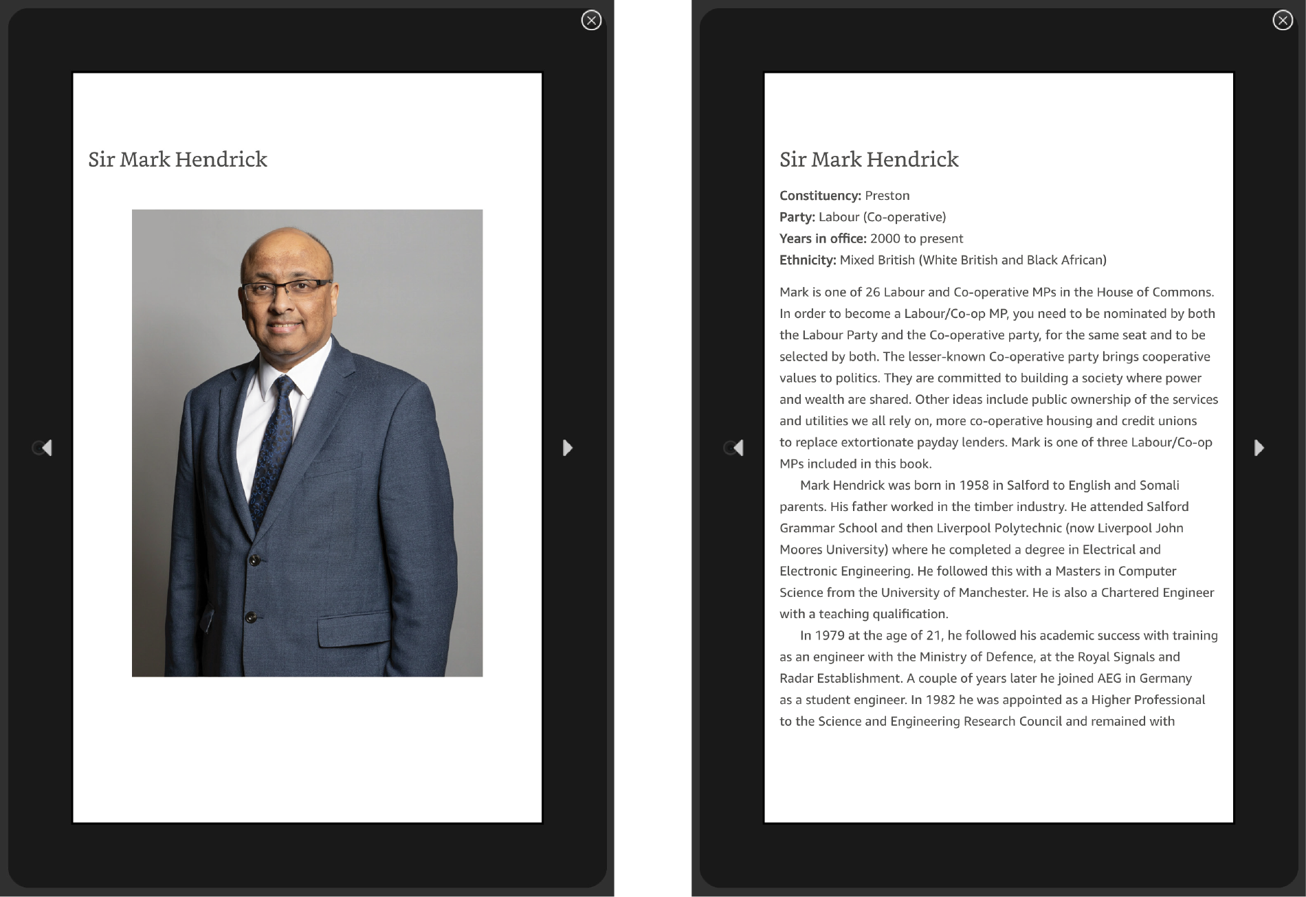
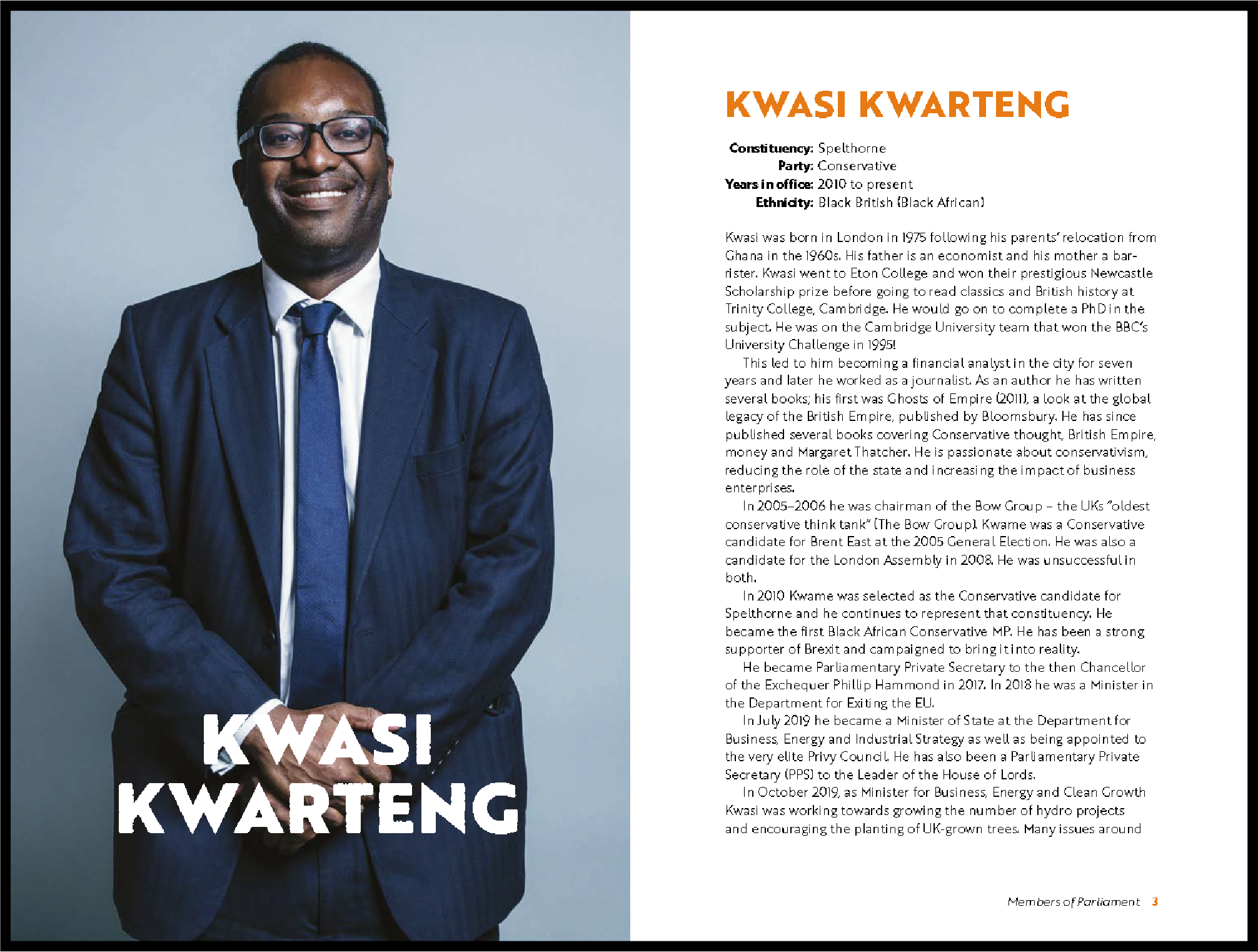
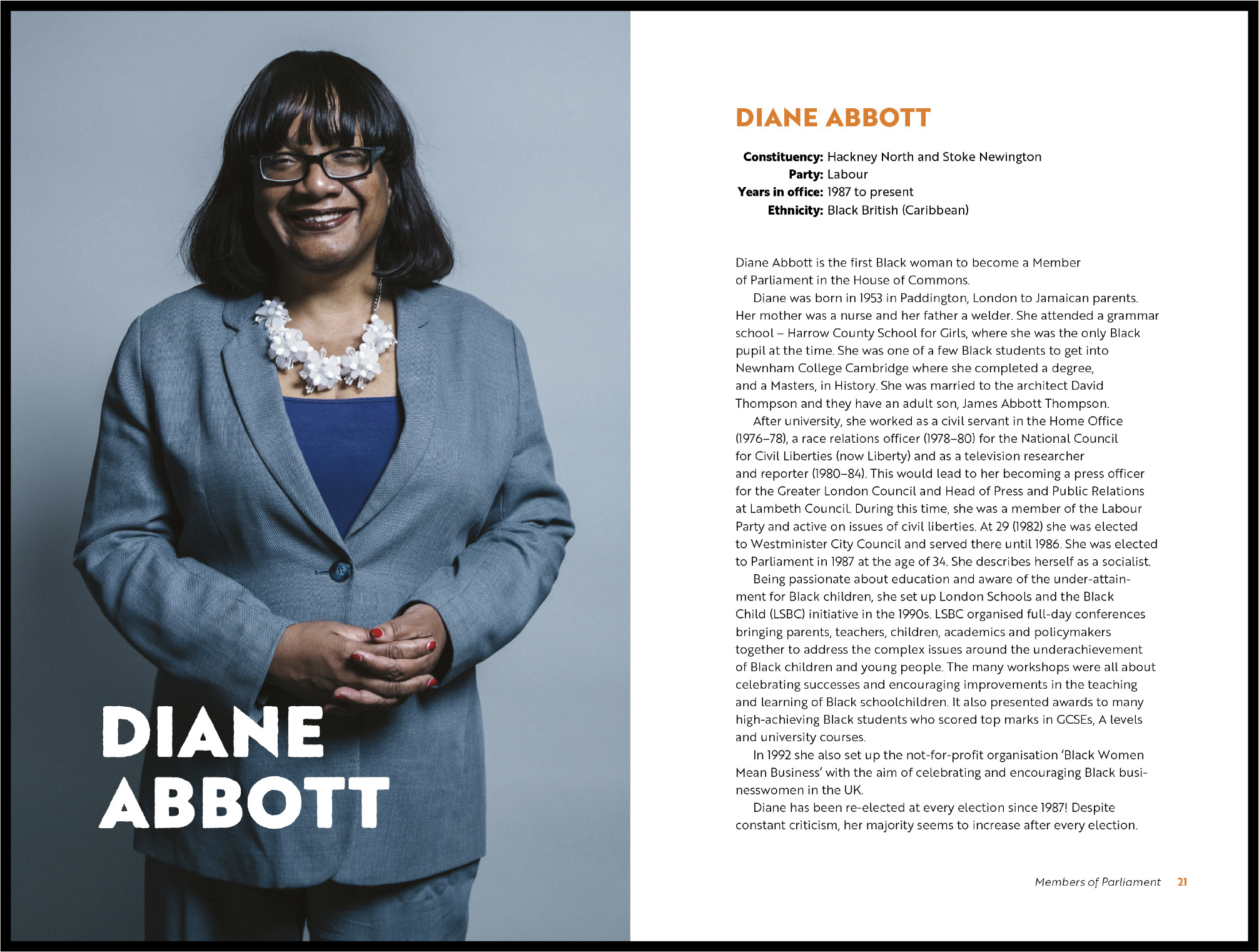
The photographs in the book and the references for the illustrations on the cover used were the MPs’ official portraits on the Government website. It raised a copyright concern as the client did not own the images. We emailed the copyright compliance office at the university to verify whether using the images for illustrative purposes on the cover and within the book would be allowed. They confirmed that using them for our specific project was permitted if we acknowledged the photographers. They also provided a structure for crediting the photographer to assist us.
One of Yaa’s main concerns was illustrating the braids of the female MPs as it is a hairstyle she struggled to draw. In addition, making the braids visible on a smaller scale was also a significant issue. Eventually, Yaa figured out a technique that worked. Most MPs wearing braids in their official portrait are wearing braids in the illustration on the front cover. However, Kate Osamor’s hairstyle was difficult to illustrate in a way that did her appearance justice. Yaa repeatedly tried to replicate the braiding style shown in her official portrait, but each attempt was unsuccessful. Therefore, she began considering alternative solutions. Black women tend to wear different braiding hairstyles, so she researched different protective hairstyles previously worn by Kate. Kate has frequently worn her straight based on recent Google Images. Ideally, we would have liked to display Kate’s African heritage through her braided hairstyle because it is a significant part of black culture. However, we decided to change Kate’s hair to match one of her recent hairstyles to convey her appearance without being offensive.
Reflection
It was challenging to take on a project having no experience in eBook design. Still, the opportunity allowed us to learn and expand our design skills, and working intensely on typography has renewed our attention to detail. Yaa also uncovered and developed her digital illustration abilities. The skills and lessons we have learnt from the project have taught us how to handle pressure and tight deadlines, maturing us as designers in the process. Overall, we are happy with the outcomes, but there is room for improvement. If we had more time, we could further refine the designs for all the deliverables. Furthermore, having the books printed through the department instead of Amazon would have produced a more professional appearance.


