Background
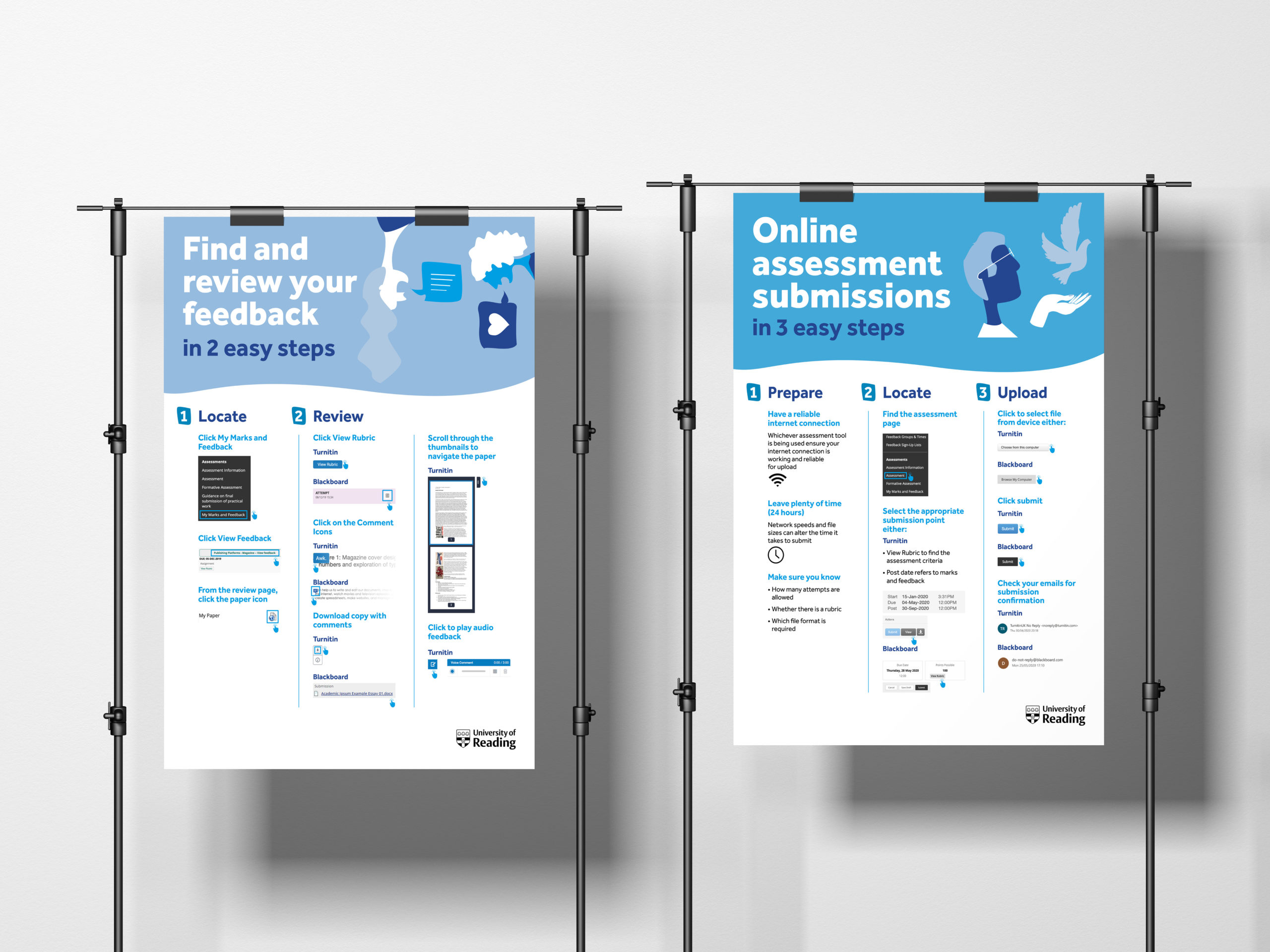
The English Department at the University of Reading required full size A1 laminated posters which addressed feedback and assessment issues in English Literature. The brand identity of the University of Reading was required for example, the Effra typeface and University of Reading logo. One problem reported by students is that they are unable to locate and read their feedback on Blackboard. To help address this, TEL produced some images to use for the posters (and digital posters). These posters are to be displayed in the English department in order to help the students.
The purpose of the A1 posters were to inform the students on how to locate their feedback and how to submit their work. This is due to the lack of guidance on how to use Blackboard and Turnitin. The posters should have a lasting impact on the students so they remember the steps and refer to this throughout their studies at the University. Another key aim of the job was to decode the existing content as, it was extremely confusing. There was not much clarity in the steps and this needed to be condensed into a few posters.
I was allocated this job for a quick turn round in order for the client to gain the correct funding for printing and get the posters up within the department. This ultimately benefitted myself because it meant I experienced the realistic time constraints of a design job.
Restated brief
The Deliverables:
- Feedback and assessment posters. A1 posters, the number of posters required was determined by the design process.
- A digital copy of the images.
A challenge that arose with the brief was the quantity of posters as this was not specified by the client as they were unsure how much of the content would fit onto one poster. When discussed with the clients they advised me to analyse the content initially to understand it well enough to identify how many posters are needed. This helped to narrow down the exact content which is needed and what steps are linked. This meant that I required 2 posters to accommodate all the information, one regarding the feedback and one on the assessment submissions.
Research
Research into existing student faced posters helped to understand the style and stance the content should have in order to draw attention to the posters. Initially, I gained background knowledge on the university brand guidelines from speaking with my clients. They helped me to take into consideration a certain typeface and to ensure the university logo was on the posters. In order to understand where in the department the posters would be placed and whats would be situated around them, I asked my client. I found out that the colour scheme in the English department is blue and the corridors where the posters would be placed are painted a shade of blue. This therefore, enabled myself to experiment with complimentary colours and identify what colour scheme would work. I intended to educate myself on the aims of the client, what they are trying to achieve on a wider scale and how this can be inputted within the posters.
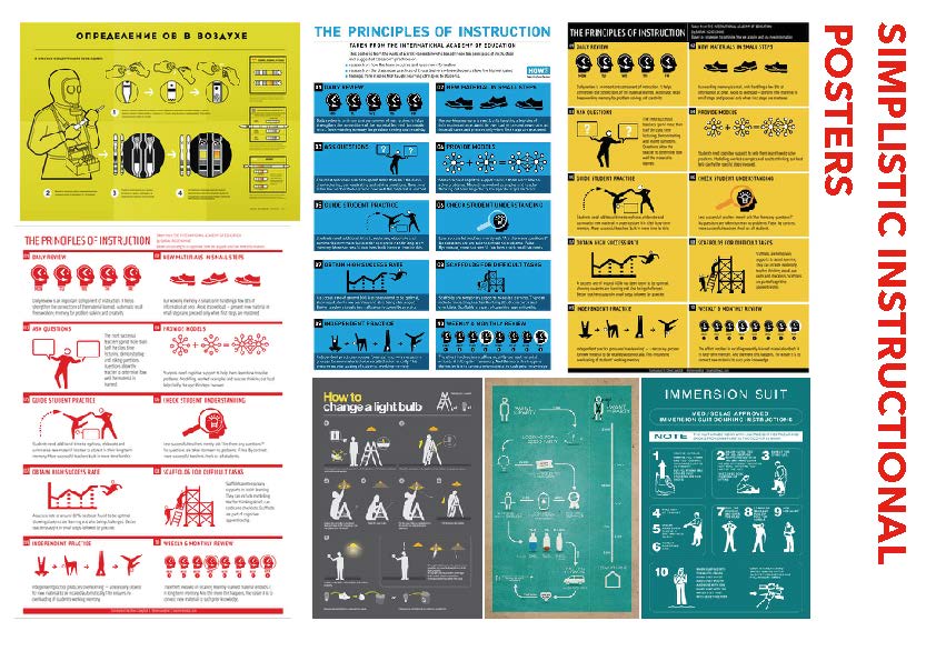
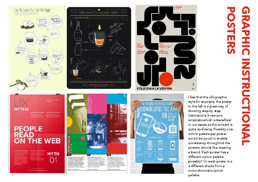
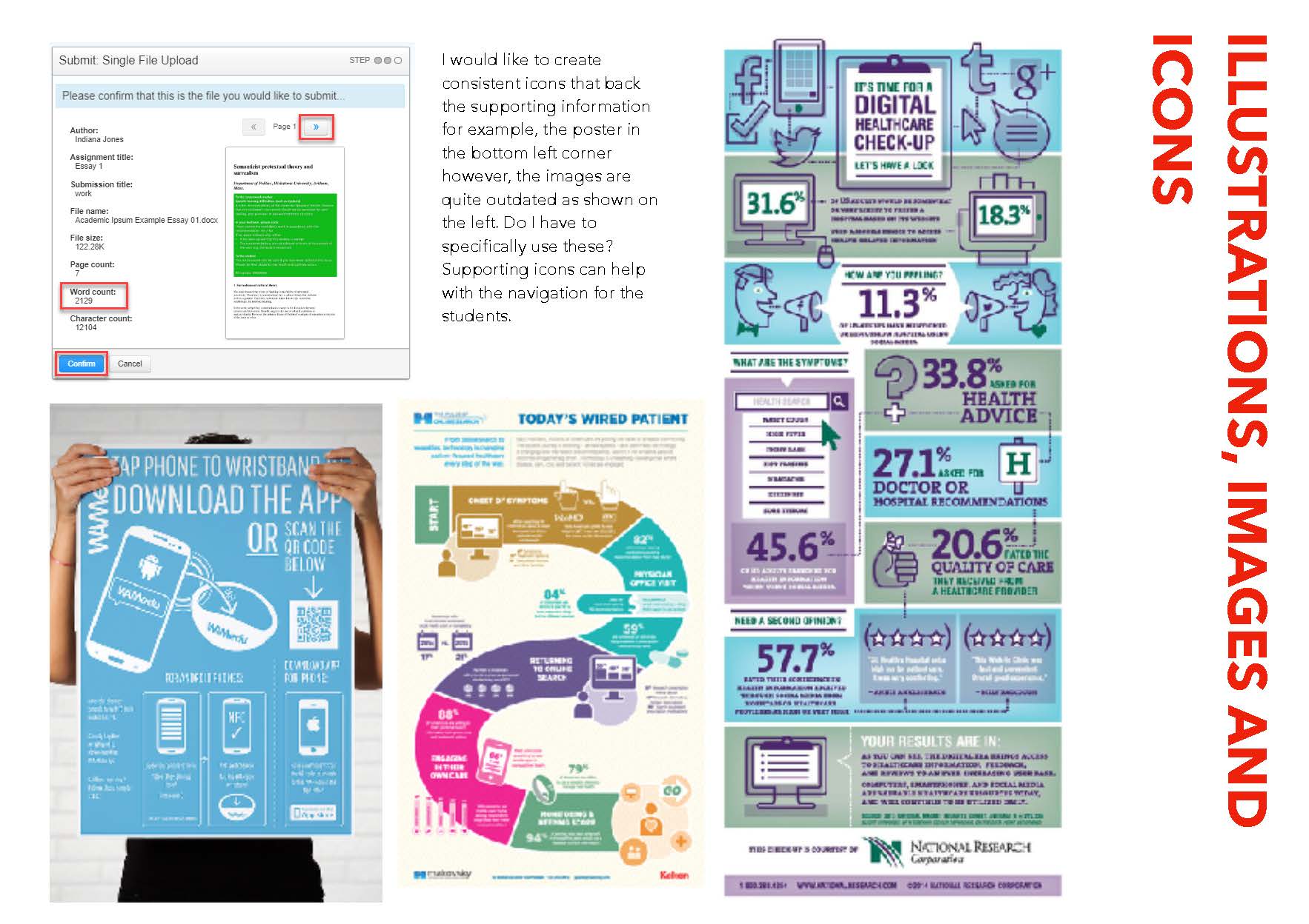
A way in which I collated ideas and displayed them for the client was by creating mood boards. The boards were sectioned into, existing simplistic instructional posters, graphic instructional posters, illustrations, images and icons and typography and brand. The boards allowed me to identify what the client preferred and what direction I should take in terms of style. The clients found this useful as they were able to suggest what they preferred, which gave me an insight to proceed with the designing aspect.
From the feedback from the client I gathered that they preferred a monochromatic blue colour scheme to match the doors within the department. They also suggested for the poster to be a step by step simplistic instructional poster. Selecting some of the images I had included helped me to understand the style they required. However, one problem was that the style did not matter until the content had been organised and re structured. This was a problem due to their being too much content for example, three pages were to be condensed into one poster. Nevertheless, once I had analysed and throughly reorganised the content, the sections became clearer and I was able to divide and produce a plan. Another limitation was that there was only one typeface ‘Effra’ to work with, making it hard to create differentiation between content.
Design Development
The design style the clients wanted were uncluttered, step by step structured posters with a monochromatic blue colour scheme with innovative digital images where necessary.
Primarily, using the style guides I created sketches of how to section the content in a visually appealing way. From these sketches I went on to develop the concept using triangles to section the content. The idea of triangles to direct the user to the next step was developed further. After showing my supervisor my design ideas, he suggested that the differentiation between different sections was still unclear. The titles seemed to get lost within the background colour. The clients seemed to be very fond of the design, however the hierarchy was still unclear and visually confusing like the copy provided. The triangular design was restricting the typographic clarity therefore, I removed them creating a new layout which included new illustrations and column layout. This worked much better and from here I further developed the design. Within a limited amount of time I sent variations to the client, I had to work efficiently as the client needs the posters before a certain date in order to cater for printing. I would gain feedback from the clients as well as my supervisor frequently in order to get a better understanding of what direction to take the posters. Due to the global pandemic of Covid 19 I was unable to show physical design deliverables however, consistent and frequent updates were communicated to the client through email. The client was unsure what size the posters should be once the posters had been completed however, I suggested for it to remain A1 due to printing costs being cheaper as opposed to a custom print. A size are more economically efficient. The client agree and this format has remained.
Final Outcomes
The client has invited myself back to the departments where the posters will be put up to have a look and view people interacting with them. The posters have ultimately been a success and will hopefully show this through their functionality. The clients particularly commented on the clarity and the visual identity of the posters from the colour palette to the typeface. The clients commented that the posters were clear and helpful for students and would fit in perfectly with the department.
Reflection
Challenges were met throughout the process of this job. The biggest constraint being the amount of content being placed into one poster alongside the restricted typeface choice of Effra. This consequently created difficulties in regard to hierarchy, which is extremely fundamental in an informative poster. I overcame this by continuously developing the structure and layout of the poster using space as the factor for differentiating sections and information. Furthermore, due to Covid 19 I was not able to show physical deliverables to the client ultimately making it hard to envision the designs. Although there were challenges the posters were sent of to print at the clients request and at the correct time and I learnt new skills such as working so closely alongside a client in difficult circumstances as well as communicating effectively.
Overall, the job was successful and I thoroughly enjoyed working alongside the clients and was delighted to hear all the positive responses from the client. Not only was the feedback good but it further emphasised that although many challenges could come in the way of the job a professional demeanour and design process is to be retained.