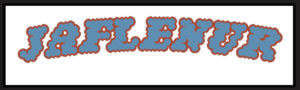
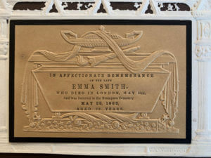
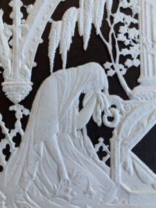
During Emma’s session, we went through all the collections available in the typography department. Amongst all the collections, I was specifically interested in the memorial cards. Memorial cards were used in the Victorian era to demonstrate heartfelt mourning and it was fully expressed through the decorative cards. According to the book, The Encyclopaedia of Ephemera by Maurice Rickards, the memorial cards were ‘commonly 75x115mm’ and ‘relied for much its appeal on the austere extravagence of blind embossing.’ Here, blind embossing refers to the method of creating raised logos or characters without the use of ink and this is evident in this memorial card, as all the text, including the design, is done in blind embossing.
Details of the text
Printing Process
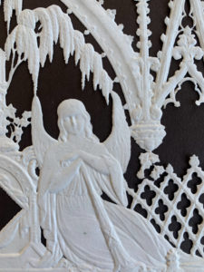
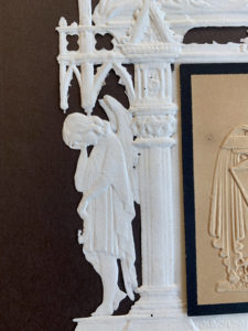
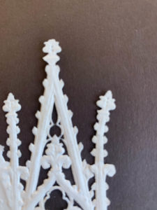
The printing process produced an uncoloured relief image, similar to company seals (The Encyclopaedia of Ephemera, Maurice Rickards). Images of angels, tombs and mourning figures were common elements found amongst these memorial cards to reflect the concept of mourning effectively.
Details and Texture
I was particularly intrigued by this card as its quite simple, with no colour except for in the middle part of the card, where all the text is allocated, yet, at the same time, the piece is a very detailed and sophisticated one. I was also told that this particular card was perhaps made for someone of higher class, thus the intricate details found in it. In terms of texture, I believe the material felt very thin and almost fragile, most probably made out of lace paper, due to the extensive decorations, and being able to create something out of this type of material is very interesting to me.
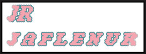
Lettering Style
In terms of the typeface style, all of the text is in serifs, varying in weight and size, to emphasise on the hierarchy of information to the targeted audience. The text is fully aligned in the centre, making it visually look neat and adjusted, with equal line spacing between each line.
Overall, this was a fun project since we got to see the collections available to us through Emma and have insights into how design has evolved over the years and the different elements that were prevalent during a certain era of design. I personally was able to learn a lot about the hierarchies of information, layouts and the use of colours in design.
For Gerry’s project, we looked at different typefaces and were given two tasks, which was using clues from the visible parts of letters and try to imagine how the rest of the letters may look like.
Task 1
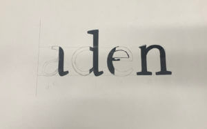
In the first task, we were given a sheet where half of the letters were printed and we were to draw the rest of the letters. The sheet I had chosen was the font ‘Rosetta Type Skolar’ and the word that spelt out after we were done was ‘aden’. I focused on the terminals of the letters and kind of replicated them when drawing the other halves of the letters, as I believe it was one of the main elements of the font. I had also drawn the x-height and the baseline of the letters in pencils (not very visible on camera), to help me with drawing the letters in the same height. Unfortunately, I was unable to finish filling in the letters with the black markers but Gerry had gone over the different fonts and explained to us the differences, the spacing and the context of the typefaces. This was very interesting to know as it would help us to choose what typefaces to use when we need them for future projects and we were also informed of where to get fonts from.
Task 1
Task 2
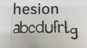
For the second task, we were given the word ‘hesion’ in a specific font and using that as a clue, we were to draw the letters ‘abcdufrtg’, figuring out how the letters look based on that font. In my sheet, I had the word in the font ‘Darden Studio Halyard’. I started off by drawing the x-height and the baseline on the paper. Then I measured the height of the letter ‘h’ to see how tall the stems of the letters should be. I had also measured the width of the stem of the letter, so as to draw the letters as accurately as possible. After all of this, I proceeded to draw the letters, using those measurements and also focusing on the shoulders and the variation of thicknesses of the letters.
Task 2
Thoughts on this project
Overall, this project helped me in understanding typefaces even better and the amount of time and thinking that goes behind creating new fonts, whether its a variation of one or a completely new one from scratch. I was also revealed to the reality of the fact that it is indeed not easy to draw letters in a certain typefaces quickly and it takes years of practice to master this skill.
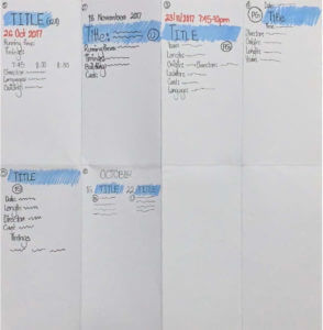
We were given a project to create a flyer for the Reading Film Theatre Autumn 2017 listings. We had to create two different designs based on the information given and our own research.
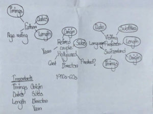
In the brief, we were asked to keep in mind the targeted audience when making the flyers and consider the layout and typography used and they were:
A father with two children under 10
A visiting professor working in Reading, but originally from Switzerland
A retired doctor and her husband, both of whom have a passion for old Hollywood
Firstly, I brainstormed the important details essential for each target audience and circled out the ones that was important amongst all of them. Then, I sketched out some potential layouts for the movie listings.
Brainstorming ideasSketches
After having some ideas of how I wanted my layout to be, I searched up the RFT logo and based on that, I chose the colour palette for my flyers. The main colours were red and grey. Then, I proceeded to edit the text information about the movies and its details and I noticed, obviously, that a lot of vital information, such as running times, country of origin, etc were missing.
Keeping the target audience in mind, therefore, for my first design, I went with a grey background with black and red text over it. I had used red for the movie titles, so that they stood out easily and I focused on making the movie running time, location of the theatre and languages available more visible, so as to make it easier for the target audiences to find these details easily, as I believe these are what the targeted audiences would look up for when searching up information of the movies. I kept my overall design simple and straightforward so that everything is accessible without much trouble.
Design 1
For my second design, I decided to categorise the movies in terms of the months they were being aired in the theatre. I used a gradient of red, grey and orange for the heading, sub headings and movie titles, to reflect the colours of the RFT logo. I did the layout of the dates of the movies from left to right and I grouped the age ratings and running times together as I believe they were the most important in terms of the hierarchy of information. For the rest of the information, I had laid out the times and the location first and then the other bits. I had also kept this whole design simple to make it quick and easy to find the information needed.
Design 2
Overall, I really enjoyed this project as I got to learn more in depth about InDesign and about layouts and hierarchies and I believe all the skills I have learned from this project will help me in my ‘Design for Reading’ book design project as well.
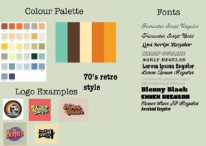
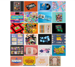
For our design class on 14/10/2021, we were joined by Sophia White who taught us about logotypes and the trends surrounding it. We were asked before hand to look at 10 of the themes she had given us and choose one that we liked. For me, I went with the 70s retro style and based on that, I did some prior research on the style and came up with these results:
Quick research
Sophia showed us some of the brands she had worked with and the process of creating for those brands, and we were taught a master class on creating mood boards, which was the first process in terms of creating something, as mood boards help with giving inspiration and visual ideas of what a theme is and so on.
mood board
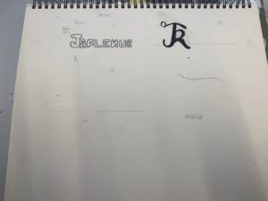
After creating mood boards, I went straight to sketching ideas for logos for branding myself as this was the task given to us, however, I soon decided that I wanted to go straight onto InDesign to create my designs, but nevertheless, I did sketch some ideas on my sketchbook.
Sketching ideas
First design
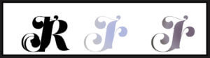
For my first design, I started out with using my initials and I used the font ‘Lust Script’, which I downloaded from Adobe fonts. I typed out my intials in different ways:
all uppercase
all lowercase
normal
Then I proceeded to kern the letters together until they merged together. After this, I used the gradient tool to give colour to the design. I used a random colour I liked instead of using the colour palette for the retro style, as I was just experimenting with the elements.
Second design
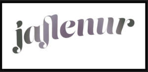
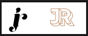
Here is another design I did, where I also used my initials, but using the font ‘rig solid’ in bold and used one of the colours from the retro style colour palette. Similar to my first design, I also kerned the letters here until the letters merged to each other side to side.
Third design
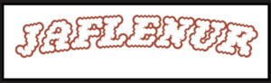
Onto my third design, I used the font ‘Narly’ in outline, and this time, I typed out my first name as I felt it would look much more nicer in this font. I really liked this design as I felt it expressed the retro style very effectively and was also simple in the same time. I had also tried it out using my initials as well and made two different versions using different colours from the colour palette.
second versions of the third design
I had also edited these designs and filled them in using the bucket tool on photoshop to test out how the design would look like when coloured in and I was satisfied with the results. I had used a colour wheel to find complementary colours to the outline of the words to fill the letters in.
For my fourth design, I took a different approach and tried to type out the letter in a curved shape. For this, I firstly used the ‘pen tool’ to draw out the line and using the move tool, shaped my line and then used the ‘type on a path tool’ to type out my first name on it. I had used the font ‘Lust Script’ for this. I was quite impressed with the results as this was something new I had tried out and for a first try, I believe I had done a good job in doing so.
Fourth design
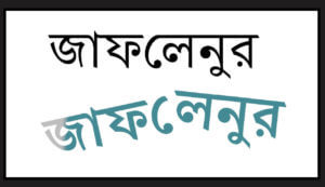
For my fifth and last design, I took a whole different turn by designing my brand in the Bengali language, as it is my second language, and is reflective of my cultural background and ethnicity. I was quite shocked to find an Adobe font for the Bengali letters, and immediately thought of making a design using the font. First, I had typed out my first name and then I used the same process I used in my fourth design to create the branding design. It is quite simple but I do like it as a first try in terms of designing logos.
Last design
Overall, this session was very enjoyable as I was able to learn about the different steps of designing logos for brands, as well as got to try out different apps in the Adobe softwares. Although I think most, if not none, of my designs don’t reflect the 70’s retro style, I think this was a good practice for me for future projects.
Link to the PDF file of all of the designs together:
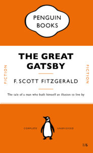
As a class, we all had to design a penguin classic book cover in Adobe InDesign and learn about the different elements that go into designing them. This was very useful as I’m a beginner in InDesign and don’t have any experience of even looking around the software. This project helped me in learning all the essential and important tools used in the software and as well as certain shortcuts we could use to make our work more fast and efficient. Overall, it was an enjoyable project that I could learn a lot from.
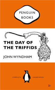
Based on learning the new skills from making the penguin classic book covers, we were told to create a new book cover of our own choice, and I went with another penguin classic book cover. Similar to the Great Gatsby cover, I had used a similar layout and had used the same font, Gill Sans, for all the words. However, in mine, I had also included an illustration that I had drawn separately in my iPad using the Ibis Paint X app and had saved and transferred the file as a png on my laptop. I had then laid out the png on the book cover and positioned it accurately on it. Overall, I found the whole process easy, except for making the cartouche which I struggled with a bit in terms of positioning and laying it out properly, but I believe I will eventually get the hang of it as I practice it more in the future.
Here are the links for a clear version of the two book design covers:
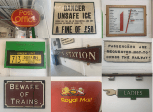
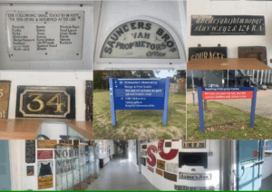
For Eric’s lesson on 04/10/2021, we were given the task to explore around and outside the department and take photos of any sign boards or letters that we are interested on. We had to do this based on the brief we were given which said to ‘search for lettering around the campus based on a theme of your choosing and take photos of it.’ Therefore, I based my theme on signs and lettering that are eye catching or somewhat interesting. Overall, the experience was interesting as it made me pay attention to the details in the said signs and the amount of details put in each of them so that it catches the eyes of passerbys. This was done so in these sign boards through using bold and bright colours such as red, yellow and green. The use of the different fonts based on the modernity or the vintage ness of the sign boards is also very clearly evident in these photos. Taking all the photos were fairly easy, as I walked around campus and visited the same route I take when walking to the typography departmen, however, in the middle of my walk, it started raining, resulting in some of the photos having a blurry effect on them.
Since none of my photos had an ongoing colour scheme or focused on one specific thing, I collaged some of my favourites and appropriate ones to show the photos I took while walking around the campus. While doing so, I realised most of my photos were taken in a straight frame, almost symmetrical, which I think also conveys how someone might look at these lettering from their viewpoint.
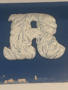
For this particular lettering, I zoomed in on one of the letters to highlight the details in the letters itself. I found it quite interesting how the letters were sticking out and not laying flat on the surface and the overall marble texture of the letters made the whole lettering look visually pleasing to look at.
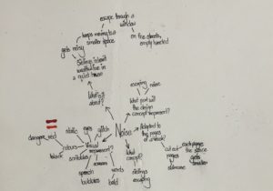
For Berta’s project, we were to chose a theme and based on it, we were asked to experiment on books, by manipulating the structure of the book, be it through disassembling the book part by part or changing the look of the whole book, in short, we were asked to just go crazy with it, as at the end of the day, this was a fun little experiment for us to learn about the different physical and material qualities of books. That being said, I chose the theme ‘noise’ as the brief about this theme really caught my interest and as I was reading the brief, I had already started to form some sort of ideas in my head about what I wanted to do with my book based on the theme. So, I started off by brainstorming my ideas and I made sure to answer the questions in the brief, which were:
What is this story about?
How can it be represented visually?
What concept would represent this story best?
How can it be adapted to the pages of a book?
What part of it will the design concept represent?
These questions helped me a lot to break down and arrange my ideas. Starting off with the first question, the story was about two siblings who had inherited their parents’ wealth and lived in a quiet house, until one day, they hear a noise and move to a small room. They continue to move into smaller spaces every time they hear a noise, until eventually, they escape through a window, and end up on the streets, empty-handed.
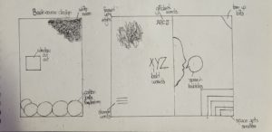
Brainstorming my ideas by linking them to the questionsSome of my first initial ideas regarding how I wanted to layout the book design
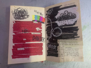
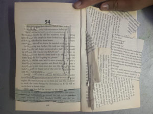
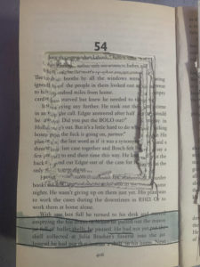
Based on that story, I wanted to design my book in a way that visualised the story in three different parts throughout the book. Therefore, in this first spread, which was at the beginning of the book, I used mainly the colours red and black; red to symbolise danger and black to symbolise the darkness the siblings were probably in as they were inside the rooms. For the left side of the spread, I had highlighted all the text using red marker, while leaving some words out that I thought related to the story, getting inspired by the works of Tom Phillips. I did the same on the other side of the spread, except on that page, I had covered up the whole text using black marker. I have also done some doodles and scribbles to visualise the concept of noise, through drawing the speech bubbles and sound effects, as well as drawing the glitch screen you would see in televisions when the signal went out, highlighting the isolation of the siblings inside the cramped rooms. Being interested in the art of stamping, I had also stamped out the word ‘help’ using letter stamps to show the desperation of the siblings to get rid of the noise. In the right corner of the spread, I had cut out shapes in a descending order, as if to show that as the siblings moved on to another room, the space kept getting smaller and smaller. Some minor details also include me fraying the edges and top of the pages by tearing them off or cutting through them using a craft knife and I have done this throughout the left side of the spread.
My first spread of the book
Close up details of the spread
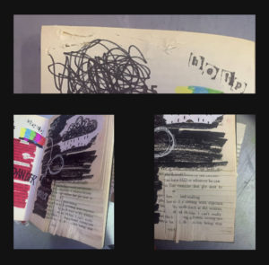
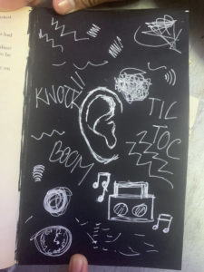
Moving on to my second design, after skipping a few pages of the book, roughly in the middle of the page, I covered one of the pages with black paper and drew an ear in the middle of the page using white pen. Around the ear, I doodled sound effects and symbols to show how the in the darkness, the siblings were on alert for any new noises.
Second page
For my last and final spread, on the last pages of the book, I craved out a huge square on the middle of one of the pages, and I continued to do so, however, due to not having enough time, I wasn’t able to dig through to make the square deep enough but overall, I was satisfied with the result. I did this so as to symbolise the window and then underneath it, I drew a road horizontally, to visualise siblings being able to escape. on the opposite side, I glued on the scraps of paper messily to show the after effects of the journey the siblings just had.
Last spread of the bookClose up of the window
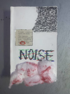
Lastly, for the book cover, I kept it simple by covering the original book cover with white paper. Then, I carved out a square through the page and the book cover, to represent the window, and from the corner of the book, I scribbled in a descending order, stopping when it reached the window. Inside the window, I circled the word ‘danger’ in red to show the danger of the situation. I wrote the title ‘noise’ in capitals, using red, blue and green markers to draw on top of the letters to kind of show that the letters are glitching. Finally, I ripped cotton balls and stuck them on at the bottom, and then coloured parts of them using red sharpie for texture. Overall, I kept the drawings messy and almost childish to represent the siblings, who I assumed, were children themselves.


 Onto my third design, I used the font ‘Narly’ in outline, and this time, I typed out my first name as I felt it would look much more nicer in this font. I really liked this design as I felt it expressed the retro style very effectively and was also simple in the same time. I had also tried it out using my initials as well and made two different versions using different colours from the colour palette.