
Initial Thoughts On How I Would Attempt The Project
In this task, I was required to create a two page spread for a magazine, promoting the top 10 books for that month (all found on the BBC website). I took inspiration from Swiss design and its use of grid systems to structure my layout. Before I started my design, I opened up an A4 document with facing pages and a bleed of 3mm, as the entire designs purpose is to be printed. I chose to have margins with a 12mm, except for the bottom, which measured 24mm to make allowance for the page number. I chose to have 3 margins on each page, as I knew the information would need to be divided into small sections, therefore it would give me more opportunity to organise the text effectively.
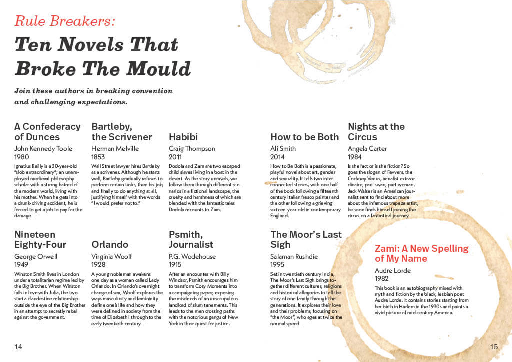
My Final Design
To start with, I needed to create a clear structure through ordering and the hierarchy of text. I have also used different typefaces to separate the heading from the main content, as well as the book title, author/year, and description. This is further helped by the weight and colour of different text, the titles are in bold and I have used red to highlight features such as a really interesting sounding book. I went for a modern layout, with the content leaning more towards the left of the spread. A coffee stain, which I added due to its association with a corner table as they tend to hold books, is also used to highlight one of the summaries for extra emphasis.
Some Other Alternative Layouts
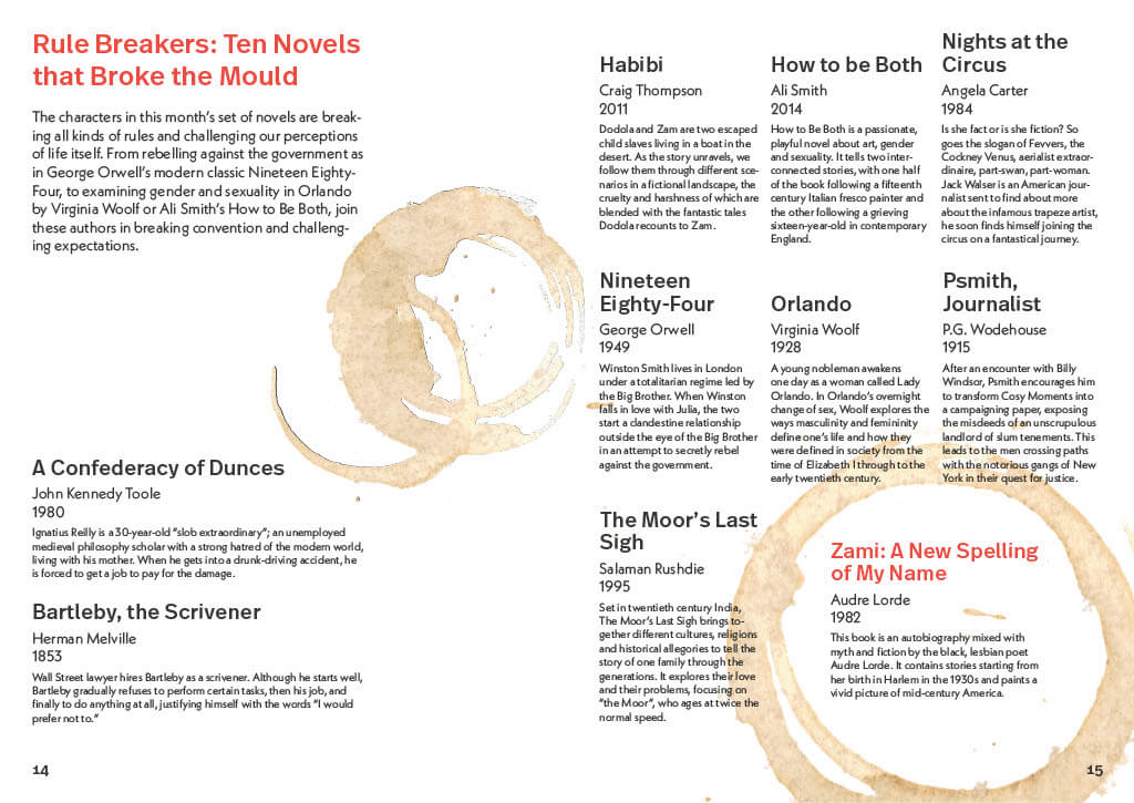
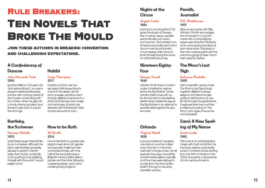
I followed the same grid-style layout for my other designs, as I wanted to see how different I could make each design look while following the same set of “rules”.
Resources That Helped Me Develop My Work
https://helpx.adobe.com/uk/indesign/how-to/margins-and-columns.html
https://www.bbc.co.uk/programmes/articles/nkgnD94Js15YK8pdpJjxFK/rule-breakers-ten-novels-that-broke-the-mould