The Ethos of the Conservation Project
The department was approached by Maggie Shelton, the Community Catchment Officer of the new heritage lottery funded project named Watercress & Winterbournes. The Test and Itchen rivers from the chalk of the Hamshire downs form a unique landscape, the environments that are home to Winterbournes and chalk streams. The client defined these as rivers which rise form the chalk lands and flow within the landscape of rural fields. These rare habitats are home to a wide diversity of wildlife and plants,however these landscapes are at risk from pollution, drought and flooding. The pressures of modern change and development threaten these habitats and therefore the Watercress & Winterbournes Conservation Project is beginning to establish. The ethos of the organisation is to restore the built heritage and addresses these environmental issues by bridging communities together for the environments to thrive, preparing them for future generations. The purpose is to fund projects for members of the community to take part in which will maintain the health of the terrain. The client wanted to brand the project, briefing the design of 3 logos per student as a 2 part project. These designs would then be presented to their board to choose from. This Real Job is a fantastic opportunity to design for a project promoting environmental awareness, such a pressing ecological issue we have provided with chance to visualise. It was really important for me to consider that the standard of design, in addition to the values it promotes will grant the conservation project further attention and advertising. The more the design was considered correctly, visualised to promote the ethos of the conservation project, the awareness of this environmental aid will be further established and convincing to its viewer.
The Clients Specifications
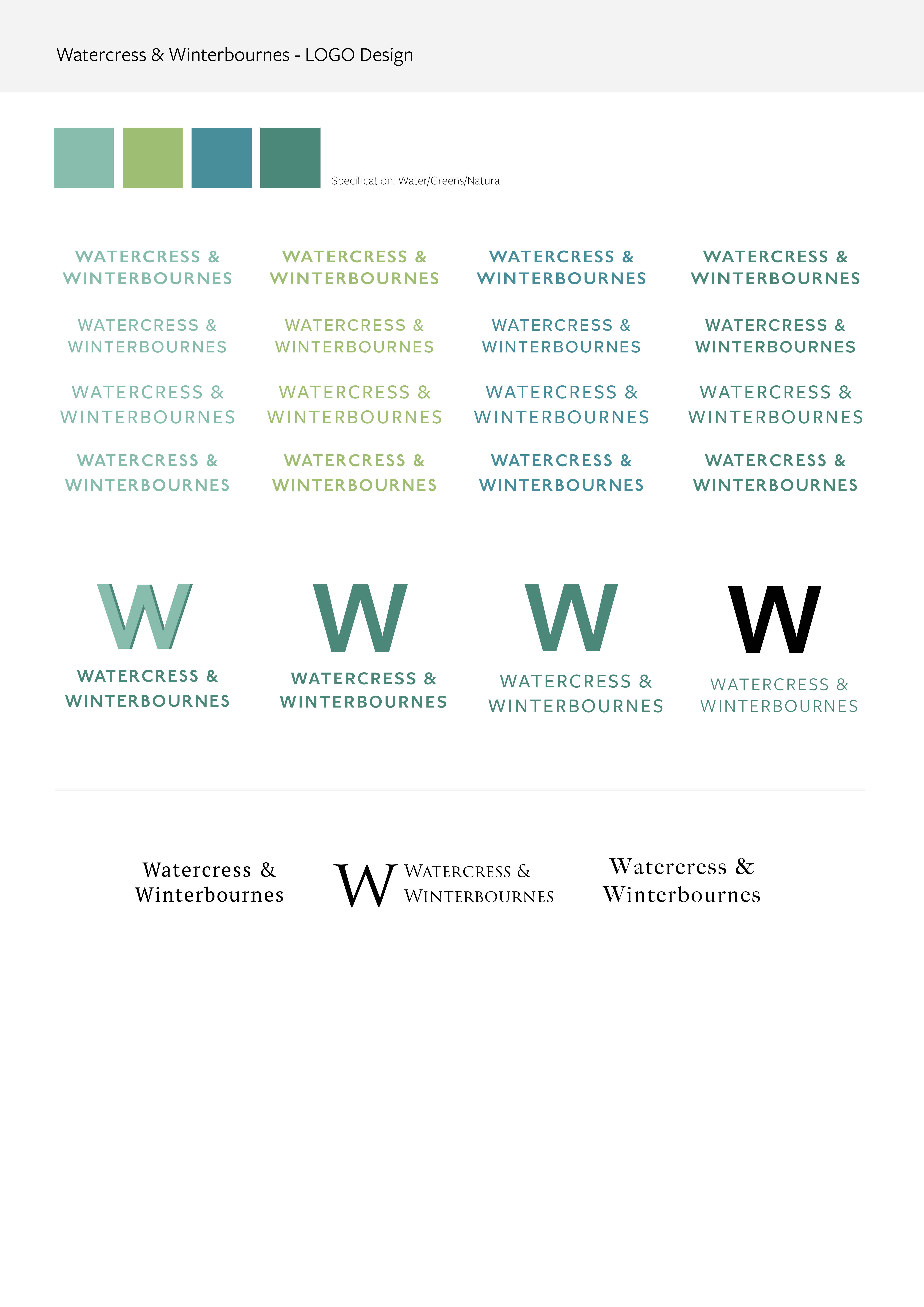
The meeting with the client allowed her to explain the values of the project in which she wanted the logo to encompass, as previously understood these are extremely important in logo design/branding as they formulate the correct message directly. Prior to beginning initial ideas, I ensured I defined with Maggie Shelton the complex subject of the study and directly what she wanted to reflect in the design that would be communicated to the potential audience members. She informed me about the conservation, defining the environmental terms in detail and according to my questions, which I ensured had to be grasped before creating an accurate logo concept. From my discussion, I ensured I asked what she expected from the logo and if there were any visualisations she specified. Shelton identified that the logos weren’t to be literal indications of the conservation name, as the project is defined by addressing a variety of issued based on the heritage and the landscape of the habitats. Shelton specifically identified the logos were to capture elements of water movement, as the streams and rivers are the main components of the conservation. She additionally specified that elements of the landscape such as plant species associated with the streams would also be a design expectation. These designs were to work in black and white, with additional detail in colour. Shelton identified the design was to identify with a character of style and this was worth introducing into the development in researching illustrative methods. Each logo is to be comfortably legible at a large and small scale for inclusion in reading documents, presentations signs and banners.
Visual Concepts & Initial Ideas
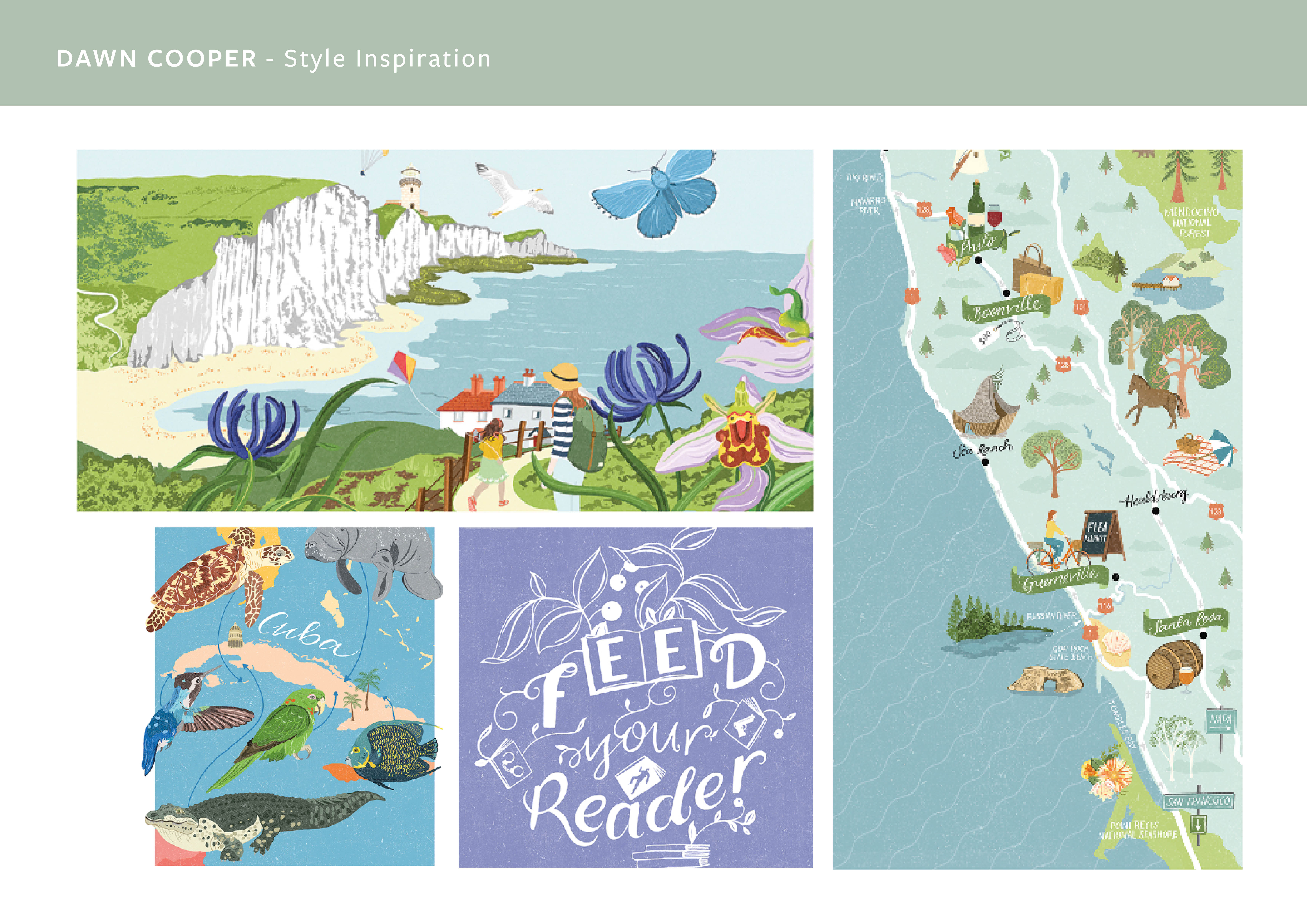
As I begin every project, I created inspiration boards soon after the client meeting to have a fresh idea of what they specified. I ensured I understood the conservation project and the subject matter, followed with corresponding visuals and concepts. I began with sketches of several designs which porgressed to more refined developments, working on the alliterated ‘W’ which I identified as a characteristic unique to the conservation when compared to other associates/partners of heritage funded projects, such as Portsmouth Water and Salmon and Trout Conservation UK, the project would, therefore, be distinctly identified amongst the collection. Focusing on Shelton,s specification for the logo to capture an illustrative character, I researched illustrators and illustrative styles which practiced these characteristics, associated with visualising natural landscapes. Dawn Cooper inspired my approach, an illustrator whom I was familiar with from my Dissertation study with illustrators from Puffin Book cover designs. Coopers work is characterised by the use of texture to give the impression of rural and organic tactility almost, which I felt immediately is relevant when designing for nature conservations.
Design Development
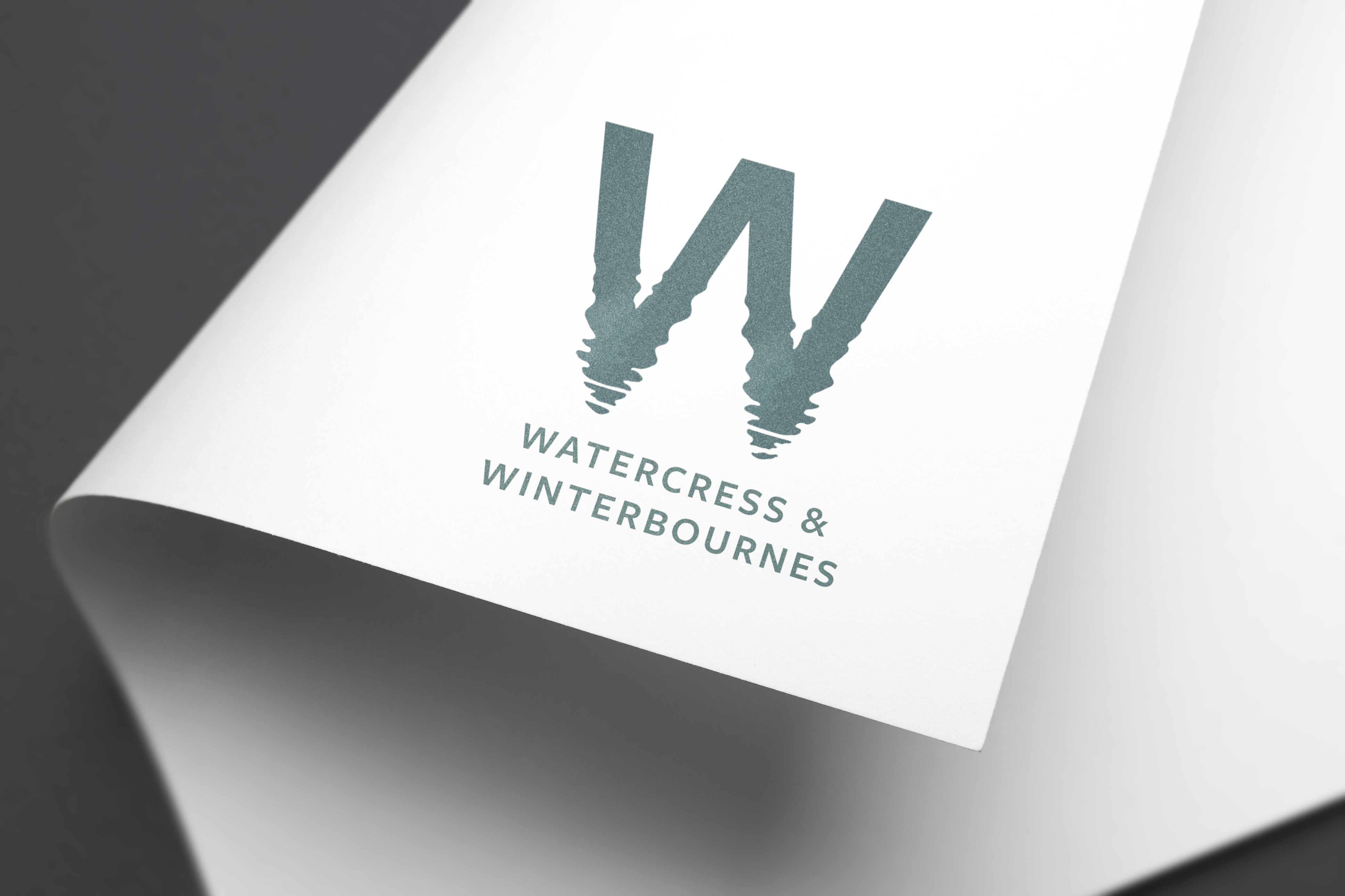
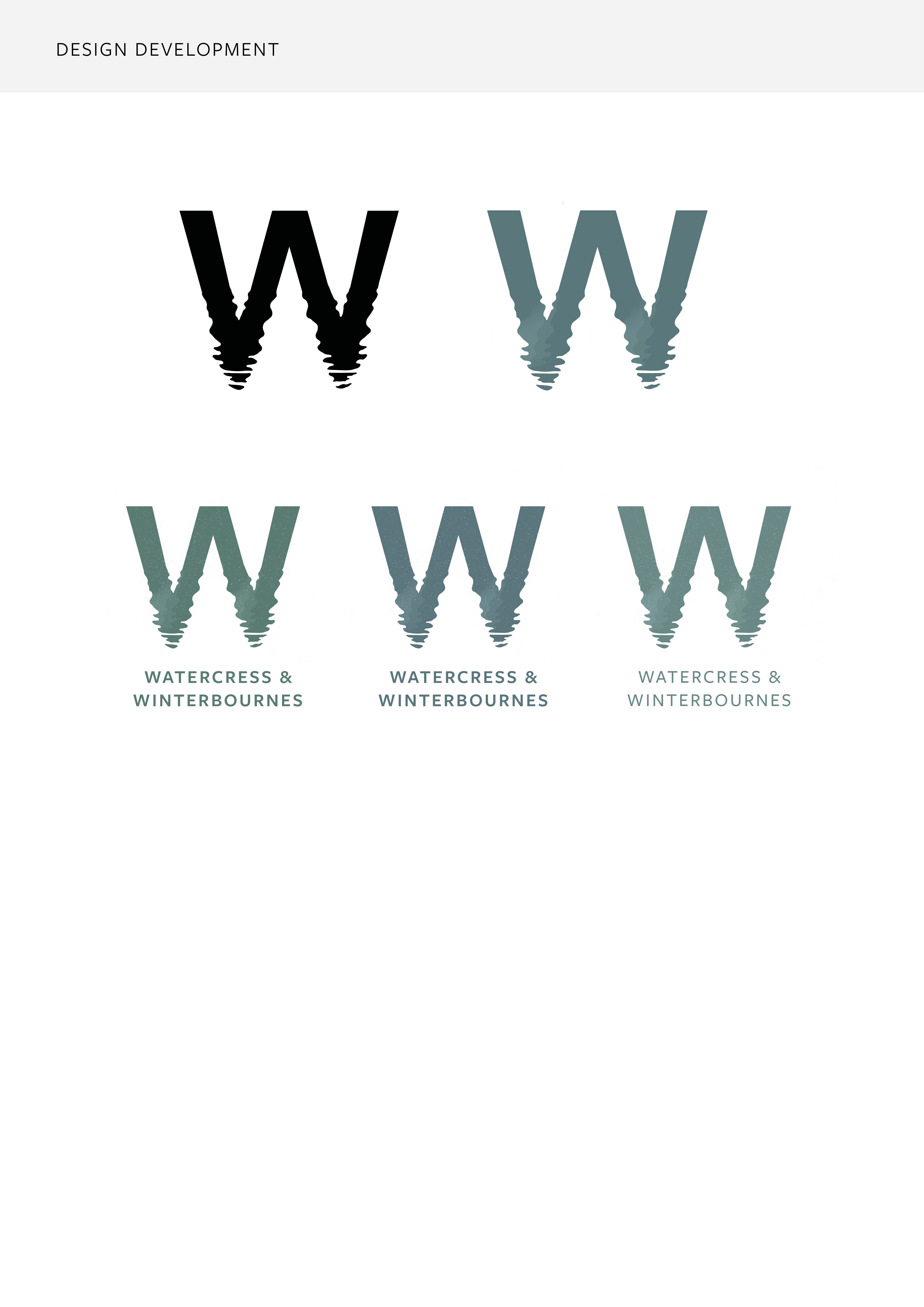
I began working on the typographic elements, which established my modern and clean approach to the logo, which could have been done to appear as traditional with the use of a serifed typeface. I chose to work with Freight Sans using the ‘W’ to edit combining my scanned illustrations with further editing to a more established and professional logo. Developed from my drawing, I digitally manipulated the ‘W’ to have water ripples as if to be sitting half in water. The water is not visualised with wave movements but replicates the slow flowing movements of streams, this attention to detail was informed by my study of the subject matter which, as I stressed from the beginning, was important to get right as an inaccurate idea may be communicated. I then added colour which was chosen to the clients specifications of blues and greens to relate its subject of nature, therefore artificial/unnatural colours were to be avoided. I then added reflection to the ‘W’ which would be the additional detail Shelton had specified for the colour edition. Inspired by Dawn Cooper to move away from a still and static corporate logo characterised by flat colour, I added texture and which from user testing people associated with organic nature, which was the appropriate reaction intended.
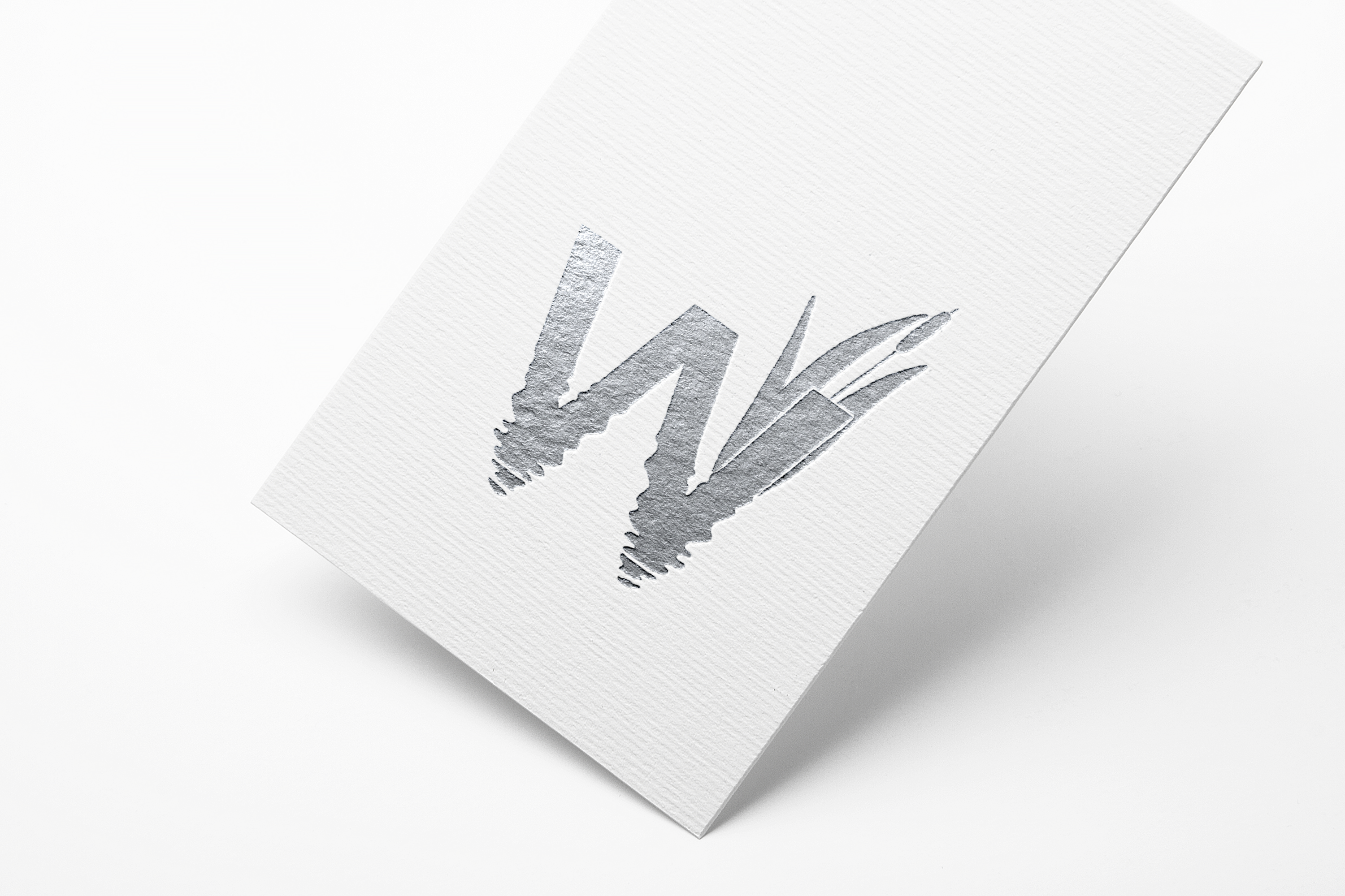
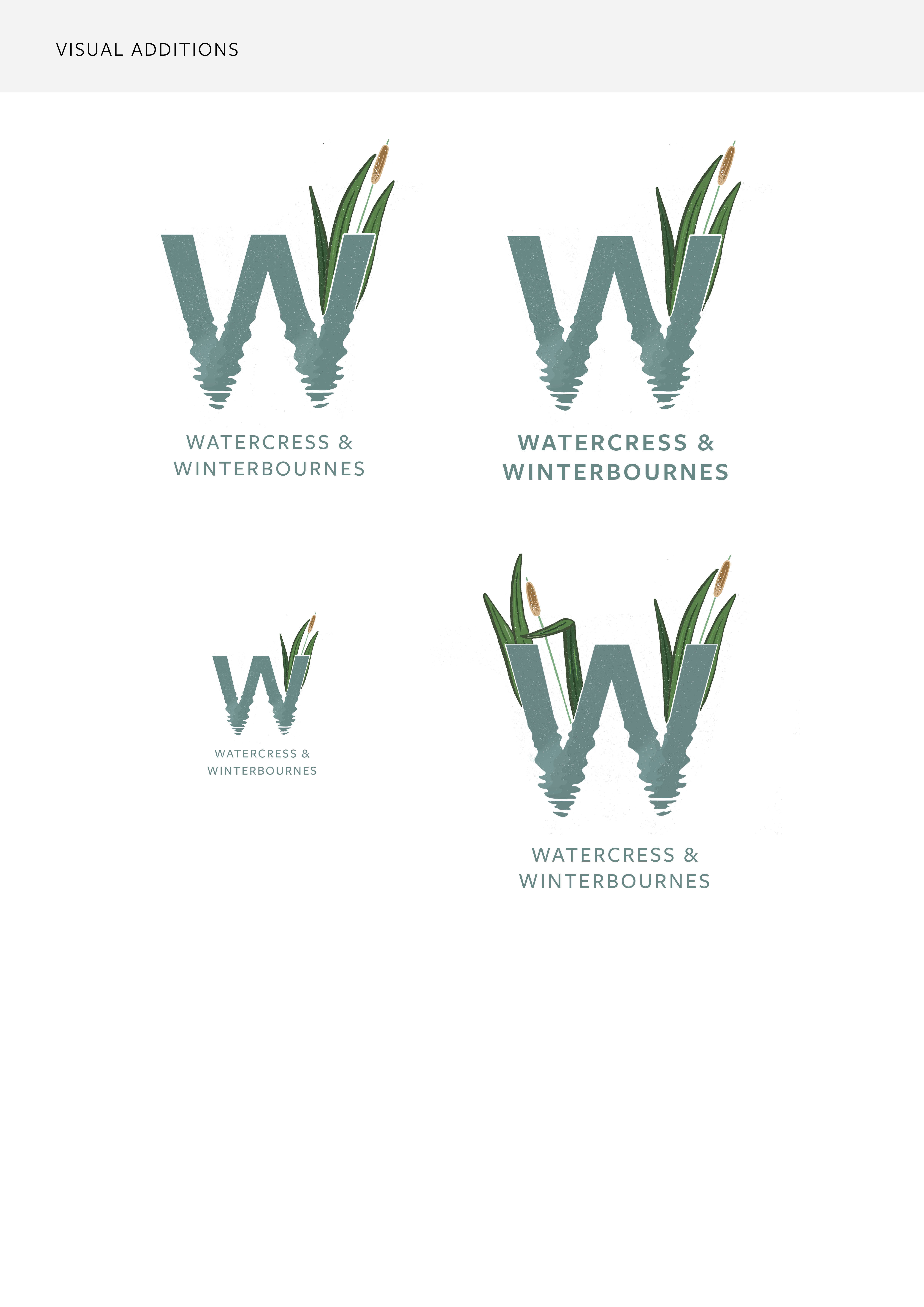
Following the client’s additional specifications for the logo to encompass iconography relating to the landscape, I added illustrations of Cat Tail Reeds which I researched grow in the chalk streams of the Hampshire downs which identity as a characteristic associated with their landscape. With additional user testing at this stage, individuals were asked what they associate the illustrations within which the response specified ‘reeds that grow in streams or rivers’ which again was the exact result intended. I then added my illustrations to a single arm of the ‘W’ and then to both sides for variation, these were then sent to the client for feedback. The problem arose when composing the geometric ‘W’ with the illustrative reeds, they were separated by the use of a stroke, this was decided as when converted to black and white the shape became undefined be the grouping of both visuals.
Conclusive Proposal
My designs will continue to develop with 2 additional logo concepts for submission to the client in the following weeks. My current variations of logo work with and without the addition of the reeds and will depend upon what the client admires, however both editions can be sent to her. In my opinon the ‘W’ logo alone works and received positive feedback from viewers more so than the edition with reeds, however I feel it implies a corporate message rather than the ideals of a nature trust which is expressed through the organic design of the progressed logos with the reed illustrations. They additional conform to Shelton’s requirements of illustrative character and iconographic elements of the landscape. I plan to improve the current logo varying contrasts of colour to avoid the use of an unnecessary stroke which prevents the unification of elements crucial for logo design. My approach with logo design is to explore every concept I have in mind to the full, exhausting every option to achieve the best result. As the client required three different logos for me to design in order for them to propose, I am currently in the process of designing a ‘W’ made out of reeds, hands holding a stream sitting alongside the text and also experimenting with the use of a reflection – every logo includes and considers the clients specifications of water flow and landscape, meeting the brief in addition to Shelton’s vision.