
Background
This catalogue celebrates the life and work of Professor Anthony Betts, who was a Fine Art professor at Reading University during 1933 to 1963, including work from his peers and students. This will be sold during the exhibition of his work and life in the Reading University.
Brief/restated brief
The brief was to design a 128 page catalogue, showing a range of images, content and types of text. This would be perfect bound. Initially the deadline for this brief was the summer of 2020, however this was delayed due to COVID-19. I was initially expected to design and typeset all the internal pages, with the back cover later added.
COVID-19
COVID-19 directly impacted the delivery of this deliverable, as a week before sign-off, COVID-19 restrictions had just been introduced. This forced the deadline to be delayed to a year after, as this catalogue was to compliment the exhibition. As there was uncertainty as to whether the exhibition would go ahead, there were concerns over whether my catalogue may be cancelled. This was not the case as the exhibition instead was online. This additional time provided me more time to refine the catalogue to surpass the client’s expectations.
Research
It was important to research the audience of this catalogue, and who may be most interested in attending the exhibition. This therefore led me to older readers, who may have either studied under Betts, or just have a general admiration for Fine Art. As a result, this helped me understand that a more subtle design, which focussed on images would be preferable.
To gain a good understanding of the type of design they expect, as well as any inspiration, I looked at a range of catalogues. Many of these focussed on Fine Art. While I had previously understood that the aesthetic was to be traditional, focusing on the images, by doing this, it helped me understand how to approach the content, as well as treatment of typography. This was fundamental in helping me understand the catalogue’s visual identity.
The design process to final outcome
I decided to use a square format, which was a similar size to the catalogues in my research. This was important as I wanted to ensure the reader would easily recognise it as a catalogue and easily use this. I favoured this format, as it provided me with a variety of options when treating images, grids and text.
The margin and grid were designed so to increase the sense on space in the catalogue. Therefore, the gutters were wider, and the page margins were generous. This made the spreads more approachable and attractive for the reader.
I did however want to incorporate some elements of the exhibition, tying this further to the catalogue. I therefore decided to use the blue-green colour for my titles, which my client was planning to use for the exhibition. This added colour to the page and emphasised hierarchy of information.
For the typography, I used Kepler Std typeface. This was used as it has a soft appearance while having character allowing the text-based spreads to remain visually interesting. This reflected the imagery well, and was light, providing additional space within the paragraphs. The typography throughout was subtle, incorporating features, such as en-dashes, ellipsis, thin spaces and multiplication sign.
The typographic detailing was constantly changing, particularly for line endings changing. This was due to changing decisions about image treatment or alterations in space, such as between different headings. Furthermore, as I started to print more spreads, testing type sizes, this naturally changed, as previously the text was too large.
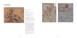
The most challenging treatment of text was for the Catalogue section, due to the extensive differentiation in types of information were required through each section of text. Italic and bold text, hair spaces, numbering and more vertical spacing made this challenging, as each section had to be consistent with each other as well as clearly defined. It was also important to group up the captions, usually to the left page, so the images could be sized and positioned to maximum impact.
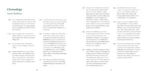
The treatment of text differed depending on the types of content. This is evident with the Chronology and Catalogue section, as the differing content forced me to adjust my approaches to these pages. This led to adjusting the typography, such as introducing spaces between the Chronology sections or reducing the type size of the image descriptions. This was necessary for the Catalogue section, as not all the text would fit on a page if sized to the other content. This resulted in a more interesting catalogue, as information was varied, with not all sections looking the same and therefore being repetitive.
Reflection
This project was challenging to me due to the large number of images and general content that required in this catalogue. This was particularly with dealing with different captions and image information, each requiring different treatments. This was often emphasised as these elements had to be consistent, clear and fit into their space on the spread.
Towards the later stages, it was also challenging adjusting or introducing typographic detailing, such as hair spaces between numbers and their measurements or adjusting line endings. This was mainly due to the size of the document, as with that number of pages, it becomes very challenging to design with perfect typography.
Despite this, this helped me appreciate designing different types of documents, and how you may often need support in terms of noticing any potential issues or to help introduce finesse.
While a challenging project, this is something I am very proud of, as I not only pushed my typography to be more refined, but I have also produced a significant project. This is something I did not expect I could do.