
Background
Georgina has been working has been working in the beauty industry for over 18 years, and gained a plethora of experience as a practicing nail technician. Georgina had been looking to share her expertise with her new business venture and brand – Georgina Rivers Academy. This brand was an extension already existing ‘Georgina Rivers Studio’, where Georgina had been offering her nails services to clients. Georgina Rivers Academy offered courses for nails, and aesthetics.
To visit the site discussed in this blog post, please visit:
https://georginariversacademy.uk/
Restated Brief
We aimed to design a visual identity that could apply itself across digital and printed mediums consistently (careful consideration to colour spaces, and scalability for the brand). One of the primary aims of the brands visual identity was to communicate its values: professional, finesse, bespoke, experienced, friendly. The approach to the new brand had to consider Georgina’s desire to keep this visually recognisable and related to the salons branding, one of the key challenges when rebranding or creating sub brands. Georgina was very open to considering using some of the design in this new brand to recreate the salon brand.
Deliverables
All parties agreed that once the brands visual identity was designed, it would need to be applied to a range to the digital and printed deliverables.
As project manager, I understood the size of this project and divided up roles and deliverables according to different strengths, if agreed between all of the design team. Wit regards to this, the team also onboarded another team member later.
Primary
-
- Digital visual identity guidelines (including salon & GeorgiaBella logo) (All – Alex oversee)
- Responsive website for academy (Alex)
- Social media strategy & rework (Instagram) (Salma)
- Social media animation advertisement (Alex & Minh)
- Mail Chimp email advertisement template (Minh)
Secondary
-
- Fliers template (mock up additional) (Minh)
- Business cards (mock up additional) (Megan)
- Certificates (mock up additional) (Megan)
Research & Ideation
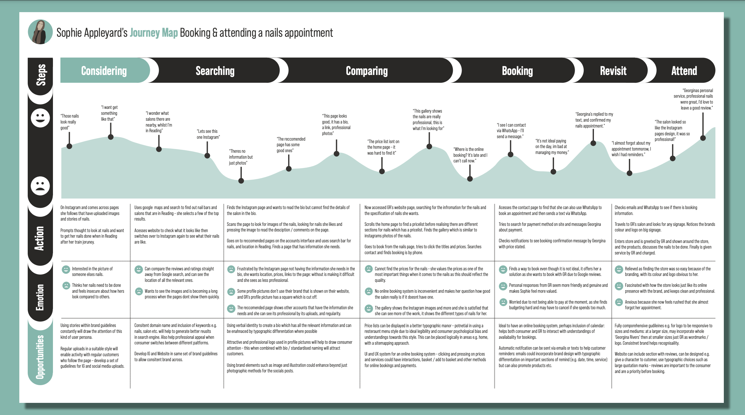
The initial approach started by understanding the brand through introspection. We wanted to create a clear understanding of what the consumers of Georgina Rivers need, and how they would engage with the brand, through a user journey. Although this is a branding project, understanding the salon consumers, and the new target audience, would help to create a brand visual identity which could draw on the values, and / or needs of the consumer. Some of the key ideas we manage to dissect helped develop the brands values, such as the ‘bespoke’ or ‘finesse’ values. Additionally, understanding the user journey helps analyse the purpose of the different deliverable. In retrospect, some ideas were not clear, but now looking at how the business cards relay the consumer to the website proposes that only some information needed, and thus places opportunities and constraints for the design (e.g. only including socials, or website adress).
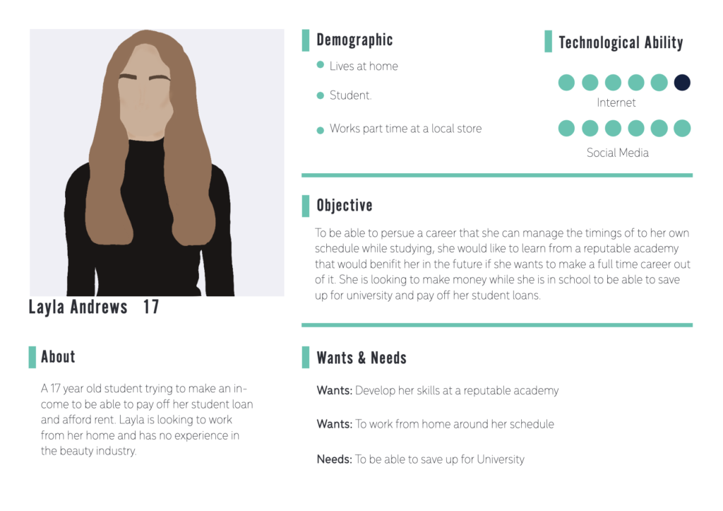
Persona for the Academy
Other methods for researching involved some analysis of competitors visual identities. This looked at logo, typography and colour, and was key to the-designing some initial ideas. In reflection, this stage should have looked at how different competitors had different imagery – as this later had become apparent how important this was for some of the brand elements.
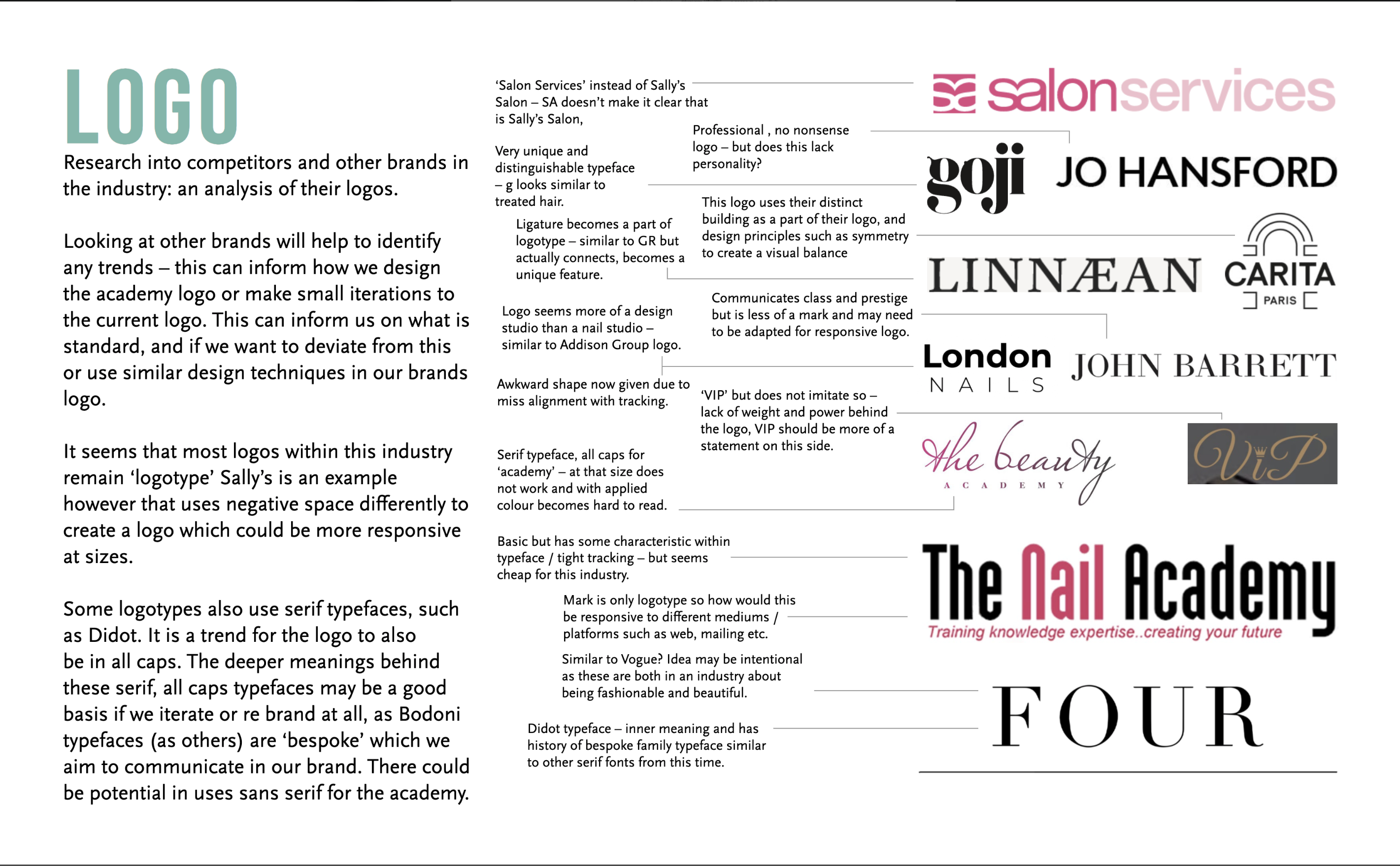
Competitor Analysis Moodboard – Logo
From undertaking this research, I approached developing a variety of initial colour pallets, and logo sketches to ultimately form the whole. Other team member, Megan, later on looked at some variations of typographic choices. At this stage, I thought that through using a specific illustration style, we could achieve the ‘finesse’ through the flair of the style. Really understanding the different team members skills was useful here – I assigned Salma, who was the most capable illustrator on the team.
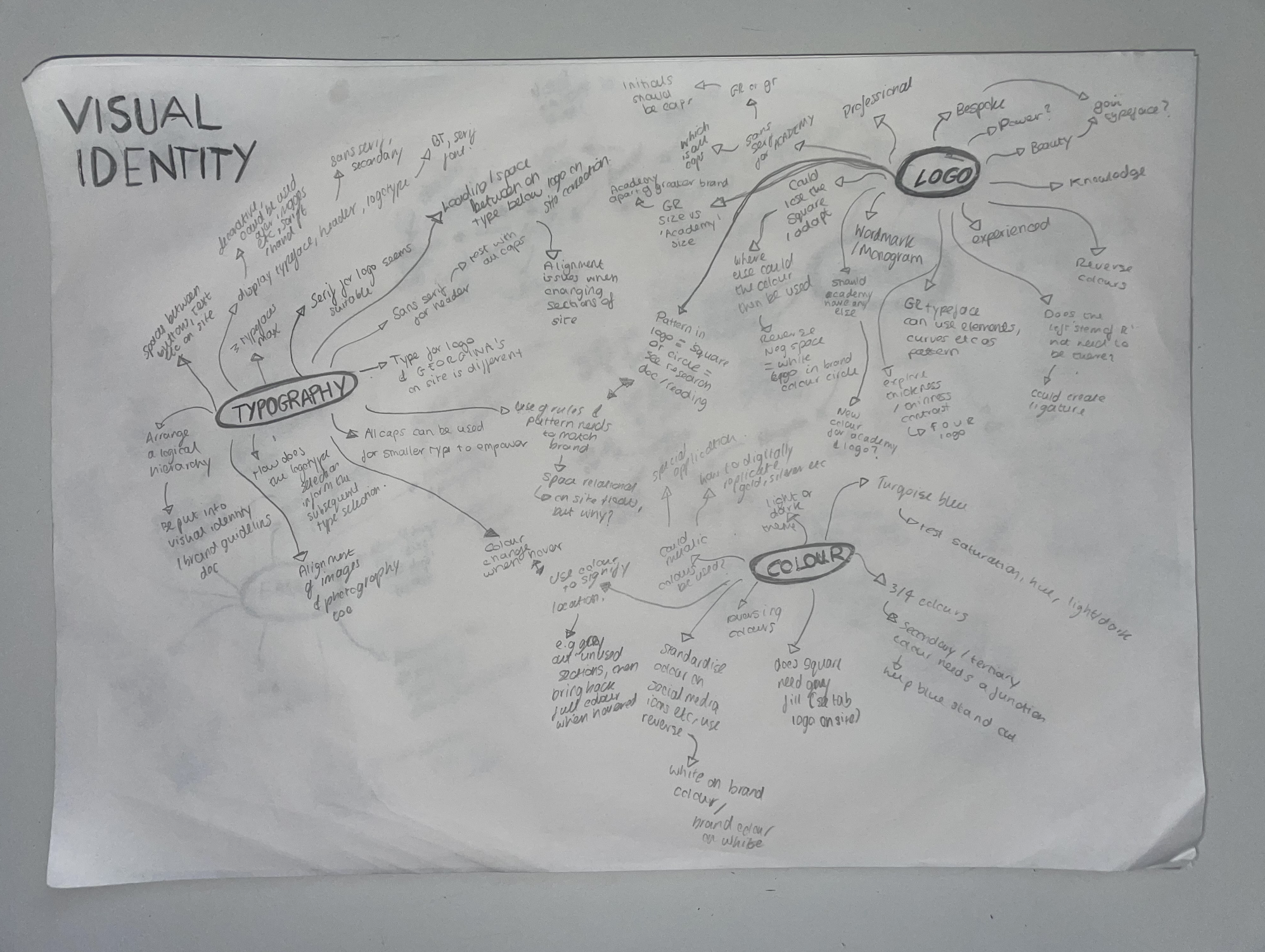
Mindmap for visual identity design
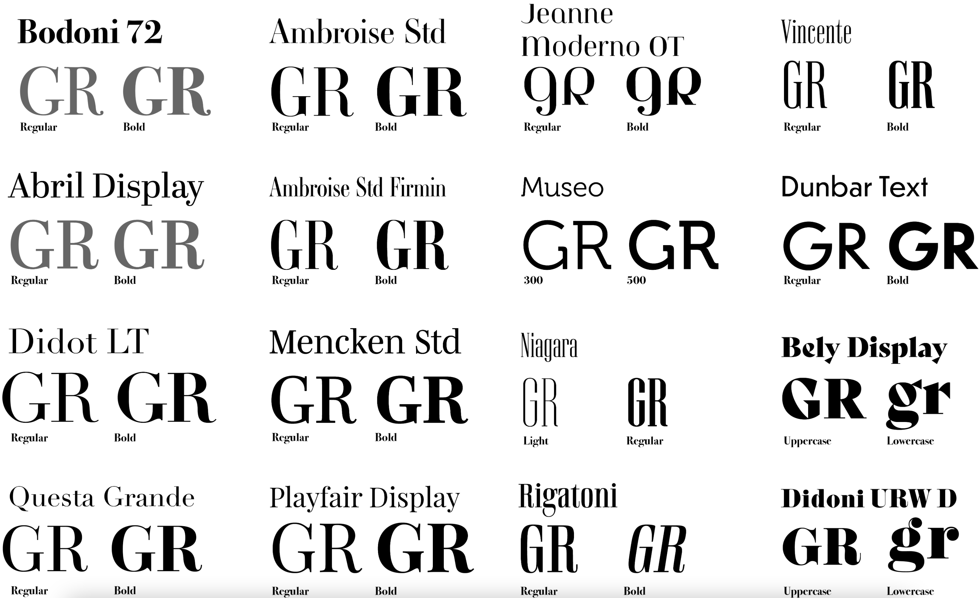
Typeface selections
Typeface selection was very crucial to this stage, hence the large sample of different typefaces that was looked at. The client was keen to keep the monogram GR, therefore, I wanted to look at developing the finesse of this typeface through using different typefaces – building on the competitor analysis and how the thin serif fonts had this connotation to fashion or beauty.
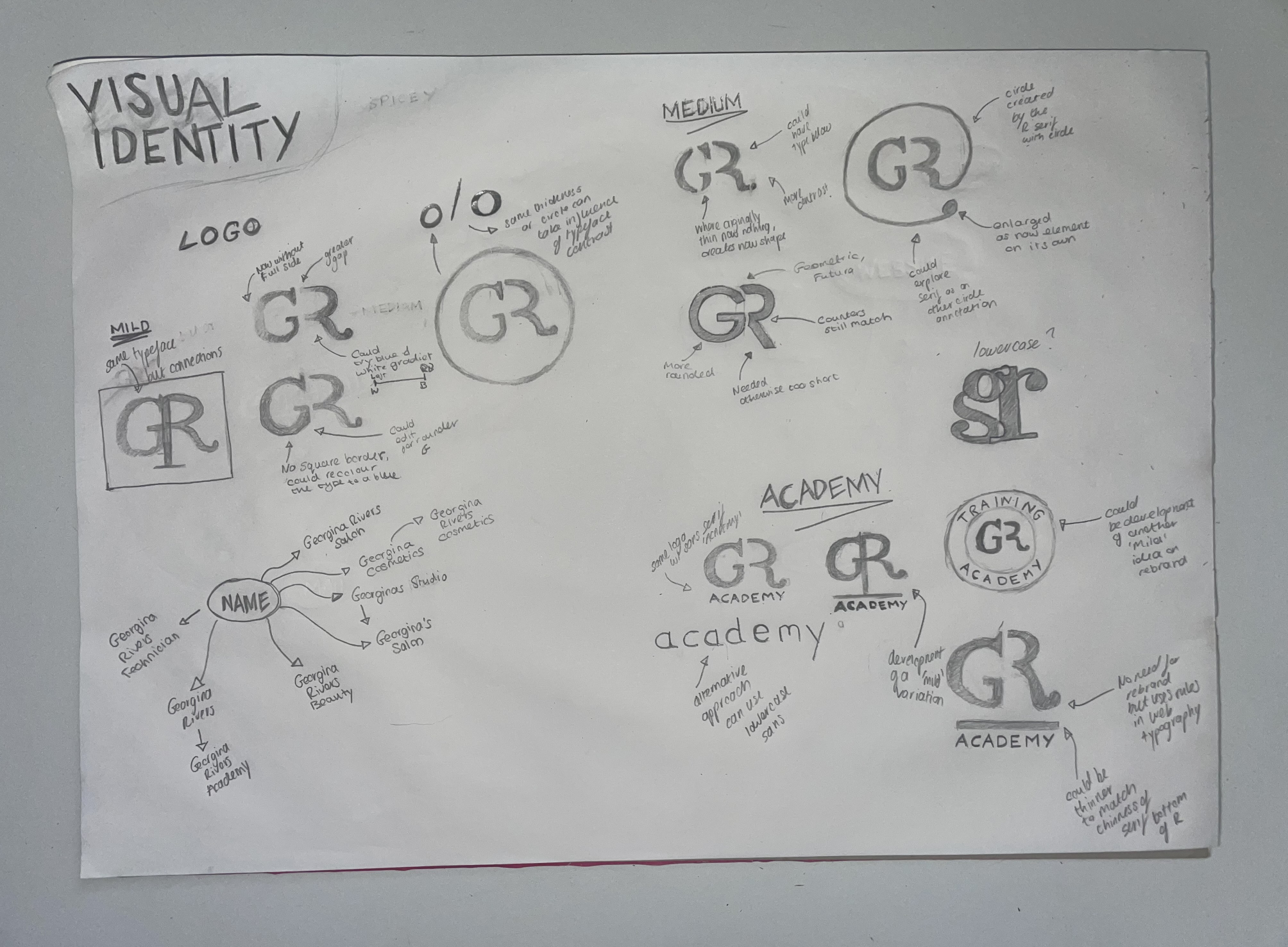
Initial logo (monogram) ieas
Initial logo (monogram) ieas
Design development
Visual Identity
Over the duration of the project, the visual identity undertook multiple changes. Originally, the design team had not thought to apply a ‘photographic style’, but with the development of the website, we needed a consistent photographic style that aligned with the rest of the brands visual identity. As the client did not any professional photographs of products, clients and the service, we supplied a summary and example of the way photographs should be taken. This was just one of the many ways in which the brand identity developed over the course of a long project.
The ultimate goal was to supply the client with a comprehensive brand guidelines document. I also approached this by summarising our feedback with the client, including an introduction, proposition and values. This had implications on the following elements of the visual identity.
Logo
I approached designing the lough through refining the clients older version seen on the salon. As I understood, the client desired to keep the monogram as a key logo of the new brand. I faced the challenge of now creating additional logo variants for the brand, as the brand required a larger logotype for signage, and could be used on other deliverables. This was also a key part of the strategic approach I took to creating a responsive logo for the website, where the logotype could scale to the monogram, and they would look apart of the same visual set.
I also explored the way in which this had variants between the academy and salon. In retrospect, I would criticise that there is too much similarity, however, the brand guidelines could serve to guide the parent brand, and if the client desires, then other areas of the visual identity could be more visually distinct.
Initial research drove the decisions in the development of the logo. The client took a liking to the ‘Bodoni 72’ typeface. This was ironic that the client chose this. As I explained to the client, that the history of this typeface has direct connotation to the ‘bespoke’ nature of the product, with Giambattista Bodoni (the typeface designer), designed such typefaces for royalty in the 18th century. Today, brands that want to appear upmarket often use this typeface, for example, Vogue, Dior and Valentino, as explained by CBA Designs.
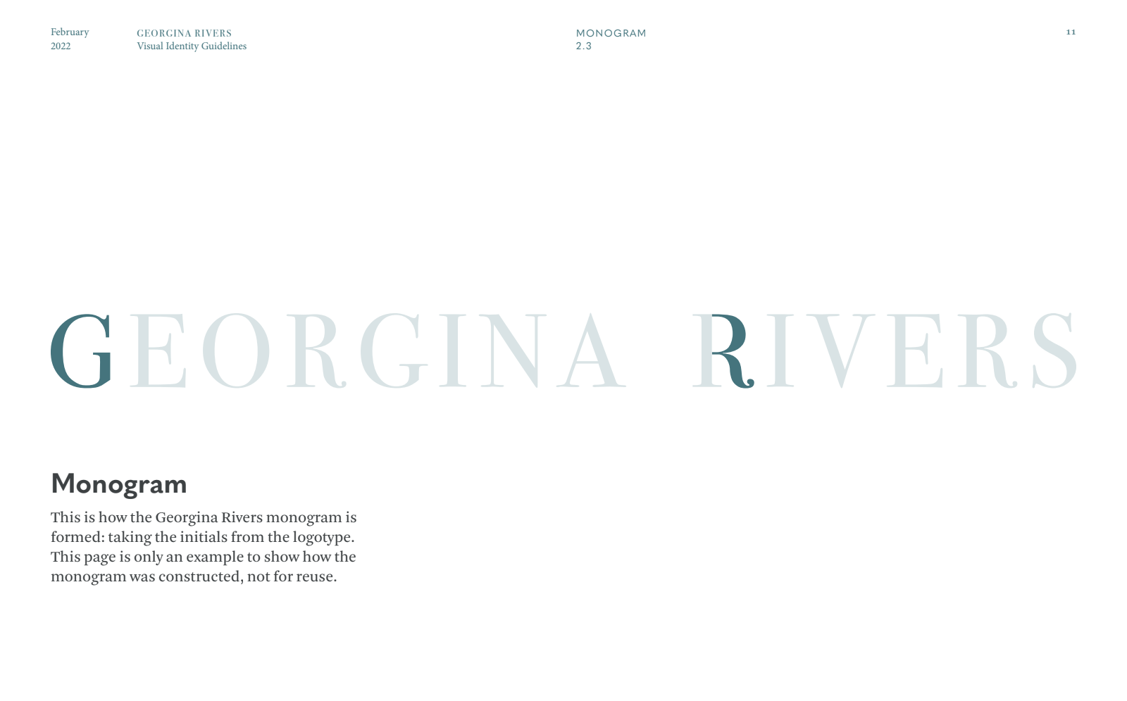
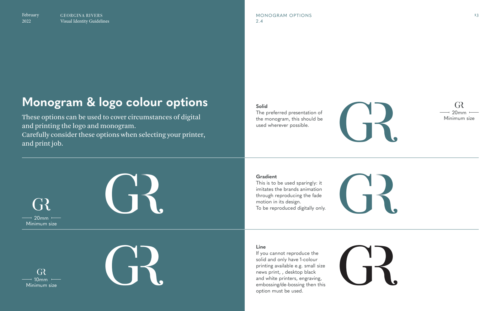
Georgina Rivers Logotype & Monogram Construction
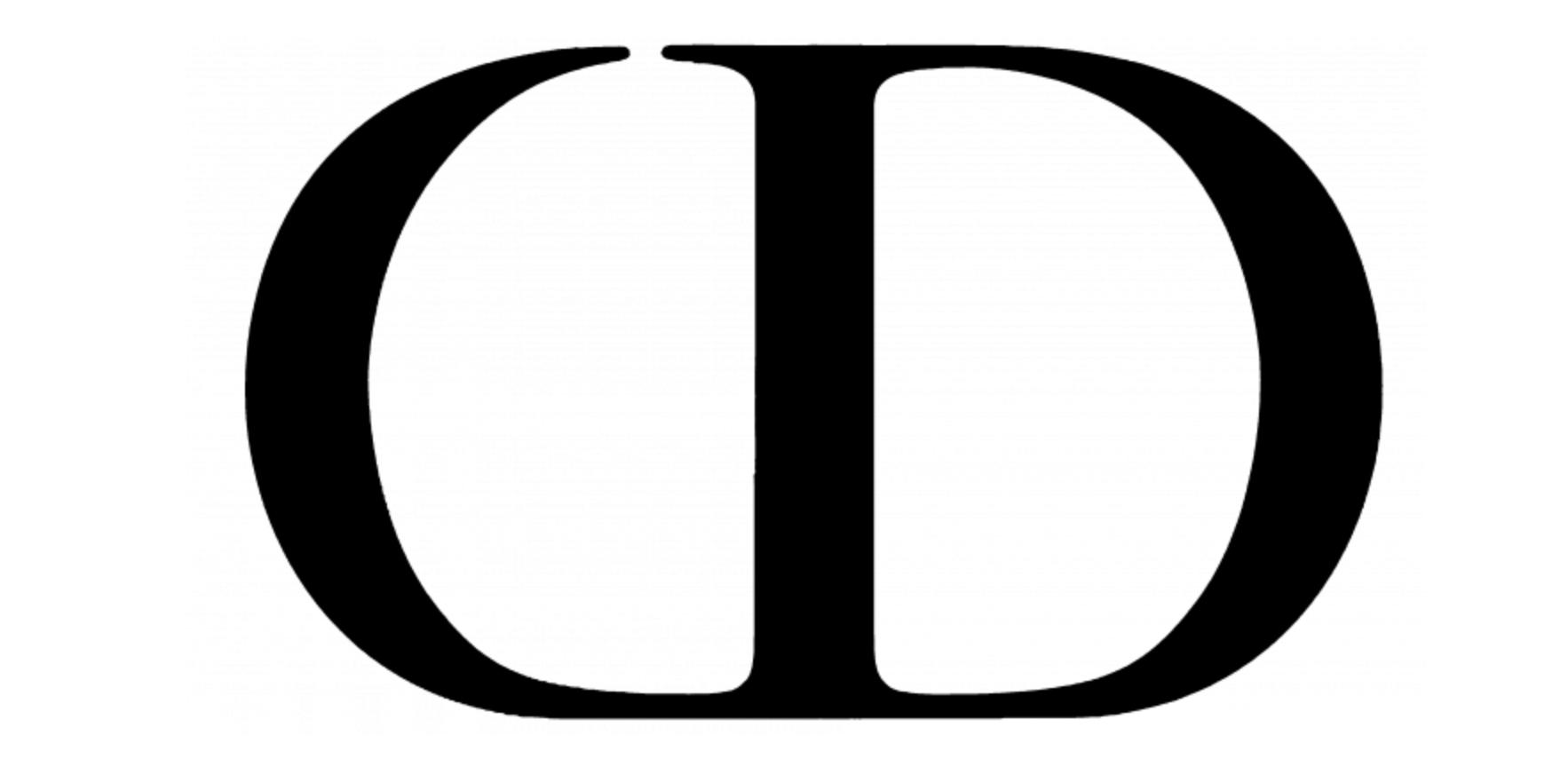
Christian Dior monogram: Similarities between the creation of a monogram using initials,
Colour
Similar to the logo, the client wanted to look at using something similar to her current colour pallets. As a way of presenting how far we could change the colour variations, I presented the client with a series of ‘mild, medium or spicy’ options, which varied on how much they broke away from the current colour pallet. This was a very useful way to gauge how much Georgina wanted to change parts of the design during this stage.
We agreed that the current-colours were too vibrant, and that the brand needed something more subtle. The client was happy to use a green / teal colour which was not too vibrant, but more subtle and had a measured mood. As seen in a-lot of luxury, high end brands, it was important to show how this would function at a monotone level, as this could then work with print finishes such as foiling, and keep a measured mood. It was also a challenge to create a variation of the colour for the salon part of the brand – to do this, I created a tint variation.
In reflection, I believe the brand should have kept a monochrome / black and white application of its logo, and the colour palette be used in special occasions. This is seen with many different luxury brands and keeps this reserved tone, maintains optimal legibility and paves way for using print finishes.
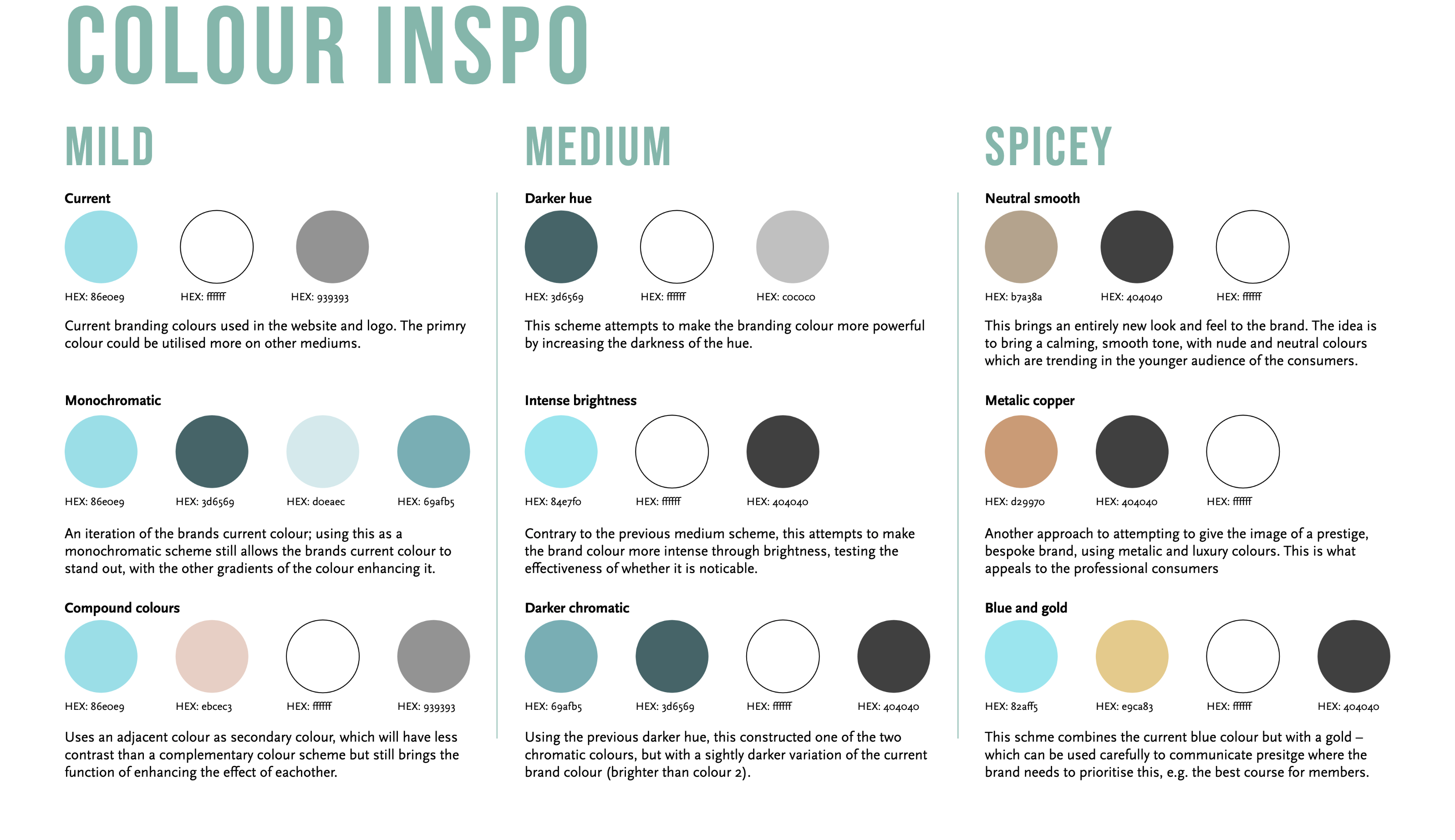
Colour palette development: mild, medium and spicy variations
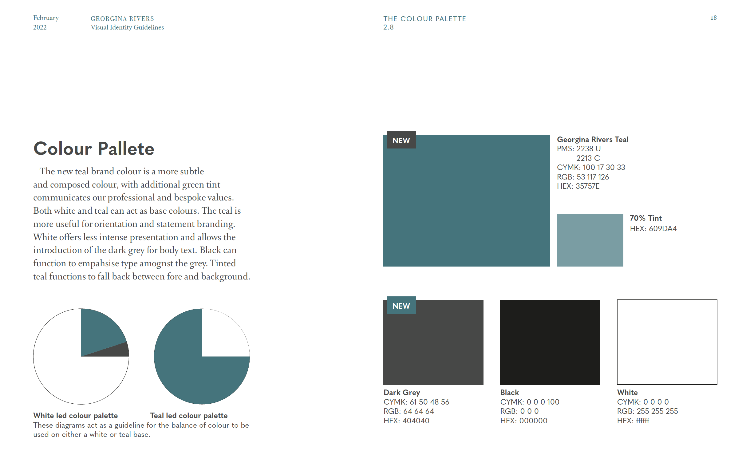
Georgina Rivers Colour palette
Typography
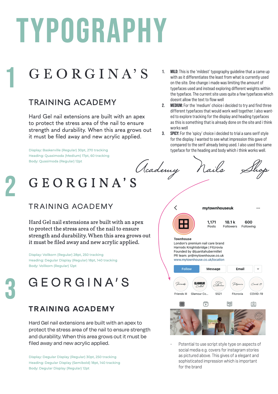
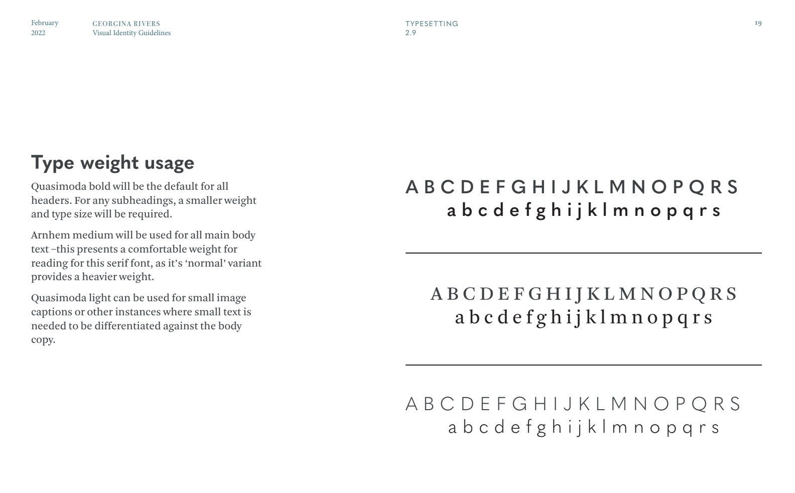
Megan was allocated the development of the typography for the brand. I gave some direction in the development, recommending the use of a sans serif for apart of the brand. This was to be used in headers, and also to be used as a part of the different logo variations. We used Quasimoda in its all caps variant for headers and often bolder weights. It some more modern flair and characteristic to the brand when using this typeface with the serif fonts.
Reflecting on this area, I now know that using two different serif fonts is not optimal. As we used Arnhem per the clients request, we should have been aware and explained that there needs to be consistent use of the different typefaces. Body text could have alternatively used Bodoni.
Georgina Rivers type weight usage
Style
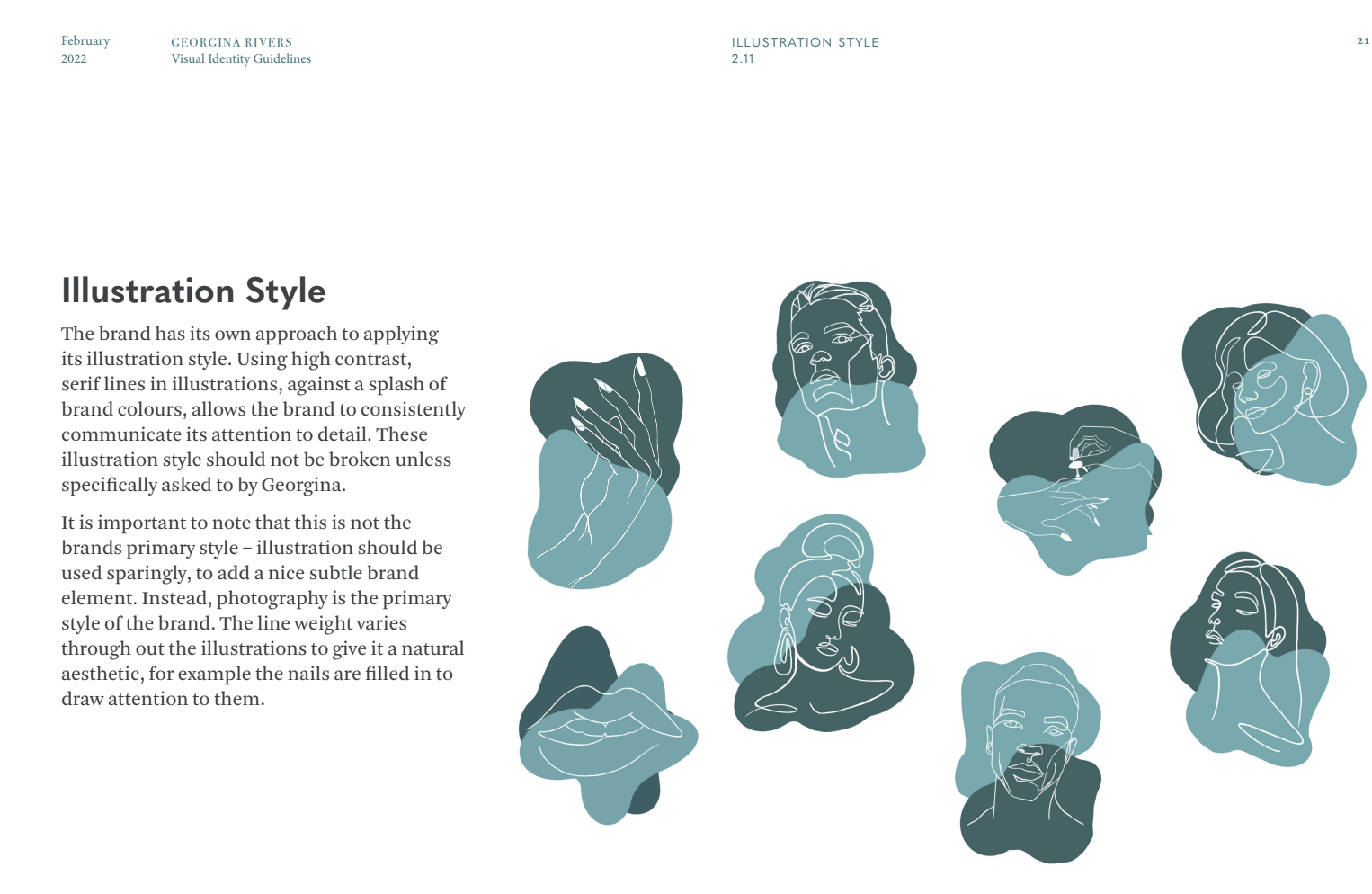
Salma was allocated the role of developing an illustration style for the brand, as she was the strongest illustrator in the design team.
The illustration was approached by creating flair and communicating the ‘finesse’ of the brand. It held some similarities to the Bodoni typefaces serifs. The brand developed its line weight overtime, to create a style which was constantly used – making use of contrast between thick and thing lines.
We did face some issues with the illustration style, with striking a balance balance between this and photographic images. Additionally, the style was only really applied across the website, and other deliverables did not make use of the style, which in turn effects how connected the brand feels.
Georgina Rivers illustration style
Web Design
Under agreement with the team, I was allocated the role of the website as other did not feel as comfortable as myself with this task. It was also key that most of the website be designed under one designer, to implement clear rules constantly across the site.
Originally, I created prototype using still screens of the website to guide my development of the real website. This specifically looked at the design, and the implementation of-the brand, but also understanding the user journey and a development of the UX of the site, so that the users could access what they needed. Over a course of feedback and iteration, once the Adobe XD prototype was completed, I moved over to WordPress.
One of the key challenges was implementing the visual identity into the website, using the colours in a measured way and using the typographic rules we had set. There was some frustration i using stock images for the purpose of this project as-well, as we did not have our own professional photography, therefore the images used had to function as representative placeholders.
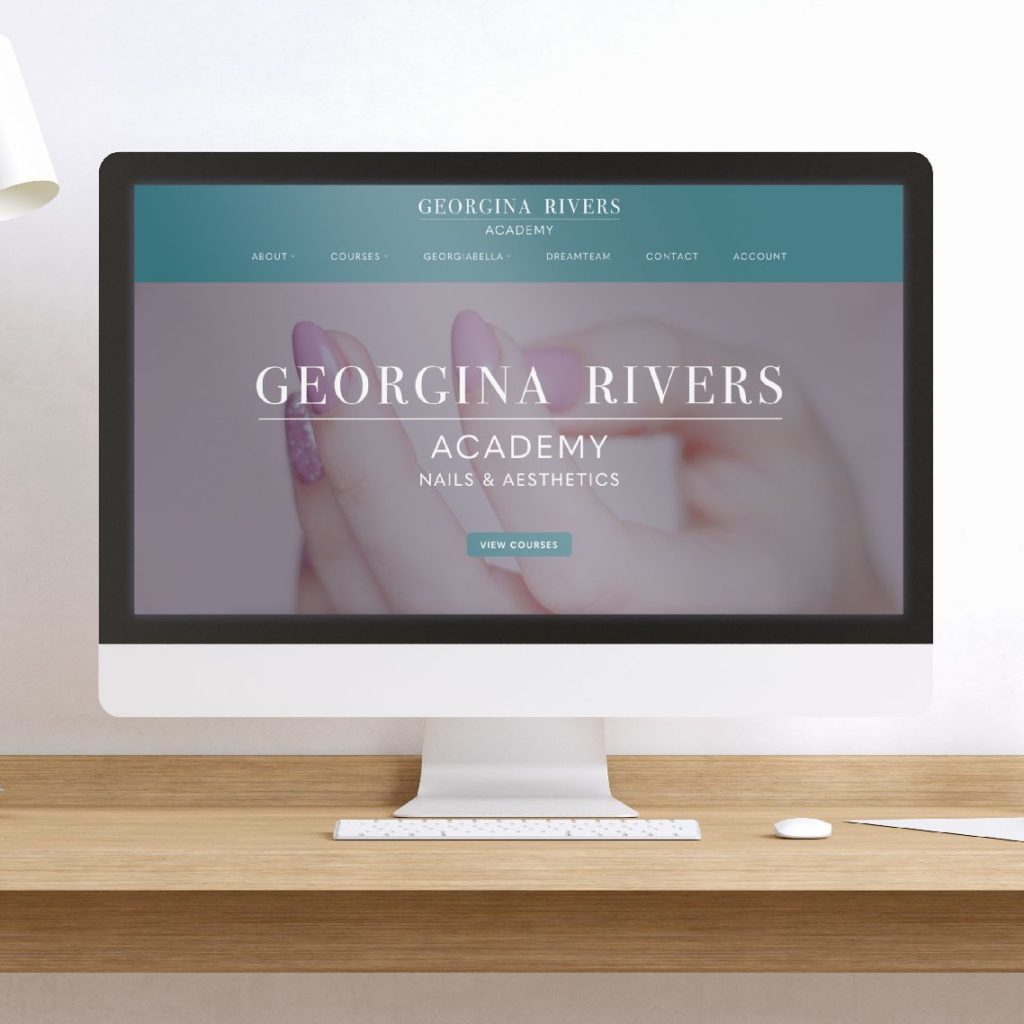
The website also made use of the different logo variations, using the monogram on the mobile site, and the logotype on the desktop site.
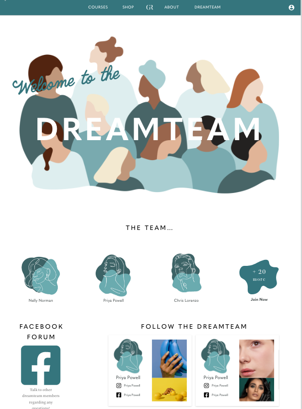
The key areas of the Academy website were the ‘Dreamteam’ and ‘Courses’ pages. There was a requirement for me to design and to use my typography skills to logically hierarch and order the different sections of the page. Through using key elements of the brand, such as thing lines, and the typographic rules, the design ultimately created a legible and ordered page, inspired by the idea of a ‘menu’, adapting from two columns to one across the breakpoints.
Dreamteam XD prototype page
I would recognise that the biggest difficulty on the entirety of this project was undertaking the task of learning WordPress. The interfaces of the platform is very difficult and overwhelming to initially engage with, understanding the technical side of hosting, plugins, themes and more was one of the biggest learning curves I have experienced on the duration of my degree.
Once I had understood some basics, I could make the functions of the website possible. Using key plugins allowed me to create a system where the client could allocate different users / profiles of the website roles which granted access to the dreamteam sections.
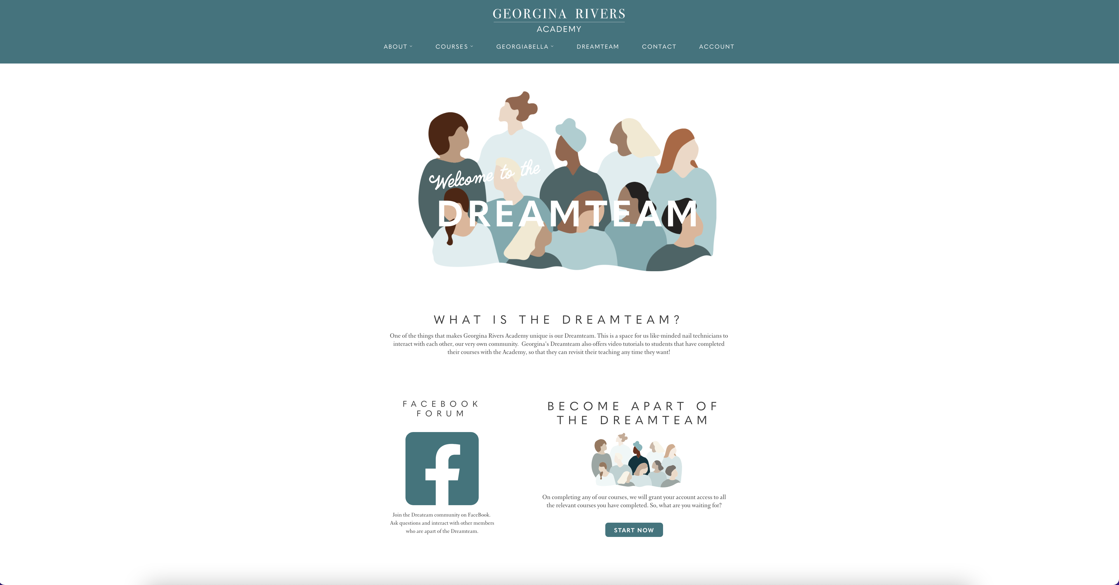
Real Dreamteam page on Georgina Rivers Academy at 50% zoom
Reflection
Overall this project experienced many ups and downs, but has been one of the biggest learning curves for me over the duration of this course. Learning not only as a designer, but also as project manager, client relationship manager and web developer.
One of the biggest problems I experienced was co-ordinating a team over the course of a long period of time. Keeping a workforce motivated and aligned in achieving the same goal for completion was very difficult. However, onboarding a new team member as talented as Minh really helped refresh all of the team members, and keep us all on track.
Additionally, using project management tools and shared workspaces was key to delivering this project. At the start of the project, we were unorganised on who would be assigned what deliverable, and through onboarding recommendations of our supervisor, the development of the design could take a more focused approach once we had clarified roles.
One of the pitfalls of the project was the inconsistent use of the supervisor meetings. When the team came into busier times with other projects, we began to fall behind in our regular meetings with our supervisor. Ultimately, this could have stopped faults in the design earlier, such as the use of more than two serif fonts.
Another task that I personally had to engage in was client relationship management. As an undergraduate student, it is easy to feel ‘imposter syndrome’, that I do not have the expert or knowledge to be in that given situation with the client. This made it difficult to constantly y ask the client to pay for required services, or to try and persuade them away from certain design decisions in the brand identity. However, overcoming this allowed the design to develop, without this, there may not have been as much development in the brands visual identity, such as the colours, or typography.
Maintaining regular communication wit the client was another task this project had to face, as a result of the long period it was undertaken. I approached this by asking the client if we could have regular weekly meetings, at specific time. This was not always met, but myself and Georgina did meet frequently to discuss progress. Whilst others may not have been able to attend every time, I have learnt the importance of dealign with this, as it created difficulties in relaying feedback to them. Through contacting the client and team after meetings with a summary, in a connected string of emails, all parties could communicate.
Finally, one of the biggest challenges I faced designing a website via WordPress. As I previously discussed, understanding the interface and capabilities took a long time to learn. The amount of time it took to design the WordPress site was not anticipated in the original brief, and was one of the key reasons for why the real job took much longer to complete. However, this is not the sole reason, other areas were delayed and was a consequence of faults in time management – this has taught me the importance of setting very specific deadlines for both client and design team, and as I learnt this, allocated a deadline schedule for all parties to ensure the completion of the project.
When reflecting on this, there may have been frustrating learning WordPress, but I now feel confident and proud to say that I have at least a basic understanding of an industry standard software.
Alex Gwynne