Overview
G Live, one of Surrey’s leading live entertainment venues, is preparing to announce a new programme called Radical Creatives, which will provide creative learning projects, workshops and activities for young people between the ages of 14-19 yrs. The programme seeks to attract 16 young artists who have a passion and interest in tackling some of the biggest challenges in the world today. The art-forms could be anything from street art, song writing, sculpting, painting, dance and many more!
The client requested for us to create a bold and artistic visual identity for Radical Creatives.
Deliverables
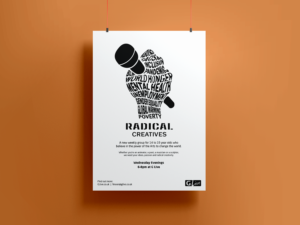
- A1 and A3 poster to advertise the programme.
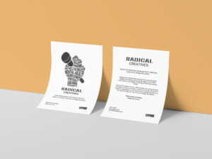
- A6 flyer for the public to get and idea of what the programme is about and what it has to offer.
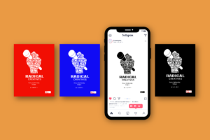
- Social media graphics for Twitter and Facebook.
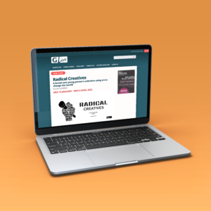
- Email and website header.
- Artwork files.
Research
After receiving the briefing from the client, we researched G Live to find out more about them, and looked carefully at their website to get a good idea of the style of illustrations they tend to go for, and the colour scheme they use. We also looked at the G Live logo because the visual identity for ‘Radical Creatives’ must work well with the main logo.
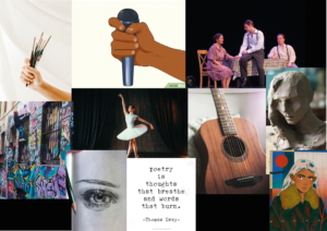
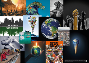
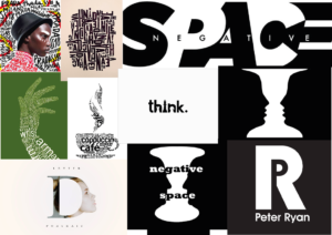
We also collected some imagery for a visual reference and to help us to curate ideas surrounding the topic of the entertainment programme. We made three different mood boards which consisted of (from the left) the art forms practiced in the programme, world problems imagery and lastly negative space used in typography and warped text into objects.
Design process
The client expressed that the design/s must be illustrative and not photographic, however he did not provide any other guidelines, so we sketched out a few ideas that we thought would work and be appropriate for the advertising of the programme. The client mentioned that he would like to see the different arts as well as world issues facing young people today expressed in the design.
Initial sketches
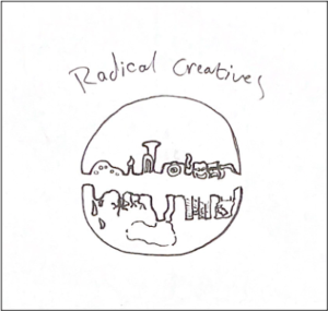
In this idea we wanted to incorporate the idea of the globe, so we created a circular design composed of two half circles, and on the top half we inserted illustrations of the different art forms, and on the bottom half, the problems in the world today. We used line drawings as a style choice to match the line drawing image advertising Radical Creatives on the G Live website. This design was difficult because the illustrations of the problems were not clearly presented, difficult to interpret and due to them being upside down, could lead to them being misinterpreted. Inverting the images of the problems in the bottom part of the image could solve the ‘upside-down’ issue, however it would still not be clear enough (especially on smaller formats). We decided to keep exploring different ideas.
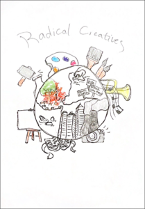
For this design, we used the shape of the globe to encapsulate the problems in the world today, and we placed the art forms around the outside. The client and supervisor liked this idea, however we discussed that it could appear very cluttered because there are so many problems in todays world, and it would not be fair to only select a few problems, placing less importance on other issues. It was suggested that we get rid of the problems illustrations, and replace them with typography.
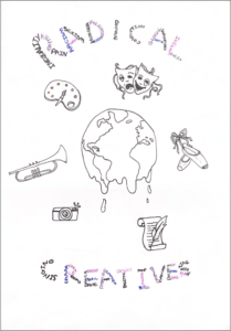
This idea came from considering the comments of both our supervisor and client. We got rid of the illustrations displaying the problems in the world, and instead wrote them out typographically in the title ‘Radical’. This way we could present all of the problems and place equal importance on them. In the word ‘Creatives’ we wrote all of the different art forms the young people could use in the programme. We also placed illustrations around the globe to symbolise the arts. We kept the globe in the centre and made it look like it was melting, to symbolise the destructive effects the problems have on the planet. Upon reflection of our supervisor and client’s feedback, we decided that the melting globe is not appropriate and appears misleading. We were encouraged to further explore the placement of the arts illustrations, as well as the placement of ‘Radical Creatives’.
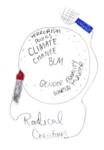
Taking inspiration from the mood boards we created previously, another idea we had was to warp the text into a shape. Here we have visualised this through the shape of a globe with some extra illustrations on the sides to give context, accompanied by the title of the programme. We think this is an interesting way to include both elements the client wanted (the art forms and the problems in the world) without the composition looking messy and full of illustrations. The typographic element helps to balance out the composition.
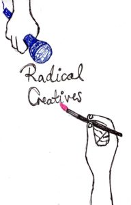
We took an illustrative approach for this sketch to build on our idea generation. Having a minimalistic design has many advantages, as proposed by our client who said how the venue already uses a variety of colours in their marketing material so to have a cleaner design would be a positive as it has the chance to stand out against all of the colour oriented pieces of work.
Development
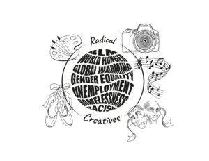
In the previous image presented under the ‘Initial sketches’, the globe became a too literal image, and it became a part of the illustration with no real meaning, so we stripped away the outline of the globe, and created a circular shape made up of words symbolising the problems in the world. We thought this was more impactful and still gave the idea of the globe. The client liked the design, however he suggested redrawing the arts in a more modern style, perhaps as line drawings that connect with each-other in a flowing line.
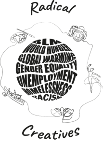
After showing our previous ideas and concepts, the client indicated that he liked the globe idea, however after seeing this design concept, he thought that the idea of the globe had been lost and suggested we experiment more with that part of the illustration. The client wanted the arts illustrations to be flowing line drawings instead of static separate illustrations. The design concept that we produced with the globe included everything that the client liked, however the different components did not work together coherently.
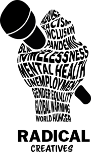
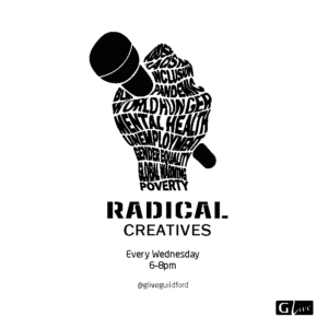
This design idea was created on a whim. Both us and the client were so focused on incorporating the idea of the globe, we wanted to show something different and fresh. It displays the arts and global issues in one powerful image. It creates a strong visual identity for Radical Creatives that we thought could be used across many different formats like the client requested. The client and our supervisor were very fond of this idea and suggested that we keep developing it. The advantage of an image that could symbolise giving youth a voice through arts offered the opportunity to simplify the image and to strip away the clutter.
Further Development
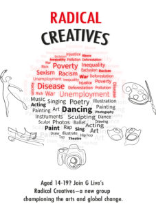
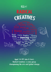
Following the request of the client, we further developed the globe design and the hand on the microphone design. Feedback on the previous version of this design pushed us to think of ways to make the typographic globe fit with the line drawings. The outcome looks cluttered and unbalanced because the line drawings do not work with the style of the globe. Therefore we agreed with the client and supervisor to pursue the design idea with the hand holding the microphone.
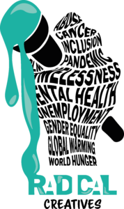
We further developed the chosen design by adding colour, and rendering the top of the microphone into dripping paint, which was meant to symbolise the arts. However the outcome is misleading because it appears more like dripping ice-cream, and does not convey the idea we wanted to portray. The colour also does not seem very radical, so it was suggested to further experiment.
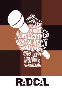
For this version of the design, we experimented with adding colour to the background of the typographic image. We wanted to display the diversity of people encouraged to join Radical Creatives, however after having a discussion with the supervisor, we came to a mutual agreement that the design appears too much like a BLM poster, and not an advertisement for an arts programme.


In this design approach, we added a fun and artistic touch by creating a paint splat and replacing it with the head of the microphone. We used a vibrant orange to make the design stand out, but it also symbolises the importance and seriousness of the global issues. Although the client liked the design, he stated that he preferred it as a black and white design without the splat. The client decided he wanted a more minimal poster design which will stand out when pinned up alongside many other colourful posters. We agreed with our supervisor that we should keep experimenting with the typography for the title ‘Radical Creatives’, as well as the other additional text.
Typography exploration
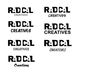
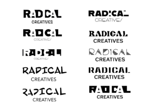
Our previous take on the title of the programme where we used negative space was not legible enough to read from a distance so here we have experimented with different typographic styles. Over the course of this project, our aim did in fact change. Before, we wanted the word ‘Radical’ to be in a quirky and bold style (which it still is), however where our aim changed was how we dealt with the word ‘Creatives’. Originally, we wanted the word ‘Creatives’ to be in an illustrative and cursive and calligraphic style, however as time went on to eliminate too many typefaces used in the final outcomes, we decided to keep the word in a clean sans serif.
Final outcomes
Poster (A3 and A1)
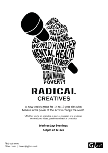
A6 flyer
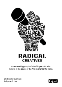
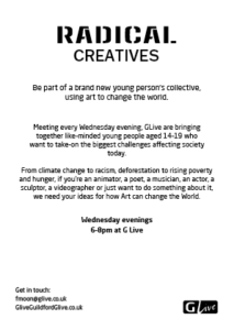
Social media graphic
Email and website banner
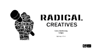
Across the poster and the flyer, the hierarchy established with the different pieces of information is equivalent to endorse a visual identity across. The challenging element of putting the text onto the outputs was to figure out how big/small to keep the typography for the A1 poster. After test-printing and tiling, experimenting with a range of different type sizes and fonts, we managed to get an appropriate hierarchy and composition. We also had to be careful balancing the top out with the bottom. As the graphic has an increased visual salience compared to the text at the bottom, it meant we had to trial and adjust the size to make it equal so that the composition did not look top-heavy.
Reflection
This project allowed us a lot of freedom for exploration, but it was also challenging due to a very open brief. We have learned new technical skills, how to function within a group work context and also how to manage client relations. It also became very clear that trying to incorporate too many ideas into one design can only lead to too much detail and a cluttered appearance. A strong image that represent many ideas has much more power to communicate clearly. Our client expressed his satisfaction with our final design and we are happy with the final outcome.
