
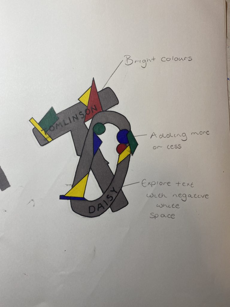
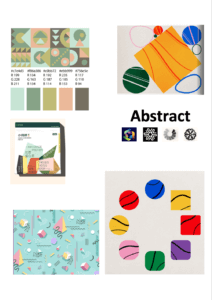
For my logo design I decided to take a more abstract approach. I started off with my mood board where I collected images that sparked my interest. Most of the images I found had lots of vibrant colours and lots of geometric shapes. My mood board then inspired my logo as I incorporated bold bright colours all throughout. The starting point for my logo was my initials which are done in bubble writing and overlap each other. I then went onto add different shapes all through out the bubble writing.
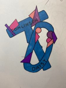
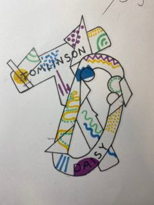
To experiment with colour I created a few versions of the same design but used different variations of colour and patterns throughout. This allowed me to figure out which version I liked the best, I chose the grey back group logo as my favourite as I like how well all the primary colours stand out from the background.
Although this is only a paper drawing it allows me to see and understand what I would design on the computer having a higher ability to change up features. For example would off my ideas I wanted to try was to have the lettering inside the bubble writing white so it stands out from the colour better.