
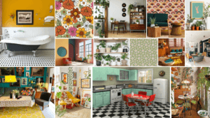
For my logo trends design, I picked the theme of 70s retro style. I first created a mood board of the 70s retro styled interior design which featured lots of interesting patterns such as floral, geometric, seamless swirls, psychedelic patterns etc… I really liked how colourful and bold everything was, but still had an elegant feel to it. I then looked at fonts, logos and brands in this era which matched very well to this retro theme. I again really liked how the text is really vivd and eye-catching, with lots of colours, making me feel rather happy and excited.
![]()
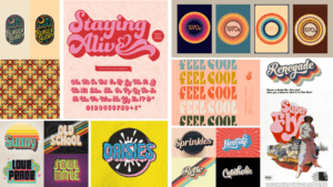
And so with this research, I wanted to mirror this kind of excitement I felt when looking at this style and put it into my logo. I started off with the font and colours. I was inspired by the Bee Gees ‘Staying Alive’ title in my second mood board and decided to use these shades of pink and a similar font. ![]()
I then created a ring of circles with pastel colours of the rainbow, imitating a vinyl to possibly have a music theme, linked with the Bee Gees and the retro themed music at the time. I got inspiration from my second mood board again where it looks like there are an array of records lined up beside each other. I thought this would be a good way to encapsulate my name (my brand) within the circle to give it a clear central focus. When putting my name in the middle, I thought it looked quite bland so looking back at my mood board, I saw a splatter-like shape and thought it would be nice to add behind my name to look like it was popping out, giving it more texture and depth. I originally drew a black splatter with a turquoise outline, however, it was slightly too harsh to the eye, so after some debate around colour, I changed it to white with a pastel purple outline, making it easier to read the logo.
![]()
Overall, I am generally happy with my design as I think it fits very well with the theme of 70s retro style. I also like how colourful it is which will capture the attention of viewers. If i had more time, I would probably reconfigure the splatter behind and continue to experiment with colours as I still think the white is too bland. Maybe I could have incorporated another retro themed pattern within it.