
Background
Hampshire RFU covers 32 rugby clubs in Hampshire with different membership types, e.g. paid members club, representative rugby, 7’s teams, women’s rugby, a LGBT+ team as well as a large number of volunteers and coaches that look towards Hampshire RFU. The RFU want to move away from their current branding in order to communicate a modern and inclusive rebrand that differentiates themselves from the RFU governing body.
The main issue that Hampshire Rugby Football Union was facing was that users struggling to identify which part of their website housed certain pieces of information, as well as which part related to them directly. Furthermore, it was easy to mistake the RFU for an individual club or with the RFU governing body as a whole. The task was to fix their inconsistent branding to suit the new younger demographic and the users that would come along with it such as parents or volunteers, as well as make their online platforms easier for users to navigate and find the information they need.
In order that we could best target the younger demographic, clearer communication on various social media platforms needed to be addressed.
The following deliverables will help create solutions to their current problems :
- A list of user personas, in particular a volunteer as the club needs them to run. A parent may be useful as if you are unfamiliar with the sport it may be confusing that HRFU isn’t an individual club it houses around 40 cubs which you can be directed to from HRFU’s website.
- A new website on sports focused CMS pitchero
- New branding including:
– A new or refreshed logo, colour palette and typography that modernises the club but keeps long standing members satisfied and resonates with fans and sponsors.
– A brand that can be easily reproduced and worked across their sub brands such as their referee site or their coaching and volunteering guides.
– A set of brand guidelines that can be easily followed by non-graphic designers and future designers for both web and print.
– A new social media and communications template and style guide
– Letterheads for print, email signatures and social media footers
Deliverables
Our deliverables included a logo refresh, a brand application proposal with brand guidelines, visual design of a Pitchero account, and lastly a presentation pitch to the HRFU board to assess which of our ideas they wanted to implement.
Initial steps
The very first stage of the project was to contact our client in order to organise a call and fill out our initial client meeting document. We also contacted our supervisor so we could go through the information gathered at this meeting, and really understand the user needs, so we could successfully restate the brief. We began researching the other clubs, as well as the pitchero platform at an early stage. After our initial meeting with the client, we also organised a weekly meeting to catchup and feedback on our developments, as well as keeping an open line of communication via email. Frequent conversations were vital in the quick and efficient progression of the project.
User personas
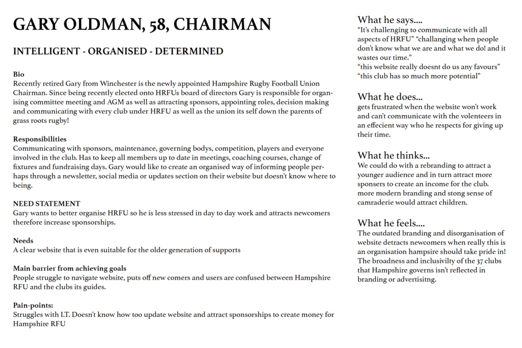
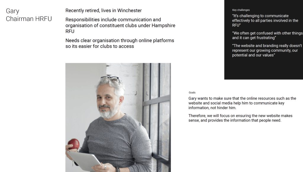
Not only are user personas one of the requested deliverables for the project, they are an important part of the research process for a branding project. The process began in our initial discussion with out client, where we could brainstorm the audience types which would most regularly use, and benefit from the brand refresh. We collectively came to the conclusion that the people we needed to target were the RFU chairman, a parent of a child playing in one of the clubs within the RFU, as well as volunteers, or potential volunteers. Once we were happy with the personas, we began developing these personas into characters, so we could target their needs and therefore inform our design with realism. A focus on the user needs meant we could create a ‘question/answer’ approach to the project. We in that way had a ‘response’ and acted on each of our users needs.
These elements were then able to be developed into a professional looking graphic that we could present as part of our deliverables to the client. Furthermore, we now had much more information so we could focus on the nuances and details that would be desired by our user, and deliver in the rest of our design work,.
Branding process (logo and other deliverables)
We started by making some sketches and brainstorming some ideas together, taking some ideas from our initial client meeting form, as well as any additional information our client gave us regarding their branding. From here, we individually began developing some digitized sketches, which we felt had some scope of development, with initial ideas starting out quite broad and abstract, such as those pictured below.
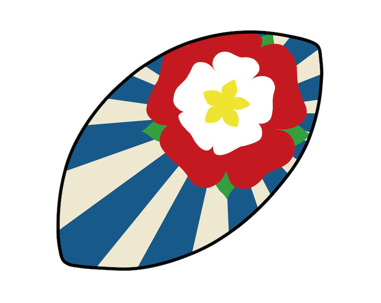
From here, we further developed our concepts. Our client suggested that the examples on the left were too detailed, and that although they were unique icons, they likely wouldn’t work as well at a range of sizes due to the level of detail. Furthermore, the client stated that they preferred that we include a crown of some sort in our logo, as they did in their previous logo. Our client did however enjoy the way we both managed to incorporate the Tudor Rose of their old logo. On this iteration, we focused on creating a simplified version of their own logo, for a fresh take on their current logo.
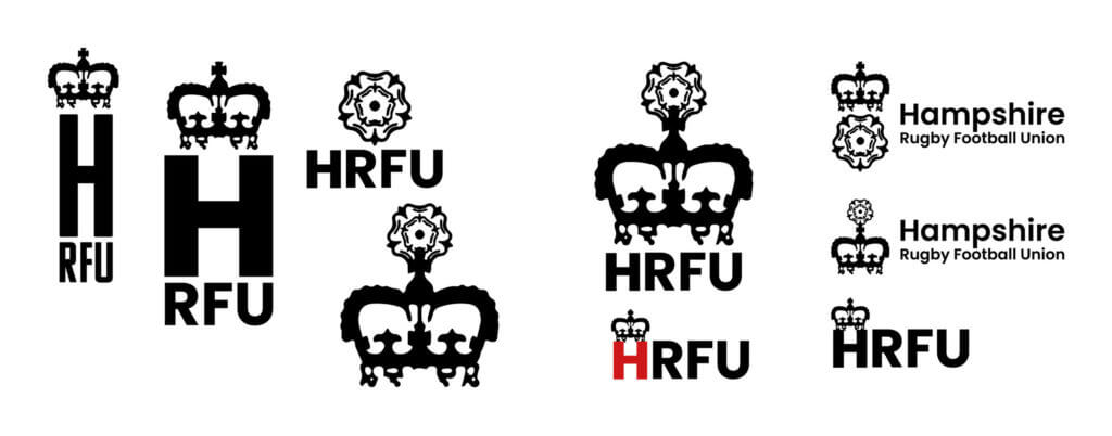
The client really enjoyed this approach and suggested that they most enjoyed the idea with the crown on top of the rose, with text to the right of the logo. From here, I experimented with drawing a range of different roses, with different colour emphasis, as well as different crowns with varying levels of detail. I also began to look into the typeface I could use for the accompanying text to the logo.
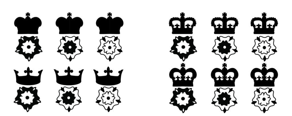
From here, the client was able to choose the feel of typeface they felt was right to represent their brand in a modern way, without losing the historic nature of the HRFU. They also gave us some feedback as to which icon variants they preferred.
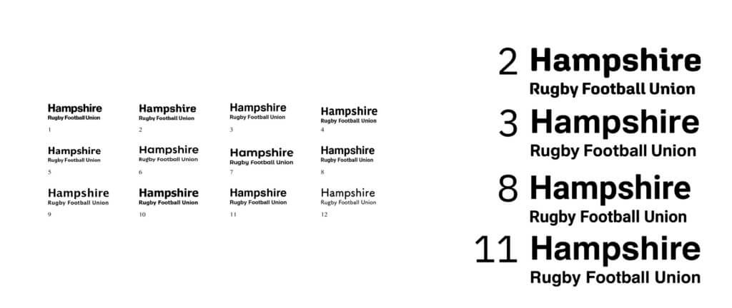
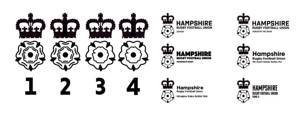
Out of the typefaces presented to them, the client suggested that they would prefer a clean, ‘swiss style’ typeface. From here, we presented them with a range of typefaces that fit their needs, to see if any of them were suitable to be the typeface we used for the logo. Out of this selection, they chose the typeface ‘Roboto’.
Now the typeface was chosen, the icon could be balanced and placed alongside the typeface, to create an ‘extended’ version of the logo, as well as a singular icon. We consulted Sara for a meeting at this point, to get her advice, particularly when it came to striking the right balance of line weight and shade in the logo itself. At this point, we also looked into colour, deciding on using (as is tradition) the colour palette of the RFU as it already exists.
![]()
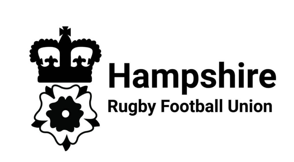
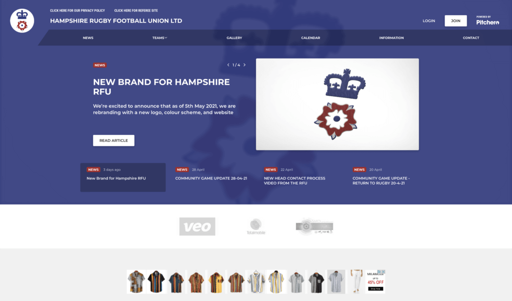
From here, the logo was refined, particularly focusing on the details of the icon, and redrawing it where necessary. The finalised logo is pictured below.
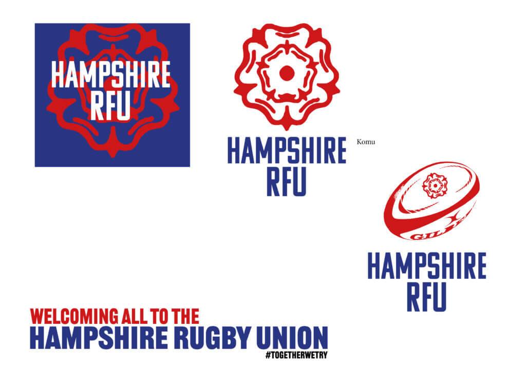
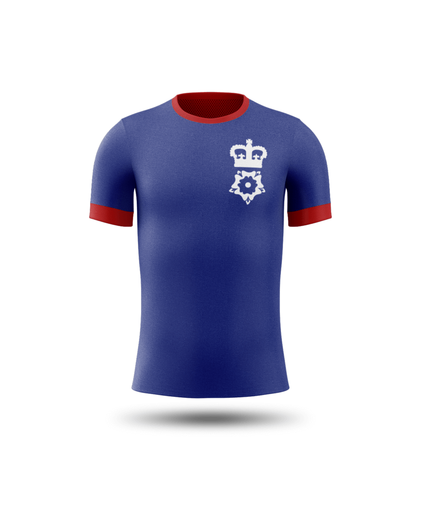
From this point onwards, the logo can be applied in a variety of different ways, including on shirts, letterheads, website branding, or any other deliverables needed. Some examples of how the new logo could now be applied are below.

Social media
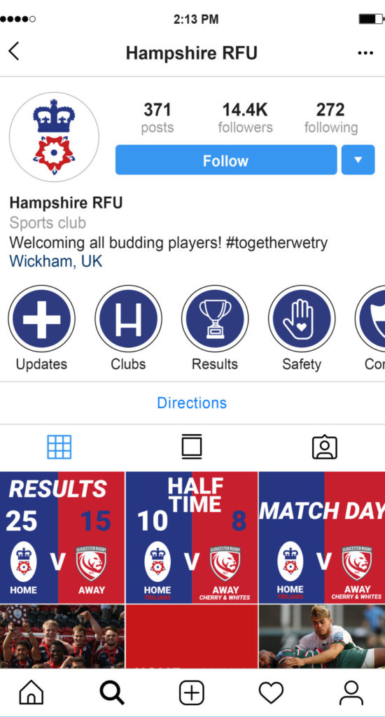
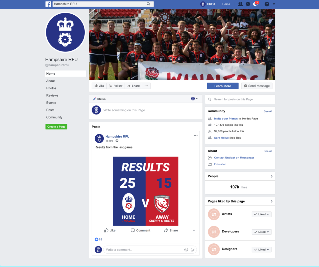
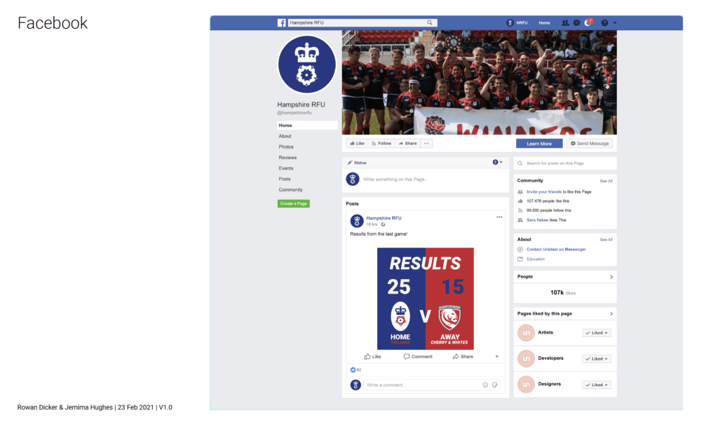
In addition to applying the logo and brand colours to social media, we were tasked with creating additional elements for their platforms, across LinkedIn, Instagram and Facebook. This elements focused in on the needs of our previously created user personas, and meant that the brand was not only applied consistently across platforms, but it fulfilled its purpose more effectively than their previous platforms. We produced icons for their Instagram stories, so all elements of information were easily available, and directly answered the concerns of our personas by making the information needed by users accessible at a glance. Tiles such as the match day tiles above were designed in order to help users see the outcomes of matches without having to ‘dig’ for the information. Each tile was designed to work individually, as well as a set, so they looked appealing and eye catching at the profile view, as well as when users come across them whilst on their feed. The features of each platform were explored, as well as the potential uses for them, in order to reach a wide audience, and to provide a convenient location for club members and patrons to find the information they need. In order to educate our client on how they can best apply the branding, as well as use their social media in the future, we created a more specific social media guide for the client. In addition to this, we made the client Powerpoint templates as requested to make their social media posts on, to ensure that the client could replicate our design with basic office software.
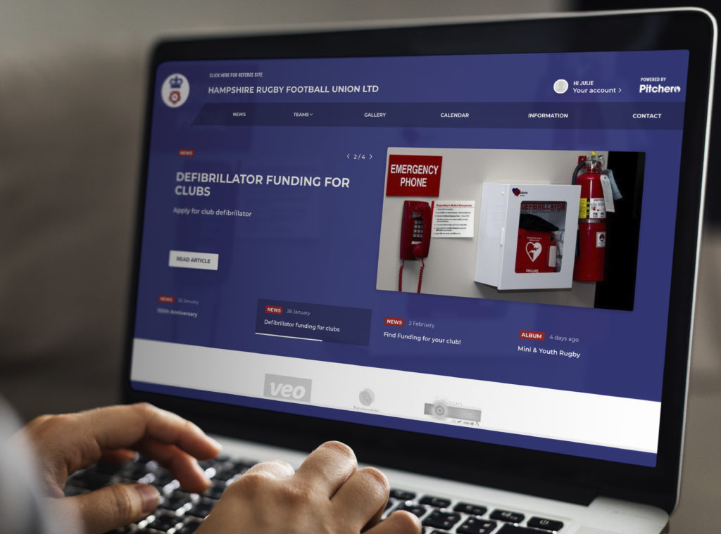
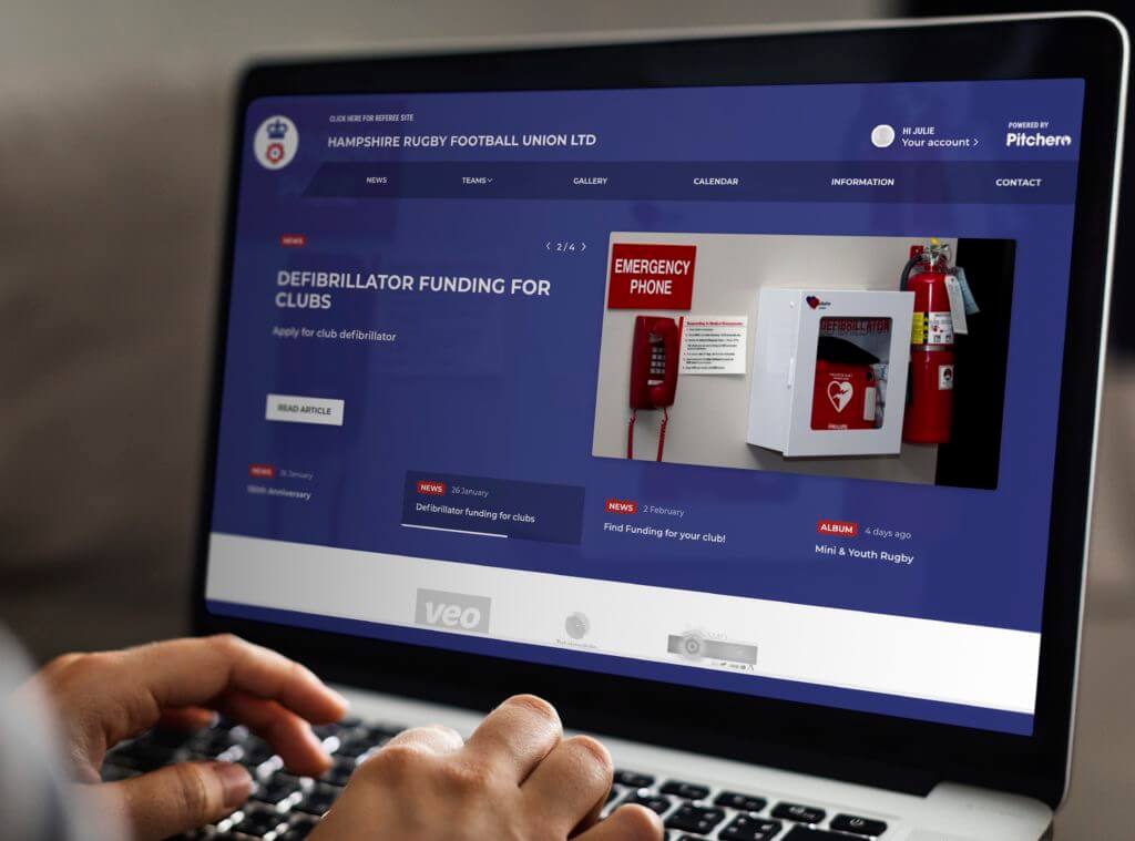
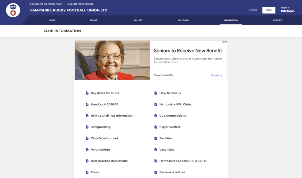
Pitchero website design
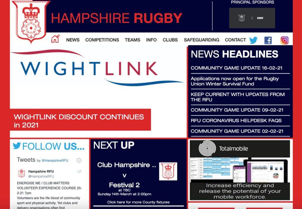
The clients were keen for us to use the sports focused CMS Pitchero platform, which can easily be edited in the future by non designers. This was particularly important to our specific client as they are a charity who release on volunteers. Prior to having access to the CMS we examined the current site and found various problems with navigation as there is so much information to find and poorly designed archives of news, latest updates and fixtures. We struggled to find how the user persona we created could differentiate between the HRF Union and the various clubs within the umbrella of the union. Putting ourselves ‘into the shoes’ of an aspiring volunteer, we found it difficult to find any vacancies or advice about how to apply for volunteering, as well as what information or checks were required to be involved. There is so much information on the current website, and lots of it is essential to include, but it is laid out in a way which is very overwhelming. We therefore decided to focus our efforts on creating a new hierarchy to target the needs of our created user personas more directly.
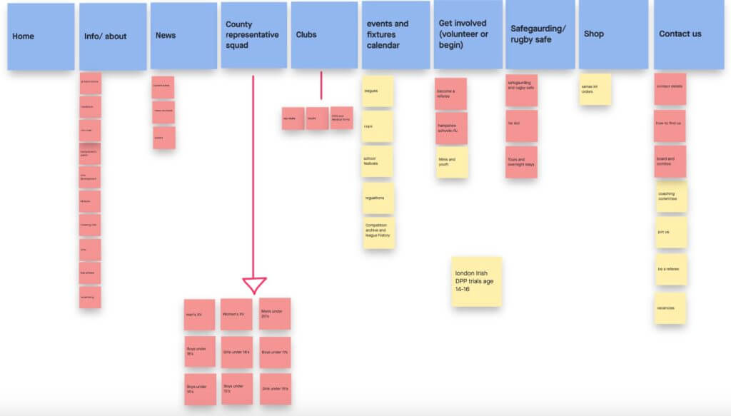
This encouraged me to make a far less cluttered website, but also to take advantage of Pitchero’s carousel function which would showcase our choice of topic. We felt it was important for the average user to have updates and news at the forefront of the site so they feature on the carousel on the landing page.

After accessing the CMS we initially found difficulty with their restrictive on the homepages top bar tabs, in turn meaning we had to keep the “information” tabs contents extremely organised. Therefore, the site would be less cluttered and wouldn’t overload the user with options, meaning navigation throughout the site was much easier.
Presentation to the board

We were given the opportunity by Mark to give a presentation to the HRFU board due to COVID-19, we had to present our work entirely over zoom. We presented our user personas which were well received and then explained our design process over the past 5 months. Starting with logos and branding, an important area to please the older generation on the board, and moving through to Rowans social media guidelines and the benefits of the new design decisions and later onto the pitchero and physical deliverables. After the presentation we asked the board for any question or suggestions and were very glad to see the design was well received by all. A board member asked whether we could include email signatures in our deliverable handover, which we took on board and have now added to our deliverables.
We were most pleased when Mark followed up our meeting with an email response “Whilst I was expecting this outcome I’m still in slight shock that everyone on the board was 100% behind what you have suggested. “ . Thow we would have preferred to give the presentation face to face we couldn’t be more pleased with Marks reply and felt our efforts were greatly appreciated by the board.
Key takeaways
This project was a great learning experience for both of us, with a wide range of deliverables, and diversity in the number of skills we had to show as a team. As a two person team from two different year groups, Ro (Year 3) and Jemima (Year 2) had varying ranges of experiences with real jobs and clients, and both learnt a huge amount through working together.
We believe that we split the workload fairly evenly, dependent on our existing skills, however we each discussed the progress of our research and designs regularly, to ensure that we were progressing well, as well as to offer advice and feedback. As a result of our different experiences we took a lot of time to brainstorm together, as well as reaching out to our supervisor Sara, in addition to the real job meetings for objective feedback. The opportunity for our year groups to mix in this way is very much a reflection on future design employment, and we believe that this helped us grow and develop as designers, both individually and as part of a team.
Furthermore, despite this job running a little bit longer than we initially planned, we believe that we handled the workload well. The deliverables, and number of things the client wanted us to deliver did seem to increase somewhat, and we quickly realised we would have to put a lot of accessibility elements in for our clients, such as templates, guides and icons, to make the implementation of our ideas easier. However, the client took this in stride, and due to our consistent communication, an extension to our initial deadline was agreed upon. One of the most significant hurdles in our process was our conflicting schedules of lectures and other deadlines, limiting the times in which we could work on the project together. The periods of closure at the University due to COVID, also meant that most of our meetings had to be remote. Despite these issues, we believe that we have delivered a successful project to our client, as well as learnt a lot about organising our schedules so we could both stay on track. We are very pleased with the comments that we have received from our supervisor, as well as the client, and grateful for the opportunity to work with Sam and Mark.
We both learned more specific skills whilst working on this job. With it being Jemima’s first job, she got an insight into how real jobs function, the organisation and level of communication required with the client, as well as becoming particularly proficient on the platform Pitchero. As a third year student, Ro further developed her skills on Adobe Illustrator, as well as drawing from her experiences on a chosen optional module, the Branding Project. The knowledge she developed from this project helped her approach this project in a methodical way which addressed the needs of the user effectively.
To conclude, in the future, we may have benefitted from a more diverse initial exploration of ideas for our logo. This may have made our design more ambitious, and unique from their previous logo. Furthermore, more exploration into the successful social media platforms and their branding could have made each element fit together most efficiently, as well as being more visually interesting. We had a great experience on this project, and it was valuable to our development in the design world.
Quote from supervisor, Sara Chapman
‘Well done! Very professional. : ) S’ – Comment regarding presentation to the HRFU board
Quote from us – Jemima Hughes
‘Since seeing this real job advertised, I had been particularly keen on the user experience design aspect of the project and was delighted when I was taken on for this opportunity. I feel very lucky to have had Rowan to help me learn the ropes of the Real Jobs module as this is my first real job. Additionally, we were very lucky to have the constant guidance of Sam Winslet from IBM and to top it off the perfect client, Mark who has always been enthusiastic towards our designs and easily contactable and I’m very grateful for the time and opportunity Sam and Mark have given me.
Working as a pair is something I have really enjoyed and feel we bounced off each other well. I can look back at my initial logo designs and see how much my design skills have developed, mostly due to my guidance from my more experienced partner who encouraged a simpler and in turn more effective design. I have also most enjoyed exploring the CMS Pitchero, it has introduced me to how to approach the limitations and benefits of the CMS, something that I believe will be beneficial in my future career.’
Quote from client – Mark Castle
‘Thank you so much for presenting tonight and all your hardwork in getting this project to that point. Whilst I was expecting this outcome I’m still in slight shock that everyone on the board was 100% behind what you have suggested. They really liked the new brand, logo, social media and colour palette, only debate was if we move to Pitchero which was more of a practical discussion and was also approved. So well done, Hampshire RFU will implement all of your suggestions and I now need to put my skills into place to project manager the move from the old to new.’ – Comment regarding presentation to the HRFU board