

Background
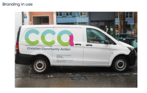
Christian Community Action, otherwise known as CCA is a Christian charitable organisation local to the Reading and Berkshire area. CCA provides support for less fortunate individuals or families who are unable to furnish a suitable living space for themselves. They recycle furniture, clothing and household goods. However, in recent years the organisation has lost support in both staff and donations. CCA also provide employability schemes and workshop skills. The client believed that a new brand identity was required to bring back to life CCA and regain momentum so they can get back to helping Reading’s community again. This brand identity would provide a refreshed image to the public and be placed at all of CCA’s premises, transport and branded goods.
The brief
The brief overall comprised of two components, consisting of a list of primary and secondary deliverables. These were the following:
Primary
1 x brand identity package (to be applied to all promotional materials such as merchandise, newsletters, postcards, posters, shop signs and vehicle wraps. This consisted of:
- 1 x logo
- 1 x Typekit
- 1 x colour palette
Secondary
Promotional materials templates:
- Shop face, banners, documents for both digital and print, posters and mockups of a new website.
The objectives of this project were to re-establish the organization through a new visual identity, reinstating its ideals. The re-brand would lift the organisation back into the current proceedings of Reading’s community. The new brand identity would need to be fresh and modern, distancing the previous conservative branding. This progressive step would take the organisation forward and more in touch with Reading, making it more approachable.
Research
I began this project by reviewing CCA’s current branding and analysing competitors and existing branding from similar organisations. From the offset of this stage, it became apparent that it would be difficult to create an identity that wasn’t too ‘Christian’ whilst making it obvious and relatable to the organisation’s values.
After reviewing an extensive amount of competitors, I began to narrow down themes and ideas that I would like to draw upon and incorporate within the new branding. I deemed these factors worth consideration as an attempt to create a strong and appealing identity. These consisted of:
- Sans serif typography – to help legibility both on and off screen mediums.
- Organic or rounded shapes – conveying calmness, tranquillity, and care.
- Soft edges – to appear friendly and appealing to the wide target audience, posing a non-authoritative tone.
- Light colours – to convey sentiments of peace and love whilst also helping the brand to appear friendly and welcoming and non-corporate
The target audience for this project was really for anyone, from young adults wishing to get stuck in with helping the community or those of an older demographic. Typically it would be between the ages of 18-70. Although a large span, this range was determined upon the multiple pools of people that may interact with the brand. Namely being:
- People seeking employment or looking to immerse themselves within charitable works.
- People in need of the services that CCA provide.
- Those looking to donate to a worthwhile cause that will benefit and help the area.
Designing and development
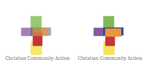
Starting with numerous sketches and ideas, I began experimenting with colour, typography and form. Initially, to keep true to the values of the organisation, I started producing logo iterations using key icons or imagery associated with Christianity. Naturally, these ideas incorporated the use of a Cross, combined with type and other Christian symbols. In turn, after a process of refinement I began to choose and develop which ideas were working best to present to my tutor, and then in turn upon approval, the client.
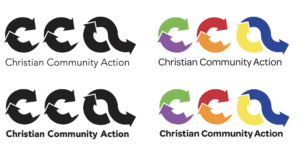
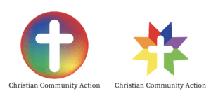
Above is the first iterations of the logo, playing off themes discussed above. I tried to incorporate CCA’s values in the most effective way, considering the use of the cross, recycling and colour. Colour was an important factor to consider after a conversation with my client. As Reading is a beautifully diverse place the client wished to try and incorporate this. The use of multiple colours throughout these designs was used to convey diversity within Reading’s community.
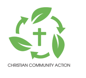
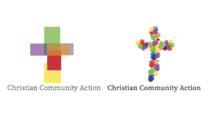
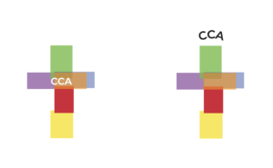
Upon feedback from my student peers and my attendance at the real jobs meetings, I was able to takeaway helpful feedback and therefore begin to refine and further develop my logo iterations. Within the next set of iterations I began to experiment with type and propose distancing away from using the cross, taking a favourable approach in focusing on CCA’s recycling aspect.
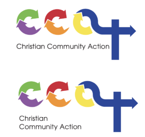
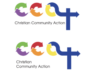
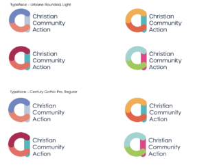
The logo approach I took forward from here utilised circular arrows. This was symbolic of recycling, progression and of the good charitable work CCA do. However, as I proceeded with iteration it was flagged up that it was of a likeness to a pre-existing corporation. From this moment I reverted my development and had to take a step back. This process of reviewing was essential in leading me to my next logo iterations and to get the project back on track.
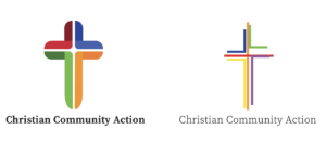
From here after having a conversation with my supervisor, I looked to see if I could turn this around. I therefore delved back into my research and initial ideas and went to see what I could make of it. This led my down a path where I designed a typographic logo, using colour and type to create a typologo. I took a u-turn too in terms of colour palette. Here I refined three potential colour ways that took a friendly and welcoming approach, making a U-turn from CCA’s current branding and colour scheme that was quite conservative.
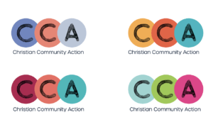
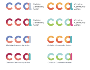
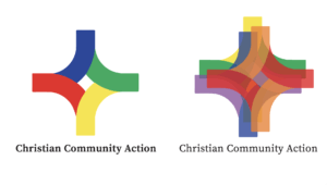
The first iterations were chosen to develop after receiving feedback on these designs. The reasoning behind their form was to still represent recycling, but also compassion and diversity with the interlinking letterforms. This represented Reading’s community and the values of CCA.
Outcomes
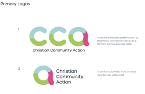
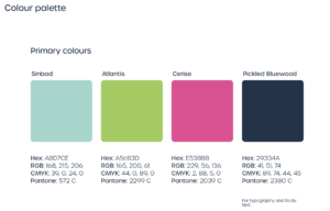
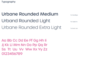
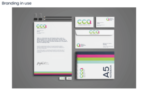
Outcomes of this project subsequently developed into a new logo with a logomark iteration. Having two types of logo iterations would serve CCA well as it would mean they could have an adaptive logo to brand their mediums. As a result, a branding toolkit was created. This consisted of the two logo iterations and guidance on how to use them, the respective colour scheme for the new branding and the typeface Urbane Rounded and its weight family. These elements were all decided on the basis of creating a friendly, warming and welcoming brand that had an organic feel. The use of light and bright colours was used to convey the values of CCA and the client. The decision for using rounded type forms for the logo and typography was also dictated by these factors. By using soft and rounded type it would come across as non-aggressive and authoritarian, in turn this meant that the visual identity was approachable and fresh. A Stark difference to the previous branding.
Reflection
On a whole this project was an enjoyable experience and I came away with many positive experiences. In all honesty, I can’t say I was completely prepared to take on a project like this as it was a different to a normal module. However, the takeways from it are invaluable and I am in no doubt that it has shaped me as a designer and learning to communicate effectively with a client and respond effectively to third party feedback. Due to the nature of this project, it was meant to be over relatively quickly, however with the on-goings of covid and the current climate, the time span increased tenfold. Moreover, it was almost a blessing in disguise to have a delay within the project as CCA was undergoing some changes. This therefore allowed me to get the branding as close to the clients wishes as possible. In reflection on myself, an area of improvement would be time management. By this I mean keeping on track with deadlines outlined in my restated brief.
Overall, I was pleased with the project outcomes and I believe the client was too. It was brilliant to also have such an enthusiastic client who really cared about the progression and purpose of project, this really made me feel like I was part of something that would help and change the lives of people.