
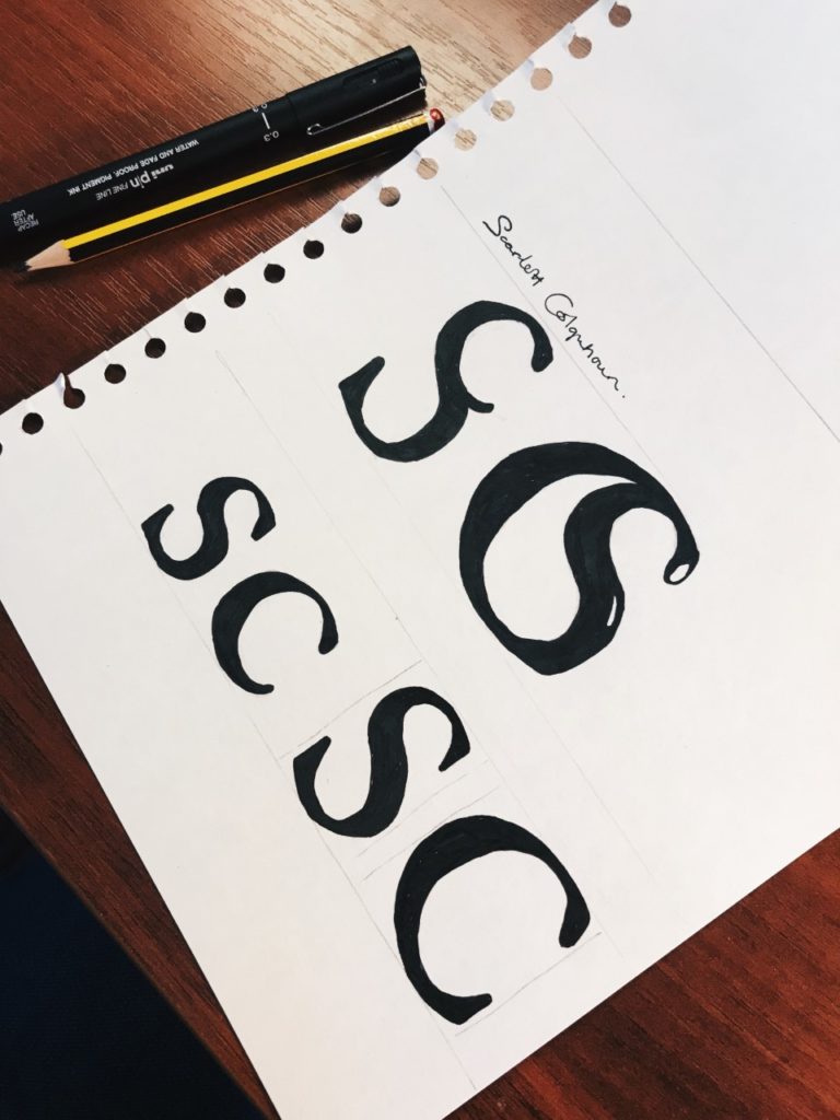
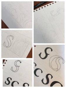

Creating a monogram. Today we took the time to experiment with making a monogram out of our initials, my initials being S and C, meant I did at times find it difficult to draw, and keep as clean cut at possible, however the curves in both letters meant I had a wide range of experimentation to do fitting the letters with each other. I started by just sketching the letters themselves and becoming familiar with their shapes. I drew them as both lower case and upper case. I then did a load of rough sketches on a piece of paper on how they could fit into one symbol and decided on two designs to make a final clean copy of.
I chose two designs, and each one containing where the S or C was large (being the letter that had the hierarchy in the design). The first design has a capital S, with a lowercase c in the top of it, I liked this design for its simplicity, and at first glace it almost looks like a normal S. The second design was a large C with the S fitted inside of it, I think this design was my favourite, just for how well the two letters fitted together, and I feel like it would be a good logo for a company to do with water (just as it looks like a drop of water in the centre). I manipulated the S slightly to make it fit better, and cut off part of its tail, but overall was quite happy with the outcome.
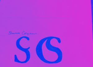
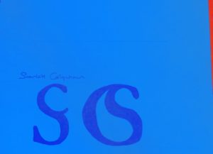
Lastly I experimented with a bit of colour using an app on my phone, just to see how they would look with different colour choices, but I still personally prefer the black and white.