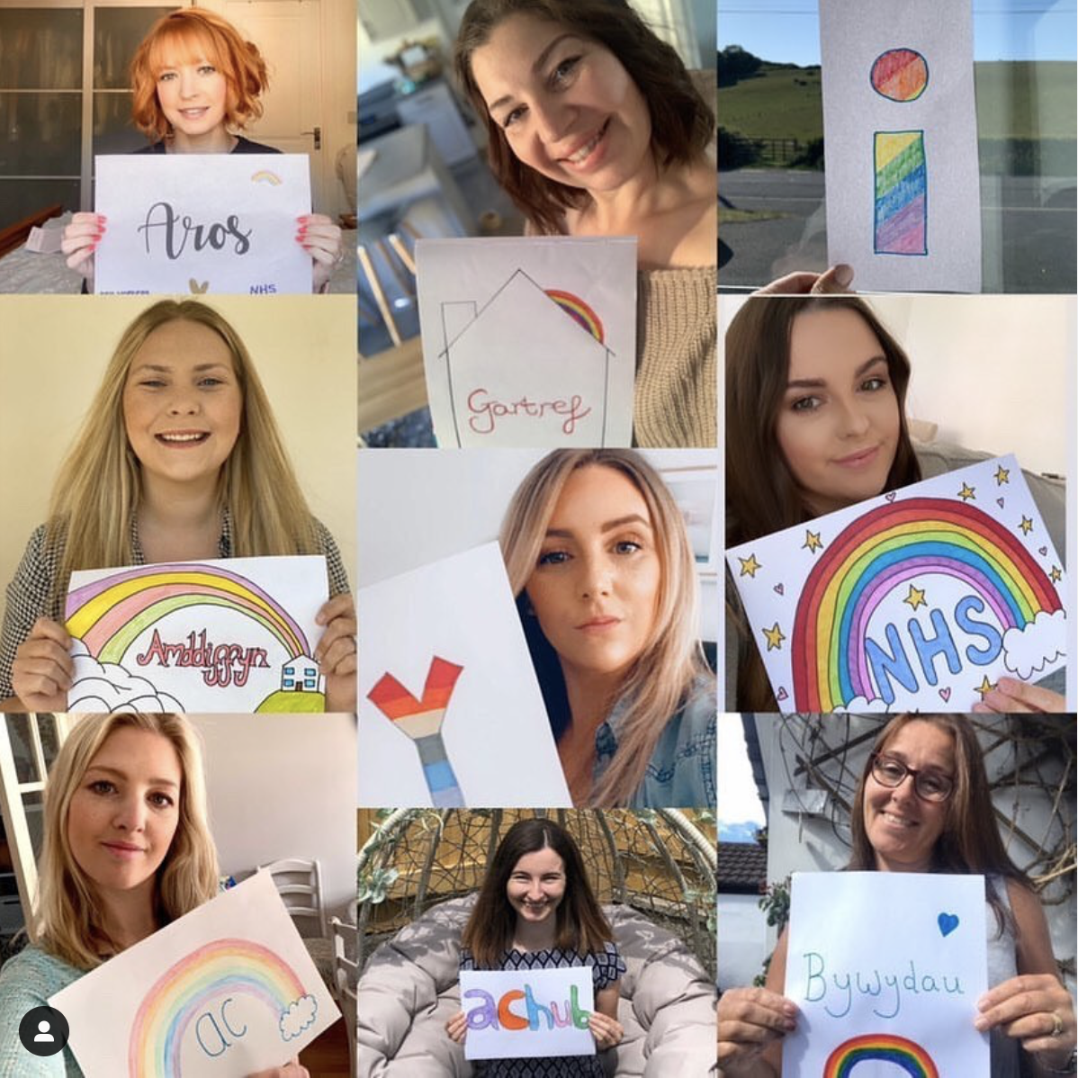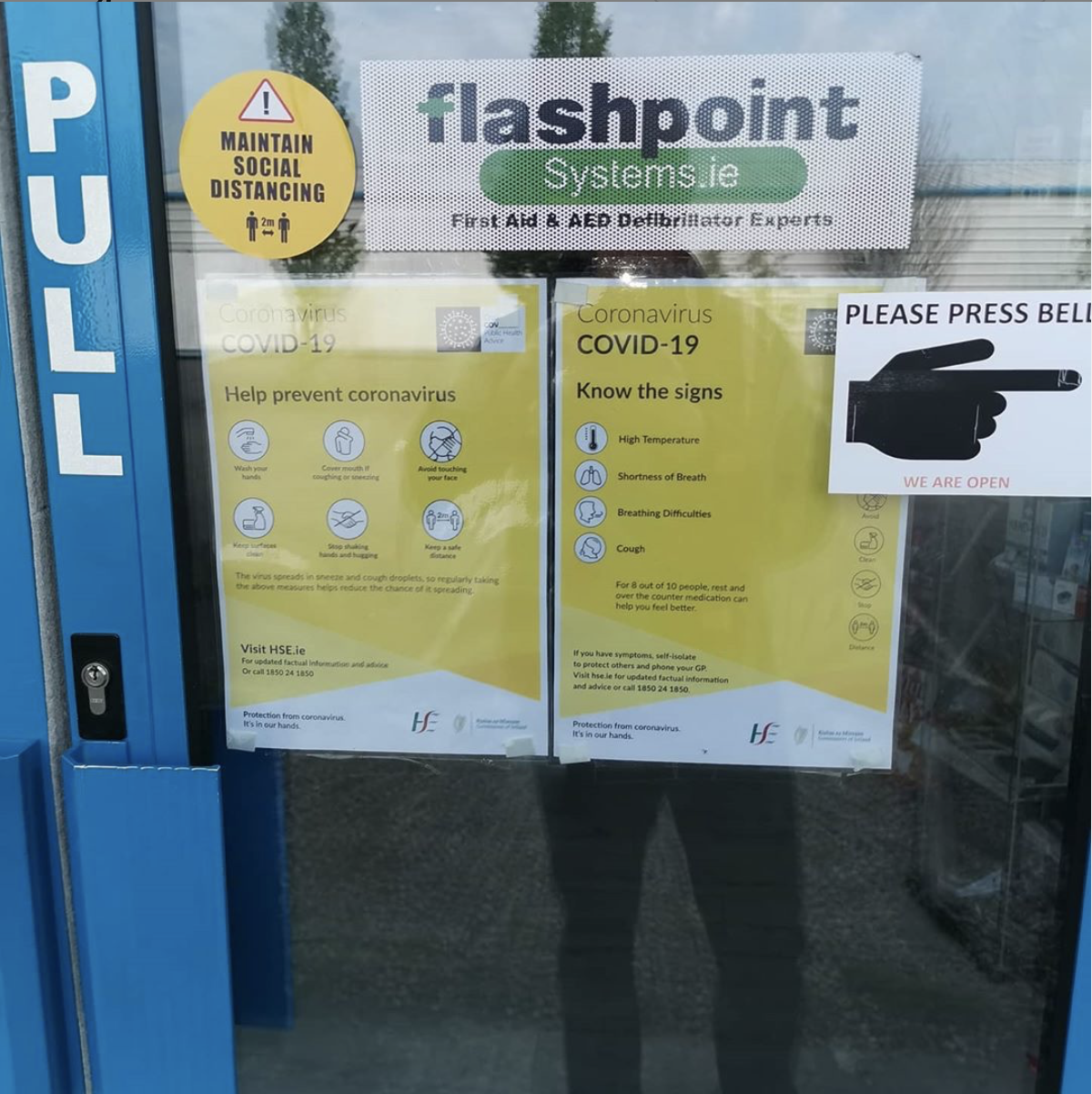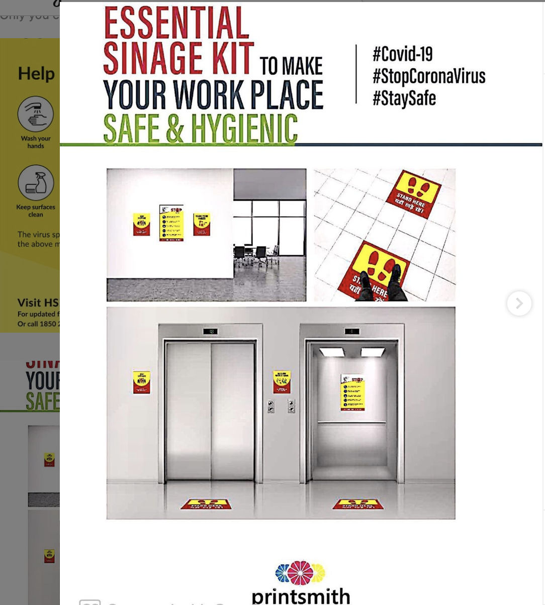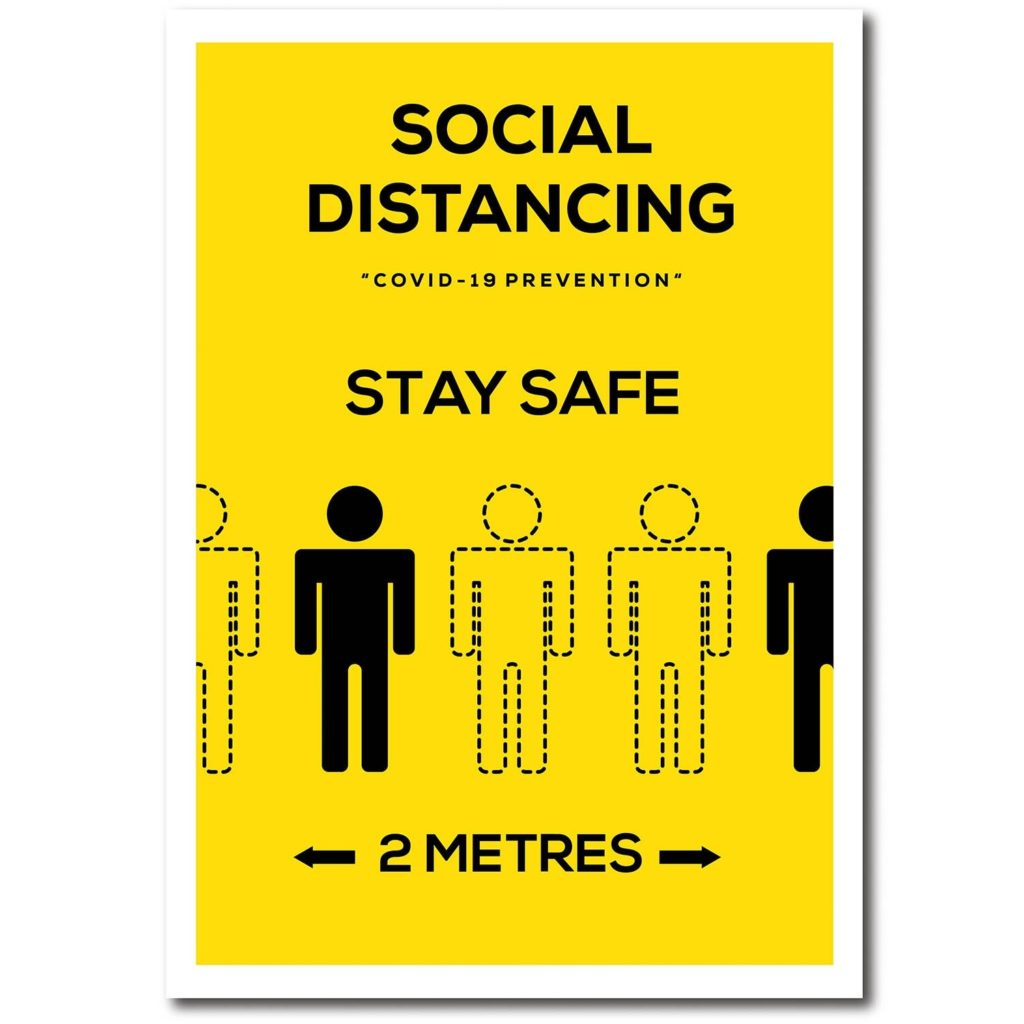
Today for Emma’s project, I researched all the different types of Covid 19 signage. I wanted to get a diverse range of material from different areas from all over the world so I decided to use the hashtag #covid19signs. this would source all the covid 19 signs from the perspective of the civilians and the companies/ businesses. this showed the signs as people interacted with them, for example the picture would be of a sign on a door from the perspective of someone who would interact with it in that given example. It also showed the different examples of mock-ups that businesses used for promoting safe signage in their businesses. i also encountered the different examples of NHS signage. Instead of focussing on the rules and advice, i also wanted to look for the supportive signs towards NHS workers and see if i could see a trend. I noticed that the typical signage that informed people of the rules used bold outlines or solid pictograms as well as sans serif type all on a bright yellow or dark yellow to head urgent warnings. the consistency in geometric weight in type and graphics accompanied with the high contrast background lends itself to a more serious tone in message. its clear to see that the NHS signs that thank workers take an opposite approach to stand out from the boring consistency in signage. Instead of using sans serif type that conveys efficiency, they hand draw their text in a curvaceous and forgiving inconsistent style, showing imperfections to convey that a person drew this, making the message feel genuine. for colour pallets they also use a softer blue for the backgrounds to symbolise the NHS and typically incorporate a rainbow to symbolise hope. The colours are also typically coloured in by hand for the previous reason and i think it is a nice distinction from the overwhelmingly bright yellow from official signs as the subtle colours are easier to digest and helps create a relaxed and warm tone to the message. Consumers of covid19 signs have adapted to the pandemic, making the official signage less efficient in standing out and conveying the importance of their message as they all blend into together in a persons given day. The different approach to the NHS signage helps stand out as people aren’t conveying such relaxed tones in the the recent average signage. Despite typically being drawn by a 9 yr old with their parents, its arguable that they are more effective in attracting the common eye in the open environment in some cases.