
In class, we learnt how to design a classic penguin cover on InDesign and know the basic format of it. We were also showed the important tools that are used on a regular basis when using and how to use it.
I am not particularly fond of InDesign for cover design cause I find the program confusing to understand and tricky to use and I prefer photoshop but with the seminar, I was able to use and understand much more tools than before
There were many tryout and errors when designing the cover since the task for the day was to replicate it as much as possible. The hardest was designing the penguin logo cause it involved so many steps to get to the final product thou I believe my logo isn’t accurate with more practice I can do better.
Messed Up Version.
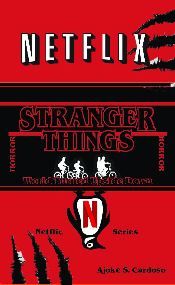
For my second tasked I did a book cover for one of my favourite series using a classic penguin book cover as inspiration. The series is called ‘Stranger Things’, It is a Fantasy, Horror TV Series on Netflix.
Stranger thing has an iconic bold logo that is recognizable anywhere. The font is ITC Benguiat, it’s a serif typeface with all letters stretched vertically. The colour theme for the cover is Red, white, and black because the logo for the series is a red or red outline with either a white or black background.
I turn the penguin upside down to represent a dimension in the series called ‘the upside-down’. The scratch marks represent the demon of the book and the marks that show that this film is horror.
The series Stranger Thing is a series I love because it has a 1983 theme, and I enjoyed the vintage layout in which the film is produced. It is influenced by Stephan king horror books so I wanted the theme of my cover to be dark.
I like the simplicity of the book and I feel like it communicates to viewers what can of the series cover is based on at the same time without giving to much information.