

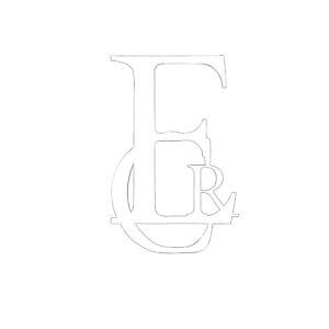
For Kim’s project, I created a monogram of my initials in the Garamond font. I experimented with layering and played with the different interactions between the letter forms. I initially came up with this design:
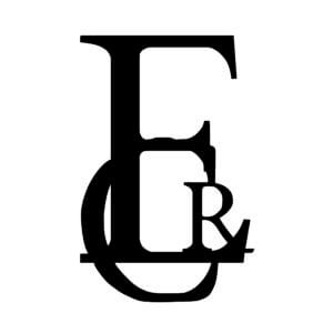

I decided to experiment further and explore flipping the letter forms. This almost removed the readable quality of the letters and created more of a visual image.


Finally I wanted to include colour and add some depth to my piece. I decided to add a drop shadow as this would also incorporate the dimension I wanted.
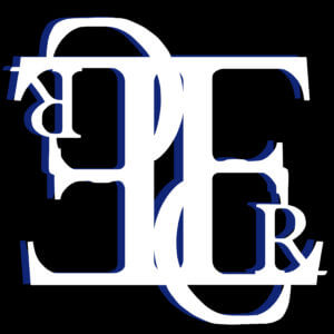
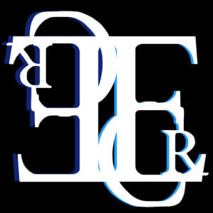


The two-tone drop shadow also adds an almost ‘trippy’ element to my outcome, further distorting the letter forms and creating an eye-catching image. However, I decided that the black background was too harsh in contrast to the white. I changed this to blue, which created a more monochromatic outcome. Overall, this made a more cohesive image. To illustrate the journey that I undertook during this project, I created a short video almost like a digital flip book, with my images in order.
MY VIDEO: