
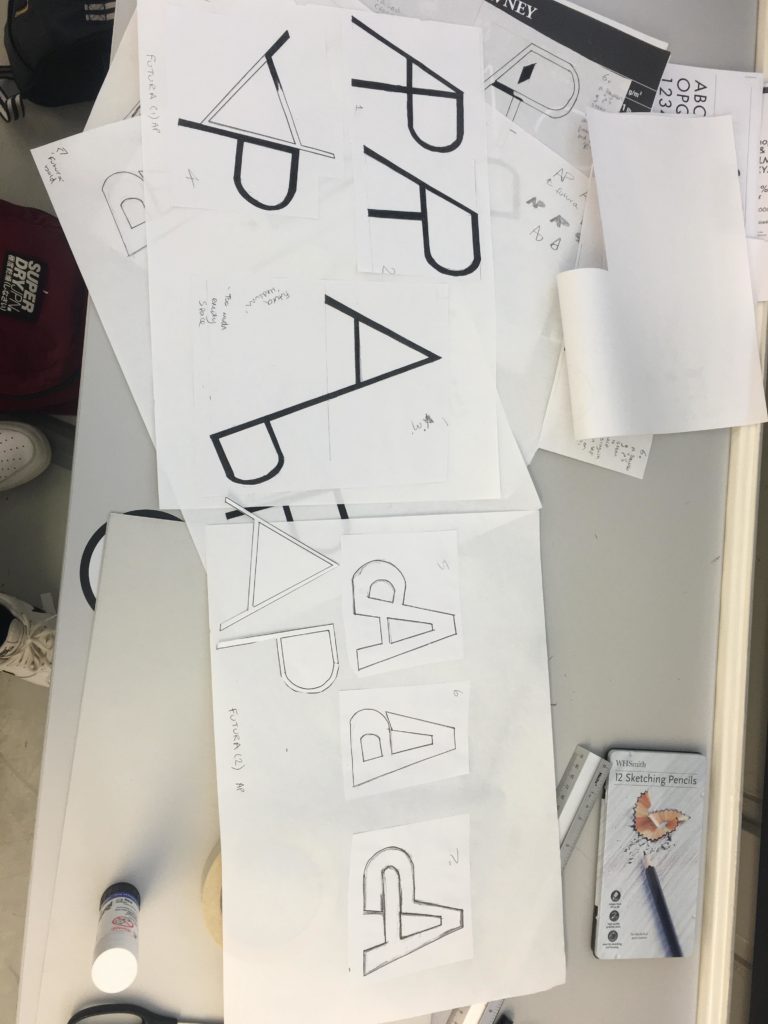
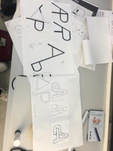
Using the Futura typeface, both medium and bold, I experimented with how the 2 letters – A and P could be incorporated together as a single unit, motif or symbol. I began by merging the letters next to each other, however it seemed that it could easily be misread as a letter R. Therefore, I explored flipping one of the letters upside down, leading to my 7th and final design solution, where the cross bar of the A merges into the the counter of the P. This creates an interesting ‘impossible staircase’ type aesthetic. I would like to further explore with colour .