
Our names are a huge part of our identity, especially when we don’t come across others with the same name, like myself. This in turn means people’s initials are part of their identity. Whilst creating a monogram of my own initials I wanted to be able to reflect my personality within this. The monogram is something that represents me, something that identifies me in the same way a brand has a logo. The following is the journey I undertook during my ‘monomorphis’.
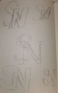
Like any designer I started my process with some initial thumbnails to capture the essence of my ideas, shown on the left. Part of this also meant I looked at different versions of the fonts we were allowed to utilise (Futura and Garamond). Garamond is a very elegant yet formal type face in my opinion with it’s serifs more curved and softened, whereas Futura is a more bold, simplistic, potentially even boring typeface. I like to think of myself as a more diverse personality so I decided to go with the S being in the sleek more angular typeface (Garamond) while doing the N in a more simplistic fashion (Futura).
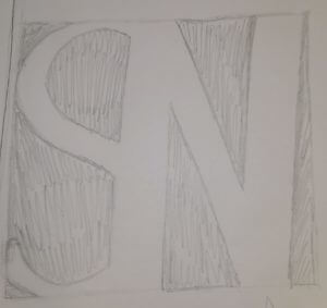
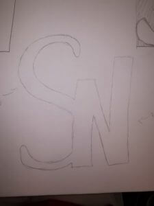
Having decided which of my initial ideas I preferred I started the process of crating those initial sketches into what it would look like. An example of this is visible on the right hand side.
In order to reach the best possible monogram I did this with the majority of my initial sketches. This also meant I could better see what worked and what I needed to improve on, e.g. the Garamond S on the right is lost in the design as it doesn’t carry enough weight. Thus making me recreate it with a heavier version of Garamond.
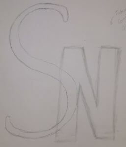
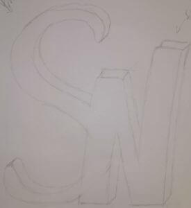
I found once I corrected the design that it still looked too standard, it didn’t really convey my personality yet. So I started playing around with the letter forms some more. This can be seen on the right where some of the N has been stretched higher than the rest, thus creating a more dynamic and interesting design.
Whilst I wasn’t unhappy with my design by this stage I still thought that it could be improved upon, become more than it is. So I kept playing about with it, eventually I layered it and created a sort of 3D effect (shown on the left).
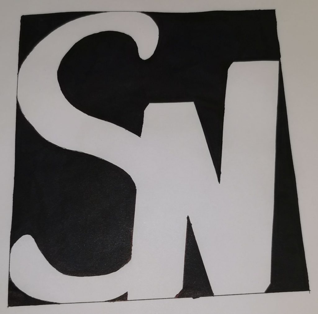
By this time I was starting to run out of ideas of how I could continue this ideas development. However I was still drawn to one of my initial designs which displayed the counters rather than the letters themselves, creating a longer lasting impression. I then decided to combine the two designs, taking the last step in this journey to create my monogram.
