
Background
TrueSwift is a respected information and data management company, see https://www.trueswift.co.uk/. Despite being relatively small, TrueSwift provide software and systems for some very high-profile clients. We even had the opportunity to work with a real, in-house software developer, which meant we were able to discover some of the pain points developers encounter when working with designers, and remedy them in the process. This project was completed by Karin Chan and me and supervised by Gerry Leonidas. Having never designed software UX, I knew this project would be beneficial to broadening my skillset as well as diversifying my portfolio.
TrueSwift needed front end UI for a new product they were developing called Park your Archive™. TrueSwift and Park your Archive™ are registered trademarks of TrueSwift Ltd. It would be used on desktop by companies that wish to provide users with all of the data they have of them. This product is based on the 2019 change in GDPR laws and enable companies to provide their customers with massive amounts of data in the form of emails. It accessed all of a company archived emails and used search queries to refine the results. A selection is then made and exported into a useful file for the end user. As the software was already built, some of the structural and functional features were already set to fixed parameters, nonetheless, there proved to be challenges of their own when designing the UX of a pre-existing system.
Restated Brief
Despite the clarity and professionalism of the client brief, our first meeting revealed a few inconsistencies. Firstly the client was unsure if they wanted a software application or website, which after some discussion with both our client and with Gerry, we agreed to design using software conventions. This was both intimidating and exiting for us as we had never designed software UX before. The purpose of maintaining this convention was to organise a complex piece of software in a user-friendly way. We maintained most other aspects of the brief, including the completion date of 01/05/19. A final major change was the focus of the project, what had initially been presented as a UX task had quickly become a UI design project. Karin and I took this as an opportunity to suggest improvements to the UX as our client had also informed us that a version 2 would be developed as soon as this project was finalised. We added and adjusted some of the criteria for the UI such as navigational arrows and progress bars as our early research into software UI design had emphasised the usefulness of these basic functions. We found a few areas where we expected to encounter difficulties, such as being limited to 3 pages to structure all the information, however, parameters such as these also made the conceptualisation process quicker and easier. After running our brief past Gerry and then TrueSwift, we were approved to move further into the research phase.
Research
Users
The user research had already been completed by TrueSwift’s in-house software developer. We used our first meeting to investigate what he had discovered. Firstly, there would only be a few users of this software, due to the high security clearance needed to operate it. There would only be a few users per company and this task would constitute much of their job at the company. this meant that users would have the opportunity to become familiar with the software UI due to frequent use, allowing us some freedom when designing for usability. We were also told that a different user group would be administrators, those using the audit tab to monitor activity on the application. After some user research exploring the journeys of both of these groups, we found that the primary user, those searching and exporting emails, would also use the audit tab to check for completed tasks. We also considered that both user groups would be switching between windows whilst using this software, meaning that creating the UI in a perpetually windowed format may improve the efficiency of the UX.
Software conventions
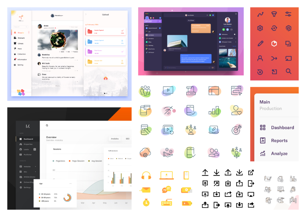
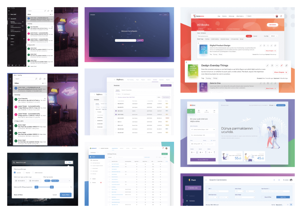
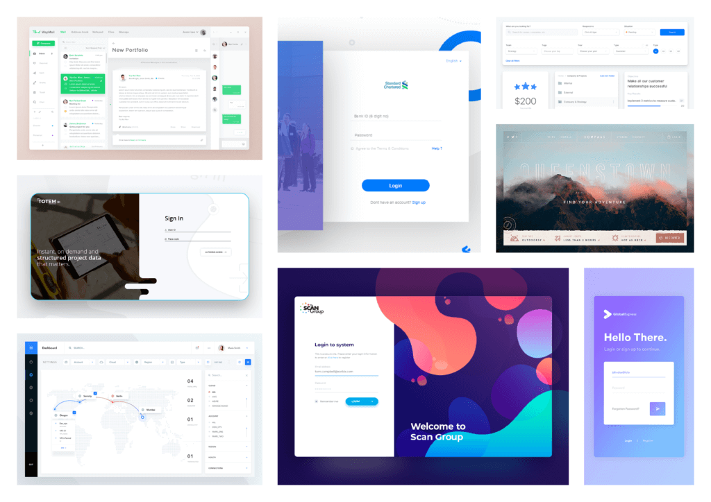
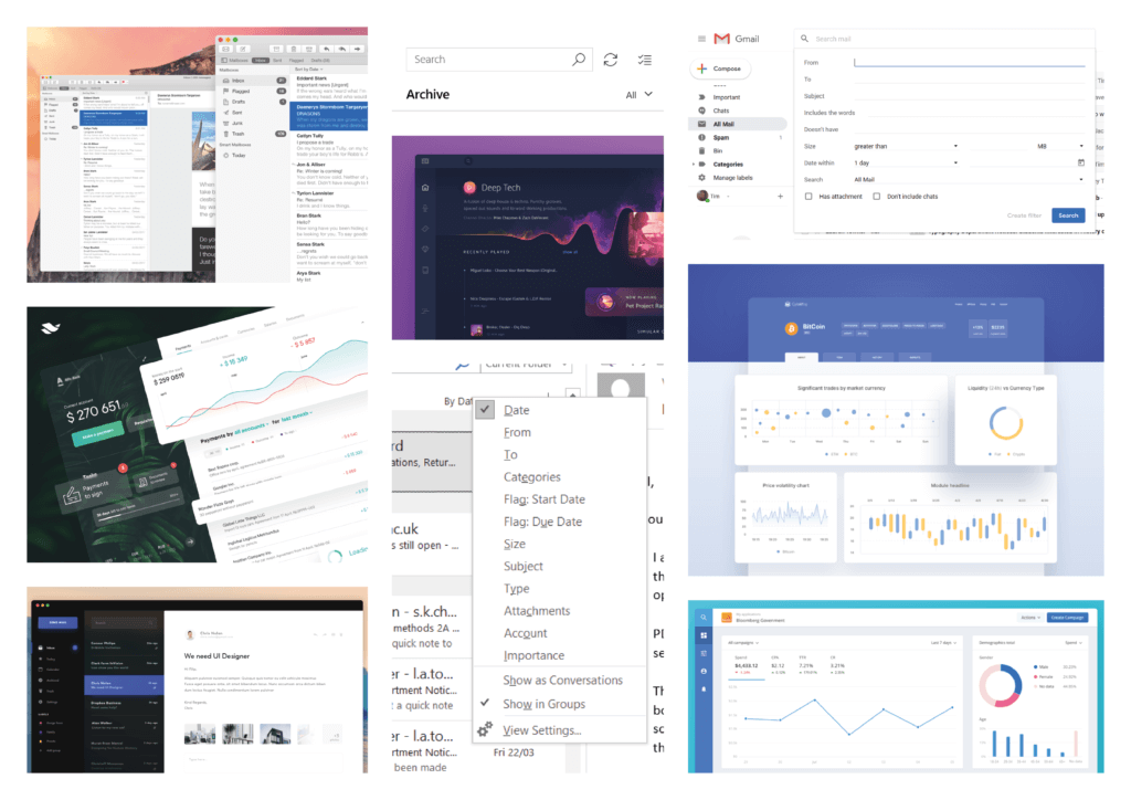
An additional aspect of the research was looking at software convention design. For this we created a series of mood boards (fig. 1) as well as notes. Our notes flagged the importance of navigational tools, especially where the software would be searching through potentially millions of emails. We also found that visual aids such as progress bars and non-static elements gave positive feedback to the user. We incorporated these aspects in our designing phase with the provision that they may end up in the second version of the software rather than this draft.
Designing
Low-fidelity prototyping
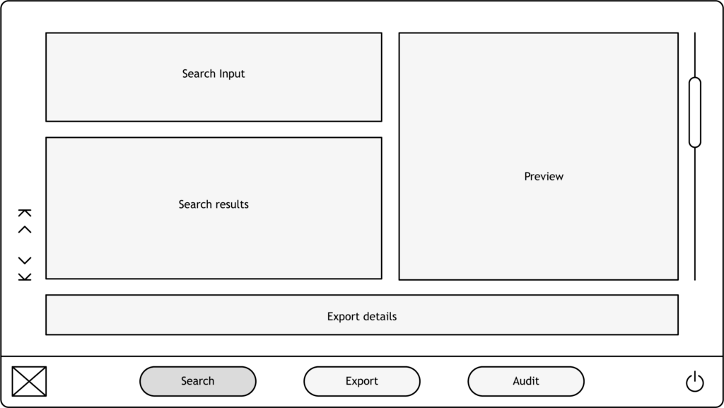
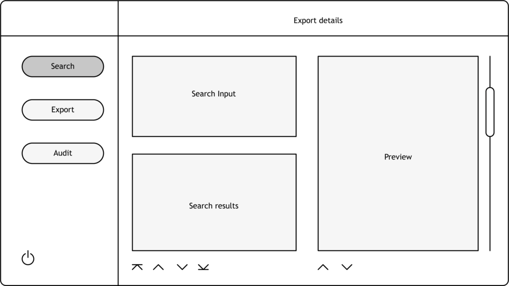
We used rapid, low-fidelity illustrations to experiment with layouts (fig. 2). Karin and I both used our research to design some basic layouts that reflected both software conventions and our user’s needs. We opted to go for a vertical, left aligned navigation as it allowed for a secondary navigation to be used horizontally during each of the flows. It also allows for this navigation to be hidden behind a menu if necessary, as users will benefit from as much space as possible. With this in mind we made the application format 1600×800 px to allow for as much space as possible whilst still being perpetually windowed for efficient usability. This phase was challanging as we found limited solutions for organising such a large quatity of information on a single page, we found that the solution that leant itself best to our user needs and to our prescribed 3 page prototype.
Initial prototype
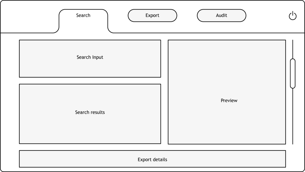
For our second client meeting we produced a working, interactive prototype (fig. 3, 4, 5). This used the low-fidelity illustrations and began organising the information with placeholder text (fig. 3). We also took the opportunity to apply the TrueSwift brand colours to give the client a more genuine experience. Despite having demonstrated our portfolios to give our clients confidence, this prototype consolidated how our client felt, the reception was overwhelmingly positive. Kris Jones, the co-founder of TrueSwift, really began engaging at this point and provided us with some organisational suggestions such as including a status indicator and a help centre. It was a relief to see our clients engage with the first prototype and I believe the extra effort making all the interactions work and animate was well worth it. This version also allowed for user testing to gauge how efficient and user-friendly our layouts were, we found that users often engaged with the flow backwards, when given the task to create an export of emails users would search before naming the export. Whilst this would have affected how we laid out the search page, TrueSwift asked that we maintain the search function at the top.
Making
Brand application
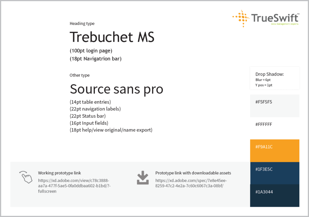
We used mostly source sans throughout the prototype due to the variety of fonts and its high legibility, even in a small display size. Headings were set in trebuchet MS as it was used in the company logo and is highly legible on screens. The colour scheme reflected TrueSwift’s branding in the navigation, however used mostly white to allow for more comfortable reading when searching for emails. We opted to use drop shadows to organise the complex navigation and information in a minimalist way, this allowed for a highly user-friendly design. The colourisation of the prototype leaves much to be desired, the blue and yellow are characteristic of major brands such as IKEA and Lidl, however we designed this way with the provision that the brand would later be modernised as another real job was underway at the time. We also concluded at this point that the program would be a web-app, a healthy compromise between a website and software. Fortunately, the software design conventions we had based our design around were appropriate for a web-app, meaning that only a few adjustments would need to be made. The only major change was changing the screen resolution to 1920×1080 px as per our client’s request, despite our rationale for perpetuating windowed mode, we all agreed that full screen would lend itself better to browsing through potentially massive lists. The branding was presented to TrueSwift in the form of a specification that outlined typeface, colour and drop shadow use as well as provided prototype links (fig. 6).
Prototype development
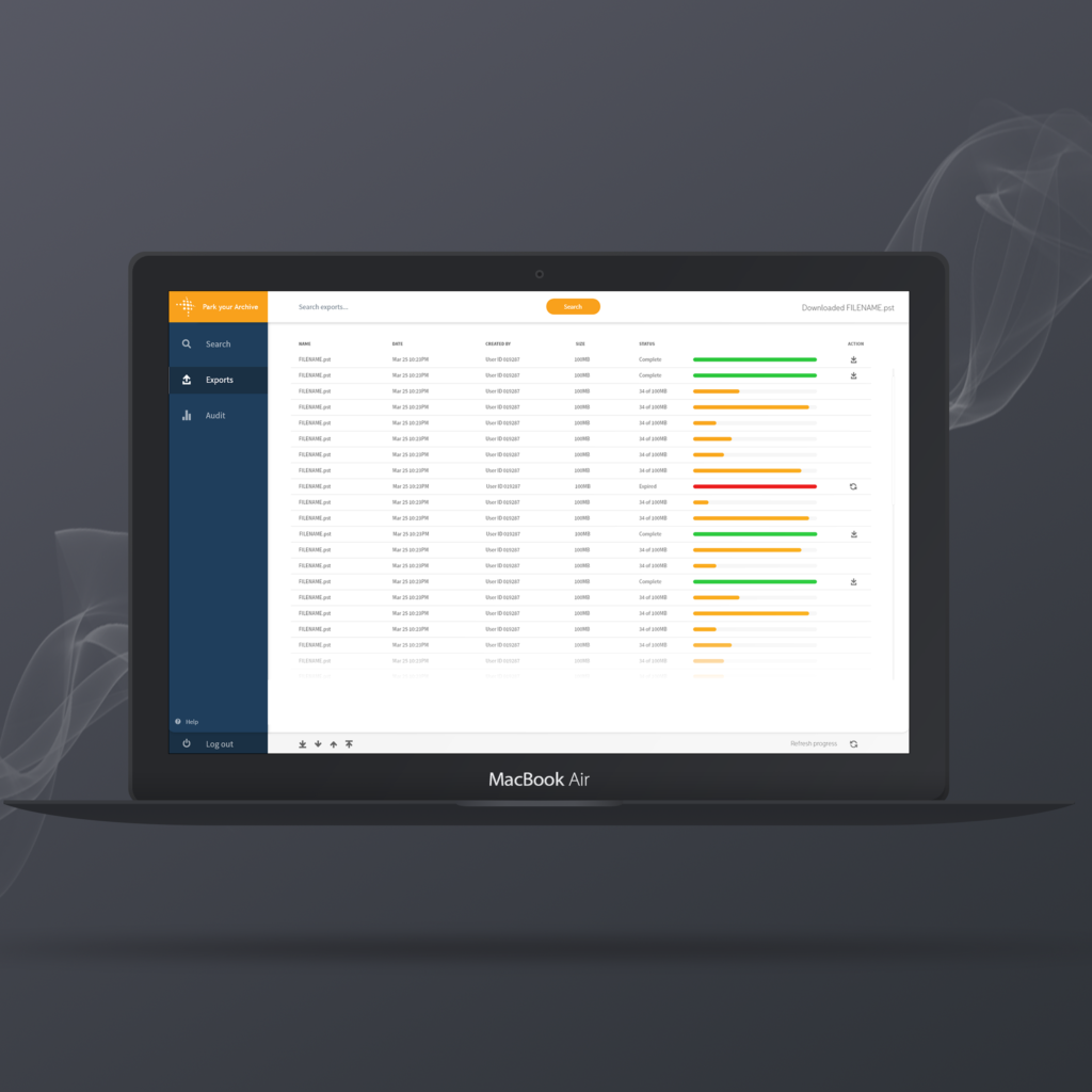
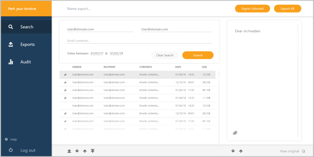
The search page (fig. 7) uses the form design provided by our client. It searches using basic email criteria as well as through a Boolean option that allows for more specific searches. Once the search is complete a list is a provided that matches the search criteria; each list entry can be previewed when it is selected. Once all the necessary emails are highlighted, they can be named and exported as a single file. both the preview and the email list have navigational arrows however only the email list has extra due to potentially millions of emails being viewed. The export button is in line with the name input as per our clients request and a status indicator occupies the top right corner. The CTA has been divided into single and packaged exports as our user research found that both will be needed in practice.
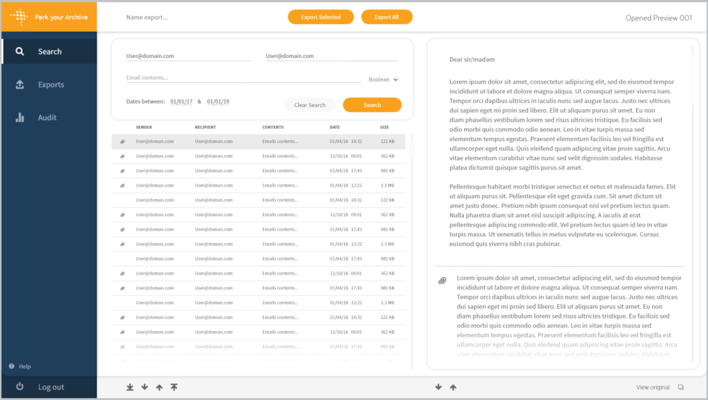
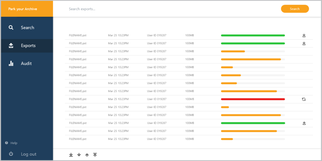
The export page is the second part of the primary flow (fig. 8). The user will export as many files as necessary and use this page to check details regarding the file, including a progress indicator, file size and most importantly interaction buttons. These buttons are conditional, if the export is complete it can be used to download the file and if it is expired it can re-export it. Again the navigation arrows feature for both design consistency and for instances where potentially hundreds of files will be exported by a single company. The list also acts as a history directory as exports are never deleted, this means the navigational arrows will be beneficial once the program has been used for some time.

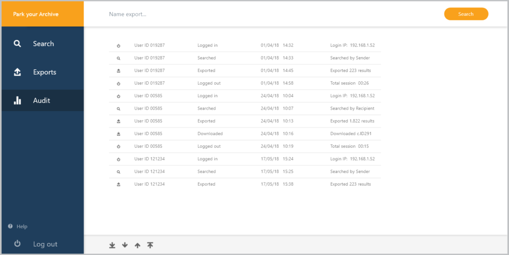
The secondary flow features on the audit page (fig. 9). Here an administrator can browse a list of all actions taken by users and gather a multitude of information on it. This information includes the action, the user, the date and time as well as some details regarding the interaction. An arrow is provided to provide even further information when necessary, however this would only be used conditionally for certain clients. This tab can also be used by the primary flow to check which tasks have already been completed. For this reason, the audit tab has been given icons for each list entry to make the interface more user-friendly and efficient. Aspects like these can be learned by the users as they will be engaging with the software multiple times a month.

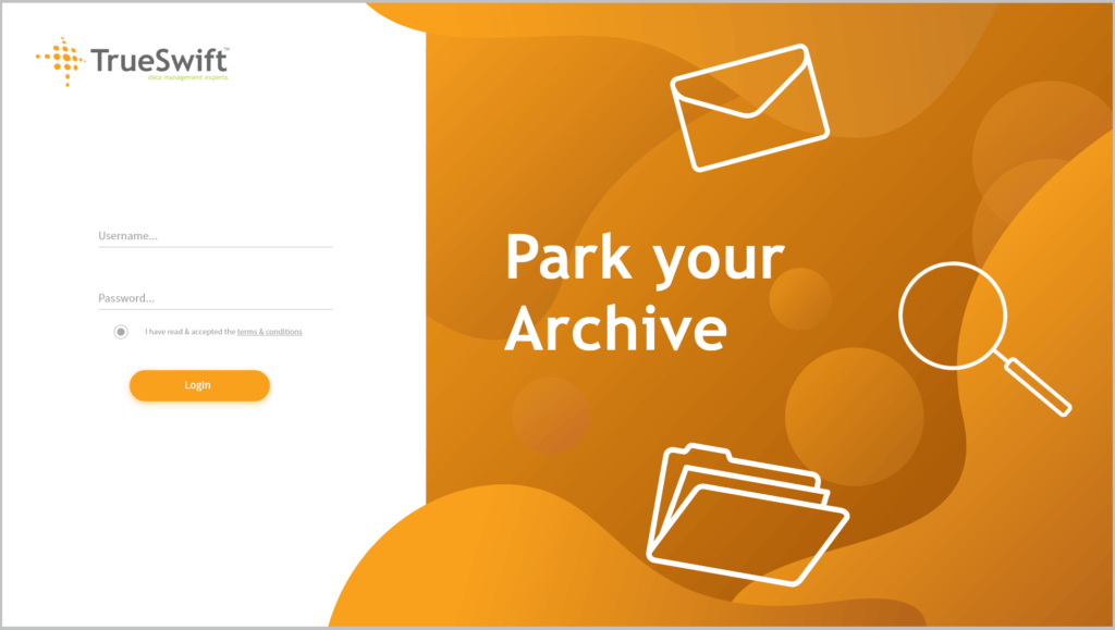
The login page (fig. 10) was one of the most interesting to engage with. The form itself was relatively straightforward, it was a simple username and password input form that had no requirement for a sign-up flow. The splash image was the primary challenge on this page, and despite being decorative, it was critical to creating an overall professional feel. The Iconography used reflects the primary functionality of the software whilst he colours used within the shapes and the rest of the UI reflect the TrueSwift brand.
Final outcomes
Throughout this project we engaged with a variety of professionals including marketing managers and software developers. We conceptualised and created the front-end UI and made valuable contributions to the overall process of industry ready software. We also helped our client overcome uncertainties using our knowledge of usability. Finally, we applied our knowledge of information and layout design to structure complex forms and information into a simple, manageable interface.
Reflection
The completion of a project for a real client was empowering to say the least, being able to engage and excel in a real design environment gave me confidence not only for further real jobs but for pursuing a design career as a whole. It lent insight into technology companies and how I was able to see learn much about the design process as a whole, including the handover between designers to developer. We also gained an appreciation for the importance of what a client wants, how to convice a client how something else may work better and how to reach a compromise. We learned that within the realm of UX design, the simplest solution is sometimes the strongest as it often adheres to usability principles.
The job was completed before the target date and, despite Karin and myself both having other work to complete, we successfully managed our time around this project. There are a few areas that would have benefitted from more research and conceptualisation, such as the wireframing. There were also a few hurdles with designing for an existing system that we have since understood, such as the restrictions on page count and functionality. Despite this, the client was impressed by the end product and the project as a whole was greatly successful.
Overall, I was also able to diversify my knowledge of UX, UI and usability design and improve my confidence working both in a team and in an industry environment. I hope to explore further into software design and potentially face challanges that completely reinvent my understanding of UX conventions. TrueSwift will be working on further versions of Park your Archive as well as other software and I hope to one day work with Kris Jones and his team again.