
The client & the brief
My client for this project was a lady named Maggie Shelton; she works as a Community Catchment Officer, for the Hampshire & Isle of Wight Wildlife Trust.
The Background Story
As a designer, gaining a clear understanding of the ecology and science behind this project’s was incredibly important when considering how to visually approach design ideas with this project’s purpose and importance in mind. The most crucial aspect of this process was to ensure I asked my client detailed and specific questions about what is most relevant to the charity’s ethos and aims. Specifically, I wanted to gain as much information as I could about the Watercress & Winterbournes conversation project. In my initial meeting with Maggie, I found out that the focus for this project is to preserve the chalk streams of the Hampshire Downs, a unique landscape specific to this region. Maggie was incredibly passionate about how crucial the preservation of these habitats are, therefore after taking part in this face to face meeting with Maggie, I understood that this project was close to her heart; this experience was a very useful learning curve as it reinforced to me the importance of the correct kind of communication with your client. The project also supports of a range of heritage industries, villages and their communities.
‘The area is central the to UK’s watercress industry and its water mills have supported industries such as the production of paper, corn, silk and even gin.’ – Maggie Shelton
My client also went into great detail about the partnership vision and their overall aims. The point of this project is primarily to unite sixteen partners, in order to help form relationships with surrounding communities in the Hampshire Downs area, who’s roles are essential in caring for the local heritage. This project also aims to encourage and inspire young people to protect the natural headwaters now and for future generations.
Deliverables
The client specifically requested three different logo designs for the Watercress & Winterbournes project. These logos would be used on letterheads, banners, featuring as part of a web presence, and should also work as part of any publicity that advertises the new Heritage Lottery Fund project. The client specifically requested that these three logo designs must work in full colour and also in black and white. These logo designs also needed to be just as successful when scaled down to a smaller size, and scaled up to be used in varying formats.
Specific Design Considerations included:
- The logo including the words ‘Watercress & Winterbournes’ specifically using an ampersand.
- The logo needed to sit alongside the Heritage Lottery Fund logo, therefore not compete with the this logo but complement it.
- The colour palette must be cheap to photocopy, as the client for this project is a member of a charity, ensuring the design is cost effective was a very important element.
- These logos must also be visually effective on a Powerpoint presentation and also effective when placed over a detailed photograph.
- Maggie Shelton specifically requested in her brief that these logos ‘reflect the ethos of the project’
I responded to this discussion with Maggie by briefly talking about some of my initial ideas for this brief. She reiterated to me that the heritage and sense of community was very important to communicate. I suggested to her that I wanted to use the concept of the natural surroundings in my logo designs. As the focus of the project is on preserving the heritage, I wanted to focus my design ideas towards a more traditional approach. This would feature hand-drawn illustrations, and perhaps serif typefaces. During this meeting I ensured that I communicated my understanding and appreciation for the project’s mission. I explained some of my ideas, in doing this, I assured her that she could trust me with respecting the project’s aims, though this is a newly founded project, the Hampshire Downs are a part of the UK’s natural heritage and I understood the relevance of this.
My Design Approach
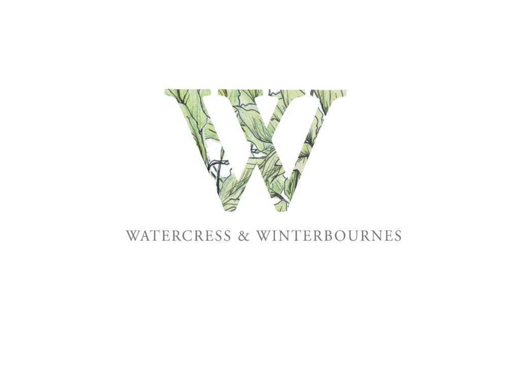
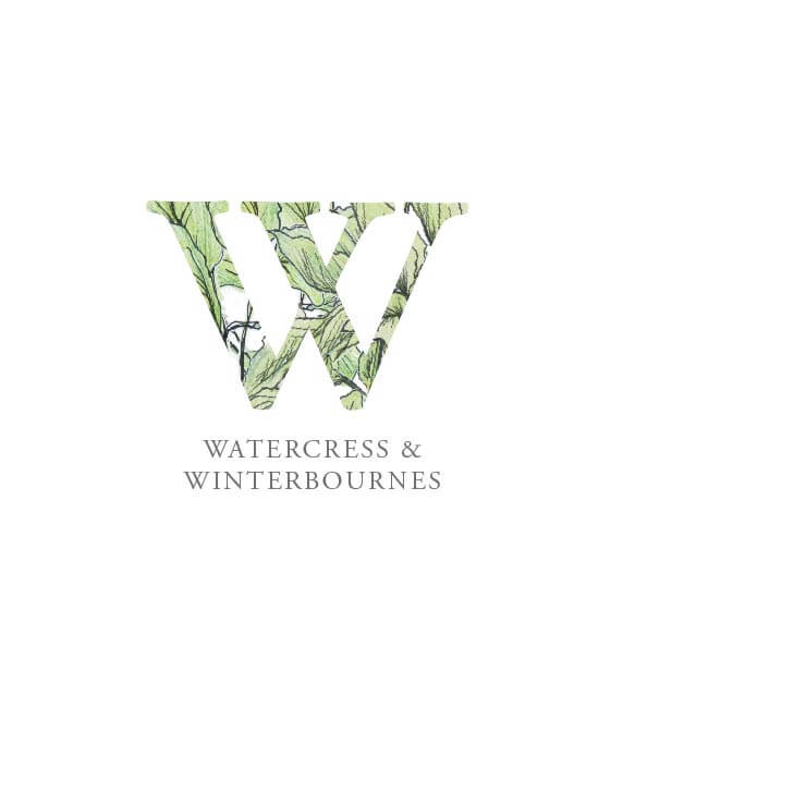
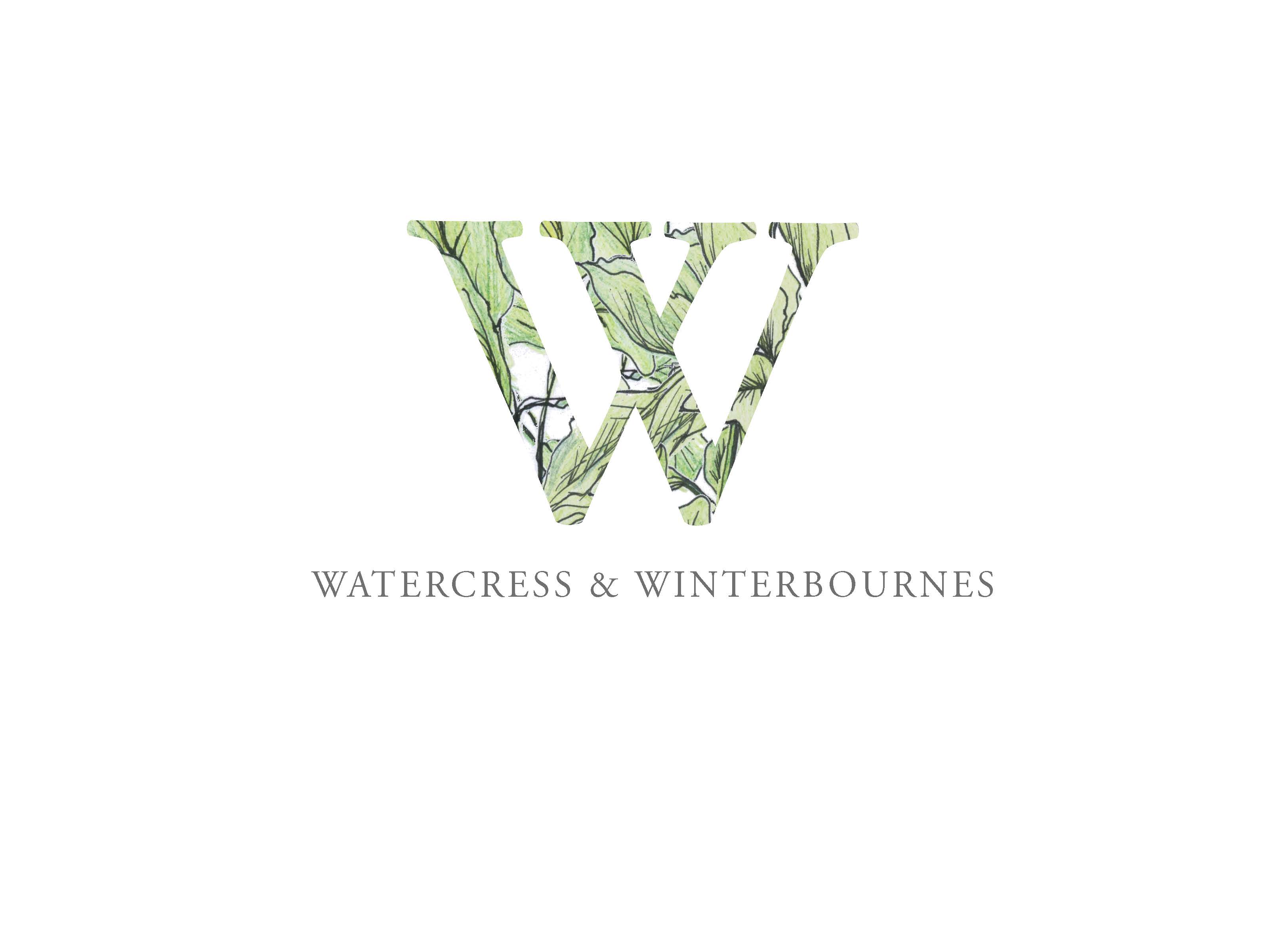
I approached this design by considering the ideas and themes discussed with my client. I wanted to incorporate the project’s ideas of preservation and the importance placed on the heritage of the region and the natural habitats it encompasses. To do this, I began by experimenting with my own hand-drawn illustrations. I focused on motifs such as the watercress, specific to the chalk streams but this also features in the name of the project itself. I wanted these drawings to be detailed and realistic in order to represent the traditional elements of the project itself as discussed with my client. These drawings resulted in a botanical drawing style. These drawings were effective in both colour, using a natural green. When designing the typography for the logo designs, I wanted to use serif typefaces, traditional and simple letterforms, with particular focus on the ‘W’, representing the Watercress & Winterbournes name. I decided to incorporate these two main elements together, by featuring the watercress drawing as part of the typography.
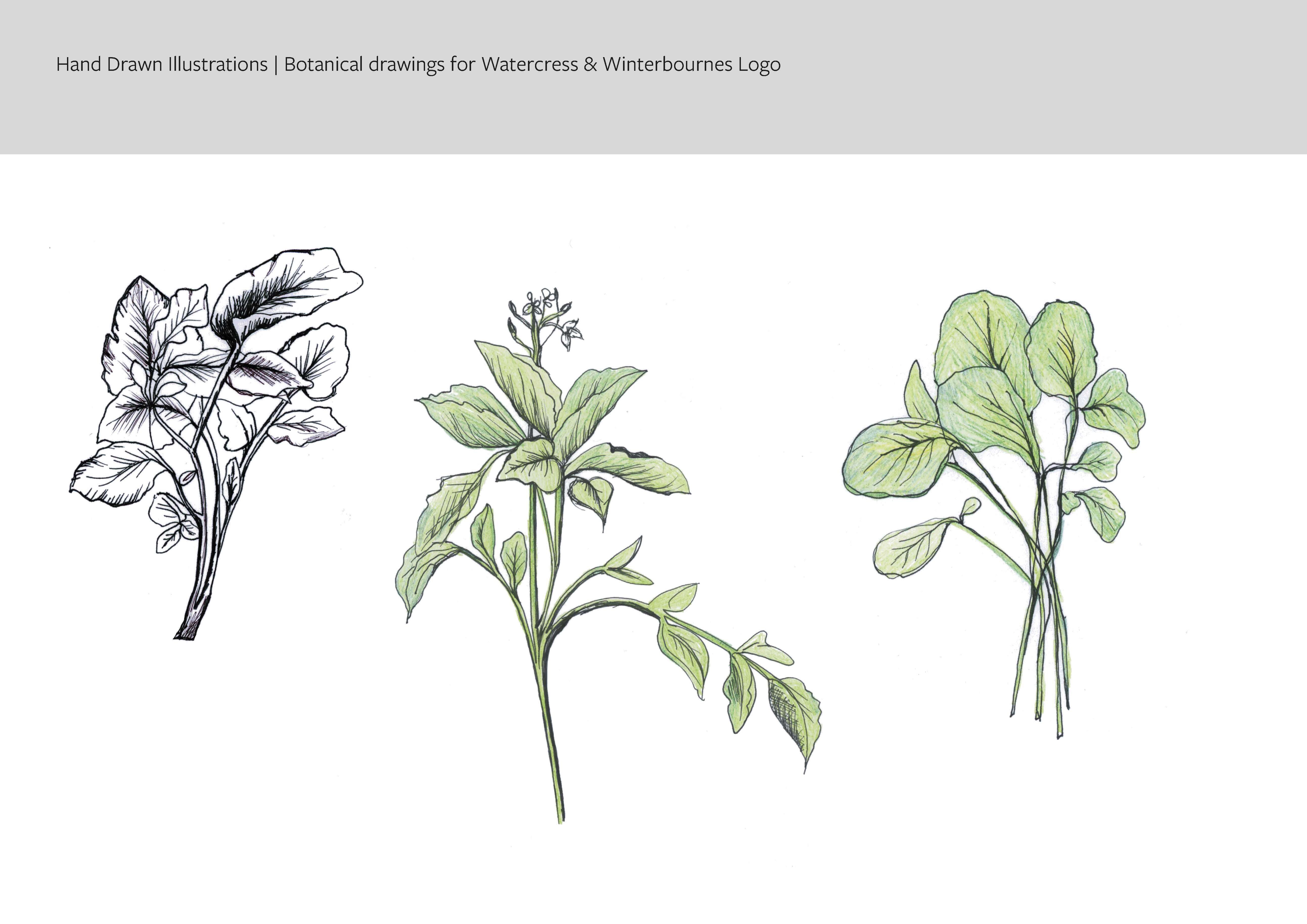
Figure 1 – Initial Visuals
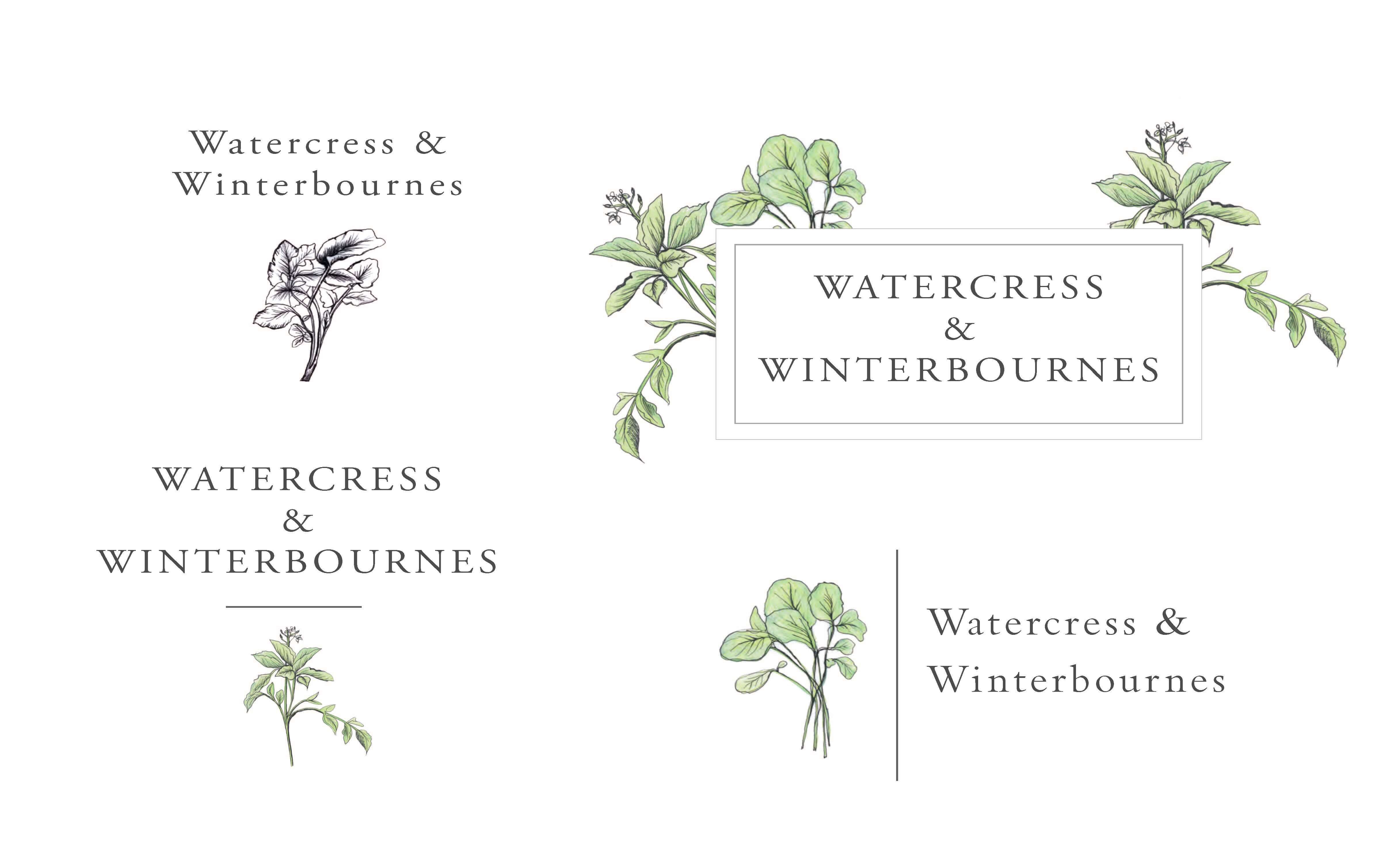
Figure 2 – Experiments with typographical treatment
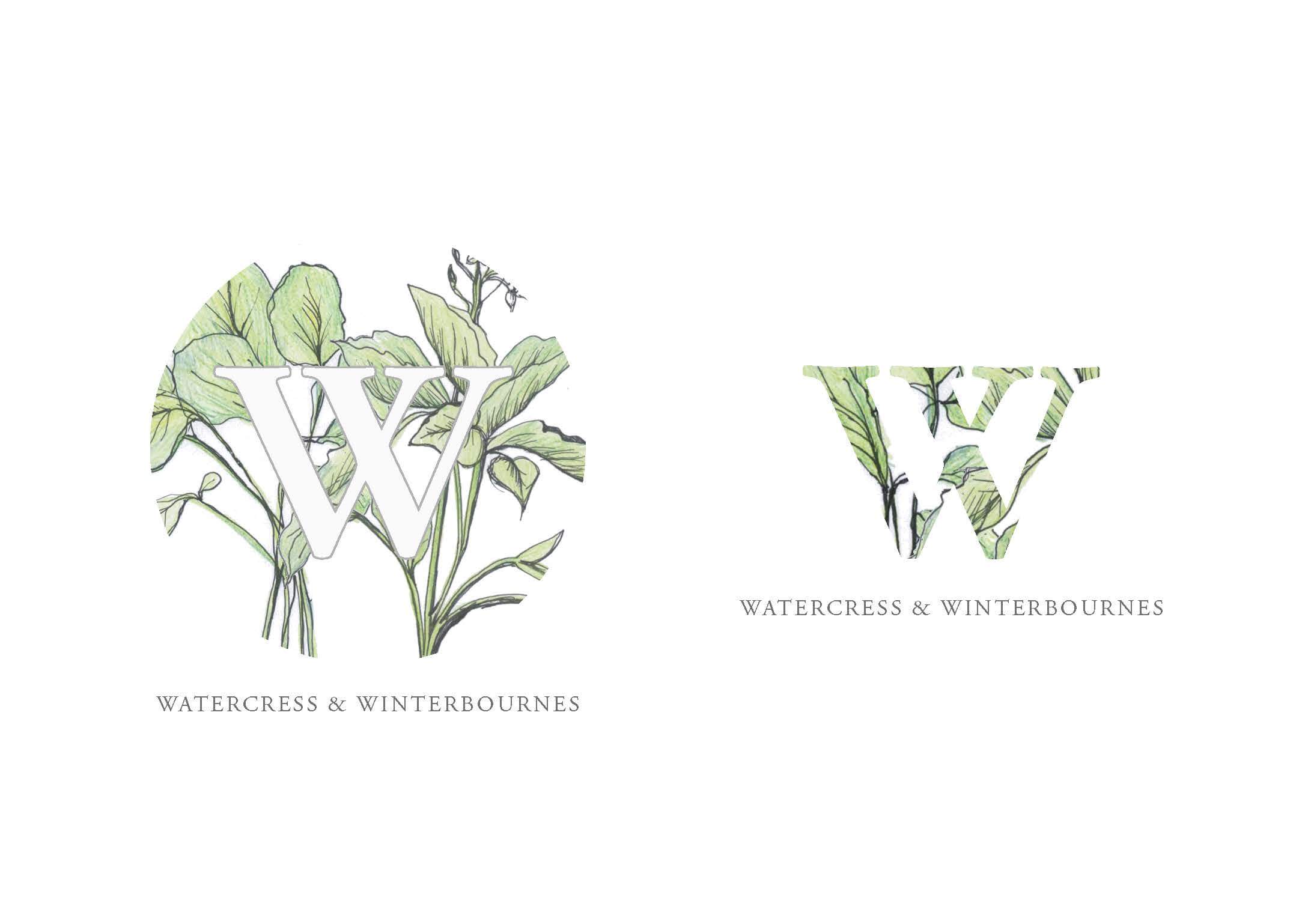
Figure 3 – Developed Logo Designs
My Experience
Overall, my experience producing logo designs for the Hampshire & Isle of Wight Wildlife Trust was incredibly positive. I learnt a considerable amount about the relationship that can be formed with a client and how this can influence your perception of the design work produced for them. I feel that I have improved my ability to retrieve information from a client, I have learnt that making sure I am asking the correct questions, influences my work very positively. Understanding a brief is also very valuable to the process; ensuring you are correctly informed about the purpose the of work you are designing for, means that as a designer, you can make the correct decisions about the job at hand. This job was very simple in terms of the content, the deliverables were clear and concise and there was little that could go wrong technically, however, the challenging part of the project was to make sure I paid homage to the project itself. The project has a particularly important and somewhat serious message. The part my logo designs played in portraying the correct identity and message for project was very specific. Another important lesson I have learnt as part of this process, was to keep an open mind about my own ideas. After attending a very informative Real Jobs meeting, I discovered that it is also important to not underestimate your abilities; to sell your ideas and to have confidence in your skills. The designs that I presented to the group in this meeting, I personally felt were a little weak in my opinion, however, my colleagues felt that my designs were strong, original and unique. I found that the most successful design, came as a result of an accidental experiment and this was quite eye-opening for me.